Deck 3: Data Visualization
Full screen (f)
Question
Question
Question
Question
Question
Question
Question
Question
Question
Question
Question
The following image is a 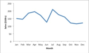
A)sparkline.
B)trendline.
C)gridline.
D)line chart.
A)sparkline.
B)trendline.
C)gridline.
D)line chart.
Question
Question
Question
Question
Question
Question
Question
Question
Question
Question
Question
Question
Question
Question
Question
Question
Question
Question
Question
Question
This Excel bar chart displays the demographics of a Business Analysis class. Approximately how many students are in the class? 
A)175
B)150
C)105
D)130
A)175
B)150
C)105
D)130
Question
Question
Question
Question
Consider the clustered bar chart of the dashboard developed to monitor the performance of a call center: 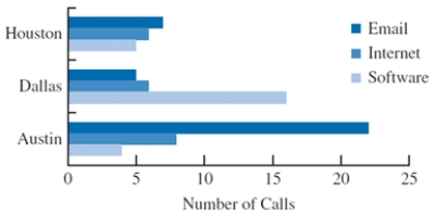 This chart allows the IT manager to
A)identify how often a problem is related to hardware.
B)identify the frequency of a particular type of problem by location.
C)identify which city contains the most customers.
D)identify the percent of customers who do not have one of the listed problems.
This chart allows the IT manager toA)identify how often a problem is related to hardware.
B)identify the frequency of a particular type of problem by location.
C)identify which city contains the most customers.
D)identify the percent of customers who do not have one of the listed problems.
Question
Question
Question
Question
Question
This bar chart displays the demographics of a Business Analysis class. How many male students are in the class? 
A)30
B)50
C)80
D)130
A)30
B)50
C)80
D)130
Question
Question
Question
Question
Question
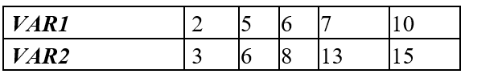
Construct a scatter chart for the following set of data. Describe the relationship between the two variables.
Question
Question

Unlock Deck
Sign up to unlock the cards in this deck!
Unlock Deck
Unlock Deck
1/47
Play
Full screen (f)
Deck 3: Data Visualization
1
The charts that are helpful in making comparisons between categorical variables are
A)bar charts and scatter charts.
B)scatter charts and line charts.
C)bar charts and column charts.
D)column charts and line charts.
A)bar charts and scatter charts.
B)scatter charts and line charts.
C)bar charts and column charts.
D)column charts and line charts.
bar charts and column charts.
2
Making visual comparisons between categorical variables may be difficult in a
A)scatter chart.
B)pie chart.
C)line chart.
D)column chart.
A)scatter chart.
B)pie chart.
C)line chart.
D)column chart.
pie chart.
3
A time series plot is also known as a
A)boxplot.
B)frequency graph.
C)dot plot
D)line chart.
A)boxplot.
B)frequency graph.
C)dot plot
D)line chart.
line chart.
4
A chart that is recommended as an alternative to a pie chart is a
A)bar chart.
B)line chart.
C)stacked column chart.
D)box plot.
A)bar chart.
B)line chart.
C)stacked column chart.
D)box plot.
Unlock Deck
Unlock for access to all 47 flashcards in this deck.
Unlock Deck
k this deck
5
Tables should be used instead of charts when
A)the reader needs relative comparisons of data.
B)there are more than two columns of data.
C)the values being displayed have different units or very different magnitudes.
D)the reader need not differentiate the columns and rows.
A)the reader needs relative comparisons of data.
B)there are more than two columns of data.
C)the values being displayed have different units or very different magnitudes.
D)the reader need not differentiate the columns and rows.
Unlock Deck
Unlock for access to all 47 flashcards in this deck.
Unlock Deck
k this deck
6
In order to visualize three variables in a two-dimensional graph, we use a
A)2-D chart.
B)3-D chart.
C)bubble chart.
D)column chart.
A)2-D chart.
B)3-D chart.
C)bubble chart.
D)column chart.
Unlock Deck
Unlock for access to all 47 flashcards in this deck.
Unlock Deck
k this deck
7
Bar charts use
A)horizontal bars to display the magnitude of the quantitative variable.
B)vertical bars to display the magnitude of the quantitative variable.
C)horizontal and vertical bars to display the magnitude of the quantitative variable.
D)vertical bars to display the magnitude of the categorical variable.
A)horizontal bars to display the magnitude of the quantitative variable.
B)vertical bars to display the magnitude of the quantitative variable.
C)horizontal and vertical bars to display the magnitude of the quantitative variable.
D)vertical bars to display the magnitude of the categorical variable.
Unlock Deck
Unlock for access to all 47 flashcards in this deck.
Unlock Deck
k this deck
8
A _____________ is a line that provides an approximation of the relationship between the variables.
A)line chart
B)sparkline
C)trendline
D)gridline
A)line chart
B)sparkline
C)trendline
D)gridline
Unlock Deck
Unlock for access to all 47 flashcards in this deck.
Unlock Deck
k this deck
9
The software package most commonly used for creating simple charts is
A)Excel.
B)XLMiner.
C)SAS.
D)R.
A)Excel.
B)XLMiner.
C)SAS.
D)R.
Unlock Deck
Unlock for access to all 47 flashcards in this deck.
Unlock Deck
k this deck
10
In many cases, white space in a chart can improve
A)complexity.
B)readability.
C)functionality.
D)stability.
A)complexity.
B)readability.
C)functionality.
D)stability.
Unlock Deck
Unlock for access to all 47 flashcards in this deck.
Unlock Deck
k this deck
11
The following image is a
A)sparkline.
B)trendline.
C)gridline.
D)line chart.
A)sparkline.
B)trendline.
C)gridline.
D)line chart.
Unlock Deck
Unlock for access to all 47 flashcards in this deck.
Unlock Deck
k this deck
12
Data-ink is the ink used in a table or chart that
A)does not help in conveying the data to the audience.
B)helps in presenting data when the audience need not know exact values.
C)is necessary to convey the meaning of the data to the audience.
D)increases the non-data-ink ratio.
A)does not help in conveying the data to the audience.
B)helps in presenting data when the audience need not know exact values.
C)is necessary to convey the meaning of the data to the audience.
D)increases the non-data-ink ratio.
Unlock Deck
Unlock for access to all 47 flashcards in this deck.
Unlock Deck
k this deck
13
__________ are visual methods of displaying data.
A)Tables
B)Charts
C)PivotTables
D)Crosstabs
A)Tables
B)Charts
C)PivotTables
D)Crosstabs
Unlock Deck
Unlock for access to all 47 flashcards in this deck.
Unlock Deck
k this deck
14
Which one of the following statements is not true concerning PivotTables in Excel?
A)PivotTables are also known as crosstabulation tables.
B)PivotTables summarize data for two variables.
C)PivotTables are interactive.
D)PivotTables can be built using data arrayed in rows.
A)PivotTables are also known as crosstabulation tables.
B)PivotTables summarize data for two variables.
C)PivotTables are interactive.
D)PivotTables can be built using data arrayed in rows.
Unlock Deck
Unlock for access to all 47 flashcards in this deck.
Unlock Deck
k this deck
15
Deleting the grid lines in a table and the horizontal lines in a chart
A)increases the data-ink ratio.
B)decreases the data-ink ratio.
C)increases the non-data-ink ratio.
D)does not affect the data-ink ratio.
A)increases the data-ink ratio.
B)decreases the data-ink ratio.
C)increases the non-data-ink ratio.
D)does not affect the data-ink ratio.
Unlock Deck
Unlock for access to all 47 flashcards in this deck.
Unlock Deck
k this deck
16
A _____________ is a graphical presentation of the relationship between two quantitative variables.
A)histogram
B)bar chart
C)pie chart
D)scatter chart
A)histogram
B)bar chart
C)pie chart
D)scatter chart
Unlock Deck
Unlock for access to all 47 flashcards in this deck.
Unlock Deck
k this deck
17
A line chart that has no axes but is used to provide information on overall trends for time series data is called a
A)time series plot.
B)sparkline.
C)trendline.
D)bubble chart.
A)time series plot.
B)sparkline.
C)trendline.
D)bubble chart.
Unlock Deck
Unlock for access to all 47 flashcards in this deck.
Unlock Deck
k this deck
18
Using multiple lines on a line chart or employing multiple charts is an alternative to a
A)column chart.
B)line chart.
C)two-dimensional graph.
D)three-dimensional chart.
A)column chart.
B)line chart.
C)two-dimensional graph.
D)three-dimensional chart.
Unlock Deck
Unlock for access to all 47 flashcards in this deck.
Unlock Deck
k this deck
19
Fields may be chosen to represent all of the following except ____________ in the body of a PivotTable.
A)rows
B)columns
C)values
D)filters
A)rows
B)columns
C)values
D)filters
Unlock Deck
Unlock for access to all 47 flashcards in this deck.
Unlock Deck
k this deck
20
DJ needs to display data over time. Which of the following charts should he use?
A)Scatter chart
B)Pie chart
C)Bar chart
D)Line chart
A)Scatter chart
B)Pie chart
C)Bar chart
D)Line chart
Unlock Deck
Unlock for access to all 47 flashcards in this deck.
Unlock Deck
k this deck
21
We create multiple dashboards
A)to help the user scroll vertically and horizontally to see the entire dashboard.
B)so that each dashboard can be viewed on a single screen.
C)to make sure the KPIs are not displayed in the data dashboard.
D)so that all dashboards can be viewed on a single screen.
A)to help the user scroll vertically and horizontally to see the entire dashboard.
B)so that each dashboard can be viewed on a single screen.
C)to make sure the KPIs are not displayed in the data dashboard.
D)so that all dashboards can be viewed on a single screen.
Unlock Deck
Unlock for access to all 47 flashcards in this deck.
Unlock Deck
k this deck
22
The data dashboard for a marketing manager may have KPIs related to
A)current sales measures and sales by region.
B)current financial standing of the company.
C)data on the company's call center.
D)overall performance of the company's stock over the previous 52 weeks.
A)current sales measures and sales by region.
B)current financial standing of the company.
C)data on the company's call center.
D)overall performance of the company's stock over the previous 52 weeks.
Unlock Deck
Unlock for access to all 47 flashcards in this deck.
Unlock Deck
k this deck
23
In a business, the values indicating the business's current operating characteristics, such as its financial position, the inventory on hand, and customer service metrics, are typically known as
A)company performance indicators.
B)performance indicators.
C)key performance indicators.
D)business performance indicators.
A)company performance indicators.
B)performance indicators.
C)key performance indicators.
D)business performance indicators.
Unlock Deck
Unlock for access to all 47 flashcards in this deck.
Unlock Deck
k this deck
24
A useful chart for displaying multiple variables is the
A)stacked column and bar chart.
B)scatter chart.
C)scatter chart matrix.
D)two-dimensional graph.
A)stacked column and bar chart.
B)scatter chart.
C)scatter chart matrix.
D)two-dimensional graph.
Unlock Deck
Unlock for access to all 47 flashcards in this deck.
Unlock Deck
k this deck
25
A data visualization tool that updates in real time and gives multiple outputs is called
A)a data table.
B)a metrics table.
C)the GIS.
D)a data dashboard.
A)a data table.
B)a metrics table.
C)the GIS.
D)a data dashboard.
Unlock Deck
Unlock for access to all 47 flashcards in this deck.
Unlock Deck
k this deck
26
A disadvantage of stacked-column charts and stacked-bar charts is that
A)they do not include all the values of the variable.
B)they cannot be used to compare relative values of quantitative variables for the same category.
C)it can be difficult to perceive small differences in areas.
D)they are only used when many quantitative variables need to be displayed.
A)they do not include all the values of the variable.
B)they cannot be used to compare relative values of quantitative variables for the same category.
C)it can be difficult to perceive small differences in areas.
D)they are only used when many quantitative variables need to be displayed.
Unlock Deck
Unlock for access to all 47 flashcards in this deck.
Unlock Deck
k this deck
27
To generate a scatter chart matrix, we use
A)native Excel functionality.
B)Excel Add-In XLMiner.
C)Excel Add-In MegaStat.
D)All of these are correct.
A)native Excel functionality.
B)Excel Add-In XLMiner.
C)Excel Add-In MegaStat.
D)All of these are correct.
Unlock Deck
Unlock for access to all 47 flashcards in this deck.
Unlock Deck
k this deck
28
To avoid problems in interpreting the differences in color in a heat map, ____________ can be added.
A)a bubble chart
B)a pie chart
C)a scatter chart
D)sparklines
A)a bubble chart
B)a pie chart
C)a scatter chart
D)sparklines
Unlock Deck
Unlock for access to all 47 flashcards in this deck.
Unlock Deck
k this deck
29
To summarize and analyze data with both a crosstabulation and charting, Excel typically pairs
A)PivotCharts with PivotTables.
B)stacked column charts with PivotTables.
C)heat maps with trendlines.
D)bubble charts with trendlines.
A)PivotCharts with PivotTables.
B)stacked column charts with PivotTables.
C)heat maps with trendlines.
D)bubble charts with trendlines.
Unlock Deck
Unlock for access to all 47 flashcards in this deck.
Unlock Deck
k this deck
30
A PivotChart, in few instances, is the same as a
A)clustered-column chart.
B)bubble chart.
C)stacked-column chart.
D)bar chart.
A)clustered-column chart.
B)bubble chart.
C)stacked-column chart.
D)bar chart.
Unlock Deck
Unlock for access to all 47 flashcards in this deck.
Unlock Deck
k this deck
31
This Excel bar chart displays the demographics of a Business Analysis class. Approximately how many students are in the class?
A)175
B)150
C)105
D)130
A)175
B)150
C)105
D)130
Unlock Deck
Unlock for access to all 47 flashcards in this deck.
Unlock Deck
k this deck
32
An effective display of trend and magnitude is achieved by using a combination of a
A)time series plot and sparklines.
B)line chart and trendlines.
C)heat map and sparklines.
D)bubble chart and trendlines.
A)time series plot and sparklines.
B)line chart and trendlines.
C)heat map and sparklines.
D)bubble chart and trendlines.
Unlock Deck
Unlock for access to all 47 flashcards in this deck.
Unlock Deck
k this deck
33
A __________ is useful for visualizing hierarchical data along multiple dimensions.
A)heat map
B)hierarchical map
C)treemap
D)map of multiple hierarchy
A)heat map
B)hierarchical map
C)treemap
D)map of multiple hierarchy
Unlock Deck
Unlock for access to all 47 flashcards in this deck.
Unlock Deck
k this deck
34
__________ merges maps and statistics to present data collected over different geographies.
A)The heat map
B)The geographic information system
C)A geographical map
D)The statistical information system
A)The heat map
B)The geographic information system
C)A geographical map
D)The statistical information system
Unlock Deck
Unlock for access to all 47 flashcards in this deck.
Unlock Deck
k this deck
35
Consider the clustered bar chart of the dashboard developed to monitor the performance of a call center: This chart allows the IT manager to
A)identify how often a problem is related to hardware.
B)identify the frequency of a particular type of problem by location.
C)identify which city contains the most customers.
D)identify the percent of customers who do not have one of the listed problems.
This chart allows the IT manager toA)identify how often a problem is related to hardware.
B)identify the frequency of a particular type of problem by location.
C)identify which city contains the most customers.
D)identify the percent of customers who do not have one of the listed problems.
Unlock Deck
Unlock for access to all 47 flashcards in this deck.
Unlock Deck
k this deck
36
A __________ is used for examining data with more than two variables, and it includes a different vertical axis for each variable.
A)scatter plot
B)PivotChart
C)column chart
D)parallel-coordinates plot
A)scatter plot
B)PivotChart
C)column chart
D)parallel-coordinates plot
Unlock Deck
Unlock for access to all 47 flashcards in this deck.
Unlock Deck
k this deck
37
The best way to differentiate chart elements is using
A)colors.
B)labels.
C)bubbles.
D)chart titles.
A)colors.
B)labels.
C)bubbles.
D)chart titles.
Unlock Deck
Unlock for access to all 47 flashcards in this deck.
Unlock Deck
k this deck
38
A two-dimensional graph representing the data using different shades of color to indicate magnitude is called a
A)heat map.
B)bubble chart.
C)column chart.
D)pie chart.
A)heat map.
B)bubble chart.
C)column chart.
D)pie chart.
Unlock Deck
Unlock for access to all 47 flashcards in this deck.
Unlock Deck
k this deck
39
An alternative for a stacked column chart when comparing more than a couple of quantitative variables in each category is a
A)stacked bar chart.
B)clustered column chart.
C)pie chart.
D)clustered bar chart.
A)stacked bar chart.
B)clustered column chart.
C)pie chart.
D)clustered bar chart.
Unlock Deck
Unlock for access to all 47 flashcards in this deck.
Unlock Deck
k this deck
40
This bar chart displays the demographics of a Business Analysis class. How many male students are in the class?
A)30
B)50
C)80
D)130
A)30
B)50
C)80
D)130
Unlock Deck
Unlock for access to all 47 flashcards in this deck.
Unlock Deck
k this deck
41
Which of the following graphs cannot be used to display categorical data?
A)Stacked-column chart
B)Scatter chart
C)Pie chart
D)Clustered-column chart
A)Stacked-column chart
B)Scatter chart
C)Pie chart
D)Clustered-column chart
Unlock Deck
Unlock for access to all 47 flashcards in this deck.
Unlock Deck
k this deck
42
Natalie needs to compare the number of employees by job title for the last five years. Which of the following charts should Natalie use?
A)Scatter chart
B)Bubble chart
C)Clustered-column (bar) chart
D)Line chart
A)Scatter chart
B)Bubble chart
C)Clustered-column (bar) chart
D)Line chart
Unlock Deck
Unlock for access to all 47 flashcards in this deck.
Unlock Deck
k this deck
43
Susan would like to create a graph to display the number of males and females in her class who got an A, B, C, D, and F on the last test. Which of the following graphs could she use?
A)Stacked-column chart
B)Scatter chart
C)Pie chart
D)Heat map
A)Stacked-column chart
B)Scatter chart
C)Pie chart
D)Heat map
Unlock Deck
Unlock for access to all 47 flashcards in this deck.
Unlock Deck
k this deck
44
Never use a __________ chart when a __________ chart will suffice.
A)3-D; 2-D
B)2-D; 3-D
C)color; black and white
D)bar; pie
A)3-D; 2-D
B)2-D; 3-D
C)color; black and white
D)bar; pie
Unlock Deck
Unlock for access to all 47 flashcards in this deck.
Unlock Deck
k this deck
45
Construct a scatter chart for the following set of data. Describe the relationship between the two variables.
Unlock Deck
Unlock for access to all 47 flashcards in this deck.
Unlock Deck
k this deck
46
The ratio of the amount of ink used in a table or chart that is necessary to convey information to the total amount of ink used in the table and chart is known as data-ink ratio. Using additional ink that is not necessary to convey information has what effect on the data-ink ratio?
A)It reduces the data-ink ratio.
B)It increases the data-ink ratio.
C)It doesn't change the data-ink ratio.
D)The data-ink ratio becomes zero.
A)It reduces the data-ink ratio.
B)It increases the data-ink ratio.
C)It doesn't change the data-ink ratio.
D)The data-ink ratio becomes zero.
Unlock Deck
Unlock for access to all 47 flashcards in this deck.
Unlock Deck
k this deck
47
A graphical presentation that uses vertical bars to display the magnitude of quantitative data is known as a
A)scatter chart.
B)bubble chart.
C)clustered column chart.
D)column chart.
A)scatter chart.
B)bubble chart.
C)clustered column chart.
D)column chart.
Unlock Deck
Unlock for access to all 47 flashcards in this deck.
Unlock Deck
k this deck
Unlock Deck
Unlock for access to all 47 flashcards in this deck.


