Deck 3: Graphical Descriptive Methods Nominal Data
Full screen (f)
Question
Which of the following statements about pie charts is false? 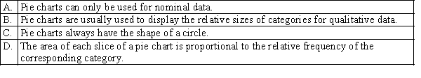
Question
Which of the following statements is true? 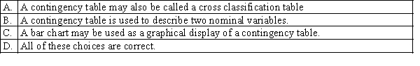
Question
Question
Question
Construct a pie chart for the sample of 200 business school graduates is shown in the following table. 
Question
Which of the following best describes a bar chart? 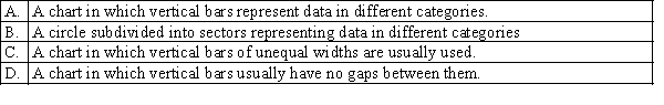
Question
Voters participating in a recent election exit poll in a Queensland electorate were asked to state their political party affiliation. Coding the data 1 for Coalition, 2 for minor parties and 3 for Labor, the data collected were as follows:  Create a bar chart to display the political party affiliation in the Queensland electorate. Write a short sentence to describe the political affiliation.
Create a bar chart to display the political party affiliation in the Queensland electorate. Write a short sentence to describe the political affiliation. Question
Question
Question
Question
Which of the following best describes a component bar chart? 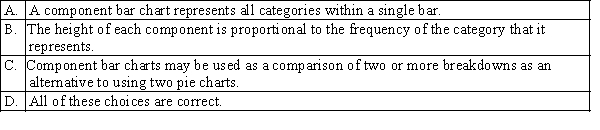
Question
Car buyers were asked by a car dealer to rate their level of satisfaction with the service they had
received. The four ratings were Excellent (E), Good (G), Satisfactory (S) and Unsatisfactory (U). The
following data were obtained.
a. Create a bar chart of the level of satisfaction with the service.
b. Create a pie chart of the level of satisfaction with the service.
received. The four ratings were Excellent (E), Good (G), Satisfactory (S) and Unsatisfactory (U). The
following data were obtained.
a. Create a bar chart of the level of satisfaction with the service.
b. Create a pie chart of the level of satisfaction with the service.
Question
Voters participating in a recent election exit poll in a Queensland electorate were asked to state their political party affiliation as well as their gender. Coding the data 1 for Coalition, 2 for minor parties and 3 for Labor, and F for female, M for male.  a. Create a cross classification table of gender by political affiliation.
b. Create a component bar chart, for each gender.
c. Interpret your component bar chart by gender.
a. Create a cross classification table of gender by political affiliation.b. Create a component bar chart, for each gender.
c. Interpret your component bar chart by gender.
Question
Which of the following is a graphical technique used to present nominal (categorical) data? 
Question
Which of the following statements is true? 
Question
Question
Which of the following applies to graphical techniques to describe ordinal data?  S
S
S Question
Question
Given the following five categories and the number of times each occurs, construct a pie chart and a bar chart. 

Unlock Deck
Sign up to unlock the cards in this deck!
Unlock Deck
Unlock Deck
1/19
Play
Full screen (f)
Deck 3: Graphical Descriptive Methods Nominal Data
1
Which of the following statements about pie charts is false?
A
2
Which of the following statements is true?
D
3
According to the Housing Mobility section of the General Social Survey, Victoria, 2006 (ABS, Catalogue Number: 4159.2.55.001), about 1493 thousand people aged 18 years or over moved in the last five years. Of these people, 758.4 thousand moved for housing reasons, 170.2 thousand moved for employment reasons, 398.6 thousand moved for family reasons and 167.2 thousand moved for other reasons.
a. Construct a pie chart.
b. Interpret your pie chart.
a. Construct a pie chart.
b. Interpret your pie chart.
a. 
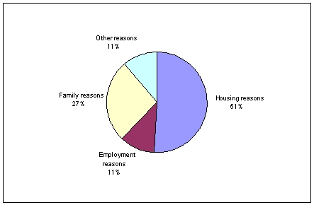 b. More than half of these people moved for housing reasons. More than one quarter of these people moved for family reasons.
b. More than half of these people moved for housing reasons. More than one quarter of these people moved for family reasons. 4
If the focus is to compare the size or frequency of various categories, a bar chart may be appropriate. Pie charts are effective whenever the objective is to display the components of a whole entity in a manner that indicates their relative sizes.
Unlock Deck
Unlock for access to all 19 flashcards in this deck.
Unlock Deck
k this deck
5
Construct a pie chart for the sample of 200 business school graduates is shown in the following table.
Unlock Deck
Unlock for access to all 19 flashcards in this deck.
Unlock Deck
k this deck
6
Which of the following best describes a bar chart?
Unlock Deck
Unlock for access to all 19 flashcards in this deck.
Unlock Deck
k this deck
7
Voters participating in a recent election exit poll in a Queensland electorate were asked to state their political party affiliation. Coding the data 1 for Coalition, 2 for minor parties and 3 for Labor, the data collected were as follows: Create a bar chart to display the political party affiliation in the Queensland electorate. Write a short sentence to describe the political affiliation.
Create a bar chart to display the political party affiliation in the Queensland electorate. Write a short sentence to describe the political affiliation. Unlock Deck
Unlock for access to all 19 flashcards in this deck.
Unlock Deck
k this deck
8
When a comparison of two breakdowns is desired, component bar charts offer a good alternative to using two pie charts.
Unlock Deck
Unlock for access to all 19 flashcards in this deck.
Unlock Deck
k this deck
9
A pie chart is always preferable to a bar chart, when describing a nominal variable.
Unlock Deck
Unlock for access to all 19 flashcards in this deck.
Unlock Deck
k this deck
10
The wedges of a pie chart, if displayed as proportions, will sum to 1 or 100%.
Unlock Deck
Unlock for access to all 19 flashcards in this deck.
Unlock Deck
k this deck
11
Which of the following best describes a component bar chart?
Unlock Deck
Unlock for access to all 19 flashcards in this deck.
Unlock Deck
k this deck
12
Car buyers were asked by a car dealer to rate their level of satisfaction with the service they had
received. The four ratings were Excellent (E), Good (G), Satisfactory (S) and Unsatisfactory (U). The
following data were obtained.
a. Create a bar chart of the level of satisfaction with the service.
b. Create a pie chart of the level of satisfaction with the service.
received. The four ratings were Excellent (E), Good (G), Satisfactory (S) and Unsatisfactory (U). The
following data were obtained.
a. Create a bar chart of the level of satisfaction with the service.
b. Create a pie chart of the level of satisfaction with the service.
Unlock Deck
Unlock for access to all 19 flashcards in this deck.
Unlock Deck
k this deck
13
Voters participating in a recent election exit poll in a Queensland electorate were asked to state their political party affiliation as well as their gender. Coding the data 1 for Coalition, 2 for minor parties and 3 for Labor, and F for female, M for male. a. Create a cross classification table of gender by political affiliation.
b. Create a component bar chart, for each gender.
c. Interpret your component bar chart by gender.
a. Create a cross classification table of gender by political affiliation.b. Create a component bar chart, for each gender.
c. Interpret your component bar chart by gender.
Unlock Deck
Unlock for access to all 19 flashcards in this deck.
Unlock Deck
k this deck
14
Which of the following is a graphical technique used to present nominal (categorical) data?
Unlock Deck
Unlock for access to all 19 flashcards in this deck.
Unlock Deck
k this deck
15
Which of the following statements is true?
Unlock Deck
Unlock for access to all 19 flashcards in this deck.
Unlock Deck
k this deck
16
Identify the type of data for which each of the following graphs is appropriate.
a. Pie chart.
b. Bar chart.
a. Pie chart.
b. Bar chart.
Unlock Deck
Unlock for access to all 19 flashcards in this deck.
Unlock Deck
k this deck
17
Which of the following applies to graphical techniques to describe ordinal data? S
S Unlock Deck
Unlock for access to all 19 flashcards in this deck.
Unlock Deck
k this deck
18
A bar chart is a graphical display of a nominal (categorical) variable. The reason for the gaps between the bars is to emphasise that the bars can be placed in any order as the variable is categorical.
Unlock Deck
Unlock for access to all 19 flashcards in this deck.
Unlock Deck
k this deck
19
Given the following five categories and the number of times each occurs, construct a pie chart and a bar chart.
Unlock Deck
Unlock for access to all 19 flashcards in this deck.
Unlock Deck
k this deck
Unlock Deck
Unlock for access to all 19 flashcards in this deck.


