Deck 2: Creating Tables and Drawing Pictures of Data
Full screen (f)
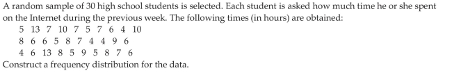
Question
The bar graph below shows the political party affiliation of 1000 registered U.S. voters. What percentage of the 1000 registered U.S. voters belonged to one of the traditional two parties (Democratic and Republican) 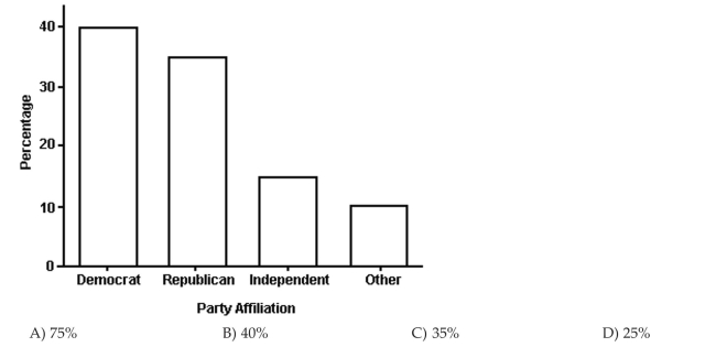
Question
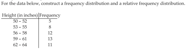
Scott Tarnowski owns a pet grooming shop. His prices for grooming dogs are based on the size of the dog. His records from last year are summarized below. Construct a frequency distribution and a relative frequency distribution. Show the percentage represented by each relative frequency. 
Question
The pie chart shows the percentage of votes received by each candidate in the student council presidential election. Use
the pie chart to answer the question.
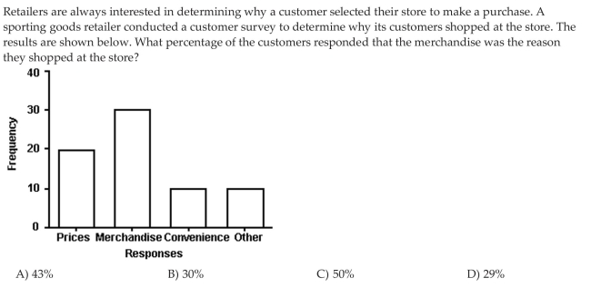
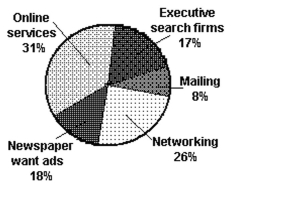
A study was conducted to determine how people get jobs. Four hundred subjects were randomly selected and the results are listed below. Round percents to whole numbers.
the pie chart to answer the question.
A study was conducted to determine how people get jobs. Four hundred subjects were randomly selected and the results are listed below. Round percents to whole numbers.
Question
The Excel frequency bar graph below describes the employment status of a random sample of U.S. adults. What is the percentage of those having no job 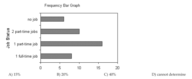 The following double-bar graph illustrates the revenue for a company for the four quarters of the year for two different years.
The following double-bar graph illustrates the revenue for a company for the four quarters of the year for two different years. Question
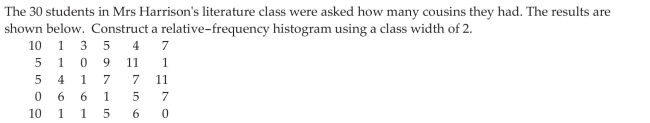
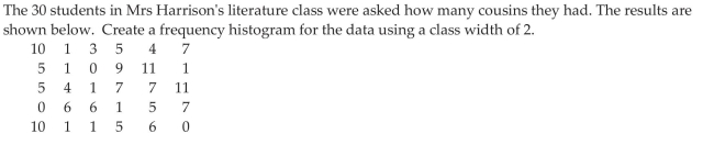
The preschool children at Elmwood Elementary School were asked to name their favorite color. The results are listed below. Construct a frequency distribution and a relative frequency distribution. 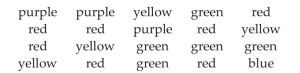
Question
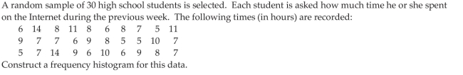
Use the graph to answer the question. 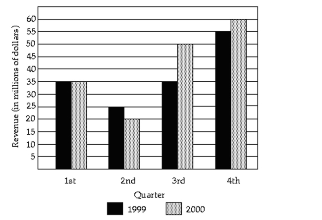
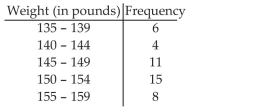
The grade point averages for 40 evening students are listed below. Construct a frequency bar graph and a relative frequency bar graph.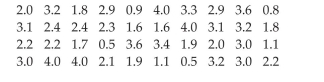
The grade point averages for 40 evening students are listed below. Construct a frequency bar graph and a relative frequency bar graph.
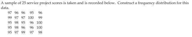
Question
Use the graph to answer the question.
What was the revenue for the fourth quarter of 2000
A) $60 million
B) $12 million
C) $55 million
D) $11 million
What was the revenue for the fourth quarter of 2000
A) $60 million
B) $12 million
C) $55 million
D) $11 million
Question
The pie chart shows the percentage of votes received by each candidate in the student council presidential election. Use
the pie chart to answer the question.
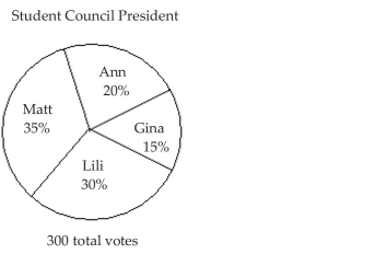 Who got the fewest votes
A) Gina
B) Lili
C) Ann
D) Matt
the pie chart to answer the question.
Who got the fewest votesA) Gina
B) Lili
C) Ann
D) Matt
Question
The pie chart shows the percentage of votes received by each candidate in the student council presidential election. Use
the pie chart to answer the question.
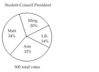 What percent of the votes did Lili and Ming receive together
A) 34%
B) 66%
C) 14%
D) 20%
the pie chart to answer the question.
What percent of the votes did Lili and Ming receive togetherA) 34%
B) 66%
C) 14%
D) 20%
Question
Use the graph to answer the question.
Listed below are the ACT scores of 40 randomly selected students at a major university.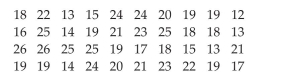 a) Construct a relative frequency bar graph of the data, using eight classes. b) If the university wants to accept the top 90% of the applicants, what should the minimum score be c) If the university sets the minimum score at 17, what percent of the applicants will be accepted
Listed below are the ACT scores of 40 randomly selected students at a major university.
a) Construct a relative frequency bar graph of the data, using eight classes. b) If the university wants to accept the top 90% of the applicants, what should the minimum score be c) If the university sets the minimum score at 17, what percent of the applicants will be accepted Question
Use the graph to answer the question.
Given the bar graph shown below, the Pareto chart that would best represent the data should have the bars in the following order.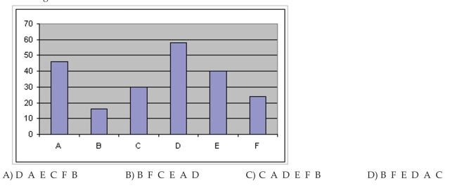
Given the bar graph shown below, the Pareto chart that would best represent the data should have the bars in the following order.
Question
Question
Relative frequency is the proportion (or percent) of observations within a category and is found using the formula: relative frequency 
Question
The 1995 payroll amounts for all major-league baseball teams are shown below. What percentage of the payrolls were in the $20-$30 million range 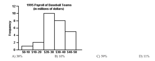
Question
Use the graph to answer the question.
The local police, using radar, checked the speeds (in mph) of 30 motorists in a construction area. The results are listed below. Construct a frequency bar graph and a relative frequency bar graph.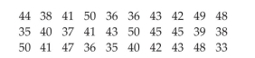
The local police, using radar, checked the speeds (in mph) of 30 motorists in a construction area. The results are listed below. Construct a frequency bar graph and a relative frequency bar graph.
Question
Use the graph to answer the question.
In what quarter was the revenue the greatest for 2000
A) fourth quarter
B) first quarter
C) second quarter
D) third quarter
In what quarter was the revenue the greatest for 2000
A) fourth quarter
B) first quarter
C) second quarter
D) third quarter
Question
The pie chart shows the percentage of votes received by each candidate in the student council presidential election. Use
the pie chart to answer the question.
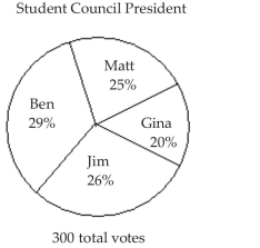 Who got the most votes
A) Ben
B) Jim
C) Matt
D) Gina
the pie chart to answer the question.
Who got the most votesA) Ben
B) Jim
C) Matt
D) Gina
Question
Question
Use the graph to answer the question.
In what quarter was the revenue the least for 1999
A) second quarter
B) first quarter
C) fourth quarter
D) third quarter
In what quarter was the revenue the least for 1999
A) second quarter
B) first quarter
C) fourth quarter
D) third quarter
Question
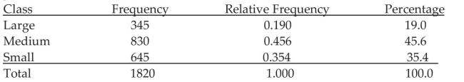
The results of a survey about a recent judicial appointment are given in the table below. Construct a relative frequency distribution. 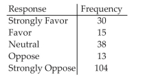
Question
The pie chart shows the percentage of votes received by each candidate in the student council presidential election. Use
the pie chart to answer the question.
the pie chart to answer the question.
Question
Construct Histograms of Continuous Data
Question
Draw Stem-and-Leaf Plots
For the stem-and-leaf plot below, what are the maximum and minimum entries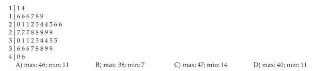
For the stem-and-leaf plot below, what are the maximum and minimum entries
Question
Construct Histograms of Continuous Data
Question
The pie chart shows the percentage of votes received by each candidate in the student council presidential election. Use
the pie chart to answer the question.
the pie chart to answer the question.
Question
The pie chart shows the percentage of votes received by each candidate in the student council presidential election. Use
the pie chart to answer the question.
the pie chart to answer the question.
Question
Question
Construct Histograms of Continuous Data
Question
Construct Histograms of Continuous Data
Question
The pie chart shows the percentage of votes received by each candidate in the student council presidential election. Use
the pie chart to answer the question.
the pie chart to answer the question.
Question
Question
Draw Stem-and-Leaf Plots
The number of home runs that Mark McGwire hit in the first 13 years of his major league baseball career are listed below. (Source: Major League Handbook) Construct a stem-and-leaf plot for this data.
The number of home runs that Mark McGwire hit in the first 13 years of his major league baseball career are listed below. (Source: Major League Handbook) Construct a stem-and-leaf plot for this data.
Question
The pie chart shows the percentage of votes received by each candidate in the student council presidential election. Use
the pie chart to answer the question.
the pie chart to answer the question.
Question
The pie chart shows the percentage of votes received by each candidate in the student council presidential election. Use
the pie chart to answer the question.
the pie chart to answer the question.
Question
The pie chart shows the percentage of votes received by each candidate in the student council presidential election. Use
the pie chart to answer the question.
the pie chart to answer the question.
Question
The pie chart shows the percentage of votes received by each candidate in the student council presidential election. Use
the pie chart to answer the question.
the pie chart to answer the question.
Question
Construct Histograms of Continuous Data
Question
The pie chart shows the percentage of votes received by each candidate in the student council presidential election. Use
the pie chart to answer the question.
the pie chart to answer the question.
Question
The pie chart shows the percentage of votes received by each candidate in the student council presidential election. Use
the pie chart to answer the question.
the pie chart to answer the question.
Question
The pie chart shows the percentage of votes received by each candidate in the student council presidential election. Use
the pie chart to answer the question.
Scott Tarnowski owns a pet grooming shop. His prices for grooming dogs are based on the size of the dog. His records from last year are summarized below. Round percents to whole numbers.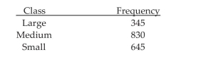
the pie chart to answer the question.
Scott Tarnowski owns a pet grooming shop. His prices for grooming dogs are based on the size of the dog. His records from last year are summarized below. Round percents to whole numbers.
Question
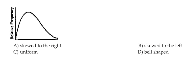
Identify the Shape of a Distribution
Question
Construct Frequency Polygons
Question
Draw Dot Plots
The local police, using radar, checked the speeds (in mph) of 30 motorists at a busy intersection. The results are listed below. Construct a dot plot for the data.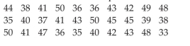
The local police, using radar, checked the speeds (in mph) of 30 motorists at a busy intersection. The results are listed below. Construct a dot plot for the data.
Question
Construct Frequency Polygons
The local police, using radar, checked the speeds (in mph) of 30 motorists in a construction area. The results are listed below. Construct a frequency polygon using six classes and a class width of 3.
The local police, using radar, checked the speeds (in mph) of 30 motorists in a construction area. The results are listed below. Construct a frequency polygon using six classes and a class width of 3.
Question
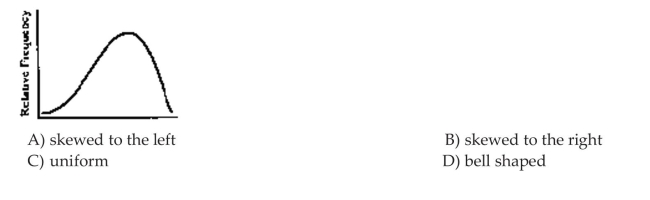
Identify the Shape of a Distribution
The data set: Pick Three Lottery Outcomes for 10 Consecutive Weeks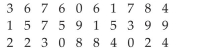
A) uniform
B) bell shaped
C) skewed to the left
D) skewed to the right
The data set: Pick Three Lottery Outcomes for 10 Consecutive Weeks
A) uniform
B) bell shaped
C) skewed to the left
D) skewed to the right
Question
Draw Stem-and-Leaf Plots
The numbers of runs batted in by Mark McLemore in the first 13 years of his major league baseball career are listed below. (Source: Major League Handbook) Construct a stem-and-leaf plot for this data.
The numbers of runs batted in by Mark McLemore in the first 13 years of his major league baseball career are listed below. (Source: Major League Handbook) Construct a stem-and-leaf plot for this data.
Question
Identify the Shape of a Distribution
Question
Create Cumulative Frequency and Relative Frequency Tables
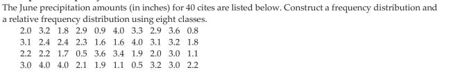
The April precipitation amounts (in inches) for 40 cities are listed below. Construct a frequency distribution, a relative frequency distribution, a cumulative frequency distribution, and a relative cumulative frequency distribution using eight classes.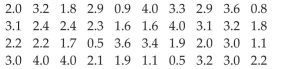
The April precipitation amounts (in inches) for 40 cities are listed below. Construct a frequency distribution, a relative frequency distribution, a cumulative frequency distribution, and a relative cumulative frequency distribution using eight classes.
Question
Question
Construct Frequency Polygons
The grade point averages for 40 evening students are listed below. Construct a frequency polygon using eight classes.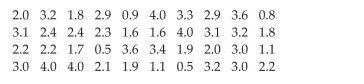
The grade point averages for 40 evening students are listed below. Construct a frequency polygon using eight classes.
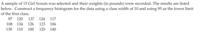
Question
Draw Dot Plots
The heights (in inches) of 30 mechanics are listed below. Construct a dot plot for the data.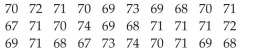
The heights (in inches) of 30 mechanics are listed below. Construct a dot plot for the data.
Question
Identify the Shape of a Distribution
The data set: ages of dishwashers (in years) in 20 randomly selected households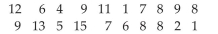
A) bell shaped
B) uniform
C) skewed to the left
D) skewed to the right
The data set: ages of dishwashers (in years) in 20 randomly selected households
A) bell shaped
B) uniform
C) skewed to the left
D) skewed to the right
Question
Construct Frequency Polygons
Question
Draw Stem-and-Leaf Plots
The heights (in inches) of 30 mechanics are listed below. Construct a stem-and-leaf plot for the data.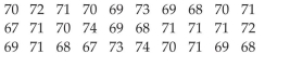
The heights (in inches) of 30 mechanics are listed below. Construct a stem-and-leaf plot for the data.
Question
Identify the Shape of a Distribution
The data set: weekly grocery bills (in dollars) for 20 randomly selected households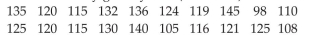
A) bell shaped
B) uniform
C) skewed to the left
D) skewed to the right
The data set: weekly grocery bills (in dollars) for 20 randomly selected households
A) bell shaped
B) uniform
C) skewed to the left
D) skewed to the right
Question
Identify the Shape of a Distribution
 Use the histograms shown to answer the question.
Use the histograms shown to answer the question. Question
Draw Stem-and-Leaf Plots
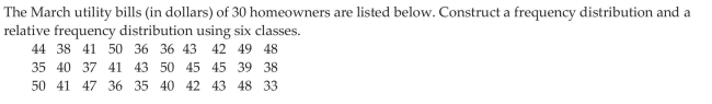
The March utility bills (in dollars) of 30 homeowners are listed below. Construct a stem-and-leaf plot for the data.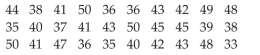
The March utility bills (in dollars) of 30 homeowners are listed below. Construct a stem-and-leaf plot for the data.
Question
Draw Stem-and-Leaf Plots
The scores for an economics test are listed below. Create a stem-and-leaf plot for the data.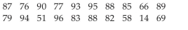 6 Draw Dot Plots
The scores for an economics test are listed below. Create a stem-and-leaf plot for the data.
6 Draw Dot Plots Question
Identify the Shape of a Distribution
Question
Question
Describe What Can Make a Graph Misleading or Deceptive
The following graph shows the number of car accidents occurring in one city in each of the years 2001 through 2006. The number of accidents dropped in 2003 after a new speed limit was imposed. How is the bar graph misleading How would you redesign the graph to be less misleading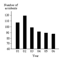
The following graph shows the number of car accidents occurring in one city in each of the years 2001 through 2006. The number of accidents dropped in 2003 after a new speed limit was imposed. How is the bar graph misleading How would you redesign the graph to be less misleading
Question
Question
Create Cumulative Frequency and Relative Frequency Tables
The local police, using radar, checked the speeds (in mph) of 30 motorists in a construction area. The results are listed below. Construct a frequency distribution, a relative frequency distribution, a cumulative frequency distribution, and a relative cumulative frequency distribution using six classes.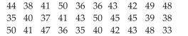
The local police, using radar, checked the speeds (in mph) of 30 motorists in a construction area. The results are listed below. Construct a frequency distribution, a relative frequency distribution, a cumulative frequency distribution, and a relative cumulative frequency distribution using six classes.
Question
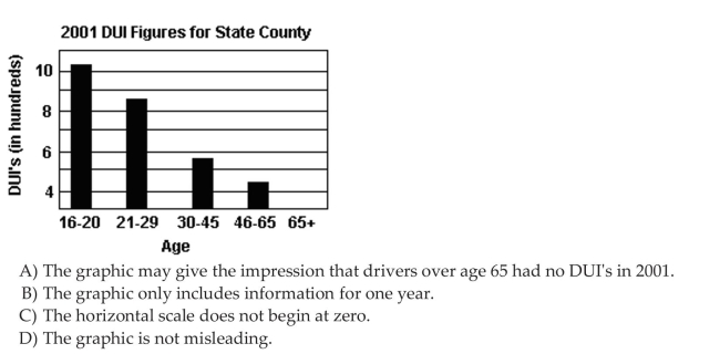
Describe What Can Make a Graph Misleading or Deceptive
Question
Create Cumulative Frequency and Relative Frequency Tables
The local police, using radar, checked the speeds (in mph) of 30 motorists on a rural road. The results are listed below. Construct a frequency ogive using six classes.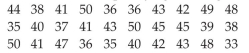
The local police, using radar, checked the speeds (in mph) of 30 motorists on a rural road. The results are listed below. Construct a frequency ogive using six classes.
Question
Create Cumulative Frequency and Relative Frequency Tables
The heights (in inches) of 30 lawyers are listed below. Construct a frequency ogive using five classes.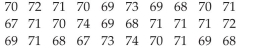
The heights (in inches) of 30 lawyers are listed below. Construct a frequency ogive using five classes.
Question
Create Cumulative Frequency and Relative Frequency Tables
The heights (in inches) of 30 lawyers are listed below. Construct a relative frequency ogive using five classes.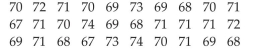
The heights (in inches) of 30 lawyers are listed below. Construct a relative frequency ogive using five classes.
Question
Describe What Can Make a Graph Misleading or Deceptive
Question
Create Cumulative Frequency and Relative Frequency Tables
The local police, using radar, checked the speeds (in mph) of 30 motorists on a rural road. The results are listed below. Construct a relative frequency ogive using six classes.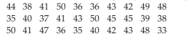
The local police, using radar, checked the speeds (in mph) of 30 motorists on a rural road. The results are listed below. Construct a relative frequency ogive using six classes.
Question
Create Cumulative Frequency and Relative Frequency Tables
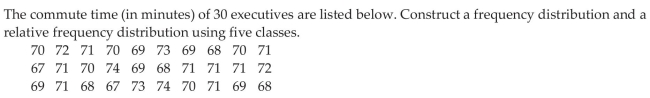
The commute time (in minutes) of 30 executives are listed below. Construct a frequency distribution, a relative frequency distribution, a cumulative frequency distribution, and a relative cumulative frequency distribution using five classes.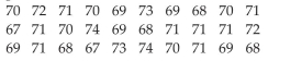
The commute time (in minutes) of 30 executives are listed below. Construct a frequency distribution, a relative frequency distribution, a cumulative frequency distribution, and a relative cumulative frequency distribution using five classes.
Question
Draw Time-Series Graphs
The data below represent the consumption of high-energy drinks (in gallons) by adult Americans over a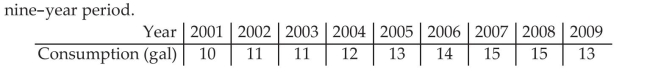
The data below represent the consumption of high-energy drinks (in gallons) by adult Americans over a
Question
Draw Time-Series Graphs
Women were allowed to enter the Boston Marathon for the first time in 1972. Listed below are the winning women s times (in minutes) for the first 10 years.
Women were allowed to enter the Boston Marathon for the first time in 1972. Listed below are the winning women s times (in minutes) for the first 10 years.
Question
Describe What Can Make a Graph Misleading or Deceptive
Question
Draw Time-Series Graphs
A transportation engineer wishes to use the following data to illustrate the number of deaths from the collision of passenger cars with motorcycles on a particular highway.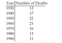
A transportation engineer wishes to use the following data to illustrate the number of deaths from the collision of passenger cars with motorcycles on a particular highway.
Question
Create Cumulative Frequency and Relative Frequency Tables
The grade point averages for 40 evening students are listed below. Construct a relative frequency ogive using eight classes.
The grade point averages for 40 evening students are listed below. Construct a relative frequency ogive using eight classes.
Question
Create Cumulative Frequency and Relative Frequency Tables
The grade point averages for 40 evening students are listed below. Construct a frequency ogive using eight classes.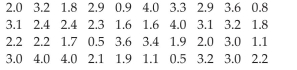
The grade point averages for 40 evening students are listed below. Construct a frequency ogive using eight classes.
Question
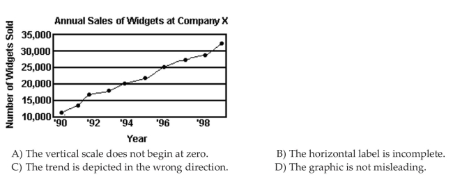
Describe What Can Make a Graph Misleading or Deceptive
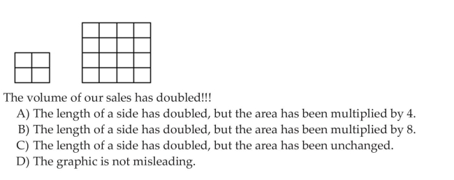
A parcel delivery store finds that their delivery rates increased over the past year. Last year it delivered 3402 parcels. This year it delivered 8942 parcels.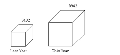 How many times larger should the graphic for this year be than the graphic for last year
A parcel delivery store finds that their delivery rates increased over the past year. Last year it delivered 3402 parcels. This year it delivered 8942 parcels.
How many times larger should the graphic for this year be than the graphic for last year
Unlock Deck
Sign up to unlock the cards in this deck!
Unlock Deck
Unlock Deck
1/77
Play
Full screen (f)
Deck 2: Creating Tables and Drawing Pictures of Data
1
The bar graph below shows the political party affiliation of 1000 registered U.S. voters. What percentage of the 1000 registered U.S. voters belonged to one of the traditional two parties (Democratic and Republican)
A
2
Scott Tarnowski owns a pet grooming shop. His prices for grooming dogs are based on the size of the dog. His records from last year are summarized below. Construct a frequency distribution and a relative frequency distribution. Show the percentage represented by each relative frequency.
3
The pie chart shows the percentage of votes received by each candidate in the student council presidential election. Use
the pie chart to answer the question.
A study was conducted to determine how people get jobs. Four hundred subjects were randomly selected and the results are listed below. Round percents to whole numbers.
the pie chart to answer the question.
A study was conducted to determine how people get jobs. Four hundred subjects were randomly selected and the results are listed below. Round percents to whole numbers.
4
The Excel frequency bar graph below describes the employment status of a random sample of U.S. adults. What is the percentage of those having no job The following double-bar graph illustrates the revenue for a company for the four quarters of the year for two different years.
The following double-bar graph illustrates the revenue for a company for the four quarters of the year for two different years. Unlock Deck
Unlock for access to all 77 flashcards in this deck.
Unlock Deck
k this deck
5
The preschool children at Elmwood Elementary School were asked to name their favorite color. The results are listed below. Construct a frequency distribution and a relative frequency distribution.
Unlock Deck
Unlock for access to all 77 flashcards in this deck.
Unlock Deck
k this deck
6
Use the graph to answer the question.
The grade point averages for 40 evening students are listed below. Construct a frequency bar graph and a relative frequency bar graph.
The grade point averages for 40 evening students are listed below. Construct a frequency bar graph and a relative frequency bar graph.
Unlock Deck
Unlock for access to all 77 flashcards in this deck.
Unlock Deck
k this deck
7
Use the graph to answer the question.
What was the revenue for the fourth quarter of 2000
A) $60 million
B) $12 million
C) $55 million
D) $11 million
What was the revenue for the fourth quarter of 2000
A) $60 million
B) $12 million
C) $55 million
D) $11 million
Unlock Deck
Unlock for access to all 77 flashcards in this deck.
Unlock Deck
k this deck
8
The pie chart shows the percentage of votes received by each candidate in the student council presidential election. Use
the pie chart to answer the question.
Who got the fewest votes
A) Gina
B) Lili
C) Ann
D) Matt
the pie chart to answer the question.
Who got the fewest votesA) Gina
B) Lili
C) Ann
D) Matt
Unlock Deck
Unlock for access to all 77 flashcards in this deck.
Unlock Deck
k this deck
9
The pie chart shows the percentage of votes received by each candidate in the student council presidential election. Use
the pie chart to answer the question.
What percent of the votes did Lili and Ming receive together
A) 34%
B) 66%
C) 14%
D) 20%
the pie chart to answer the question.
What percent of the votes did Lili and Ming receive togetherA) 34%
B) 66%
C) 14%
D) 20%
Unlock Deck
Unlock for access to all 77 flashcards in this deck.
Unlock Deck
k this deck
10
Use the graph to answer the question.
Listed below are the ACT scores of 40 randomly selected students at a major university. a) Construct a relative frequency bar graph of the data, using eight classes. b) If the university wants to accept the top 90% of the applicants, what should the minimum score be c) If the university sets the minimum score at 17, what percent of the applicants will be accepted
Listed below are the ACT scores of 40 randomly selected students at a major university.
a) Construct a relative frequency bar graph of the data, using eight classes. b) If the university wants to accept the top 90% of the applicants, what should the minimum score be c) If the university sets the minimum score at 17, what percent of the applicants will be accepted Unlock Deck
Unlock for access to all 77 flashcards in this deck.
Unlock Deck
k this deck
11
Use the graph to answer the question.
Given the bar graph shown below, the Pareto chart that would best represent the data should have the bars in the following order.
Given the bar graph shown below, the Pareto chart that would best represent the data should have the bars in the following order.
Unlock Deck
Unlock for access to all 77 flashcards in this deck.
Unlock Deck
k this deck
12
Unlock Deck
Unlock for access to all 77 flashcards in this deck.
Unlock Deck
k this deck
13
Relative frequency is the proportion (or percent) of observations within a category and is found using the formula: relative frequency
Unlock Deck
Unlock for access to all 77 flashcards in this deck.
Unlock Deck
k this deck
14
The 1995 payroll amounts for all major-league baseball teams are shown below. What percentage of the payrolls were in the $20-$30 million range
Unlock Deck
Unlock for access to all 77 flashcards in this deck.
Unlock Deck
k this deck
15
Use the graph to answer the question.
The local police, using radar, checked the speeds (in mph) of 30 motorists in a construction area. The results are listed below. Construct a frequency bar graph and a relative frequency bar graph.
The local police, using radar, checked the speeds (in mph) of 30 motorists in a construction area. The results are listed below. Construct a frequency bar graph and a relative frequency bar graph.
Unlock Deck
Unlock for access to all 77 flashcards in this deck.
Unlock Deck
k this deck
16
Use the graph to answer the question.
In what quarter was the revenue the greatest for 2000
A) fourth quarter
B) first quarter
C) second quarter
D) third quarter
In what quarter was the revenue the greatest for 2000
A) fourth quarter
B) first quarter
C) second quarter
D) third quarter
Unlock Deck
Unlock for access to all 77 flashcards in this deck.
Unlock Deck
k this deck
17
The pie chart shows the percentage of votes received by each candidate in the student council presidential election. Use
the pie chart to answer the question.
Who got the most votes
A) Ben
B) Jim
C) Matt
D) Gina
the pie chart to answer the question.
Who got the most votesA) Ben
B) Jim
C) Matt
D) Gina
Unlock Deck
Unlock for access to all 77 flashcards in this deck.
Unlock Deck
k this deck
18
The sum of all the relative frequencies of a distribution will always add up to 1.
Unlock Deck
Unlock for access to all 77 flashcards in this deck.
Unlock Deck
k this deck
19
Use the graph to answer the question.
In what quarter was the revenue the least for 1999
A) second quarter
B) first quarter
C) fourth quarter
D) third quarter
In what quarter was the revenue the least for 1999
A) second quarter
B) first quarter
C) fourth quarter
D) third quarter
Unlock Deck
Unlock for access to all 77 flashcards in this deck.
Unlock Deck
k this deck
20
The results of a survey about a recent judicial appointment are given in the table below. Construct a relative frequency distribution.
Unlock Deck
Unlock for access to all 77 flashcards in this deck.
Unlock Deck
k this deck
21
The pie chart shows the percentage of votes received by each candidate in the student council presidential election. Use
the pie chart to answer the question.
the pie chart to answer the question.
Unlock Deck
Unlock for access to all 77 flashcards in this deck.
Unlock Deck
k this deck
22
Construct Histograms of Continuous Data
Unlock Deck
Unlock for access to all 77 flashcards in this deck.
Unlock Deck
k this deck
23
Draw Stem-and-Leaf Plots
For the stem-and-leaf plot below, what are the maximum and minimum entries
For the stem-and-leaf plot below, what are the maximum and minimum entries
Unlock Deck
Unlock for access to all 77 flashcards in this deck.
Unlock Deck
k this deck
24
Construct Histograms of Continuous Data
Unlock Deck
Unlock for access to all 77 flashcards in this deck.
Unlock Deck
k this deck
25
The pie chart shows the percentage of votes received by each candidate in the student council presidential election. Use
the pie chart to answer the question.
the pie chart to answer the question.
Unlock Deck
Unlock for access to all 77 flashcards in this deck.
Unlock Deck
k this deck
26
The pie chart shows the percentage of votes received by each candidate in the student council presidential election. Use
the pie chart to answer the question.
the pie chart to answer the question.
Unlock Deck
Unlock for access to all 77 flashcards in this deck.
Unlock Deck
k this deck
27
The pie chart shows the percentage of votes received by each candidate in the student council presidential election. Use
the pie chart to answer the question.
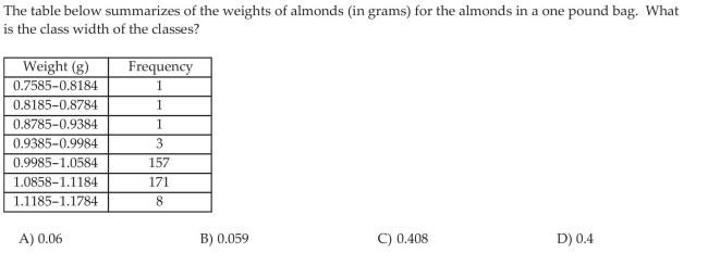
The class width is the difference between
A) Two successive lower class limits
B) The high and the low data values
C) The upper class limit and the lower class limit of a class
D) The largest frequency and the smallest frequency
the pie chart to answer the question.
The class width is the difference between
A) Two successive lower class limits
B) The high and the low data values
C) The upper class limit and the lower class limit of a class
D) The largest frequency and the smallest frequency
Unlock Deck
Unlock for access to all 77 flashcards in this deck.
Unlock Deck
k this deck
28
Construct Histograms of Continuous Data
Unlock Deck
Unlock for access to all 77 flashcards in this deck.
Unlock Deck
k this deck
29
Construct Histograms of Continuous Data
Unlock Deck
Unlock for access to all 77 flashcards in this deck.
Unlock Deck
k this deck
30
The pie chart shows the percentage of votes received by each candidate in the student council presidential election. Use
the pie chart to answer the question.
the pie chart to answer the question.
Unlock Deck
Unlock for access to all 77 flashcards in this deck.
Unlock Deck
k this deck
31
Construct Histograms of Continuous Data
What is the difference between a bar chart and a histogram
A) The bars on a bar chart do not touch while the bars of a histogram do touch.
B) The bars in a bar chart may be of various widths while the bars of a histogram are all the same width.
C) The bars in a bar chart are all the same width while the bars of a histogram may be of various widths.
D) There is no difference between these two graphical displays.
Unlock Deck
Unlock for access to all 77 flashcards in this deck.
Unlock Deck
k this deck
32
Draw Stem-and-Leaf Plots
The number of home runs that Mark McGwire hit in the first 13 years of his major league baseball career are listed below. (Source: Major League Handbook) Construct a stem-and-leaf plot for this data.
The number of home runs that Mark McGwire hit in the first 13 years of his major league baseball career are listed below. (Source: Major League Handbook) Construct a stem-and-leaf plot for this data.
Unlock Deck
Unlock for access to all 77 flashcards in this deck.
Unlock Deck
k this deck
33
The pie chart shows the percentage of votes received by each candidate in the student council presidential election. Use
the pie chart to answer the question.
the pie chart to answer the question.
Unlock Deck
Unlock for access to all 77 flashcards in this deck.
Unlock Deck
k this deck
34
The pie chart shows the percentage of votes received by each candidate in the student council presidential election. Use
the pie chart to answer the question.
the pie chart to answer the question.
Unlock Deck
Unlock for access to all 77 flashcards in this deck.
Unlock Deck
k this deck
35
The pie chart shows the percentage of votes received by each candidate in the student council presidential election. Use
the pie chart to answer the question.
the pie chart to answer the question.
Unlock Deck
Unlock for access to all 77 flashcards in this deck.
Unlock Deck
k this deck
36
The pie chart shows the percentage of votes received by each candidate in the student council presidential election. Use
the pie chart to answer the question.
the pie chart to answer the question.
Unlock Deck
Unlock for access to all 77 flashcards in this deck.
Unlock Deck
k this deck
37
Construct Histograms of Continuous Data
Unlock Deck
Unlock for access to all 77 flashcards in this deck.
Unlock Deck
k this deck
38
The pie chart shows the percentage of votes received by each candidate in the student council presidential election. Use
the pie chart to answer the question.
the pie chart to answer the question.
Unlock Deck
Unlock for access to all 77 flashcards in this deck.
Unlock Deck
k this deck
39
The pie chart shows the percentage of votes received by each candidate in the student council presidential election. Use
the pie chart to answer the question.
the pie chart to answer the question.
Unlock Deck
Unlock for access to all 77 flashcards in this deck.
Unlock Deck
k this deck
40
The pie chart shows the percentage of votes received by each candidate in the student council presidential election. Use
the pie chart to answer the question.
Scott Tarnowski owns a pet grooming shop. His prices for grooming dogs are based on the size of the dog. His records from last year are summarized below. Round percents to whole numbers.
the pie chart to answer the question.
Scott Tarnowski owns a pet grooming shop. His prices for grooming dogs are based on the size of the dog. His records from last year are summarized below. Round percents to whole numbers.
Unlock Deck
Unlock for access to all 77 flashcards in this deck.
Unlock Deck
k this deck
41
Identify the Shape of a Distribution
Unlock Deck
Unlock for access to all 77 flashcards in this deck.
Unlock Deck
k this deck
42
Construct Frequency Polygons
Unlock Deck
Unlock for access to all 77 flashcards in this deck.
Unlock Deck
k this deck
43
Draw Dot Plots
The local police, using radar, checked the speeds (in mph) of 30 motorists at a busy intersection. The results are listed below. Construct a dot plot for the data.
The local police, using radar, checked the speeds (in mph) of 30 motorists at a busy intersection. The results are listed below. Construct a dot plot for the data.
Unlock Deck
Unlock for access to all 77 flashcards in this deck.
Unlock Deck
k this deck
44
Construct Frequency Polygons
The local police, using radar, checked the speeds (in mph) of 30 motorists in a construction area. The results are listed below. Construct a frequency polygon using six classes and a class width of 3.
The local police, using radar, checked the speeds (in mph) of 30 motorists in a construction area. The results are listed below. Construct a frequency polygon using six classes and a class width of 3.
Unlock Deck
Unlock for access to all 77 flashcards in this deck.
Unlock Deck
k this deck
45
Identify the Shape of a Distribution
The data set: Pick Three Lottery Outcomes for 10 Consecutive Weeks
A) uniform
B) bell shaped
C) skewed to the left
D) skewed to the right
The data set: Pick Three Lottery Outcomes for 10 Consecutive Weeks
A) uniform
B) bell shaped
C) skewed to the left
D) skewed to the right
Unlock Deck
Unlock for access to all 77 flashcards in this deck.
Unlock Deck
k this deck
46
Draw Stem-and-Leaf Plots
The numbers of runs batted in by Mark McLemore in the first 13 years of his major league baseball career are listed below. (Source: Major League Handbook) Construct a stem-and-leaf plot for this data.
The numbers of runs batted in by Mark McLemore in the first 13 years of his major league baseball career are listed below. (Source: Major League Handbook) Construct a stem-and-leaf plot for this data.
Unlock Deck
Unlock for access to all 77 flashcards in this deck.
Unlock Deck
k this deck
47
Identify the Shape of a Distribution
Unlock Deck
Unlock for access to all 77 flashcards in this deck.
Unlock Deck
k this deck
48
Create Cumulative Frequency and Relative Frequency Tables
The April precipitation amounts (in inches) for 40 cities are listed below. Construct a frequency distribution, a relative frequency distribution, a cumulative frequency distribution, and a relative cumulative frequency distribution using eight classes.
The April precipitation amounts (in inches) for 40 cities are listed below. Construct a frequency distribution, a relative frequency distribution, a cumulative frequency distribution, and a relative cumulative frequency distribution using eight classes.
Unlock Deck
Unlock for access to all 77 flashcards in this deck.
Unlock Deck
k this deck
49
Construct Frequency Polygons
A frequency polygon always begins and ends with a frequency of zero.
A frequency polygon always begins and ends with a frequency of zero.
Unlock Deck
Unlock for access to all 77 flashcards in this deck.
Unlock Deck
k this deck
50
Construct Frequency Polygons
The grade point averages for 40 evening students are listed below. Construct a frequency polygon using eight classes.
The grade point averages for 40 evening students are listed below. Construct a frequency polygon using eight classes.
Unlock Deck
Unlock for access to all 77 flashcards in this deck.
Unlock Deck
k this deck
51
Draw Dot Plots
The heights (in inches) of 30 mechanics are listed below. Construct a dot plot for the data.
The heights (in inches) of 30 mechanics are listed below. Construct a dot plot for the data.
Unlock Deck
Unlock for access to all 77 flashcards in this deck.
Unlock Deck
k this deck
52
Identify the Shape of a Distribution
The data set: ages of dishwashers (in years) in 20 randomly selected households
A) bell shaped
B) uniform
C) skewed to the left
D) skewed to the right
The data set: ages of dishwashers (in years) in 20 randomly selected households
A) bell shaped
B) uniform
C) skewed to the left
D) skewed to the right
Unlock Deck
Unlock for access to all 77 flashcards in this deck.
Unlock Deck
k this deck
53
Construct Frequency Polygons
Unlock Deck
Unlock for access to all 77 flashcards in this deck.
Unlock Deck
k this deck
54
Draw Stem-and-Leaf Plots
The heights (in inches) of 30 mechanics are listed below. Construct a stem-and-leaf plot for the data.
The heights (in inches) of 30 mechanics are listed below. Construct a stem-and-leaf plot for the data.
Unlock Deck
Unlock for access to all 77 flashcards in this deck.
Unlock Deck
k this deck
55
Identify the Shape of a Distribution
The data set: weekly grocery bills (in dollars) for 20 randomly selected households
A) bell shaped
B) uniform
C) skewed to the left
D) skewed to the right
The data set: weekly grocery bills (in dollars) for 20 randomly selected households
A) bell shaped
B) uniform
C) skewed to the left
D) skewed to the right
Unlock Deck
Unlock for access to all 77 flashcards in this deck.
Unlock Deck
k this deck
56
Identify the Shape of a Distribution
Use the histograms shown to answer the question.
Use the histograms shown to answer the question. Unlock Deck
Unlock for access to all 77 flashcards in this deck.
Unlock Deck
k this deck
57
Draw Stem-and-Leaf Plots
The March utility bills (in dollars) of 30 homeowners are listed below. Construct a stem-and-leaf plot for the data.
The March utility bills (in dollars) of 30 homeowners are listed below. Construct a stem-and-leaf plot for the data.
Unlock Deck
Unlock for access to all 77 flashcards in this deck.
Unlock Deck
k this deck
58
Draw Stem-and-Leaf Plots
The scores for an economics test are listed below. Create a stem-and-leaf plot for the data. 6 Draw Dot Plots
The scores for an economics test are listed below. Create a stem-and-leaf plot for the data.
6 Draw Dot Plots Unlock Deck
Unlock for access to all 77 flashcards in this deck.
Unlock Deck
k this deck
59
Identify the Shape of a Distribution
Unlock Deck
Unlock for access to all 77 flashcards in this deck.
Unlock Deck
k this deck
60
Construct Frequency Polygons
The class midpoint can be determined by adding to the lower class limit one-half of the class width.
The class midpoint can be determined by adding to the lower class limit one-half of the class width.
Unlock Deck
Unlock for access to all 77 flashcards in this deck.
Unlock Deck
k this deck
61
Describe What Can Make a Graph Misleading or Deceptive
The following graph shows the number of car accidents occurring in one city in each of the years 2001 through 2006. The number of accidents dropped in 2003 after a new speed limit was imposed. How is the bar graph misleading How would you redesign the graph to be less misleading
The following graph shows the number of car accidents occurring in one city in each of the years 2001 through 2006. The number of accidents dropped in 2003 after a new speed limit was imposed. How is the bar graph misleading How would you redesign the graph to be less misleading
Unlock Deck
Unlock for access to all 77 flashcards in this deck.
Unlock Deck
k this deck
62
Create Cumulative Frequency and Relative Frequency Tables
An ogive is a graph that represents cumulative frequencies or cumulative relative frequencies. The points labeled on the horizontal axis are the
A) Upper class limits
B) Lower class limits
C) Midpoints
D) Frequencies
An ogive is a graph that represents cumulative frequencies or cumulative relative frequencies. The points labeled on the horizontal axis are the
A) Upper class limits
B) Lower class limits
C) Midpoints
D) Frequencies
Unlock Deck
Unlock for access to all 77 flashcards in this deck.
Unlock Deck
k this deck
63
Create Cumulative Frequency and Relative Frequency Tables
The local police, using radar, checked the speeds (in mph) of 30 motorists in a construction area. The results are listed below. Construct a frequency distribution, a relative frequency distribution, a cumulative frequency distribution, and a relative cumulative frequency distribution using six classes.
The local police, using radar, checked the speeds (in mph) of 30 motorists in a construction area. The results are listed below. Construct a frequency distribution, a relative frequency distribution, a cumulative frequency distribution, and a relative cumulative frequency distribution using six classes.
Unlock Deck
Unlock for access to all 77 flashcards in this deck.
Unlock Deck
k this deck
64
Describe What Can Make a Graph Misleading or Deceptive
Unlock Deck
Unlock for access to all 77 flashcards in this deck.
Unlock Deck
k this deck
65
Create Cumulative Frequency and Relative Frequency Tables
The local police, using radar, checked the speeds (in mph) of 30 motorists on a rural road. The results are listed below. Construct a frequency ogive using six classes.
The local police, using radar, checked the speeds (in mph) of 30 motorists on a rural road. The results are listed below. Construct a frequency ogive using six classes.
Unlock Deck
Unlock for access to all 77 flashcards in this deck.
Unlock Deck
k this deck
66
Create Cumulative Frequency and Relative Frequency Tables
The heights (in inches) of 30 lawyers are listed below. Construct a frequency ogive using five classes.
The heights (in inches) of 30 lawyers are listed below. Construct a frequency ogive using five classes.
Unlock Deck
Unlock for access to all 77 flashcards in this deck.
Unlock Deck
k this deck
67
Create Cumulative Frequency and Relative Frequency Tables
The heights (in inches) of 30 lawyers are listed below. Construct a relative frequency ogive using five classes.
The heights (in inches) of 30 lawyers are listed below. Construct a relative frequency ogive using five classes.
Unlock Deck
Unlock for access to all 77 flashcards in this deck.
Unlock Deck
k this deck
68
Describe What Can Make a Graph Misleading or Deceptive
Unlock Deck
Unlock for access to all 77 flashcards in this deck.
Unlock Deck
k this deck
69
Create Cumulative Frequency and Relative Frequency Tables
The local police, using radar, checked the speeds (in mph) of 30 motorists on a rural road. The results are listed below. Construct a relative frequency ogive using six classes.
The local police, using radar, checked the speeds (in mph) of 30 motorists on a rural road. The results are listed below. Construct a relative frequency ogive using six classes.
Unlock Deck
Unlock for access to all 77 flashcards in this deck.
Unlock Deck
k this deck
70
Create Cumulative Frequency and Relative Frequency Tables
The commute time (in minutes) of 30 executives are listed below. Construct a frequency distribution, a relative frequency distribution, a cumulative frequency distribution, and a relative cumulative frequency distribution using five classes.
The commute time (in minutes) of 30 executives are listed below. Construct a frequency distribution, a relative frequency distribution, a cumulative frequency distribution, and a relative cumulative frequency distribution using five classes.
Unlock Deck
Unlock for access to all 77 flashcards in this deck.
Unlock Deck
k this deck
71
Draw Time-Series Graphs
The data below represent the consumption of high-energy drinks (in gallons) by adult Americans over a
The data below represent the consumption of high-energy drinks (in gallons) by adult Americans over a
Unlock Deck
Unlock for access to all 77 flashcards in this deck.
Unlock Deck
k this deck
72
Draw Time-Series Graphs
Women were allowed to enter the Boston Marathon for the first time in 1972. Listed below are the winning women s times (in minutes) for the first 10 years.
Women were allowed to enter the Boston Marathon for the first time in 1972. Listed below are the winning women s times (in minutes) for the first 10 years.
Unlock Deck
Unlock for access to all 77 flashcards in this deck.
Unlock Deck
k this deck
73
Describe What Can Make a Graph Misleading or Deceptive
Unlock Deck
Unlock for access to all 77 flashcards in this deck.
Unlock Deck
k this deck
74
Draw Time-Series Graphs
A transportation engineer wishes to use the following data to illustrate the number of deaths from the collision of passenger cars with motorcycles on a particular highway.
A transportation engineer wishes to use the following data to illustrate the number of deaths from the collision of passenger cars with motorcycles on a particular highway.
Unlock Deck
Unlock for access to all 77 flashcards in this deck.
Unlock Deck
k this deck
75
Create Cumulative Frequency and Relative Frequency Tables
The grade point averages for 40 evening students are listed below. Construct a relative frequency ogive using eight classes.
The grade point averages for 40 evening students are listed below. Construct a relative frequency ogive using eight classes.
Unlock Deck
Unlock for access to all 77 flashcards in this deck.
Unlock Deck
k this deck
76
Create Cumulative Frequency and Relative Frequency Tables
The grade point averages for 40 evening students are listed below. Construct a frequency ogive using eight classes.
The grade point averages for 40 evening students are listed below. Construct a frequency ogive using eight classes.
Unlock Deck
Unlock for access to all 77 flashcards in this deck.
Unlock Deck
k this deck
77
Describe What Can Make a Graph Misleading or Deceptive
A parcel delivery store finds that their delivery rates increased over the past year. Last year it delivered 3402 parcels. This year it delivered 8942 parcels. How many times larger should the graphic for this year be than the graphic for last year
A parcel delivery store finds that their delivery rates increased over the past year. Last year it delivered 3402 parcels. This year it delivered 8942 parcels.
How many times larger should the graphic for this year be than the graphic for last year Unlock Deck
Unlock for access to all 77 flashcards in this deck.
Unlock Deck
k this deck
Unlock Deck
Unlock for access to all 77 flashcards in this deck.


