Deck 1: Picturing Distributions With Graphs
Full screen (f)
Question
Question
Question
Question
Question
Question
Question
Question
Question
Question
Question
Question
Question
Question
Question
Question
Question
A sample of 55 streams in severe distress was obtained during 2007. The following bar graph illustrates the number of streams that are from the Northeast, Northwest, Southeast, or Southwest. In the bar graph, the bar for the Northeast has been omitted.
What percent of streams are not from the Northeast?
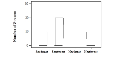
A)27%
B)40%
C)73%
D)75%
What percent of streams are not from the Northeast?
A)27%
B)40%
C)73%
D)75%
Question
A sample of 55 streams in severe distress was obtained during 2007. The following bar graph illustrates the number of streams that are from the Northeast, Northwest, Southeast, or Southwest. In the bar graph, the bar for the Northeast has been omitted.
How many streams are from the Northeast?
A)15
B)25
C)35
D)45
How many streams are from the Northeast?
A)15
B)25
C)35
D)45
Question
A sample of 55 streams in severe distress was obtained during 2007. The following bar graph illustrates the number of streams that are from the Northeast, Northwest, Southeast, or Southwest. In the bar graph, the bar for the Northeast has been omitted.
Which of the following statements is correct about these data?

A)A time plot of the 2007 distribution would be more informative.
B)The bar graph is skewed to the right.
C)The bar graph is skewed to the left.
D)It would be correct to make a pie chart if you included the Northeast category.
Which of the following statements is correct about these data?
A)A time plot of the 2007 distribution would be more informative.
B)The bar graph is skewed to the right.
C)The bar graph is skewed to the left.
D)It would be correct to make a pie chart if you included the Northeast category.
Question
Question
The following graph shows the percent of adults who are overweight or obese in countries with different income levels, based on 2010 data from the World Health Organization and the United Nations.
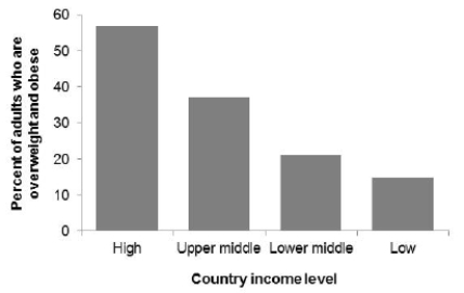 What is the correct description of this graph?
A)Bar graph
B)Histogram with a clear right skew
C)Histogram with a clear left skew
D)Boxplot
What is the correct description of this graph?A)Bar graph
B)Histogram with a clear right skew
C)Histogram with a clear left skew
D)Boxplot
Question
The following graph shows the percent of adults who are overweight or obese in countries with different income levels, based on 2010 data from the World Health Organization and the United Nations.
 Which of the following statements about these data is correct?
A)The majority of adults who are overweight or obese live in high-income countries.
B)The majority of adults who live in high-income countries are overweight or obese.
C)Both statements are correct.
D)Both statements are incorrect.
Which of the following statements about these data is correct?A)The majority of adults who are overweight or obese live in high-income countries.
B)The majority of adults who live in high-income countries are overweight or obese.
C)Both statements are correct.
D)Both statements are incorrect.
Question
Question
Question
The following histogram shows body temperatures (in degrees Fahrenheit) for 65 healthy adult women.
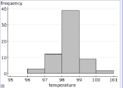 What is the best description of this distribution?
A)Roughly symmetric
B)Bimodal
C)Clearly right-skewed
D)Clearly left-skewed
What is the best description of this distribution?A)Roughly symmetric
B)Bimodal
C)Clearly right-skewed
D)Clearly left-skewed
Question
The following histogram shows body temperatures (in degrees Fahrenheit) for 65 healthy adult women.
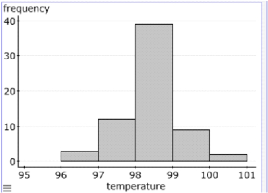 Approximately how many women in the sample have a body temperature lower than 98 degrees Fahrenheit?
A)15
B)20
C)45
D)50
Approximately how many women in the sample have a body temperature lower than 98 degrees Fahrenheit?A)15
B)20
C)45
D)50
Question
A sample of 40 endangered species was obtained, and the length of time (in months) since being placed on the list was recorded for each species. A histogram of these data is given here:
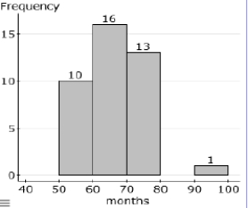 Approximately how many species in the sample have been on the list for less than 5 years?
A)10
B)12
C)14
D)18
Approximately how many species in the sample have been on the list for less than 5 years?A)10
B)12
C)14
D)18
Question
The following dotplot shows migraine intensity (on a scale of 1 to 10) for 29 adults suffering from recurring migraines.
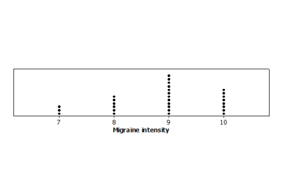 What is the best description of this distribution?
A)Symmetric with 3 outliers
B)Moderately left-skewed
C)Moderately right-skewed
D)Multimodal
What is the best description of this distribution?A)Symmetric with 3 outliers
B)Moderately left-skewed
C)Moderately right-skewed
D)Multimodal
Question
The following histogram depicts the prevalence rates of a particular genetic marker in samples among 25 impoverished communities in 2004. In each interval, the left endpoint is included but not the right endpoint, so the class intervals are 10 ≤ rate < 15, 15 ≤ rate < 20, . . . .
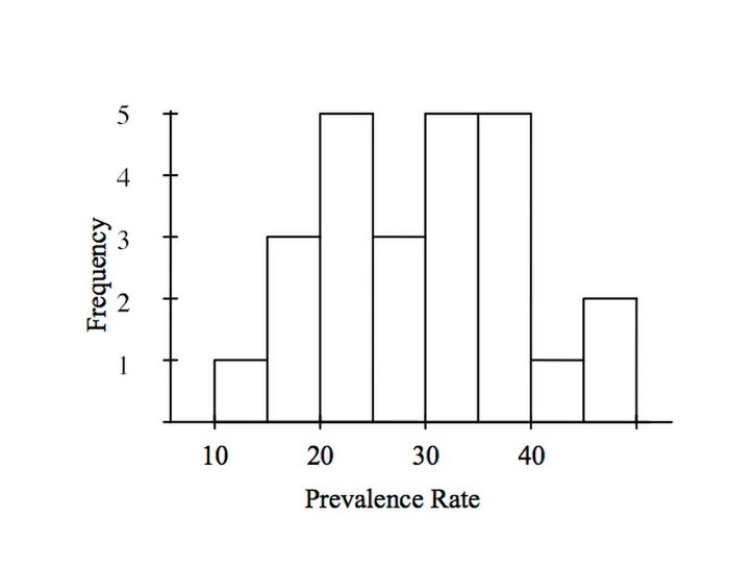
How many communities have a prevalence rate of 30% or higher?
A)5
B)12
C)10
D)13
How many communities have a prevalence rate of 30% or higher?
A)5
B)12
C)10
D)13
Question
The following histogram shows the yearly number of unprovoked attacks by alligators on people in Florida over a 33-year period.
 What is the overall shape of the distribution?
A)Bimodal
B)Slightly skewed to the right
C)Strongly skewed to the left
D)Roughly symmetric with an outlier
What is the overall shape of the distribution?A)Bimodal
B)Slightly skewed to the right
C)Strongly skewed to the left
D)Roughly symmetric with an outlier
Question
The following histogram shows the yearly number of unprovoked attacks by alligators on people in Florida over a 33-year period.
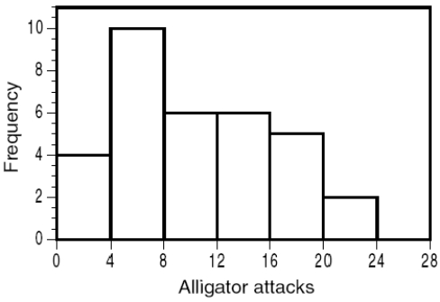
What is the midpoint of the yearly number of unprovoked alligator attacks?
A)Class 4 to 8
B)Class 8 to 12
C)Class 12 to 16
D)Class 16 to 20
What is the midpoint of the yearly number of unprovoked alligator attacks?
A)Class 4 to 8
B)Class 8 to 12
C)Class 12 to 16
D)Class 16 to 20
Question
The following graph shows the percent of adult hemodialysis patients who received adequate dialysis (urea reduction ratio 65% or greater), by age, over the 2002-2007 period.
 Which of the following statements about these data is NOT correct?
A)From 2002 to 2007, the overall percent of adult hemodialysis patients receiving adequate dialysis improved from about 86% to about 89%.
B)Comparing 2002 to 2007 data, improvements in the percent of adult hemodialysis patients receiving adequate dialysis were observed among all age groups.
C)In all years, adults age 18-44 and 45-64 were less likely than adults age 65 and older to receive adequate dialysis.
D)From 2002 to 2007, data for adults age 18 to 44 indicate a clear cyclical pattern.
Which of the following statements about these data is NOT correct?A)From 2002 to 2007, the overall percent of adult hemodialysis patients receiving adequate dialysis improved from about 86% to about 89%.
B)Comparing 2002 to 2007 data, improvements in the percent of adult hemodialysis patients receiving adequate dialysis were observed among all age groups.
C)In all years, adults age 18-44 and 45-64 were less likely than adults age 65 and older to receive adequate dialysis.
D)From 2002 to 2007, data for adults age 18 to 44 indicate a clear cyclical pattern.
Question
Opioid pain relievers are prescribed at a higher rate in the United States than in any other nation, yet abuse of these pain relievers can result in addiction and fatal overdoses. The CDC examined opioid pain reliever prescriptions in each U.S. state to determine how variable prescription rates are across the nation. The following time plot gives the number of deaths from opioid pain relievers from 2001 to 2014.
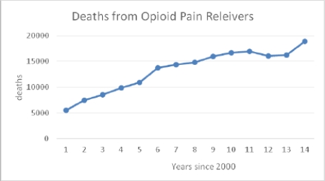 What was the number of deaths in 2007?
A)Approximately 10,000
B)Fewer than 15,000
C)Approximately 16,000
D)Approximately 15,000
What was the number of deaths in 2007?A)Approximately 10,000
B)Fewer than 15,000
C)Approximately 16,000
D)Approximately 15,000
Question
The following time plot gives the number of deaths from opioid pain relievers in the years 2001 to 2014.

Which of the following statements is TRUE about the data?
A)There is a fairly steady upward trend in the number of deaths from opioid pain relievers over this entire time period.
B)The number of deaths for 2012 is a clear outlier.
C)The time period is too short to describe any pattern in the data.
D)None of these choices is correct.
Question
Every month, the Gallup polling organization tracks various health issues in the United States using large national surveys. The following graph shows the estimated percent of American adults sick with a cold between June 2008 and January 2013.
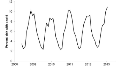
Which of the following statements about the data is TRUE?
A)There is a clear upward trend but no cyclical pattern.
B)There is a clear cyclical pattern but no trend.
C)There is a clear upward trend as well as a clear cyclical pattern.
D)There is neither a clear trend nor a cyclical pattern.
Which of the following statements about the data is TRUE?
A)There is a clear upward trend but no cyclical pattern.
B)There is a clear cyclical pattern but no trend.
C)There is a clear upward trend as well as a clear cyclical pattern.
D)There is neither a clear trend nor a cyclical pattern.
Question
Every month, the Gallup polling organization tracks various health issues in the United States using large national surveys. The following graph shows the estimated percent of American adults who reported exercising regularly (at least 30 minutes on 3 or more days per week) between June 2008 and January 2013.
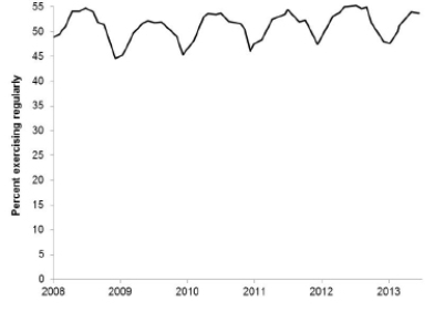
Which of the following statements about the data is TRUE?
A)There is a clear upward trend but no cyclical pattern.
B)There is a clear cyclical pattern but no trend.
C)There is a clear upward trend as well as a clear cyclical pattern.
D)There is neither a clear trend nor a cyclical pattern.
Which of the following statements about the data is TRUE?
A)There is a clear upward trend but no cyclical pattern.
B)There is a clear cyclical pattern but no trend.
C)There is a clear upward trend as well as a clear cyclical pattern.
D)There is neither a clear trend nor a cyclical pattern.
Question
The U.S. Global Change Research Program examined data for evidence of global climate change. The following graph shows the yearly number of days without frost (air temperature below freezing) between 1904 and 2008 in Fairbanks, Alaska.
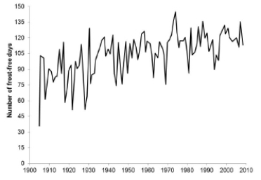
Which of the following statements about the data is TRUE?
A)There is a clear upward trend but no cyclical pattern.
B)There is a clear cyclical pattern but no trend.
C)There is a clear upward trend as well as a clear cyclical pattern.
D)There is neither a clear trend nor a cyclical pattern.
Which of the following statements about the data is TRUE?
A)There is a clear upward trend but no cyclical pattern.
B)There is a clear cyclical pattern but no trend.
C)There is a clear upward trend as well as a clear cyclical pattern.
D)There is neither a clear trend nor a cyclical pattern.
Question
The U.S. Global Change Research Program examined data for evidence of global climate change. The following graph shows the average yearly ground temperature at a depth of 65.5 feet (the typical measure of permafrost, indicative of ground frozen solid) between 1978 and 2008 in Deadhorse, a town in northern Alaska.
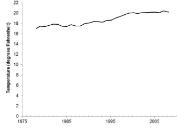
Which of the following statements about the data is TRUE?
A)There is a clear upward trend but no cyclical pattern.
B)There is a clear cyclical pattern but no trend.
C)There is a clear upward trend as well as a clear cyclical pattern.
D)There is neither a clear trend nor a cyclical pattern.
Which of the following statements about the data is TRUE?
A)There is a clear upward trend but no cyclical pattern.
B)There is a clear cyclical pattern but no trend.
C)There is a clear upward trend as well as a clear cyclical pattern.
D)There is neither a clear trend nor a cyclical pattern.

Unlock Deck
Sign up to unlock the cards in this deck!
Unlock Deck
Unlock Deck
1/38
Play
Full screen (f)
Deck 1: Picturing Distributions With Graphs
1
Some variables that were recorded while studying diets of sharks are given below. Which of these variables is not quantitative?
A)Amount of food eaten in a day by the shark being observed
B)Age of the shark being observed
C)Type of shark being observed
D)Length of the shark being observed
A)Amount of food eaten in a day by the shark being observed
B)Age of the shark being observed
C)Type of shark being observed
D)Length of the shark being observed
C
2
A survey is conducted among students taking a statistics class. Several variables are measured in the survey. Which of the variables listed below is qualitative?
A)Number of credit hours taken during the quarter
B)Gender
C)Parents' annual income
D)High school GPA
A)Number of credit hours taken during the quarter
B)Gender
C)Parents' annual income
D)High school GPA
B
3
Stream quality is based on the levels of many variables, including those listed below. Which of these variables is quantitative?
A)Amount of phosphorus
B)Number of distinct species present
C)Amount of dissolved oxygen
D)All of these answers are correct.
A)Amount of phosphorus
B)Number of distinct species present
C)Amount of dissolved oxygen
D)All of these answers are correct.
D
4
During winter, red foxes hunt small rodents by jumping into thick snow cover. Researchers report that a hunting trip lasts, on average, 19 minutes and involves, on average, 7 jumps. In a surprising finding, they report that 79% of successful jumps are made in the northeast direction. Which of the following statements about these results is TRUE?
A)The three variables reported are all quantitative.
B)The three variables reported are all categorical.
C)Two of variables reported are quantitative and one is categorical.
D)Two of variables reported are categorical and one is quantitative.
A)The three variables reported are all quantitative.
B)The three variables reported are all categorical.
C)Two of variables reported are quantitative and one is categorical.
D)Two of variables reported are categorical and one is quantitative.
Unlock Deck
Unlock for access to all 38 flashcards in this deck.
Unlock Deck
k this deck
5
A survey records many variables of interest to the researchers conducting the survey. The following variables are some of the variables collected in a survey conducted by the USDA. Which of these variables is categorical?
A)Type of grain grown
B)Number of acres owned
C)Total farm income, before taxes, in 1993
D)Number of children younger than age 12 on the farm
A)Type of grain grown
B)Number of acres owned
C)Total farm income, before taxes, in 1993
D)Number of children younger than age 12 on the farm
Unlock Deck
Unlock for access to all 38 flashcards in this deck.
Unlock Deck
k this deck
6
The EPA sends out a survey to learn about people's water-usage habits. Some of the variables to be analyzed are responses to the following questions. Which of these questions leads to categorical responses?
A)How many times a day do you take a shower?
B)Do you leave the water running when brushing your teeth?
C)How many times a week do you water your lawn?
D)None of these answers is correct.
A)How many times a day do you take a shower?
B)Do you leave the water running when brushing your teeth?
C)How many times a week do you water your lawn?
D)None of these answers is correct.
Unlock Deck
Unlock for access to all 38 flashcards in this deck.
Unlock Deck
k this deck
7
Which of the following is a discrete variable?
A)Number of different toxins present in a fish
B)Length of a fish
C)Weight of a fish
D)All of these answers are correct.
A)Number of different toxins present in a fish
B)Length of a fish
C)Weight of a fish
D)All of these answers are correct.
Unlock Deck
Unlock for access to all 38 flashcards in this deck.
Unlock Deck
k this deck
8
Some variables were recorded while surveying plants in a wildlife area. Which of the following variables is continuous?
A)Count of petals per flower
B)Count of flowers per plant
C)Plant height in centimeters
D)Plant species
A)Count of petals per flower
B)Count of flowers per plant
C)Plant height in centimeters
D)Plant species
Unlock Deck
Unlock for access to all 38 flashcards in this deck.
Unlock Deck
k this deck
9
Some variables were recorded while surveying plants in a wildlife area. Which of the following variables is discrete?
A)Count of petals per flower
B)Whether the plant grows under the shade of another plant
C)Plant height in centimeters
D)Plant species
A)Count of petals per flower
B)Whether the plant grows under the shade of another plant
C)Plant height in centimeters
D)Plant species
Unlock Deck
Unlock for access to all 38 flashcards in this deck.
Unlock Deck
k this deck
10
Here are records of eye color for a random sample of 103 individuals:
?
?
This data set is best represented graphically in a
A)Histogram.
B)Stemplot.
C)Scatterplot.
D)Boxplot.
E) Pie chart.
?
?
This data set is best represented graphically in a
A)Histogram.
B)Stemplot.
C)Scatterplot.
D)Boxplot.
E) Pie chart.
Unlock Deck
Unlock for access to all 38 flashcards in this deck.
Unlock Deck
k this deck
11
During winter, red foxes hunt small rodents by jumping into thick snow cover. Researchers report that a hunting trip lasts, on average, 19 minutes and involves, on average, 7 jumps. In a surprising finding, they report that 79% of all successful jumps are made in the northeast direction. Three variables are mentioned in this report. What is the best description of the first variable mentioned?
A)Quantitative and discrete
B)Quantitative and continuous
C)Categorical
D)Ordinal
A)Quantitative and discrete
B)Quantitative and continuous
C)Categorical
D)Ordinal
Unlock Deck
Unlock for access to all 38 flashcards in this deck.
Unlock Deck
k this deck
12
During winter, red foxes hunt small rodents by jumping into thick snow cover. Researchers report that a hunting trip lasts, on average, 19 minutes and involves, on average, 7 jumps. In a surprising finding, they report that 79% of all successful jumps are made in the northeast direction. Three variables are mentioned in this report. What is the best description of the second variable mentioned?
A)Quantitative and discrete
B)Quantitative and continuous
C)Categorical
D)Ordinal
A)Quantitative and discrete
B)Quantitative and continuous
C)Categorical
D)Ordinal
Unlock Deck
Unlock for access to all 38 flashcards in this deck.
Unlock Deck
k this deck
13
During winter, red foxes hunt small rodents by jumping into thick snow cover. Researchers report that a hunting trip lasts, on average, 19 minutes and involves, on average, 7 jumps. In a surprising finding, they report that 79% of all successful jumps are made in the northeast direction. Three variables are mentioned in this report. What is the best description of the third variable mentioned?
A)Quantitative and discrete
B)Quantitative and continuous
C)Categorical
D)Ordinal
A)Quantitative and discrete
B)Quantitative and continuous
C)Categorical
D)Ordinal
Unlock Deck
Unlock for access to all 38 flashcards in this deck.
Unlock Deck
k this deck
14
What is important to do when drawing a histogram?
A)Use no more than four class intervals, except for categorical variables.
B)Leave gaps between the bars so the reader can easily distinguish between the class intervals.
C)Label the vertical axis, so the reader can determine the counts or percent in each class interval.
D)Make certain the mean and median are contained in the same class interval, so the correct type of skewness can be identified.
Unlock Deck
Unlock for access to all 38 flashcards in this deck.
Unlock Deck
k this deck
15
For a biology lab course containing 10 students, the maximum point total for the quarter was 200. The point totals for the 10 students are given in the following stemplot:
?
?
To which type of graph is this stemplot most similar?
A)A histogram with class intervals 110 ?score < 120, 120 ?score < 130, . . .
B)a time plot of the data with the observations taken in increasing order
C)A boxplot of the data
D)Reporting the five-point summary for the data, with the mean
?
?
To which type of graph is this stemplot most similar?
A)A histogram with class intervals 110 ?score < 120, 120 ?score < 130, . . .
B)a time plot of the data with the observations taken in increasing order
C)A boxplot of the data
D)Reporting the five-point summary for the data, with the mean
Unlock Deck
Unlock for access to all 38 flashcards in this deck.
Unlock Deck
k this deck
16
For a biology lab course containing 10 students, the maximum point total for the quarter was 200. The point totals for the 10 students are given in the following stemplot:
Suppose this stemplot was drawn as a histogram. What would be the best description of the shape of this histogram?
A)Skewed right
B)Skewed left
C)Symmetric
D)Bimodal
Suppose this stemplot was drawn as a histogram. What would be the best description of the shape of this histogram?
A)Skewed right
B)Skewed left
C)Symmetric
D)Bimodal
Unlock Deck
Unlock for access to all 38 flashcards in this deck.
Unlock Deck
k this deck
17
A sample of 55 streams in severe distress was obtained during 2007. The following bar graph illustrates the number of streams that are from the Northeast, Northwest, Southeast, or Southwest. In the bar graph, the bar for the Northeast has been omitted.
What percent of streams are not from the Northeast?
A)27%
B)40%
C)73%
D)75%
What percent of streams are not from the Northeast?
A)27%
B)40%
C)73%
D)75%
Unlock Deck
Unlock for access to all 38 flashcards in this deck.
Unlock Deck
k this deck
18
A sample of 55 streams in severe distress was obtained during 2007. The following bar graph illustrates the number of streams that are from the Northeast, Northwest, Southeast, or Southwest. In the bar graph, the bar for the Northeast has been omitted.
How many streams are from the Northeast?
A)15
B)25
C)35
D)45
How many streams are from the Northeast?
A)15
B)25
C)35
D)45
Unlock Deck
Unlock for access to all 38 flashcards in this deck.
Unlock Deck
k this deck
19
A sample of 55 streams in severe distress was obtained during 2007. The following bar graph illustrates the number of streams that are from the Northeast, Northwest, Southeast, or Southwest. In the bar graph, the bar for the Northeast has been omitted.
Which of the following statements is correct about these data?
A)A time plot of the 2007 distribution would be more informative.
B)The bar graph is skewed to the right.
C)The bar graph is skewed to the left.
D)It would be correct to make a pie chart if you included the Northeast category.
Which of the following statements is correct about these data?
A)A time plot of the 2007 distribution would be more informative.
B)The bar graph is skewed to the right.
C)The bar graph is skewed to the left.
D)It would be correct to make a pie chart if you included the Northeast category.
Unlock Deck
Unlock for access to all 38 flashcards in this deck.
Unlock Deck
k this deck
20
The following table shows the percent of current smokers in 2006 among various groups, according to the Centers for Disease Control and Prevention.
Would it be correct to display these data in a single pie chart?
A)Yes, because the data are categorical and all categorical data can be plotted in a pie chart
B)Yes, because the data break down all smokers age 18 to 29 in the United States in 2006
C)No, because the data represent smokers within four different groups
D)No, because the data are quantitative
Unlock Deck
Unlock for access to all 38 flashcards in this deck.
Unlock Deck
k this deck
21
The following graph shows the percent of adults who are overweight or obese in countries with different income levels, based on 2010 data from the World Health Organization and the United Nations.
What is the correct description of this graph?
A)Bar graph
B)Histogram with a clear right skew
C)Histogram with a clear left skew
D)Boxplot
What is the correct description of this graph?A)Bar graph
B)Histogram with a clear right skew
C)Histogram with a clear left skew
D)Boxplot
Unlock Deck
Unlock for access to all 38 flashcards in this deck.
Unlock Deck
k this deck
22
The following graph shows the percent of adults who are overweight or obese in countries with different income levels, based on 2010 data from the World Health Organization and the United Nations.
Which of the following statements about these data is correct?
A)The majority of adults who are overweight or obese live in high-income countries.
B)The majority of adults who live in high-income countries are overweight or obese.
C)Both statements are correct.
D)Both statements are incorrect.
Which of the following statements about these data is correct?A)The majority of adults who are overweight or obese live in high-income countries.
B)The majority of adults who live in high-income countries are overweight or obese.
C)Both statements are correct.
D)Both statements are incorrect.
Unlock Deck
Unlock for access to all 38 flashcards in this deck.
Unlock Deck
k this deck
23
The estimated annual number of smoking-attributable deaths in the United States can be broken down by specific causes, as follows:
What percent of U.S. annual deaths attributable to smoking are lung cancer deaths?
A)16.7%
B)29.1%
C)78.5%
D)There is not enough information to answer.
What percent of U.S. annual deaths attributable to smoking are lung cancer deaths?
A)16.7%
B)29.1%
C)78.5%
D)There is not enough information to answer.
Unlock Deck
Unlock for access to all 38 flashcards in this deck.
Unlock Deck
k this deck
24
The estimated annual number of smoking-attributable deaths in the United States can be broken down by specific causes, as follows:
Would it be correct to display these data in a pie chart?
A)Yes, because these counts make up all U.S. deaths attributable to smoking in a year
B)No, because we are missing the deaths that are attributable to causes other than smoking
C)No, because the data are quantitative
D)Yes, because the data are categorical and all categorical data can be plotted in a pie chart
Unlock Deck
Unlock for access to all 38 flashcards in this deck.
Unlock Deck
k this deck
25
The following histogram shows body temperatures (in degrees Fahrenheit) for 65 healthy adult women.
What is the best description of this distribution?
A)Roughly symmetric
B)Bimodal
C)Clearly right-skewed
D)Clearly left-skewed
What is the best description of this distribution?A)Roughly symmetric
B)Bimodal
C)Clearly right-skewed
D)Clearly left-skewed
Unlock Deck
Unlock for access to all 38 flashcards in this deck.
Unlock Deck
k this deck
26
The following histogram shows body temperatures (in degrees Fahrenheit) for 65 healthy adult women.
Approximately how many women in the sample have a body temperature lower than 98 degrees Fahrenheit?
A)15
B)20
C)45
D)50
Approximately how many women in the sample have a body temperature lower than 98 degrees Fahrenheit?A)15
B)20
C)45
D)50
Unlock Deck
Unlock for access to all 38 flashcards in this deck.
Unlock Deck
k this deck
27
A sample of 40 endangered species was obtained, and the length of time (in months) since being placed on the list was recorded for each species. A histogram of these data is given here:
Approximately how many species in the sample have been on the list for less than 5 years?
A)10
B)12
C)14
D)18
Approximately how many species in the sample have been on the list for less than 5 years?A)10
B)12
C)14
D)18
Unlock Deck
Unlock for access to all 38 flashcards in this deck.
Unlock Deck
k this deck
28
The following dotplot shows migraine intensity (on a scale of 1 to 10) for 29 adults suffering from recurring migraines.
What is the best description of this distribution?
A)Symmetric with 3 outliers
B)Moderately left-skewed
C)Moderately right-skewed
D)Multimodal
What is the best description of this distribution?A)Symmetric with 3 outliers
B)Moderately left-skewed
C)Moderately right-skewed
D)Multimodal
Unlock Deck
Unlock for access to all 38 flashcards in this deck.
Unlock Deck
k this deck
29
The following histogram depicts the prevalence rates of a particular genetic marker in samples among 25 impoverished communities in 2004. In each interval, the left endpoint is included but not the right endpoint, so the class intervals are 10 ≤ rate < 15, 15 ≤ rate < 20, . . . .
How many communities have a prevalence rate of 30% or higher?
A)5
B)12
C)10
D)13
How many communities have a prevalence rate of 30% or higher?
A)5
B)12
C)10
D)13
Unlock Deck
Unlock for access to all 38 flashcards in this deck.
Unlock Deck
k this deck
30
The following histogram shows the yearly number of unprovoked attacks by alligators on people in Florida over a 33-year period.
What is the overall shape of the distribution?
A)Bimodal
B)Slightly skewed to the right
C)Strongly skewed to the left
D)Roughly symmetric with an outlier
What is the overall shape of the distribution?A)Bimodal
B)Slightly skewed to the right
C)Strongly skewed to the left
D)Roughly symmetric with an outlier
Unlock Deck
Unlock for access to all 38 flashcards in this deck.
Unlock Deck
k this deck
31
The following histogram shows the yearly number of unprovoked attacks by alligators on people in Florida over a 33-year period.
What is the midpoint of the yearly number of unprovoked alligator attacks?
A)Class 4 to 8
B)Class 8 to 12
C)Class 12 to 16
D)Class 16 to 20
What is the midpoint of the yearly number of unprovoked alligator attacks?
A)Class 4 to 8
B)Class 8 to 12
C)Class 12 to 16
D)Class 16 to 20
Unlock Deck
Unlock for access to all 38 flashcards in this deck.
Unlock Deck
k this deck
32
The following graph shows the percent of adult hemodialysis patients who received adequate dialysis (urea reduction ratio 65% or greater), by age, over the 2002-2007 period.
Which of the following statements about these data is NOT correct?
A)From 2002 to 2007, the overall percent of adult hemodialysis patients receiving adequate dialysis improved from about 86% to about 89%.
B)Comparing 2002 to 2007 data, improvements in the percent of adult hemodialysis patients receiving adequate dialysis were observed among all age groups.
C)In all years, adults age 18-44 and 45-64 were less likely than adults age 65 and older to receive adequate dialysis.
D)From 2002 to 2007, data for adults age 18 to 44 indicate a clear cyclical pattern.
Which of the following statements about these data is NOT correct?A)From 2002 to 2007, the overall percent of adult hemodialysis patients receiving adequate dialysis improved from about 86% to about 89%.
B)Comparing 2002 to 2007 data, improvements in the percent of adult hemodialysis patients receiving adequate dialysis were observed among all age groups.
C)In all years, adults age 18-44 and 45-64 were less likely than adults age 65 and older to receive adequate dialysis.
D)From 2002 to 2007, data for adults age 18 to 44 indicate a clear cyclical pattern.
Unlock Deck
Unlock for access to all 38 flashcards in this deck.
Unlock Deck
k this deck
33
Opioid pain relievers are prescribed at a higher rate in the United States than in any other nation, yet abuse of these pain relievers can result in addiction and fatal overdoses. The CDC examined opioid pain reliever prescriptions in each U.S. state to determine how variable prescription rates are across the nation. The following time plot gives the number of deaths from opioid pain relievers from 2001 to 2014.
What was the number of deaths in 2007?
A)Approximately 10,000
B)Fewer than 15,000
C)Approximately 16,000
D)Approximately 15,000
What was the number of deaths in 2007?A)Approximately 10,000
B)Fewer than 15,000
C)Approximately 16,000
D)Approximately 15,000
Unlock Deck
Unlock for access to all 38 flashcards in this deck.
Unlock Deck
k this deck
34
The following time plot gives the number of deaths from opioid pain relievers in the years 2001 to 2014.
Which of the following statements is TRUE about the data?
A)There is a fairly steady upward trend in the number of deaths from opioid pain relievers over this entire time period.
B)The number of deaths for 2012 is a clear outlier.
C)The time period is too short to describe any pattern in the data.
D)None of these choices is correct.
Unlock Deck
Unlock for access to all 38 flashcards in this deck.
Unlock Deck
k this deck
35
Every month, the Gallup polling organization tracks various health issues in the United States using large national surveys. The following graph shows the estimated percent of American adults sick with a cold between June 2008 and January 2013.
Which of the following statements about the data is TRUE?
A)There is a clear upward trend but no cyclical pattern.
B)There is a clear cyclical pattern but no trend.
C)There is a clear upward trend as well as a clear cyclical pattern.
D)There is neither a clear trend nor a cyclical pattern.
Which of the following statements about the data is TRUE?
A)There is a clear upward trend but no cyclical pattern.
B)There is a clear cyclical pattern but no trend.
C)There is a clear upward trend as well as a clear cyclical pattern.
D)There is neither a clear trend nor a cyclical pattern.
Unlock Deck
Unlock for access to all 38 flashcards in this deck.
Unlock Deck
k this deck
36
Every month, the Gallup polling organization tracks various health issues in the United States using large national surveys. The following graph shows the estimated percent of American adults who reported exercising regularly (at least 30 minutes on 3 or more days per week) between June 2008 and January 2013.
Which of the following statements about the data is TRUE?
A)There is a clear upward trend but no cyclical pattern.
B)There is a clear cyclical pattern but no trend.
C)There is a clear upward trend as well as a clear cyclical pattern.
D)There is neither a clear trend nor a cyclical pattern.
Which of the following statements about the data is TRUE?
A)There is a clear upward trend but no cyclical pattern.
B)There is a clear cyclical pattern but no trend.
C)There is a clear upward trend as well as a clear cyclical pattern.
D)There is neither a clear trend nor a cyclical pattern.
Unlock Deck
Unlock for access to all 38 flashcards in this deck.
Unlock Deck
k this deck
37
The U.S. Global Change Research Program examined data for evidence of global climate change. The following graph shows the yearly number of days without frost (air temperature below freezing) between 1904 and 2008 in Fairbanks, Alaska.
Which of the following statements about the data is TRUE?
A)There is a clear upward trend but no cyclical pattern.
B)There is a clear cyclical pattern but no trend.
C)There is a clear upward trend as well as a clear cyclical pattern.
D)There is neither a clear trend nor a cyclical pattern.
Which of the following statements about the data is TRUE?
A)There is a clear upward trend but no cyclical pattern.
B)There is a clear cyclical pattern but no trend.
C)There is a clear upward trend as well as a clear cyclical pattern.
D)There is neither a clear trend nor a cyclical pattern.
Unlock Deck
Unlock for access to all 38 flashcards in this deck.
Unlock Deck
k this deck
38
The U.S. Global Change Research Program examined data for evidence of global climate change. The following graph shows the average yearly ground temperature at a depth of 65.5 feet (the typical measure of permafrost, indicative of ground frozen solid) between 1978 and 2008 in Deadhorse, a town in northern Alaska.
Which of the following statements about the data is TRUE?
A)There is a clear upward trend but no cyclical pattern.
B)There is a clear cyclical pattern but no trend.
C)There is a clear upward trend as well as a clear cyclical pattern.
D)There is neither a clear trend nor a cyclical pattern.
Which of the following statements about the data is TRUE?
A)There is a clear upward trend but no cyclical pattern.
B)There is a clear cyclical pattern but no trend.
C)There is a clear upward trend as well as a clear cyclical pattern.
D)There is neither a clear trend nor a cyclical pattern.
Unlock Deck
Unlock for access to all 38 flashcards in this deck.
Unlock Deck
k this deck
Unlock Deck
Unlock for access to all 38 flashcards in this deck.


