Deck 11: Two Quantitative Variables
Full screen (f)
Question
Babies born with low birth weights (less than 2500 grams) are at an increased risk for many infant diseases. Researchers in North Carolina collected data to see what variables may influence the birth weight (in grams) of a child, including whether the mother drank alcohol during pregnancy, whether the mother smoked during pregnancy, the mother's age (years), the gestation of the pregnancy (number of weeks from conception until birth), the mother's race, the length of the birth (hours), and several others. The plot below summarizes some of the variables measured. 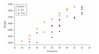
-For each of the three variables displayed in the plot, state whether they are categorical or quantitative.
Weight:
Gestation:
Smoke:
-For each of the three variables displayed in the plot, state whether they are categorical or quantitative.
Weight:
Gestation:
Smoke:
Question
Babies born with low birth weights (less than 2500 grams) are at an increased risk for many infant diseases. Researchers in North Carolina collected data to see what variables may influence the birth weight (in grams) of a child, including whether the mother drank alcohol during pregnancy, whether the mother smoked during pregnancy, the mother's age (years), the gestation of the pregnancy (number of weeks from conception until birth), the mother's race, the length of the birth (hours), and several others. The plot below summarizes some of the variables measured.
-Based on the plot, does there appear to be an association between gestation period and birth weight?
A) Yes, because as one variable increases, the other tends to increase as well.
B) No, because as one variable increases, the other tends to increase as well.
C) Yes, because most of the circles on the plot appear to be higher than the triangles.
D) No, because one variable does not appear to change the other variable.
Question
Babies born with low birth weights (less than 2500 grams) are at an increased risk for many infant diseases. Researchers in North Carolina collected data to see what variables may influence the birth weight (in grams) of a child, including whether the mother drank alcohol during pregnancy, whether the mother smoked during pregnancy, the mother's age (years), the gestation of the pregnancy (number of weeks from conception until birth), the mother's race, the length of the birth (hours), and several others. The plot below summarizes some of the variables measured.
-Is whether the mother smoked during pregnancy a confounding variable in describing the relationship between gestation period and birth weight?
A) No, because smoking status is not associated with gestation period.
B) No, because smoking status is not associated with birth weight.
C) Yes, because mothers who smoke tend to have lighter babies, and mothers who smoke also tend to have shorter gestation periods.
D) Yes, because mothers who smoke tend to have heavier babies, and mothers who smoke also tend to have longer gestation periods.
E) We cannot determine whether smoking status is a confounding variable based on this plot.
Question
Babies born with low birth weights (less than 2500 grams) are at an increased risk for many infant diseases. Researchers in North Carolina collected data to see what variables may influence the birth weight (in grams) of a child, including whether the mother drank alcohol during pregnancy, whether the mother smoked during pregnancy, the mother's age (years), the gestation of the pregnancy (number of weeks from conception until birth), the mother's race, the length of the birth (hours), and several others. The plot below summarizes some of the variables measured.
-Does the association between gestation period and birthweight appear to depend on smoking status?
A) Yes, since the regression line for non-smokers is higher than the regression line for smokers.
B) Yes, since the regression line for non-smokers would have a higher y-intercept than the regression line for smokers.
C) No, since the regression line for non-smokers and the regression line for smokers have similar slopes.
D) No, since the sample sizes of smokers and non-smokers are similar.
Question
Babies born with low birth weights (less than 2500 grams) are at an increased risk for many infant diseases. Researchers in North Carolina collected data to see what variables may influence the birth weight (in grams) of a child, including whether the mother drank alcohol during pregnancy, whether the mother smoked during pregnancy, the mother's age (years), the gestation of the pregnancy (number of weeks from conception until birth), the mother's race, the length of the birth (hours), and several others. The plot below summarizes some of the variables measured.
-How would the correlation coefficient between birth weight and gestation period computed from all women in the sample compare to the correlation coefficient between birth weight and gestation period computed from only non-smoking women?
A) The correlation coefficient for the entire sample would be closer to 1 than the correlation coefficient for the non-smoking group.
B) The correlation coefficient for the entire sample would be closer to 0 than the correlation coefficient for the non-smoking group.
C) The correlation coefficient for the entire sample would be the same as the correlation coefficient for the non-smoking group.
D) We cannot determine how the two correlation coefficients compare based on this plot.
Question
Babies born with low birth weights (less than 2500 grams) are at an increased risk for many infant diseases. Researchers in North Carolina collected data to see what variables may influence the birth weight (in grams) of a child, including whether the mother drank alcohol during pregnancy, whether the mother smoked during pregnancy, the mother's age (years), the gestation of the pregnancy (number of weeks from conception until birth), the mother's race, the length of the birth (hours), and several others. The plot below summarizes some of the variables measured.
-What type of plot would be appropriate for examining the relationship between a mother's age and her baby's birth weight?
A) Scatterplot
B) Side-by-side boxplots
C) Segmented bar graph
D) Dotplot
-What type of plot would be appropriate for examining the relationship between a mother's age and her baby's birth weight?
A) Scatterplot
B) Side-by-side boxplots
C) Segmented bar graph
D) Dotplot
Question
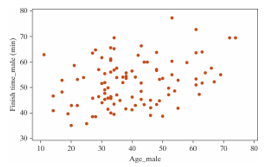
The following scatterplot displays the finish time (in minutes) and age (in years) for the male racers at the 2018 Strawberry Stampede (a 10k race through Arroyo Grande). 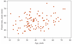
-What is the form of this scatterplot?
A) Linear
B) Non-linear
-What is the form of this scatterplot?
A) Linear
B) Non-linear
Question
The following scatterplot displays the finish time (in minutes) and age (in years) for the male racers at the 2018 Strawberry Stampede (a 10k race through Arroyo Grande).
-What is the direction of the association between finish time and age?
A) Positive
B) Negative
-What is the direction of the association between finish time and age?
A) Positive
B) Negative
Question
The following scatterplot displays the finish time (in minutes) and age (in years) for the male racers at the 2018 Strawberry Stampede (a 10k race through Arroyo Grande).
-Approximate the value of the correlation coefficient for these data.
A) 0
B) 0.25
C) 0.50
D) 0.80
-Approximate the value of the correlation coefficient for these data.
A) 0
B) 0.25
C) 0.50
D) 0.80
Question
The following scatterplot displays the finish time (in minutes) and age (in years) for the male racers at the 2018 Strawberry Stampede (a 10k race through Arroyo Grande).
-If 70-year-old male with a finishing time of 35 minutes was added to the data set, would the correlation coefficient increase, decrease, or remain the same?
A) Increase
B) Decrease
C) Remain the same
D) Unable to determine with the information provided
-If 70-year-old male with a finishing time of 35 minutes was added to the data set, would the correlation coefficient increase, decrease, or remain the same?
A) Increase
B) Decrease
C) Remain the same
D) Unable to determine with the information provided
Question
Which of the following plots has the strongest correlation between the two variables plotted?
A)
B)
C)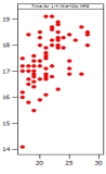
D)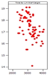
A)
B)
C)
D)
Question
Estimate the value of the correlation coefficient between the two variables shown in the following scatterplot. 
A) 0.90
B) 0.80
C) -0.80
D) 0.09
A) 0.90
B) 0.80
C) -0.80
D) 0.09
Question
Question
The graph below shows a scatter plot of medical expenses in the past year by age for a sample of Americans. 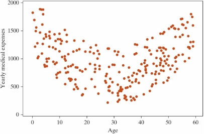 Which one of the following is a true statement about the data shown in the graph?
A) The correlation must be close to one because there is a strong relationship between age and medical expenses.
B) Using correlation on the data shown in the graph above is not appropriate because the relationship shown in the graph is not linear.
C) Both A and B are true statements.
D) Neither A nor B is a true statement.
Which one of the following is a true statement about the data shown in the graph?A) The correlation must be close to one because there is a strong relationship between age and medical expenses.
B) Using correlation on the data shown in the graph above is not appropriate because the relationship shown in the graph is not linear.
C) Both A and B are true statements.
D) Neither A nor B is a true statement.
Question
Question
Are people with bigger brains more intelligent? Forty college students volunteered to participate in a study which examined brain size (measured as 1000's of pixels counted in a brain scan), and IQ scores (measured in points). A scatterplot of the data is shown below. 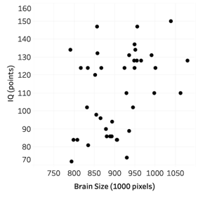
-Approximate the value of the correlation coefficient for these data.
A) 0.10
B) 0.40
C) 0.80
D) 0
-Approximate the value of the correlation coefficient for these data.
A) 0.10
B) 0.40
C) 0.80
D) 0
Question
Are people with bigger brains more intelligent? Forty college students volunteered to participate in a study which examined brain size (measured as 1000's of pixels counted in a brain scan), and IQ scores (measured in points). A scatterplot of the data is shown below.
-State the null and alternative hypotheses using proper notation.
A) versus
B) versus
C) versus
D) versus
-State the null and alternative hypotheses using proper notation.
A)
versus B)
versus C)
versus D)
versus Question
Are people with bigger brains more intelligent? Forty college students volunteered to participate in a study which examined brain size (measured as 1000's of pixels counted in a brain scan), and IQ scores (measured in points). A scatterplot of the data is shown below.
-Select the best explanation for how one sample would be simulated in order to generate the null distribution.
A) Flip a coin to decide whether to swap the values for brain size and IQ or not. Plot the correlation coefficient of the randomized points on the null distribution.
B) Holding the order of brain size values constant, randomize the order of the IQs. Plot the correlation coefficient of the shuffled data on the null distribution.
C) Put each pair of (brain size, IQ) on a piece of paper. Draw with replacement 40 times. Plot the correlation coefficient of the resampled data on the null distribution.
D) Add or subtract the appropriate value from each brain size and IQ in order to force the null hypothesis to be true. Plot the correlation coefficient of the shifted data on the null distribution.
Question
Are people with bigger brains more intelligent? Forty college students volunteered to participate in a study which examined brain size (measured as 1000's of pixels counted in a brain scan), and IQ scores (measured in points). A scatterplot of the data is shown below.
-Below is a picture of a simulated null distribution of correlation coefficients created using the Corr/Regression applet. How would you use this distribution to calculate the p-value?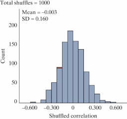
A) Find the proportion of simulated correlation coefficients greater than zero.
B) Find the proportion of simulated correlation coefficients as far away from zero or further than the one observed.
C) Find the proportion of simulated correlation coefficients as small or smaller than the one observed.
D) Find the proportion of simulated correlation coefficients as large or larger than the one observed.
Question
Are people with bigger brains more intelligent? Forty college students volunteered to participate in a study which examined brain size (measured as 1000's of pixels counted in a brain scan), and IQ scores (measured in points). A scatterplot of the data is shown below.
-The p-value for this test is 0.008. What can we conclude?
A) We have strong evidence that an increase in brain size will increase IQ.
B) We have strong evidence that an increase in brain size is associated with an increase in IQ.
C) We have strong evidence that an increase in IQ will increase brain size.
D) We have strong evidence that brain size and IQ are not associated.
Question
Data from gapminder.org on 184 countries was used to examine if there is an association between (average) female life expectancy (that is, the average lifespan of women in the country) and the average number of children women give birth to for the year 2019. A scatterplot of the data follows. 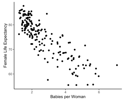
-What are the observational units?
A) Women
B) Babies
C) Countries
D) Years
-What are the observational units?
A) Women
B) Babies
C) Countries
D) Years
Question
Data from gapminder.org on 184 countries was used to examine if there is an association between (average) female life expectancy (that is, the average lifespan of women in the country) and the average number of children women give birth to for the year 2019. A scatterplot of the data follows.
-Approximate the correlation coefficient for these data.
A)
B)
C)
D)
-Approximate the correlation coefficient for these data.
A)
B)
C)
D)
Question
Data from gapminder.org on 184 countries was used to examine if there is an association between (average) female life expectancy (that is, the average lifespan of women in the country) and the average number of children women give birth to for the year 2019. A scatterplot of the data follows.
-State the null and alternative hypotheses using proper notation.
A) versus
B) versus
C) versus
D) versus
-State the null and alternative hypotheses using proper notation.
A)
versus B)
versus C)
versus D)
versus Question
Data from gapminder.org on 184 countries was used to examine if there is an association between (average) female life expectancy (that is, the average lifespan of women in the country) and the average number of children women give birth to for the year 2019. A scatterplot of the data follows.
-Select the best explanation for how one sample would be simulated in order to generate the null distribution.
A) Holding the average number of children constant, randomize the order of the female life expectancies. Plot the correlation coefficient of the shuffled data on the null distribution.
B) Add or subtract the appropriate value from each average number of children and female life expectancy in order to force the null hypothesis to be true. Plot the correlation coefficient of the shifted data on the null distribution.
C) Flip a coin to decide whether to swap the values for average number of children and female life expectancy or not. Plot the correlation coefficient of the randomized points on the null distribution.
D) Put each pair of (average number of children, female life expectancy) on a piece of paper. Draw with replacement 40 times. Plot the correlation coefficient of the resampled data on the null distribution.
Question
Data from gapminder.org on 184 countries was used to examine if there is an association between (average) female life expectancy (that is, the average lifespan of women in the country) and the average number of children women give birth to for the year 2019. A scatterplot of the data follows.
-Below is a picture of a simulated null distribution of correlation coefficients created using the Corr/Regression applet. How would you use this distribution to calculate the p-value?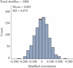
A) Find the proportion of simulated correlation coefficients greater than zero.
B) Find the proportion of simulated correlation coefficients as far away from zero or further than the one observed.
C) Find the proportion of simulated correlation coefficients as small or smaller than the one observed.
D) Find the proportion of simulated correlation coefficients as large or larger than the one observed.
Question
Data from gapminder.org on 184 countries was used to examine if there is an association between (average) female life expectancy (that is, the average lifespan of women in the country) and the average number of children women give birth to for the year 2019. A scatterplot of the data follows.
-The p-value for this test is less than 0.001. What can we conclude?
A) We have strong evidence that average number of children per woman is associated with female life expectancy.
B) We have strong evidence that an increase in average number of children per woman will decrease female life expectancy.
C) We have strong evidence that an increase in female life expectancy will decrease the average number of children per woman.
D) We have strong evidence that average number of children per woman is not associated with female life expectancy.
Question
The following scatterplot displays the finish time (in minutes) and age (in years) for the male racers at the 2018 Strawberry Stampede (a 10k race through Arroyo Grande).?
 Below are the same data for the female racers in this year's race.
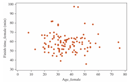
-Do you think the correlation coefficient for the females will be larger, smaller, or remain the same as the male's?
A) Larger
B) Smaller
C) Remain the same
Below are the same data for the female racers in this year's race.-Do you think the correlation coefficient for the females will be larger, smaller, or remain the same as the male's?
A) Larger
B) Smaller
C) Remain the same
Question
The following scatterplot displays the finish time (in minutes) and age (in years) for the male racers at the 2018 Strawberry Stampede (a 10k race through Arroyo Grande).?
Below are the same data for the female racers in this year's race.
-Select the best explanation for how one sample would be simulated in order to generate the null distribution for the females.
A) Holding the ages constant, randomize the order of the race finish times. Plot the correlation coefficient of the shuffled data on the null distribution.
B) Add or subtract the appropriate value from each age and race finish time in order to force the null hypothesis to be true. Plot the correlation coefficient of the shifted data on the null distribution.
C) Flip a coin to decide whether to swap the values for age and race finish time or not. Plot the correlation coefficient of the randomized points on the null distribution.
D) Put each pair of (age, race finish time) on a piece of paper. Draw with replacement 40 times. Plot the correlation coefficient of the resampled data on the null distribution.
Below are the same data for the female racers in this year's race.-Select the best explanation for how one sample would be simulated in order to generate the null distribution for the females.
A) Holding the ages constant, randomize the order of the race finish times. Plot the correlation coefficient of the shuffled data on the null distribution.
B) Add or subtract the appropriate value from each age and race finish time in order to force the null hypothesis to be true. Plot the correlation coefficient of the shifted data on the null distribution.
C) Flip a coin to decide whether to swap the values for age and race finish time or not. Plot the correlation coefficient of the randomized points on the null distribution.
D) Put each pair of (age, race finish time) on a piece of paper. Draw with replacement 40 times. Plot the correlation coefficient of the resampled data on the null distribution.
Question
The following scatterplot displays the finish time (in minutes) and age (in years) for the male racers at the 2018 Strawberry Stampede (a 10k race through Arroyo Grande).?
Below are the same data for the female racers in this year's race.
-What is the null hypothesis for a simulation-based test of the correlation coefficient for the females.
A) There is an association between female ages and female race finish times.
B) There is no association between female ages and female race finish times.
Below are the same data for the female racers in this year's race.-What is the null hypothesis for a simulation-based test of the correlation coefficient for the females.
A) There is an association between female ages and female race finish times.
B) There is no association between female ages and female race finish times.
Question
The following scatterplot displays the finish time (in minutes) and age (in years) for the male racers at the 2018 Strawberry Stampede (a 10k race through Arroyo Grande).?
Below are the same data for the female racers in this year's race.
-The p-value for a simulation-based test of the correlation coefficient for the females is 0.213. We have evidence that there is no association between female ages and female race finish times.
Below are the same data for the female racers in this year's race.-The p-value for a simulation-based test of the correlation coefficient for the females is 0.213. We have evidence that there is no association between female ages and female race finish times.
Question
Question
Annual measurements of the number of powerboat registrations (in thousands) and the number of manatees killed by powerboats in Florida were collected over the 14 years 1977-1990. A scatterplot of the data, least squares regression line, and correlation coefficient follow. 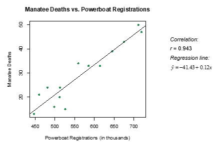
-How would you interpret the slope of the regression line in the context of the problem? Select all that apply.
A) Every 8,000 powerboat registrations is associated with a predicted increase of one manatee death.
B) We predict an additional 0.12 manatee death for each single powerboat registration.
C) We predict an additional 0.12 manatee death for every 1,000 powerboats registered.
D) We predict a decrease of 41.43 manatee deaths for every 1,000 powerboats registered.
Question
Annual measurements of the number of powerboat registrations (in thousands) and the number of manatees killed by powerboats in Florida were collected over the 14 years 1977-1990. A scatterplot of the data, least squares regression line, and correlation coefficient follow.
-Fill in the blanks with the appropriate values to interpret the y-intercept:
We predict ___(1)____ manatee deaths when there are ____(2)____ powerboat registrations.
-Fill in the blanks with the appropriate values to interpret the y-intercept:
We predict ___(1)____ manatee deaths when there are ____(2)____ powerboat registrations.
Question
Annual measurements of the number of powerboat registrations (in thousands) and the number of manatees killed by powerboats in Florida were collected over the 14 years 1977-1990. A scatterplot of the data, least squares regression line, and correlation coefficient follow.
-The y-intercept is not a valid prediction of manatee deaths. Why?
A) It is an example of extrapolation.
B) We cannot observe a negative number of manatee deaths.
C) Both A and B
D) Neither A nor B
-The y-intercept is not a valid prediction of manatee deaths. Why?
A) It is an example of extrapolation.
B) We cannot observe a negative number of manatee deaths.
C) Both A and B
D) Neither A nor B
Question
Annual measurements of the number of powerboat registrations (in thousands) and the number of manatees killed by powerboats in Florida were collected over the 14 years 1977-1990. A scatterplot of the data, least squares regression line, and correlation coefficient follow.
-What is the predicted number of manatee deaths for a year with 600,000 powerboat registrations?
-What is the predicted number of manatee deaths for a year with 600,000 powerboat registrations?
Question
Annual measurements of the number of powerboat registrations (in thousands) and the number of manatees killed by powerboats in Florida were collected over the 14 years 1977-1990. A scatterplot of the data, least squares regression line, and correlation coefficient follow.
-The year 1984 had 559,000 powerboat registrations and 34 manatee deaths. Calculate the residual for this observation.
-The year 1984 had 559,000 powerboat registrations and 34 manatee deaths. Calculate the residual for this observation.
Question
Annual measurements of the number of powerboat registrations (in thousands) and the number of manatees killed by powerboats in Florida were collected over the 14 years 1977-1990. A scatterplot of the data, least squares regression line, and correlation coefficient follow.
-The year 1984 had 559,000 powerboat registrations and 34 manatee deaths. Did the least squares regression line underestimate, overestimate, or accurately estimate the number of manatee deaths for the year 1984?
A) Underestimate
B) Overestimate
C) Accurately estimate
-The year 1984 had 559,000 powerboat registrations and 34 manatee deaths. Did the least squares regression line underestimate, overestimate, or accurately estimate the number of manatee deaths for the year 1984?
A) Underestimate
B) Overestimate
C) Accurately estimate
Question
Annual measurements of the number of powerboat registrations (in thousands) and the number of manatees killed by powerboats in Florida were collected over the 14 years 1977-1990. A scatterplot of the data, least squares regression line, and correlation coefficient follow.
-Which of the following is a correct interpretation of the coefficient of determination?
A) About 94.3% of the variation in manatee deaths can be explained by the number of powerboat registrations.
B) About 88.9% of the variation in manatee deaths can be explained by the number of powerboat registrations.
C) An increase of 1,000 powerboat registrations is associated with a predicted increase of 0.943 manatee deaths.
D) An increase of 1,000 powerboat registrations is associated with a predicted increase of 0.889 manatee deaths.
Question
Data from the World Bank for 25 Western Hemisphere countries was used to examine the association between (average) female life expectancy (that is, the average lifespan of women in the country) and the average number of children women give birth to. Given below is the scatterplot for the data. 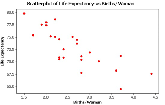 The regression equation for this context is found to be:
y= 84.5 - 4.4x
where Y is female life expectancy in years, and is the average number of births per woman.
-Interpret the slope in the context of the study.
A) We expect to see an increase of 84.5 years in female life expectancy when the average number of births per woman in a country increases by one child.
B) When a country has zero births per woman on average, we predict a female life expectancy of 84.5 years.
C) We expect to see a decrease of 4.4 years in female life expectancy when the average number of births per woman in a country increases by one child.
D) When a country has zero births per woman on average, we predict a female life expectancy of 4.4 years.
The regression equation for this context is found to be:y= 84.5 - 4.4x
where Y is female life expectancy in years, and is the average number of births per woman.
-Interpret the slope in the context of the study.
A) We expect to see an increase of 84.5 years in female life expectancy when the average number of births per woman in a country increases by one child.
B) When a country has zero births per woman on average, we predict a female life expectancy of 84.5 years.
C) We expect to see a decrease of 4.4 years in female life expectancy when the average number of births per woman in a country increases by one child.
D) When a country has zero births per woman on average, we predict a female life expectancy of 4.4 years.
Question
Data from the World Bank for 25 Western Hemisphere countries was used to examine the association between (average) female life expectancy (that is, the average lifespan of women in the country) and the average number of children women give birth to. Given below is the scatterplot for the data. The regression equation for this context is found to be:
y= 84.5 - 4.4x
where Y is female life expectancy in years, and is the average number of births per woman.
-Interpret the y-intercept in the context of the study.
A) We expect to see an increase of 84.5 years in female life expectancy when the average number of births per woman in a country increases by one child.
B) When a country has zero births per woman on average, we predict a female life expectancy of 84.5 years.
C) We expect to see a decrease of 4.4 years in female life expectancy when the average number of births per woman in a country increases by one child.
D) When a country has zero births per woman on average, we predict a female life expectancy of 4.4 years.
The regression equation for this context is found to be:y= 84.5 - 4.4x
where Y is female life expectancy in years, and is the average number of births per woman.
-Interpret the y-intercept in the context of the study.
A) We expect to see an increase of 84.5 years in female life expectancy when the average number of births per woman in a country increases by one child.
B) When a country has zero births per woman on average, we predict a female life expectancy of 84.5 years.
C) We expect to see a decrease of 4.4 years in female life expectancy when the average number of births per woman in a country increases by one child.
D) When a country has zero births per woman on average, we predict a female life expectancy of 4.4 years.
Question
Data from the World Bank for 25 Western Hemisphere countries was used to examine the association between (average) female life expectancy (that is, the average lifespan of women in the country) and the average number of children women give birth to. Given below is the scatterplot for the data. The regression equation for this context is found to be:
y= 84.5 - 4.4x
where Y is female life expectancy in years, and is the average number of births per woman.
-Is the interpretation of the y-intercept meaningful in the context? Why?
A) No, since it is an example of extrapolation.
B) No, since the lowest value for average births per woman in the data set was 1.5.
C) Both A and B
D) Neither A nor B
The regression equation for this context is found to be:y= 84.5 - 4.4x
where Y is female life expectancy in years, and is the average number of births per woman.
-Is the interpretation of the y-intercept meaningful in the context? Why?
A) No, since it is an example of extrapolation.
B) No, since the lowest value for average births per woman in the data set was 1.5.
C) Both A and B
D) Neither A nor B
Question
Question
Question
Question
Question
Social warmth is a term referring to the feeling of being connected to others. A study published in PLoS One in 2016 looked at a potential relationship between physical warmth (body temperature) and social warmth among a group of 54 volunteers (Inagki et al.). These volunteers had their oral temperature taken by a registered nurse and then assessed themselves using a scale of 1 to 5 on twelve items related to a feeling of social connection for which the average was recorded. Higher average scores indicated higher levels of social warmth. The theory was that the thermoregulatory system, which helps maintain a relatively warm internal body temperature, may also help people assess feelings of social connection. Below is a scatterplot and least-squares regression line of the data. 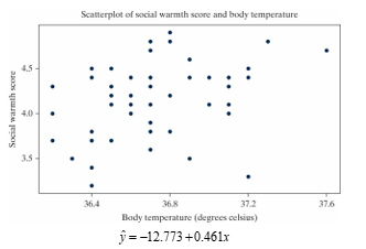
-How would you interpret the slope of the regression line in the context of the study?
A) The correlation coefficient between body temperature and social warmth score is 0.461.
B) The predicted social warmth score when body temperature is zero degrees Celsius is -12.773.
C) A one degree Celsius increase in body temperature is associated with a predicted 0.461 increase in social warmth score.
D) About 46.1% of variability in social warmth scores can be explained by body temperature.
Question
Social warmth is a term referring to the feeling of being connected to others. A study published in PLoS One in 2016 looked at a potential relationship between physical warmth (body temperature) and social warmth among a group of 54 volunteers (Inagki et al.). These volunteers had their oral temperature taken by a registered nurse and then assessed themselves using a scale of 1 to 5 on twelve items related to a feeling of social connection for which the average was recorded. Higher average scores indicated higher levels of social warmth. The theory was that the thermoregulatory system, which helps maintain a relatively warm internal body temperature, may also help people assess feelings of social connection. Below is a scatterplot and least-squares regression line of the data.
-Which of the following is the correlation coefficient for these data?
A) 0.348
B) 0.721
C) -0.032
D) -0.213
-Which of the following is the correlation coefficient for these data?
A) 0.348
B) 0.721
C) -0.032
D) -0.213
Question
Social warmth is a term referring to the feeling of being connected to others. A study published in PLoS One in 2016 looked at a potential relationship between physical warmth (body temperature) and social warmth among a group of 54 volunteers (Inagki et al.). These volunteers had their oral temperature taken by a registered nurse and then assessed themselves using a scale of 1 to 5 on twelve items related to a feeling of social connection for which the average was recorded. Higher average scores indicated higher levels of social warmth. The theory was that the thermoregulatory system, which helps maintain a relatively warm internal body temperature, may also help people assess feelings of social connection. Below is a scatterplot and least-squares regression line of the data.
-State the null and alternative hypotheses for a simulation-based test of the slope using proper notation.
A) versus
B) versus
C) versus
D) versus
-State the null and alternative hypotheses for a simulation-based test of the slope using proper notation.
A)
versus B)
versus C)
versus D)
versus Question
Social warmth is a term referring to the feeling of being connected to others. A study published in PLoS One in 2016 looked at a potential relationship between physical warmth (body temperature) and social warmth among a group of 54 volunteers (Inagki et al.). These volunteers had their oral temperature taken by a registered nurse and then assessed themselves using a scale of 1 to 5 on twelve items related to a feeling of social connection for which the average was recorded. Higher average scores indicated higher levels of social warmth. The theory was that the thermoregulatory system, which helps maintain a relatively warm internal body temperature, may also help people assess feelings of social connection. Below is a scatterplot and least-squares regression line of the data.
-Select the best explanation for how one sample would be simulated in order to generate the null distribution.
A) Holding the body temperatures constant, randomize the order of the social warmth scores. Plot the slope of the regression line of the shuffled data on the null distribution.
B) Add or subtract the appropriate value from each body temperature and social warmth score in order to force the null hypothesis to be true. Plot the slope of the regression line of the shifted data on the null distribution.
C) Flip a coin to decide whether to swap the values for body temperature and social warmth score or not. Plot the slope of the regression line of the randomized points on the null distribution.
D) Put each pair of (body temperature, social warmth score) on a piece of paper. Draw with replacement 40 times. Plot the slope of the regression line of the resampled data on the null distribution.
Question
Social warmth is a term referring to the feeling of being connected to others. A study published in PLoS One in 2016 looked at a potential relationship between physical warmth (body temperature) and social warmth among a group of 54 volunteers (Inagki et al.). These volunteers had their oral temperature taken by a registered nurse and then assessed themselves using a scale of 1 to 5 on twelve items related to a feeling of social connection for which the average was recorded. Higher average scores indicated higher levels of social warmth. The theory was that the thermoregulatory system, which helps maintain a relatively warm internal body temperature, may also help people assess feelings of social connection. Below is a scatterplot and least-squares regression line of the data.
-Below is a picture of a simulated null distribution of slopes created using the Corr/Regression applet. How is this distribution used calculate the p-value?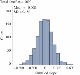
A) Find the proportion of simulated slopes greater than zero.
B) Find the proportion of simulated slopes as far away from zero or further than 0.461.
C) Find the proportion of simulated slopes as small or smaller than 0.461.
D) Find the proportion of simulated slopes as large or larger than 0.461.
Question
Social warmth is a term referring to the feeling of being connected to others. A study published in PLoS One in 2016 looked at a potential relationship between physical warmth (body temperature) and social warmth among a group of 54 volunteers (Inagki et al.). These volunteers had their oral temperature taken by a registered nurse and then assessed themselves using a scale of 1 to 5 on twelve items related to a feeling of social connection for which the average was recorded. Higher average scores indicated higher levels of social warmth. The theory was that the thermoregulatory system, which helps maintain a relatively warm internal body temperature, may also help people assess feelings of social connection. Below is a scatterplot and least-squares regression line of the data.
-Based off of the simulated null distribution in question 51, what is the strength of evidence against the null hypothesis?
A) We have strong evidence against the null hypothesis.
B) We have moderate evidence against the null hypothesis.
C) We have weak evidence against the null hypothesis.
D) We have no evidence against the null hypothesis.
Question
It is commonly expected that as a person ages, their muscle mass decreases. To further examine this relationship in women, a nutritionist randomly selected 60 female patients from her clinic, 15 women from each 10-year age group beginning with age 40 and ending with age 80. For each patient, her age and current muscle mass was recorded. A scatterplot, least squares regression line, and coefficient of determination are as follows. 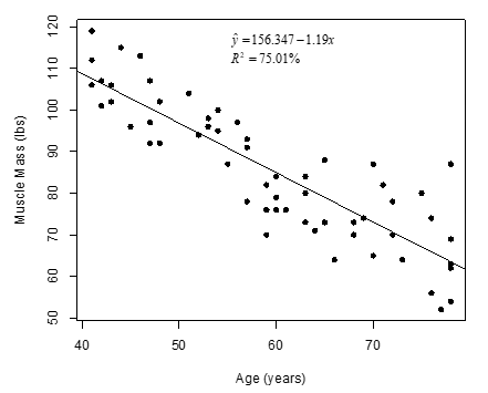
-Write a sentence interpreting the value of the slope in the context of the study.
A) A one year increase in age is associated with a 1.19 lb increase in predicted muscle mass.
B) A one year increase in age is associated with a 1.19 lb decrease in predicted muscle mass.
C) A one year increase in muscle mass is associated with a 1.19 lb increase in predicted age.
D) A one year increase in muscle mass is associated with a 1.19 lb decrease in predicted age.
Question
It is commonly expected that as a person ages, their muscle mass decreases. To further examine this relationship in women, a nutritionist randomly selected 60 female patients from her clinic, 15 women from each 10-year age group beginning with age 40 and ending with age 80. For each patient, her age and current muscle mass was recorded. A scatterplot, least squares regression line, and coefficient of determination are as follows.
-Which of the following is a correct interpretation of the coefficient of determination?
A) When the age of a woman is equal to zero, her predicted muscle mass is 75.01 lbs.
B) The correlation coefficient between age and muscle mass is equal to 0.7501.
C) Each additional year in age is associated with a 75.01% decrease in predicted muscle mass.
D) Approximately 75.01% of the variation in muscle mass can be explained by changes in age among these women.
Question
It is commonly expected that as a person ages, their muscle mass decreases. To further examine this relationship in women, a nutritionist randomly selected 60 female patients from her clinic, 15 women from each 10-year age group beginning with age 40 and ending with age 80. For each patient, her age and current muscle mass was recorded. A scatterplot, least squares regression line, and coefficient of determination are as follows.
-What is the value of the correlation coefficient between age and muscle mass for these data?
A) 0.7501
B) -0.7501
C) 0.8661
D) -0.8661
-What is the value of the correlation coefficient between age and muscle mass for these data?
A) 0.7501
B) -0.7501
C) 0.8661
D) -0.8661
Question
It is commonly expected that as a person ages, their muscle mass decreases. To further examine this relationship in women, a nutritionist randomly selected 60 female patients from her clinic, 15 women from each 10-year age group beginning with age 40 and ending with age 80. For each patient, her age and current muscle mass was recorded. A scatterplot, least squares regression line, and coefficient of determination are as follows.
-Write the null and alternative hypotheses of interest for testing if there is a negative linear relationship between age and muscle mass using proper notation for a test of slope.
A) versus
B) versus
C) versus
D) versus
-Write the null and alternative hypotheses of interest for testing if there is a negative linear relationship between age and muscle mass using proper notation for a test of slope.
A)
versus B)
versus C)
versus D)
versus Question
It is commonly expected that as a person ages, their muscle mass decreases. To further examine this relationship in women, a nutritionist randomly selected 60 female patients from her clinic, 15 women from each 10-year age group beginning with age 40 and ending with age 80. For each patient, her age and current muscle mass was recorded. A scatterplot, least squares regression line, and coefficient of determination are as follows.
-How would you simulate one sample, assuming the null hypothesis is true?
A) Label cards with muscle mass values from the original data. Mix cards together; shuffle into two new groups of age 40 and age 80.
B) Label cards with muscle mass values from the original data. Mix cards together, and deal one muscle mass value to each of the age values in the data.
C) Flip a coin for each woman in the sample; if heads, swap the difference between age and muscle mass.
D) Label cards with age values from the original data. Mix cards together; shuffle into two new groups of low and high muscle mass.
Question
It is commonly expected that as a person ages, their muscle mass decreases. To further examine this relationship in women, a nutritionist randomly selected 60 female patients from her clinic, 15 women from each 10-year age group beginning with age 40 and ending with age 80. For each patient, her age and current muscle mass was recorded. A scatterplot, least squares regression line, and coefficient of determination are as follows.
-The p-value for these data was less than 0.0001. Write a conclusion of the test in the context of the study.
A) We have strong evidence that an increase in age causes a decrease in muscle mass.
B) We have strong evidence that age is negatively correlated with muscle mass.
C) We do not have strong evidence that an increase in age causes a decrease in muscle mass.
D) We do not have strong evidence that age is negatively correlated with muscle mass.
Question
It is commonly expected that as a person ages, their muscle mass decreases. To further examine this relationship in women, a nutritionist randomly selected 60 female patients from her clinic, 15 women from each 10-year age group beginning with age 40 and ending with age 80. For each patient, her age and current muscle mass was recorded. A scatterplot, least squares regression line, and coefficient of determination are as follows.
-If you were to conduct a simulation-based test using the correlation coefficient as your statistic, would the p-value be larger, smaller, or remain the same as the p-value reported in question 58?
A) Larger
B) Smaller
C) Remain the same
D) Not enough information provided
-If you were to conduct a simulation-based test using the correlation coefficient as your statistic, would the p-value be larger, smaller, or remain the same as the p-value reported in question 58?
A) Larger
B) Smaller
C) Remain the same
D) Not enough information provided
Question
It is commonly expected that as a person ages, their muscle mass decreases. To further examine this relationship in women, a nutritionist randomly selected 60 female patients from her clinic, 15 women from each 10-year age group beginning with age 40 and ending with age 80. For each patient, her age and current muscle mass was recorded. A scatterplot, least squares regression line, and coefficient of determination are as follows.
-Can these results be generalized to the population of all patients at this clinic?
A) Yes, since it was a random sample.
B) No, since the sample size was too small.
C) No, since only female patients were selected.
D) No, since age was not randomly assigned to patients.
-Can these results be generalized to the population of all patients at this clinic?
A) Yes, since it was a random sample.
B) No, since the sample size was too small.
C) No, since only female patients were selected.
D) No, since age was not randomly assigned to patients.
Question
Data from gapminder.org on 184 countries was used to examine if there is an association between (average) female life expectancy (that is, the average lifespan of women in the country) and the average number of children women give birth to for the year 2019. A scatterplot of the data and a regression table from the Corr/Regression applet follows. 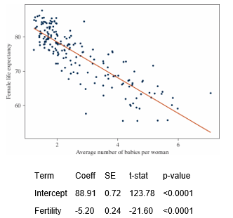
-Which of the following validity conditions does not need to be checked in order to conduct a theory-based test for a regression slope?
A) The number of countries in the data set is larger than 20.
B) The variability in female life expectancy around the regression line should be similar regardless of the value of average number of babies per woman.
C) There is approximately the same distribution of points above the regression line as below the regression line.
D) The general pattern of the points on the scatterplot has a linear trend.
Question
Data from gapminder.org on 184 countries was used to examine if there is an association between (average) female life expectancy (that is, the average lifespan of women in the country) and the average number of children women give birth to for the year 2019. A scatterplot of the data and a regression table from the Corr/Regression applet follows.
-Which of the approaches to a test of the regression slope are valid?
A) Simulation-based test
B) Theory-based test
C) Both A and B
D) Neither A nor B
-Which of the approaches to a test of the regression slope are valid?
A) Simulation-based test
B) Theory-based test
C) Both A and B
D) Neither A nor B
Question
Data from gapminder.org on 184 countries was used to examine if there is an association between (average) female life expectancy (that is, the average lifespan of women in the country) and the average number of children women give birth to for the year 2019. A scatterplot of the data and a regression table from the Corr/Regression applet follows.
-State the null and alternative hypotheses to examine if there is an association between female life expectancy and the average number of children women give birth to for the year 2019.
A) versus
B) versus
C) versus
D) versus
E) Both A and C F. Both B and D
-State the null and alternative hypotheses to examine if there is an association between female life expectancy and the average number of children women give birth to for the year 2019.
A)
versus B)
versus C)
versus D)
versus E) Both A and C F. Both B and D
Question
Data from gapminder.org on 184 countries was used to examine if there is an association between (average) female life expectancy (that is, the average lifespan of women in the country) and the average number of children women give birth to for the year 2019. A scatterplot of the data and a regression table from the Corr/Regression applet follows.
-Using the regression table output, state the equation of the regression line.
A)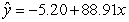
B)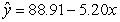
C)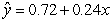
D)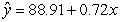
-Using the regression table output, state the equation of the regression line.
A)
B)
C)
D)
Question
Data from gapminder.org on 184 countries was used to examine if there is an association between (average) female life expectancy (that is, the average lifespan of women in the country) and the average number of children women give birth to for the year 2019. A scatterplot of the data and a regression table from the Corr/Regression applet follows.
-Using the regression table output, what is the standardized statistic for a test of the regression slope.
A) 123.78
B) -21.60
C) 88.91
D) -5.20
-Using the regression table output, what is the standardized statistic for a test of the regression slope.
A) 123.78
B) -21.60
C) 88.91
D) -5.20
Question
Data from gapminder.org on 184 countries was used to examine if there is an association between (average) female life expectancy (that is, the average lifespan of women in the country) and the average number of children women give birth to for the year 2019. A scatterplot of the data and a regression table from the Corr/Regression applet follows.
-How would you interpret the standardized statistic for a test of the regression slope?
A) The observed sample slope of -5.20 is 21.6 standard errors below the hypothesized value of zero.
B) The observed sample intercept of 88.91 is 21.6 standard errors below the hypothesized value of zero.
C) Zero is 21.6 standard errors below the observed sample slope of -5.20.
D) Zero is 21.6 standard errors below the observed sample intercept of 88.91.
Question
Data from gapminder.org on 184 countries was used to examine if there is an association between (average) female life expectancy (that is, the average lifespan of women in the country) and the average number of children women give birth to for the year 2019. A scatterplot of the data and a regression table from the Corr/Regression applet follows.
-Is there significant evidence of an association between female life expectancy and the average number of children women give birth to for the year 2019?
A) Yes, since the slope of the regression line is negative.
B) Yes, since the intercept of the regression line is positive.
C) Yes, since the correlation is negative.
D) Yes, since the p-value for the intercept is less than 0.01.
E) Yes, since the p-value for the slope is less than 0.01.
Question
Data from gapminder.org on 184 countries was used to examine if there is an association between (average) female life expectancy (that is, the average lifespan of women in the country) and the average number of children women give birth to for the year 2019. A scatterplot of the data and a regression table from the Corr/Regression applet follows.
-A 95% confidence interval for the population slope is (-5.68, -4.73). How would you interpret this interval in the context of the study?
A) If we repeated this study many times, 95% of the regression slopes would fall between -5.68 and -4.73.
B) There is a 95% probability that the population slope is between -5.68 and -4.73.
C) We are 95% confident that the population slope is between -5.68 and -4.73.
D) A one baby increase in average number of babies per woman is associated with between a 4.73 and 5.68 year decrease in female life expectancy, with 95% confidence.
E) Both A and B
F)Both B and C
G) Both C and D
Question
How is the number of pages in a textbook related to the price of the textbook? To find out, two Cal Poly freshmen (2006) randomly selected 30 textbooks at the campus bookstore and recorded the price ($) and number of pages for each book. Here's output from analyzing the data collected in the Corr/Regression applet. Assume, for now, that the normal approximation-based method is valid, and thus, the p-value from the Regression Table below is valid. 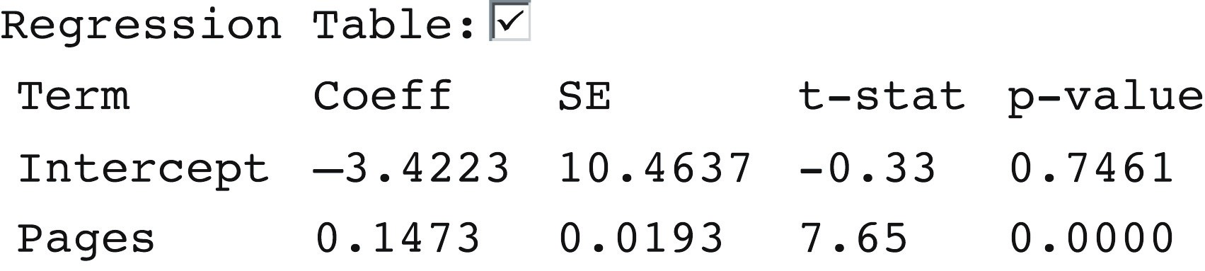
-What is the most appropriate null hypothesis for testing the regression slope using theory-based methods?
A) There is no association between number of pages in a textbook and price of the textbook.
B) There is an association between number of pages in a textbook and price of the textbook.
C) There is no linear association between number of pages in a textbook and price of the textbook.
D) There is a linear association between number of pages in a textbook and price of the textbook.
Question
How is the number of pages in a textbook related to the price of the textbook? To find out, two Cal Poly freshmen (2006) randomly selected 30 textbooks at the campus bookstore and recorded the price ($) and number of pages for each book. Here's output from analyzing the data collected in the Corr/Regression applet. Assume, for now, that the normal approximation-based method is valid, and thus, the p-value from the Regression Table below is valid.
-We can conclude that the price of a textbook will increase if we add more pages.
-We can conclude that the price of a textbook will increase if we add more pages.
Question
How is the number of pages in a textbook related to the price of the textbook? To find out, two Cal Poly freshmen (2006) randomly selected 30 textbooks at the campus bookstore and recorded the price ($) and number of pages for each book. Here's output from analyzing the data collected in the Corr/Regression applet. Assume, for now, that the normal approximation-based method is valid, and thus, the p-value from the Regression Table below is valid.
-A 95% confidence interval for the population slope is (0.108, 0.187). Which of the following statements are valid based on this interval?
A) If we repeated this study many times, 95% of the regression slopes would fall between 0.108 and 0.187.
B) There is a 95% probability that the population slope is between 0.108 and 0.187.
C) We are 95% confident that the population slope is between 0.108 and 0.187.
D) We have significant evidence that the population slope is greater than zero.
E) Both A and B
F) Both B and C
G) Both C and D
Question
A student in an AP Statistics class decided to conduct a study to determine whether you could predict the number of followers a teen has on Instagram based on the number of people he or she is following. To do this, she randomly selected fifty students from her high school that had Instagram accounts and for each student recorded the number of people they were following and the number of followers they had. A scatterplot of the data is shown.
The regression line is
.
followers=-45.3+1.21(following)
-We want to test: H0: β = 0, Ha: β ≠ 0. Use results from the null distribution of simulated slopes shown to determine the standardized statistic.
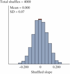
The regression line is
.
followers=-45.3+1.21(following)
-We want to test: H0: β = 0, Ha: β ≠ 0. Use results from the null distribution of simulated slopes shown to determine the standardized statistic.
Question
A student in an AP Statistics class decided to conduct a study to determine whether you could predict the number of followers a teen has on Instagram based on the number of people he or she is following. To do this, she randomly selected fifty students from her high school that had Instagram accounts and for each student recorded the number of people they were following and the number of followers they had. A scatterplot of the data is shown.
The regression line is
.
followers=-45.3+1.21(following)
-Based on the standardized statistic, is there strong evidence of an association between the number of followers and the number of people following an Instagram account?
A) No, since the mean of the null distribution is zero.
B) Yes, since the regression slope is positive.
C) Yes, since the standardized statistic is greater than 3.
D) Yes, since the correlation is positive.
Question
A student in an AP Statistics class decided to conduct a study to determine whether you could predict the number of followers a teen has on Instagram based on the number of people he or she is following. To do this, she randomly selected fifty students from her high school that had Instagram accounts and for each student recorded the number of people they were following and the number of followers they had. A scatterplot of the data is shown.
The regression line is
.
followers=-45.3+1.21(following)
-A 95% confidence interval for the population slope is (1.07, 1.35). How would you interpret this in the context of the study?
A) We are 95% confident that the population slope is between 1.07 and 1.35.
B) If we repeated this study many times, 95% of the regression slopes would fall between 1.07 and 1.35.
C) There is a 95% probability that the population slope is between 1.07 and 1.35.
D) We are 95% confident that a one person increase in the number of people one is following on Instagram is associated with between a 1.07 to 1.35 person increase in the number of followers.
E) Both A and D
F) Both A and B
G) Both B and C

Unlock Deck
Sign up to unlock the cards in this deck!
Unlock Deck
Unlock Deck
1/73
Play
Full screen (f)
Deck 11: Two Quantitative Variables
1
Babies born with low birth weights (less than 2500 grams) are at an increased risk for many infant diseases. Researchers in North Carolina collected data to see what variables may influence the birth weight (in grams) of a child, including whether the mother drank alcohol during pregnancy, whether the mother smoked during pregnancy, the mother's age (years), the gestation of the pregnancy (number of weeks from conception until birth), the mother's race, the length of the birth (hours), and several others. The plot below summarizes some of the variables measured.
-For each of the three variables displayed in the plot, state whether they are categorical or quantitative.
Weight:
Gestation:
Smoke:
-For each of the three variables displayed in the plot, state whether they are categorical or quantitative.
Weight:
Gestation:
Smoke:
Weight: quantitative
Gestation: quantitative
Smoke: categorical
Gestation: quantitative
Smoke: categorical
2
Babies born with low birth weights (less than 2500 grams) are at an increased risk for many infant diseases. Researchers in North Carolina collected data to see what variables may influence the birth weight (in grams) of a child, including whether the mother drank alcohol during pregnancy, whether the mother smoked during pregnancy, the mother's age (years), the gestation of the pregnancy (number of weeks from conception until birth), the mother's race, the length of the birth (hours), and several others. The plot below summarizes some of the variables measured.
-Based on the plot, does there appear to be an association between gestation period and birth weight?
A) Yes, because as one variable increases, the other tends to increase as well.
B) No, because as one variable increases, the other tends to increase as well.
C) Yes, because most of the circles on the plot appear to be higher than the triangles.
D) No, because one variable does not appear to change the other variable.
Yes, because as one variable increases, the other tends to increase as well.
3
Babies born with low birth weights (less than 2500 grams) are at an increased risk for many infant diseases. Researchers in North Carolina collected data to see what variables may influence the birth weight (in grams) of a child, including whether the mother drank alcohol during pregnancy, whether the mother smoked during pregnancy, the mother's age (years), the gestation of the pregnancy (number of weeks from conception until birth), the mother's race, the length of the birth (hours), and several others. The plot below summarizes some of the variables measured.
-Is whether the mother smoked during pregnancy a confounding variable in describing the relationship between gestation period and birth weight?
A) No, because smoking status is not associated with gestation period.
B) No, because smoking status is not associated with birth weight.
C) Yes, because mothers who smoke tend to have lighter babies, and mothers who smoke also tend to have shorter gestation periods.
D) Yes, because mothers who smoke tend to have heavier babies, and mothers who smoke also tend to have longer gestation periods.
E) We cannot determine whether smoking status is a confounding variable based on this plot.
Yes, because mothers who smoke tend to have lighter babies, and mothers who smoke also tend to have shorter gestation periods.
4
Babies born with low birth weights (less than 2500 grams) are at an increased risk for many infant diseases. Researchers in North Carolina collected data to see what variables may influence the birth weight (in grams) of a child, including whether the mother drank alcohol during pregnancy, whether the mother smoked during pregnancy, the mother's age (years), the gestation of the pregnancy (number of weeks from conception until birth), the mother's race, the length of the birth (hours), and several others. The plot below summarizes some of the variables measured.
-Does the association between gestation period and birthweight appear to depend on smoking status?
A) Yes, since the regression line for non-smokers is higher than the regression line for smokers.
B) Yes, since the regression line for non-smokers would have a higher y-intercept than the regression line for smokers.
C) No, since the regression line for non-smokers and the regression line for smokers have similar slopes.
D) No, since the sample sizes of smokers and non-smokers are similar.
Unlock Deck
Unlock for access to all 73 flashcards in this deck.
Unlock Deck
k this deck
5
Babies born with low birth weights (less than 2500 grams) are at an increased risk for many infant diseases. Researchers in North Carolina collected data to see what variables may influence the birth weight (in grams) of a child, including whether the mother drank alcohol during pregnancy, whether the mother smoked during pregnancy, the mother's age (years), the gestation of the pregnancy (number of weeks from conception until birth), the mother's race, the length of the birth (hours), and several others. The plot below summarizes some of the variables measured.
-How would the correlation coefficient between birth weight and gestation period computed from all women in the sample compare to the correlation coefficient between birth weight and gestation period computed from only non-smoking women?
A) The correlation coefficient for the entire sample would be closer to 1 than the correlation coefficient for the non-smoking group.
B) The correlation coefficient for the entire sample would be closer to 0 than the correlation coefficient for the non-smoking group.
C) The correlation coefficient for the entire sample would be the same as the correlation coefficient for the non-smoking group.
D) We cannot determine how the two correlation coefficients compare based on this plot.
Unlock Deck
Unlock for access to all 73 flashcards in this deck.
Unlock Deck
k this deck
6
Babies born with low birth weights (less than 2500 grams) are at an increased risk for many infant diseases. Researchers in North Carolina collected data to see what variables may influence the birth weight (in grams) of a child, including whether the mother drank alcohol during pregnancy, whether the mother smoked during pregnancy, the mother's age (years), the gestation of the pregnancy (number of weeks from conception until birth), the mother's race, the length of the birth (hours), and several others. The plot below summarizes some of the variables measured.
-What type of plot would be appropriate for examining the relationship between a mother's age and her baby's birth weight?
A) Scatterplot
B) Side-by-side boxplots
C) Segmented bar graph
D) Dotplot
-What type of plot would be appropriate for examining the relationship between a mother's age and her baby's birth weight?
A) Scatterplot
B) Side-by-side boxplots
C) Segmented bar graph
D) Dotplot
Unlock Deck
Unlock for access to all 73 flashcards in this deck.
Unlock Deck
k this deck
7
The following scatterplot displays the finish time (in minutes) and age (in years) for the male racers at the 2018 Strawberry Stampede (a 10k race through Arroyo Grande).
-What is the form of this scatterplot?
A) Linear
B) Non-linear
-What is the form of this scatterplot?
A) Linear
B) Non-linear
Unlock Deck
Unlock for access to all 73 flashcards in this deck.
Unlock Deck
k this deck
8
The following scatterplot displays the finish time (in minutes) and age (in years) for the male racers at the 2018 Strawberry Stampede (a 10k race through Arroyo Grande).
-What is the direction of the association between finish time and age?
A) Positive
B) Negative
-What is the direction of the association between finish time and age?
A) Positive
B) Negative
Unlock Deck
Unlock for access to all 73 flashcards in this deck.
Unlock Deck
k this deck
9
The following scatterplot displays the finish time (in minutes) and age (in years) for the male racers at the 2018 Strawberry Stampede (a 10k race through Arroyo Grande).
-Approximate the value of the correlation coefficient for these data.
A) 0
B) 0.25
C) 0.50
D) 0.80
-Approximate the value of the correlation coefficient for these data.
A) 0
B) 0.25
C) 0.50
D) 0.80
Unlock Deck
Unlock for access to all 73 flashcards in this deck.
Unlock Deck
k this deck
10
The following scatterplot displays the finish time (in minutes) and age (in years) for the male racers at the 2018 Strawberry Stampede (a 10k race through Arroyo Grande).
-If 70-year-old male with a finishing time of 35 minutes was added to the data set, would the correlation coefficient increase, decrease, or remain the same?
A) Increase
B) Decrease
C) Remain the same
D) Unable to determine with the information provided
-If 70-year-old male with a finishing time of 35 minutes was added to the data set, would the correlation coefficient increase, decrease, or remain the same?
A) Increase
B) Decrease
C) Remain the same
D) Unable to determine with the information provided
Unlock Deck
Unlock for access to all 73 flashcards in this deck.
Unlock Deck
k this deck
11
Which of the following plots has the strongest correlation between the two variables plotted?
A)
B)
C)
D)
A)
B)
C)
D)
Unlock Deck
Unlock for access to all 73 flashcards in this deck.
Unlock Deck
k this deck
12
Estimate the value of the correlation coefficient between the two variables shown in the following scatterplot.
A) 0.90
B) 0.80
C) -0.80
D) 0.09
A) 0.90
B) 0.80
C) -0.80
D) 0.09
Unlock Deck
Unlock for access to all 73 flashcards in this deck.
Unlock Deck
k this deck
13
If the correlation coefficient between variables x and y is equal to zero, then we can say that x and y are not associated.
Unlock Deck
Unlock for access to all 73 flashcards in this deck.
Unlock Deck
k this deck
14
The graph below shows a scatter plot of medical expenses in the past year by age for a sample of Americans. Which one of the following is a true statement about the data shown in the graph?
A) The correlation must be close to one because there is a strong relationship between age and medical expenses.
B) Using correlation on the data shown in the graph above is not appropriate because the relationship shown in the graph is not linear.
C) Both A and B are true statements.
D) Neither A nor B is a true statement.
Which one of the following is a true statement about the data shown in the graph?A) The correlation must be close to one because there is a strong relationship between age and medical expenses.
B) Using correlation on the data shown in the graph above is not appropriate because the relationship shown in the graph is not linear.
C) Both A and B are true statements.
D) Neither A nor B is a true statement.
Unlock Deck
Unlock for access to all 73 flashcards in this deck.
Unlock Deck
k this deck
15
Which of the following correlation coefficient values describes the weakest linear association between two variables.
A) -0.99
B) -0.23
C) 0.12
D) 0.38
A) -0.99
B) -0.23
C) 0.12
D) 0.38
Unlock Deck
Unlock for access to all 73 flashcards in this deck.
Unlock Deck
k this deck
16
Are people with bigger brains more intelligent? Forty college students volunteered to participate in a study which examined brain size (measured as 1000's of pixels counted in a brain scan), and IQ scores (measured in points). A scatterplot of the data is shown below.
-Approximate the value of the correlation coefficient for these data.
A) 0.10
B) 0.40
C) 0.80
D) 0
-Approximate the value of the correlation coefficient for these data.
A) 0.10
B) 0.40
C) 0.80
D) 0
Unlock Deck
Unlock for access to all 73 flashcards in this deck.
Unlock Deck
k this deck
17
Are people with bigger brains more intelligent? Forty college students volunteered to participate in a study which examined brain size (measured as 1000's of pixels counted in a brain scan), and IQ scores (measured in points). A scatterplot of the data is shown below.
-State the null and alternative hypotheses using proper notation.
A) versus
B) versus
C) versus
D) versus
-State the null and alternative hypotheses using proper notation.
A)
versus B)
versus C)
versus D)
versus Unlock Deck
Unlock for access to all 73 flashcards in this deck.
Unlock Deck
k this deck
18
Are people with bigger brains more intelligent? Forty college students volunteered to participate in a study which examined brain size (measured as 1000's of pixels counted in a brain scan), and IQ scores (measured in points). A scatterplot of the data is shown below.
-Select the best explanation for how one sample would be simulated in order to generate the null distribution.
A) Flip a coin to decide whether to swap the values for brain size and IQ or not. Plot the correlation coefficient of the randomized points on the null distribution.
B) Holding the order of brain size values constant, randomize the order of the IQs. Plot the correlation coefficient of the shuffled data on the null distribution.
C) Put each pair of (brain size, IQ) on a piece of paper. Draw with replacement 40 times. Plot the correlation coefficient of the resampled data on the null distribution.
D) Add or subtract the appropriate value from each brain size and IQ in order to force the null hypothesis to be true. Plot the correlation coefficient of the shifted data on the null distribution.
Unlock Deck
Unlock for access to all 73 flashcards in this deck.
Unlock Deck
k this deck
19
Are people with bigger brains more intelligent? Forty college students volunteered to participate in a study which examined brain size (measured as 1000's of pixels counted in a brain scan), and IQ scores (measured in points). A scatterplot of the data is shown below.
-Below is a picture of a simulated null distribution of correlation coefficients created using the Corr/Regression applet. How would you use this distribution to calculate the p-value?
A) Find the proportion of simulated correlation coefficients greater than zero.
B) Find the proportion of simulated correlation coefficients as far away from zero or further than the one observed.
C) Find the proportion of simulated correlation coefficients as small or smaller than the one observed.
D) Find the proportion of simulated correlation coefficients as large or larger than the one observed.
Unlock Deck
Unlock for access to all 73 flashcards in this deck.
Unlock Deck
k this deck
20
Are people with bigger brains more intelligent? Forty college students volunteered to participate in a study which examined brain size (measured as 1000's of pixels counted in a brain scan), and IQ scores (measured in points). A scatterplot of the data is shown below.
-The p-value for this test is 0.008. What can we conclude?
A) We have strong evidence that an increase in brain size will increase IQ.
B) We have strong evidence that an increase in brain size is associated with an increase in IQ.
C) We have strong evidence that an increase in IQ will increase brain size.
D) We have strong evidence that brain size and IQ are not associated.
Unlock Deck
Unlock for access to all 73 flashcards in this deck.
Unlock Deck
k this deck
21
Data from gapminder.org on 184 countries was used to examine if there is an association between (average) female life expectancy (that is, the average lifespan of women in the country) and the average number of children women give birth to for the year 2019. A scatterplot of the data follows.
-What are the observational units?
A) Women
B) Babies
C) Countries
D) Years
-What are the observational units?
A) Women
B) Babies
C) Countries
D) Years
Unlock Deck
Unlock for access to all 73 flashcards in this deck.
Unlock Deck
k this deck
22
Data from gapminder.org on 184 countries was used to examine if there is an association between (average) female life expectancy (that is, the average lifespan of women in the country) and the average number of children women give birth to for the year 2019. A scatterplot of the data follows.
-Approximate the correlation coefficient for these data.
A)
B)
C)
D)
-Approximate the correlation coefficient for these data.
A)
B)
C)
D)
Unlock Deck
Unlock for access to all 73 flashcards in this deck.
Unlock Deck
k this deck
23
Data from gapminder.org on 184 countries was used to examine if there is an association between (average) female life expectancy (that is, the average lifespan of women in the country) and the average number of children women give birth to for the year 2019. A scatterplot of the data follows.
-State the null and alternative hypotheses using proper notation.
A) versus
B) versus
C) versus
D) versus
-State the null and alternative hypotheses using proper notation.
A)
versus B)
versus C)
versus D)
versus Unlock Deck
Unlock for access to all 73 flashcards in this deck.
Unlock Deck
k this deck
24
Data from gapminder.org on 184 countries was used to examine if there is an association between (average) female life expectancy (that is, the average lifespan of women in the country) and the average number of children women give birth to for the year 2019. A scatterplot of the data follows.
-Select the best explanation for how one sample would be simulated in order to generate the null distribution.
A) Holding the average number of children constant, randomize the order of the female life expectancies. Plot the correlation coefficient of the shuffled data on the null distribution.
B) Add or subtract the appropriate value from each average number of children and female life expectancy in order to force the null hypothesis to be true. Plot the correlation coefficient of the shifted data on the null distribution.
C) Flip a coin to decide whether to swap the values for average number of children and female life expectancy or not. Plot the correlation coefficient of the randomized points on the null distribution.
D) Put each pair of (average number of children, female life expectancy) on a piece of paper. Draw with replacement 40 times. Plot the correlation coefficient of the resampled data on the null distribution.
Unlock Deck
Unlock for access to all 73 flashcards in this deck.
Unlock Deck
k this deck
25
Data from gapminder.org on 184 countries was used to examine if there is an association between (average) female life expectancy (that is, the average lifespan of women in the country) and the average number of children women give birth to for the year 2019. A scatterplot of the data follows.
-Below is a picture of a simulated null distribution of correlation coefficients created using the Corr/Regression applet. How would you use this distribution to calculate the p-value?
A) Find the proportion of simulated correlation coefficients greater than zero.
B) Find the proportion of simulated correlation coefficients as far away from zero or further than the one observed.
C) Find the proportion of simulated correlation coefficients as small or smaller than the one observed.
D) Find the proportion of simulated correlation coefficients as large or larger than the one observed.
Unlock Deck
Unlock for access to all 73 flashcards in this deck.
Unlock Deck
k this deck
26
Data from gapminder.org on 184 countries was used to examine if there is an association between (average) female life expectancy (that is, the average lifespan of women in the country) and the average number of children women give birth to for the year 2019. A scatterplot of the data follows.
-The p-value for this test is less than 0.001. What can we conclude?
A) We have strong evidence that average number of children per woman is associated with female life expectancy.
B) We have strong evidence that an increase in average number of children per woman will decrease female life expectancy.
C) We have strong evidence that an increase in female life expectancy will decrease the average number of children per woman.
D) We have strong evidence that average number of children per woman is not associated with female life expectancy.
Unlock Deck
Unlock for access to all 73 flashcards in this deck.
Unlock Deck
k this deck
27
The following scatterplot displays the finish time (in minutes) and age (in years) for the male racers at the 2018 Strawberry Stampede (a 10k race through Arroyo Grande).?
Below are the same data for the female racers in this year's race.
-Do you think the correlation coefficient for the females will be larger, smaller, or remain the same as the male's?
A) Larger
B) Smaller
C) Remain the same
Below are the same data for the female racers in this year's race.-Do you think the correlation coefficient for the females will be larger, smaller, or remain the same as the male's?
A) Larger
B) Smaller
C) Remain the same
Unlock Deck
Unlock for access to all 73 flashcards in this deck.
Unlock Deck
k this deck
28
The following scatterplot displays the finish time (in minutes) and age (in years) for the male racers at the 2018 Strawberry Stampede (a 10k race through Arroyo Grande).?
Below are the same data for the female racers in this year's race.
-Select the best explanation for how one sample would be simulated in order to generate the null distribution for the females.
A) Holding the ages constant, randomize the order of the race finish times. Plot the correlation coefficient of the shuffled data on the null distribution.
B) Add or subtract the appropriate value from each age and race finish time in order to force the null hypothesis to be true. Plot the correlation coefficient of the shifted data on the null distribution.
C) Flip a coin to decide whether to swap the values for age and race finish time or not. Plot the correlation coefficient of the randomized points on the null distribution.
D) Put each pair of (age, race finish time) on a piece of paper. Draw with replacement 40 times. Plot the correlation coefficient of the resampled data on the null distribution.
Below are the same data for the female racers in this year's race.-Select the best explanation for how one sample would be simulated in order to generate the null distribution for the females.
A) Holding the ages constant, randomize the order of the race finish times. Plot the correlation coefficient of the shuffled data on the null distribution.
B) Add or subtract the appropriate value from each age and race finish time in order to force the null hypothesis to be true. Plot the correlation coefficient of the shifted data on the null distribution.
C) Flip a coin to decide whether to swap the values for age and race finish time or not. Plot the correlation coefficient of the randomized points on the null distribution.
D) Put each pair of (age, race finish time) on a piece of paper. Draw with replacement 40 times. Plot the correlation coefficient of the resampled data on the null distribution.
Unlock Deck
Unlock for access to all 73 flashcards in this deck.
Unlock Deck
k this deck
29
The following scatterplot displays the finish time (in minutes) and age (in years) for the male racers at the 2018 Strawberry Stampede (a 10k race through Arroyo Grande).?
Below are the same data for the female racers in this year's race.
-What is the null hypothesis for a simulation-based test of the correlation coefficient for the females.
A) There is an association between female ages and female race finish times.
B) There is no association between female ages and female race finish times.
Below are the same data for the female racers in this year's race.-What is the null hypothesis for a simulation-based test of the correlation coefficient for the females.
A) There is an association between female ages and female race finish times.
B) There is no association between female ages and female race finish times.
Unlock Deck
Unlock for access to all 73 flashcards in this deck.
Unlock Deck
k this deck
30
The following scatterplot displays the finish time (in minutes) and age (in years) for the male racers at the 2018 Strawberry Stampede (a 10k race through Arroyo Grande).?
Below are the same data for the female racers in this year's race.
-The p-value for a simulation-based test of the correlation coefficient for the females is 0.213. We have evidence that there is no association between female ages and female race finish times.
Below are the same data for the female racers in this year's race.-The p-value for a simulation-based test of the correlation coefficient for the females is 0.213. We have evidence that there is no association between female ages and female race finish times.
Unlock Deck
Unlock for access to all 73 flashcards in this deck.
Unlock Deck
k this deck
31
If you fit a least squares line to two quantitative variables x and y, and the slope of the line differs from zero, then you know the correlation coefficient also differs from zero.
Unlock Deck
Unlock for access to all 73 flashcards in this deck.
Unlock Deck
k this deck
32
Annual measurements of the number of powerboat registrations (in thousands) and the number of manatees killed by powerboats in Florida were collected over the 14 years 1977-1990. A scatterplot of the data, least squares regression line, and correlation coefficient follow.
-How would you interpret the slope of the regression line in the context of the problem? Select all that apply.
A) Every 8,000 powerboat registrations is associated with a predicted increase of one manatee death.
B) We predict an additional 0.12 manatee death for each single powerboat registration.
C) We predict an additional 0.12 manatee death for every 1,000 powerboats registered.
D) We predict a decrease of 41.43 manatee deaths for every 1,000 powerboats registered.
Unlock Deck
Unlock for access to all 73 flashcards in this deck.
Unlock Deck
k this deck
33
Annual measurements of the number of powerboat registrations (in thousands) and the number of manatees killed by powerboats in Florida were collected over the 14 years 1977-1990. A scatterplot of the data, least squares regression line, and correlation coefficient follow.
-Fill in the blanks with the appropriate values to interpret the y-intercept:
We predict ___(1)____ manatee deaths when there are ____(2)____ powerboat registrations.
-Fill in the blanks with the appropriate values to interpret the y-intercept:
We predict ___(1)____ manatee deaths when there are ____(2)____ powerboat registrations.
Unlock Deck
Unlock for access to all 73 flashcards in this deck.
Unlock Deck
k this deck
34
Annual measurements of the number of powerboat registrations (in thousands) and the number of manatees killed by powerboats in Florida were collected over the 14 years 1977-1990. A scatterplot of the data, least squares regression line, and correlation coefficient follow.
-The y-intercept is not a valid prediction of manatee deaths. Why?
A) It is an example of extrapolation.
B) We cannot observe a negative number of manatee deaths.
C) Both A and B
D) Neither A nor B
-The y-intercept is not a valid prediction of manatee deaths. Why?
A) It is an example of extrapolation.
B) We cannot observe a negative number of manatee deaths.
C) Both A and B
D) Neither A nor B
Unlock Deck
Unlock for access to all 73 flashcards in this deck.
Unlock Deck
k this deck
35
Annual measurements of the number of powerboat registrations (in thousands) and the number of manatees killed by powerboats in Florida were collected over the 14 years 1977-1990. A scatterplot of the data, least squares regression line, and correlation coefficient follow.
-What is the predicted number of manatee deaths for a year with 600,000 powerboat registrations?
-What is the predicted number of manatee deaths for a year with 600,000 powerboat registrations?
Unlock Deck
Unlock for access to all 73 flashcards in this deck.
Unlock Deck
k this deck
36
Annual measurements of the number of powerboat registrations (in thousands) and the number of manatees killed by powerboats in Florida were collected over the 14 years 1977-1990. A scatterplot of the data, least squares regression line, and correlation coefficient follow.
-The year 1984 had 559,000 powerboat registrations and 34 manatee deaths. Calculate the residual for this observation.
-The year 1984 had 559,000 powerboat registrations and 34 manatee deaths. Calculate the residual for this observation.
Unlock Deck
Unlock for access to all 73 flashcards in this deck.
Unlock Deck
k this deck
37
Annual measurements of the number of powerboat registrations (in thousands) and the number of manatees killed by powerboats in Florida were collected over the 14 years 1977-1990. A scatterplot of the data, least squares regression line, and correlation coefficient follow.
-The year 1984 had 559,000 powerboat registrations and 34 manatee deaths. Did the least squares regression line underestimate, overestimate, or accurately estimate the number of manatee deaths for the year 1984?
A) Underestimate
B) Overestimate
C) Accurately estimate
-The year 1984 had 559,000 powerboat registrations and 34 manatee deaths. Did the least squares regression line underestimate, overestimate, or accurately estimate the number of manatee deaths for the year 1984?
A) Underestimate
B) Overestimate
C) Accurately estimate
Unlock Deck
Unlock for access to all 73 flashcards in this deck.
Unlock Deck
k this deck
38
Annual measurements of the number of powerboat registrations (in thousands) and the number of manatees killed by powerboats in Florida were collected over the 14 years 1977-1990. A scatterplot of the data, least squares regression line, and correlation coefficient follow.
-Which of the following is a correct interpretation of the coefficient of determination?
A) About 94.3% of the variation in manatee deaths can be explained by the number of powerboat registrations.
B) About 88.9% of the variation in manatee deaths can be explained by the number of powerboat registrations.
C) An increase of 1,000 powerboat registrations is associated with a predicted increase of 0.943 manatee deaths.
D) An increase of 1,000 powerboat registrations is associated with a predicted increase of 0.889 manatee deaths.
Unlock Deck
Unlock for access to all 73 flashcards in this deck.
Unlock Deck
k this deck
39
Data from the World Bank for 25 Western Hemisphere countries was used to examine the association between (average) female life expectancy (that is, the average lifespan of women in the country) and the average number of children women give birth to. Given below is the scatterplot for the data. The regression equation for this context is found to be:
y= 84.5 - 4.4x
where Y is female life expectancy in years, and is the average number of births per woman.
-Interpret the slope in the context of the study.
A) We expect to see an increase of 84.5 years in female life expectancy when the average number of births per woman in a country increases by one child.
B) When a country has zero births per woman on average, we predict a female life expectancy of 84.5 years.
C) We expect to see a decrease of 4.4 years in female life expectancy when the average number of births per woman in a country increases by one child.
D) When a country has zero births per woman on average, we predict a female life expectancy of 4.4 years.
The regression equation for this context is found to be:y= 84.5 - 4.4x
where Y is female life expectancy in years, and is the average number of births per woman.
-Interpret the slope in the context of the study.
A) We expect to see an increase of 84.5 years in female life expectancy when the average number of births per woman in a country increases by one child.
B) When a country has zero births per woman on average, we predict a female life expectancy of 84.5 years.
C) We expect to see a decrease of 4.4 years in female life expectancy when the average number of births per woman in a country increases by one child.
D) When a country has zero births per woman on average, we predict a female life expectancy of 4.4 years.
Unlock Deck
Unlock for access to all 73 flashcards in this deck.
Unlock Deck
k this deck
40
Data from the World Bank for 25 Western Hemisphere countries was used to examine the association between (average) female life expectancy (that is, the average lifespan of women in the country) and the average number of children women give birth to. Given below is the scatterplot for the data. The regression equation for this context is found to be:
y= 84.5 - 4.4x
where Y is female life expectancy in years, and is the average number of births per woman.
-Interpret the y-intercept in the context of the study.
A) We expect to see an increase of 84.5 years in female life expectancy when the average number of births per woman in a country increases by one child.
B) When a country has zero births per woman on average, we predict a female life expectancy of 84.5 years.
C) We expect to see a decrease of 4.4 years in female life expectancy when the average number of births per woman in a country increases by one child.
D) When a country has zero births per woman on average, we predict a female life expectancy of 4.4 years.
The regression equation for this context is found to be:y= 84.5 - 4.4x
where Y is female life expectancy in years, and is the average number of births per woman.
-Interpret the y-intercept in the context of the study.
A) We expect to see an increase of 84.5 years in female life expectancy when the average number of births per woman in a country increases by one child.
B) When a country has zero births per woman on average, we predict a female life expectancy of 84.5 years.
C) We expect to see a decrease of 4.4 years in female life expectancy when the average number of births per woman in a country increases by one child.
D) When a country has zero births per woman on average, we predict a female life expectancy of 4.4 years.
Unlock Deck
Unlock for access to all 73 flashcards in this deck.
Unlock Deck
k this deck
41
Data from the World Bank for 25 Western Hemisphere countries was used to examine the association between (average) female life expectancy (that is, the average lifespan of women in the country) and the average number of children women give birth to. Given below is the scatterplot for the data. The regression equation for this context is found to be:
y= 84.5 - 4.4x
where Y is female life expectancy in years, and is the average number of births per woman.
-Is the interpretation of the y-intercept meaningful in the context? Why?
A) No, since it is an example of extrapolation.
B) No, since the lowest value for average births per woman in the data set was 1.5.
C) Both A and B
D) Neither A nor B
The regression equation for this context is found to be:y= 84.5 - 4.4x
where Y is female life expectancy in years, and is the average number of births per woman.
-Is the interpretation of the y-intercept meaningful in the context? Why?
A) No, since it is an example of extrapolation.
B) No, since the lowest value for average births per woman in the data set was 1.5.
C) Both A and B
D) Neither A nor B
Unlock Deck
Unlock for access to all 73 flashcards in this deck.
Unlock Deck
k this deck
42
Observations with values of the explanatory variable near the mean of the explanatory variable may potentially be influential.
Unlock Deck
Unlock for access to all 73 flashcards in this deck.
Unlock Deck
k this deck
43
The least squares regression line minimizes the absolute value of the residuals.
Unlock Deck
Unlock for access to all 73 flashcards in this deck.
Unlock Deck
k this deck
44
The correlation coefficient is the proportion of total variation in the response variable that is accounted for by changes in the explanatory variable.
Unlock Deck
Unlock for access to all 73 flashcards in this deck.
Unlock Deck
k this deck
45
For a given dataset, a test of association based on a slope is equivalent to a test of association based on a correlation coefficient. Being equivalent means which of the following is true?
A) The confidence intervals for the population correlation and population slope will have the same center.
B) The p-value will be the same whether you use correlation as the statistic or the slope of the regression line as the statistic.
C) The observed correlation will be the same as the observed slope of the regression line.
D) The confidence intervals for the population correlation and population slope will have the same width.
Unlock Deck
Unlock for access to all 73 flashcards in this deck.
Unlock Deck
k this deck
46
Social warmth is a term referring to the feeling of being connected to others. A study published in PLoS One in 2016 looked at a potential relationship between physical warmth (body temperature) and social warmth among a group of 54 volunteers (Inagki et al.). These volunteers had their oral temperature taken by a registered nurse and then assessed themselves using a scale of 1 to 5 on twelve items related to a feeling of social connection for which the average was recorded. Higher average scores indicated higher levels of social warmth. The theory was that the thermoregulatory system, which helps maintain a relatively warm internal body temperature, may also help people assess feelings of social connection. Below is a scatterplot and least-squares regression line of the data.
-How would you interpret the slope of the regression line in the context of the study?
A) The correlation coefficient between body temperature and social warmth score is 0.461.
B) The predicted social warmth score when body temperature is zero degrees Celsius is -12.773.
C) A one degree Celsius increase in body temperature is associated with a predicted 0.461 increase in social warmth score.
D) About 46.1% of variability in social warmth scores can be explained by body temperature.
Unlock Deck
Unlock for access to all 73 flashcards in this deck.
Unlock Deck
k this deck
47
Social warmth is a term referring to the feeling of being connected to others. A study published in PLoS One in 2016 looked at a potential relationship between physical warmth (body temperature) and social warmth among a group of 54 volunteers (Inagki et al.). These volunteers had their oral temperature taken by a registered nurse and then assessed themselves using a scale of 1 to 5 on twelve items related to a feeling of social connection for which the average was recorded. Higher average scores indicated higher levels of social warmth. The theory was that the thermoregulatory system, which helps maintain a relatively warm internal body temperature, may also help people assess feelings of social connection. Below is a scatterplot and least-squares regression line of the data.
-Which of the following is the correlation coefficient for these data?
A) 0.348
B) 0.721
C) -0.032
D) -0.213
-Which of the following is the correlation coefficient for these data?
A) 0.348
B) 0.721
C) -0.032
D) -0.213
Unlock Deck
Unlock for access to all 73 flashcards in this deck.
Unlock Deck
k this deck
48
Social warmth is a term referring to the feeling of being connected to others. A study published in PLoS One in 2016 looked at a potential relationship between physical warmth (body temperature) and social warmth among a group of 54 volunteers (Inagki et al.). These volunteers had their oral temperature taken by a registered nurse and then assessed themselves using a scale of 1 to 5 on twelve items related to a feeling of social connection for which the average was recorded. Higher average scores indicated higher levels of social warmth. The theory was that the thermoregulatory system, which helps maintain a relatively warm internal body temperature, may also help people assess feelings of social connection. Below is a scatterplot and least-squares regression line of the data.
-State the null and alternative hypotheses for a simulation-based test of the slope using proper notation.
A) versus
B) versus
C) versus
D) versus
-State the null and alternative hypotheses for a simulation-based test of the slope using proper notation.
A)
versus B)
versus C)
versus D)
versus Unlock Deck
Unlock for access to all 73 flashcards in this deck.
Unlock Deck
k this deck
49
Social warmth is a term referring to the feeling of being connected to others. A study published in PLoS One in 2016 looked at a potential relationship between physical warmth (body temperature) and social warmth among a group of 54 volunteers (Inagki et al.). These volunteers had their oral temperature taken by a registered nurse and then assessed themselves using a scale of 1 to 5 on twelve items related to a feeling of social connection for which the average was recorded. Higher average scores indicated higher levels of social warmth. The theory was that the thermoregulatory system, which helps maintain a relatively warm internal body temperature, may also help people assess feelings of social connection. Below is a scatterplot and least-squares regression line of the data.
-Select the best explanation for how one sample would be simulated in order to generate the null distribution.
A) Holding the body temperatures constant, randomize the order of the social warmth scores. Plot the slope of the regression line of the shuffled data on the null distribution.
B) Add or subtract the appropriate value from each body temperature and social warmth score in order to force the null hypothesis to be true. Plot the slope of the regression line of the shifted data on the null distribution.
C) Flip a coin to decide whether to swap the values for body temperature and social warmth score or not. Plot the slope of the regression line of the randomized points on the null distribution.
D) Put each pair of (body temperature, social warmth score) on a piece of paper. Draw with replacement 40 times. Plot the slope of the regression line of the resampled data on the null distribution.
Unlock Deck
Unlock for access to all 73 flashcards in this deck.
Unlock Deck
k this deck
50
Social warmth is a term referring to the feeling of being connected to others. A study published in PLoS One in 2016 looked at a potential relationship between physical warmth (body temperature) and social warmth among a group of 54 volunteers (Inagki et al.). These volunteers had their oral temperature taken by a registered nurse and then assessed themselves using a scale of 1 to 5 on twelve items related to a feeling of social connection for which the average was recorded. Higher average scores indicated higher levels of social warmth. The theory was that the thermoregulatory system, which helps maintain a relatively warm internal body temperature, may also help people assess feelings of social connection. Below is a scatterplot and least-squares regression line of the data.
-Below is a picture of a simulated null distribution of slopes created using the Corr/Regression applet. How is this distribution used calculate the p-value?
A) Find the proportion of simulated slopes greater than zero.
B) Find the proportion of simulated slopes as far away from zero or further than 0.461.
C) Find the proportion of simulated slopes as small or smaller than 0.461.
D) Find the proportion of simulated slopes as large or larger than 0.461.
Unlock Deck
Unlock for access to all 73 flashcards in this deck.
Unlock Deck
k this deck
51
Social warmth is a term referring to the feeling of being connected to others. A study published in PLoS One in 2016 looked at a potential relationship between physical warmth (body temperature) and social warmth among a group of 54 volunteers (Inagki et al.). These volunteers had their oral temperature taken by a registered nurse and then assessed themselves using a scale of 1 to 5 on twelve items related to a feeling of social connection for which the average was recorded. Higher average scores indicated higher levels of social warmth. The theory was that the thermoregulatory system, which helps maintain a relatively warm internal body temperature, may also help people assess feelings of social connection. Below is a scatterplot and least-squares regression line of the data.
-Based off of the simulated null distribution in question 51, what is the strength of evidence against the null hypothesis?
A) We have strong evidence against the null hypothesis.
B) We have moderate evidence against the null hypothesis.
C) We have weak evidence against the null hypothesis.
D) We have no evidence against the null hypothesis.
Unlock Deck
Unlock for access to all 73 flashcards in this deck.
Unlock Deck
k this deck
52
It is commonly expected that as a person ages, their muscle mass decreases. To further examine this relationship in women, a nutritionist randomly selected 60 female patients from her clinic, 15 women from each 10-year age group beginning with age 40 and ending with age 80. For each patient, her age and current muscle mass was recorded. A scatterplot, least squares regression line, and coefficient of determination are as follows.
-Write a sentence interpreting the value of the slope in the context of the study.
A) A one year increase in age is associated with a 1.19 lb increase in predicted muscle mass.
B) A one year increase in age is associated with a 1.19 lb decrease in predicted muscle mass.
C) A one year increase in muscle mass is associated with a 1.19 lb increase in predicted age.
D) A one year increase in muscle mass is associated with a 1.19 lb decrease in predicted age.
Unlock Deck
Unlock for access to all 73 flashcards in this deck.
Unlock Deck
k this deck
53
It is commonly expected that as a person ages, their muscle mass decreases. To further examine this relationship in women, a nutritionist randomly selected 60 female patients from her clinic, 15 women from each 10-year age group beginning with age 40 and ending with age 80. For each patient, her age and current muscle mass was recorded. A scatterplot, least squares regression line, and coefficient of determination are as follows.
-Which of the following is a correct interpretation of the coefficient of determination?
A) When the age of a woman is equal to zero, her predicted muscle mass is 75.01 lbs.
B) The correlation coefficient between age and muscle mass is equal to 0.7501.
C) Each additional year in age is associated with a 75.01% decrease in predicted muscle mass.
D) Approximately 75.01% of the variation in muscle mass can be explained by changes in age among these women.
Unlock Deck
Unlock for access to all 73 flashcards in this deck.
Unlock Deck
k this deck
54
It is commonly expected that as a person ages, their muscle mass decreases. To further examine this relationship in women, a nutritionist randomly selected 60 female patients from her clinic, 15 women from each 10-year age group beginning with age 40 and ending with age 80. For each patient, her age and current muscle mass was recorded. A scatterplot, least squares regression line, and coefficient of determination are as follows.
-What is the value of the correlation coefficient between age and muscle mass for these data?
A) 0.7501
B) -0.7501
C) 0.8661
D) -0.8661
-What is the value of the correlation coefficient between age and muscle mass for these data?
A) 0.7501
B) -0.7501
C) 0.8661
D) -0.8661
Unlock Deck
Unlock for access to all 73 flashcards in this deck.
Unlock Deck
k this deck
55
It is commonly expected that as a person ages, their muscle mass decreases. To further examine this relationship in women, a nutritionist randomly selected 60 female patients from her clinic, 15 women from each 10-year age group beginning with age 40 and ending with age 80. For each patient, her age and current muscle mass was recorded. A scatterplot, least squares regression line, and coefficient of determination are as follows.
-Write the null and alternative hypotheses of interest for testing if there is a negative linear relationship between age and muscle mass using proper notation for a test of slope.
A) versus
B) versus
C) versus
D) versus
-Write the null and alternative hypotheses of interest for testing if there is a negative linear relationship between age and muscle mass using proper notation for a test of slope.
A)
versus B)
versus C)
versus D)
versus Unlock Deck
Unlock for access to all 73 flashcards in this deck.
Unlock Deck
k this deck
56
It is commonly expected that as a person ages, their muscle mass decreases. To further examine this relationship in women, a nutritionist randomly selected 60 female patients from her clinic, 15 women from each 10-year age group beginning with age 40 and ending with age 80. For each patient, her age and current muscle mass was recorded. A scatterplot, least squares regression line, and coefficient of determination are as follows.
-How would you simulate one sample, assuming the null hypothesis is true?
A) Label cards with muscle mass values from the original data. Mix cards together; shuffle into two new groups of age 40 and age 80.
B) Label cards with muscle mass values from the original data. Mix cards together, and deal one muscle mass value to each of the age values in the data.
C) Flip a coin for each woman in the sample; if heads, swap the difference between age and muscle mass.
D) Label cards with age values from the original data. Mix cards together; shuffle into two new groups of low and high muscle mass.
Unlock Deck
Unlock for access to all 73 flashcards in this deck.
Unlock Deck
k this deck
57
It is commonly expected that as a person ages, their muscle mass decreases. To further examine this relationship in women, a nutritionist randomly selected 60 female patients from her clinic, 15 women from each 10-year age group beginning with age 40 and ending with age 80. For each patient, her age and current muscle mass was recorded. A scatterplot, least squares regression line, and coefficient of determination are as follows.
-The p-value for these data was less than 0.0001. Write a conclusion of the test in the context of the study.
A) We have strong evidence that an increase in age causes a decrease in muscle mass.
B) We have strong evidence that age is negatively correlated with muscle mass.
C) We do not have strong evidence that an increase in age causes a decrease in muscle mass.
D) We do not have strong evidence that age is negatively correlated with muscle mass.
Unlock Deck
Unlock for access to all 73 flashcards in this deck.
Unlock Deck
k this deck
58
It is commonly expected that as a person ages, their muscle mass decreases. To further examine this relationship in women, a nutritionist randomly selected 60 female patients from her clinic, 15 women from each 10-year age group beginning with age 40 and ending with age 80. For each patient, her age and current muscle mass was recorded. A scatterplot, least squares regression line, and coefficient of determination are as follows.
-If you were to conduct a simulation-based test using the correlation coefficient as your statistic, would the p-value be larger, smaller, or remain the same as the p-value reported in question 58?
A) Larger
B) Smaller
C) Remain the same
D) Not enough information provided
-If you were to conduct a simulation-based test using the correlation coefficient as your statistic, would the p-value be larger, smaller, or remain the same as the p-value reported in question 58?
A) Larger
B) Smaller
C) Remain the same
D) Not enough information provided
Unlock Deck
Unlock for access to all 73 flashcards in this deck.
Unlock Deck
k this deck
59
It is commonly expected that as a person ages, their muscle mass decreases. To further examine this relationship in women, a nutritionist randomly selected 60 female patients from her clinic, 15 women from each 10-year age group beginning with age 40 and ending with age 80. For each patient, her age and current muscle mass was recorded. A scatterplot, least squares regression line, and coefficient of determination are as follows.
-Can these results be generalized to the population of all patients at this clinic?
A) Yes, since it was a random sample.
B) No, since the sample size was too small.
C) No, since only female patients were selected.
D) No, since age was not randomly assigned to patients.
-Can these results be generalized to the population of all patients at this clinic?
A) Yes, since it was a random sample.
B) No, since the sample size was too small.
C) No, since only female patients were selected.
D) No, since age was not randomly assigned to patients.
Unlock Deck
Unlock for access to all 73 flashcards in this deck.
Unlock Deck
k this deck
60
Data from gapminder.org on 184 countries was used to examine if there is an association between (average) female life expectancy (that is, the average lifespan of women in the country) and the average number of children women give birth to for the year 2019. A scatterplot of the data and a regression table from the Corr/Regression applet follows.
-Which of the following validity conditions does not need to be checked in order to conduct a theory-based test for a regression slope?
A) The number of countries in the data set is larger than 20.
B) The variability in female life expectancy around the regression line should be similar regardless of the value of average number of babies per woman.
C) There is approximately the same distribution of points above the regression line as below the regression line.
D) The general pattern of the points on the scatterplot has a linear trend.
Unlock Deck
Unlock for access to all 73 flashcards in this deck.
Unlock Deck
k this deck
61
Data from gapminder.org on 184 countries was used to examine if there is an association between (average) female life expectancy (that is, the average lifespan of women in the country) and the average number of children women give birth to for the year 2019. A scatterplot of the data and a regression table from the Corr/Regression applet follows.
-Which of the approaches to a test of the regression slope are valid?
A) Simulation-based test
B) Theory-based test
C) Both A and B
D) Neither A nor B
-Which of the approaches to a test of the regression slope are valid?
A) Simulation-based test
B) Theory-based test
C) Both A and B
D) Neither A nor B
Unlock Deck
Unlock for access to all 73 flashcards in this deck.
Unlock Deck
k this deck
62
Data from gapminder.org on 184 countries was used to examine if there is an association between (average) female life expectancy (that is, the average lifespan of women in the country) and the average number of children women give birth to for the year 2019. A scatterplot of the data and a regression table from the Corr/Regression applet follows.
-State the null and alternative hypotheses to examine if there is an association between female life expectancy and the average number of children women give birth to for the year 2019.
A) versus
B) versus
C) versus
D) versus
E) Both A and C F. Both B and D
-State the null and alternative hypotheses to examine if there is an association between female life expectancy and the average number of children women give birth to for the year 2019.
A)
versus B)
versus C)
versus D)
versus E) Both A and C F. Both B and D
Unlock Deck
Unlock for access to all 73 flashcards in this deck.
Unlock Deck
k this deck
63
Data from gapminder.org on 184 countries was used to examine if there is an association between (average) female life expectancy (that is, the average lifespan of women in the country) and the average number of children women give birth to for the year 2019. A scatterplot of the data and a regression table from the Corr/Regression applet follows.
-Using the regression table output, state the equation of the regression line.
A)
B)
C)
D)
-Using the regression table output, state the equation of the regression line.
A)
B)
C)
D)
Unlock Deck
Unlock for access to all 73 flashcards in this deck.
Unlock Deck
k this deck
64
Data from gapminder.org on 184 countries was used to examine if there is an association between (average) female life expectancy (that is, the average lifespan of women in the country) and the average number of children women give birth to for the year 2019. A scatterplot of the data and a regression table from the Corr/Regression applet follows.
-Using the regression table output, what is the standardized statistic for a test of the regression slope.
A) 123.78
B) -21.60
C) 88.91
D) -5.20
-Using the regression table output, what is the standardized statistic for a test of the regression slope.
A) 123.78
B) -21.60
C) 88.91
D) -5.20
Unlock Deck
Unlock for access to all 73 flashcards in this deck.
Unlock Deck
k this deck
65
Data from gapminder.org on 184 countries was used to examine if there is an association between (average) female life expectancy (that is, the average lifespan of women in the country) and the average number of children women give birth to for the year 2019. A scatterplot of the data and a regression table from the Corr/Regression applet follows.
-How would you interpret the standardized statistic for a test of the regression slope?
A) The observed sample slope of -5.20 is 21.6 standard errors below the hypothesized value of zero.
B) The observed sample intercept of 88.91 is 21.6 standard errors below the hypothesized value of zero.
C) Zero is 21.6 standard errors below the observed sample slope of -5.20.
D) Zero is 21.6 standard errors below the observed sample intercept of 88.91.
Unlock Deck
Unlock for access to all 73 flashcards in this deck.
Unlock Deck
k this deck
66
Data from gapminder.org on 184 countries was used to examine if there is an association between (average) female life expectancy (that is, the average lifespan of women in the country) and the average number of children women give birth to for the year 2019. A scatterplot of the data and a regression table from the Corr/Regression applet follows.
-Is there significant evidence of an association between female life expectancy and the average number of children women give birth to for the year 2019?
A) Yes, since the slope of the regression line is negative.
B) Yes, since the intercept of the regression line is positive.
C) Yes, since the correlation is negative.
D) Yes, since the p-value for the intercept is less than 0.01.
E) Yes, since the p-value for the slope is less than 0.01.
Unlock Deck
Unlock for access to all 73 flashcards in this deck.
Unlock Deck
k this deck
67
Data from gapminder.org on 184 countries was used to examine if there is an association between (average) female life expectancy (that is, the average lifespan of women in the country) and the average number of children women give birth to for the year 2019. A scatterplot of the data and a regression table from the Corr/Regression applet follows.
-A 95% confidence interval for the population slope is (-5.68, -4.73). How would you interpret this interval in the context of the study?
A) If we repeated this study many times, 95% of the regression slopes would fall between -5.68 and -4.73.
B) There is a 95% probability that the population slope is between -5.68 and -4.73.
C) We are 95% confident that the population slope is between -5.68 and -4.73.
D) A one baby increase in average number of babies per woman is associated with between a 4.73 and 5.68 year decrease in female life expectancy, with 95% confidence.
E) Both A and B
F)Both B and C
G) Both C and D
Unlock Deck
Unlock for access to all 73 flashcards in this deck.
Unlock Deck
k this deck
68
How is the number of pages in a textbook related to the price of the textbook? To find out, two Cal Poly freshmen (2006) randomly selected 30 textbooks at the campus bookstore and recorded the price ($) and number of pages for each book. Here's output from analyzing the data collected in the Corr/Regression applet. Assume, for now, that the normal approximation-based method is valid, and thus, the p-value from the Regression Table below is valid.
-What is the most appropriate null hypothesis for testing the regression slope using theory-based methods?
A) There is no association between number of pages in a textbook and price of the textbook.
B) There is an association between number of pages in a textbook and price of the textbook.
C) There is no linear association between number of pages in a textbook and price of the textbook.
D) There is a linear association between number of pages in a textbook and price of the textbook.
Unlock Deck
Unlock for access to all 73 flashcards in this deck.
Unlock Deck
k this deck
69
How is the number of pages in a textbook related to the price of the textbook? To find out, two Cal Poly freshmen (2006) randomly selected 30 textbooks at the campus bookstore and recorded the price ($) and number of pages for each book. Here's output from analyzing the data collected in the Corr/Regression applet. Assume, for now, that the normal approximation-based method is valid, and thus, the p-value from the Regression Table below is valid.
-We can conclude that the price of a textbook will increase if we add more pages.
-We can conclude that the price of a textbook will increase if we add more pages.
Unlock Deck
Unlock for access to all 73 flashcards in this deck.
Unlock Deck
k this deck
70
How is the number of pages in a textbook related to the price of the textbook? To find out, two Cal Poly freshmen (2006) randomly selected 30 textbooks at the campus bookstore and recorded the price ($) and number of pages for each book. Here's output from analyzing the data collected in the Corr/Regression applet. Assume, for now, that the normal approximation-based method is valid, and thus, the p-value from the Regression Table below is valid.
-A 95% confidence interval for the population slope is (0.108, 0.187). Which of the following statements are valid based on this interval?
A) If we repeated this study many times, 95% of the regression slopes would fall between 0.108 and 0.187.
B) There is a 95% probability that the population slope is between 0.108 and 0.187.
C) We are 95% confident that the population slope is between 0.108 and 0.187.
D) We have significant evidence that the population slope is greater than zero.
E) Both A and B
F) Both B and C
G) Both C and D
Unlock Deck
Unlock for access to all 73 flashcards in this deck.
Unlock Deck
k this deck
71
A student in an AP Statistics class decided to conduct a study to determine whether you could predict the number of followers a teen has on Instagram based on the number of people he or she is following. To do this, she randomly selected fifty students from her high school that had Instagram accounts and for each student recorded the number of people they were following and the number of followers they had. A scatterplot of the data is shown.
The regression line is
.
followers=-45.3+1.21(following)
-We want to test: H0: β = 0, Ha: β ≠ 0. Use results from the null distribution of simulated slopes shown to determine the standardized statistic.
The regression line is
.
followers=-45.3+1.21(following)
-We want to test: H0: β = 0, Ha: β ≠ 0. Use results from the null distribution of simulated slopes shown to determine the standardized statistic.
Unlock Deck
Unlock for access to all 73 flashcards in this deck.
Unlock Deck
k this deck
72
A student in an AP Statistics class decided to conduct a study to determine whether you could predict the number of followers a teen has on Instagram based on the number of people he or she is following. To do this, she randomly selected fifty students from her high school that had Instagram accounts and for each student recorded the number of people they were following and the number of followers they had. A scatterplot of the data is shown.
The regression line is
.
followers=-45.3+1.21(following)
-Based on the standardized statistic, is there strong evidence of an association between the number of followers and the number of people following an Instagram account?
A) No, since the mean of the null distribution is zero.
B) Yes, since the regression slope is positive.
C) Yes, since the standardized statistic is greater than 3.
D) Yes, since the correlation is positive.
Unlock Deck
Unlock for access to all 73 flashcards in this deck.
Unlock Deck
k this deck
73
A student in an AP Statistics class decided to conduct a study to determine whether you could predict the number of followers a teen has on Instagram based on the number of people he or she is following. To do this, she randomly selected fifty students from her high school that had Instagram accounts and for each student recorded the number of people they were following and the number of followers they had. A scatterplot of the data is shown.
The regression line is
.
followers=-45.3+1.21(following)
-A 95% confidence interval for the population slope is (1.07, 1.35). How would you interpret this in the context of the study?
A) We are 95% confident that the population slope is between 1.07 and 1.35.
B) If we repeated this study many times, 95% of the regression slopes would fall between 1.07 and 1.35.
C) There is a 95% probability that the population slope is between 1.07 and 1.35.
D) We are 95% confident that a one person increase in the number of people one is following on Instagram is associated with between a 1.07 to 1.35 person increase in the number of followers.
E) Both A and D
F) Both A and B
G) Both B and C
Unlock Deck
Unlock for access to all 73 flashcards in this deck.
Unlock Deck
k this deck
Unlock Deck
Unlock for access to all 73 flashcards in this deck.


