Deck 2: Picturing Distributions With Graphs
Full screen (f)
Question
The stemplot below displays midterm exam scores for 34 students taking a calculus course. The highest possible test score was 100. The teacher declared that an exam grade of 65 or higher was good enough for a grade of C or better.  The percent of students earning a grade of C or higher (as declared by the teacher) is closest to:
A)35%.
B)50%.
C)65%.
D)80%.
The percent of students earning a grade of C or higher (as declared by the teacher) is closest to:A)35%.
B)50%.
C)65%.
D)80%.
Question
Question
The following is a histogram showing the distribution per year of the cumulative property damage caused by tornadoes over the period 1950 to 1999 in each of the 50 states and Puerto Rico. The data are in millions of dollars, and the class intervals are 0 to < 10, 10 to < 20, and so forth.  The histogram:
A)is skewed to the right.
B)shows one high outlier.
C)has a center of about $10 million dollars.
D)All of the answer options are correct.
The histogram:A)is skewed to the right.
B)shows one high outlier.
C)has a center of about $10 million dollars.
D)All of the answer options are correct.
Question
Question
Question
Question
The following is a histogram showing the distribution per year of the cumulative property damage caused by tornadoes, over the period 1950 to 1999, in each of the 50 states and Puerto Rico. The data are in millions of dollars, and the class intervals are 0 to < 10, 10 to < 20, and so forth.  The percent of the data with average property damage of under $20 million dollars is about:
A)20%.
B)30%.
C)40%.
D)60%.
The percent of the data with average property damage of under $20 million dollars is about:A)20%.
B)30%.
C)40%.
D)60%.
Question
The following histogram represents the distribution of acceptance rates (percent accepted) among 25 business schools in 2004. In each class interval, the left endpoint but not the right is included, so the class intervals are 10 rate < 15, 15 rate < 20, etc. 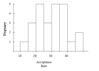 What is the approximate spread of the data?
A)25
B)30
C)40
D)50
What is the approximate spread of the data?A)25
B)30
C)40
D)50
Question
The stemplot below displays midterm exam scores for 34 students taking a calculus course. The highest possible test score was 100. The teacher declared that an exam grade of 65 or higher was good enough for a grade of C or better.  This stemplot is most similar to:
A)a boxplot of the data.
B)a time plot of the data with the observations taken in increasing order.
C)a histogram with class intervals 30 score < 40, 40 score < 50, etc.
D)reporting the five-number summary for the data, with the mean.
This stemplot is most similar to:A)a boxplot of the data.
B)a time plot of the data with the observations taken in increasing order.
C)a histogram with class intervals 30 score < 40, 40 score < 50, etc.
D)reporting the five-number summary for the data, with the mean.
Question
A large university is divided into six colleges, with most students graduating from one of four of these colleges. The following bar chart gives the distribution of the percent graduating from each of these four most popular colleges in 2003. 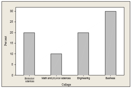 The percent of students graduating from either engineering or business is:
A)approximately 30%.
B)approximately 40%.
C)approximately 50%.
D)over 60%.
The percent of students graduating from either engineering or business is:A)approximately 30%.
B)approximately 40%.
C)approximately 50%.
D)over 60%.
Question
A sample of 40 employees from the local Honda plant was obtained, and the length of time (in months) that each employee has worked at the plant was recorded. A stemplot of these data follows. In the stemplot, 5|2 represents 52 months.  The percentage of employees in the sample that has worked at the plant for less than five years is:
A)approximately zero.
B)10%.
C)15%.
D)25%.
The percentage of employees in the sample that has worked at the plant for less than five years is:A)approximately zero.
B)10%.
C)15%.
D)25%.
Question
A poll was conducted of more than 50,000 buyers of new cars, 90 days after the cars were purchased. The data on problems per 100 vehicles for cars made by Toyota and General Motors (GM) are given in the time plot below for the years 1998-2004. The solid line is for GM and the dashed line is for Toyota. 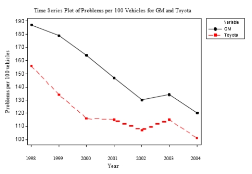 In 2002, the number of problems per 100 vehicles was:
A)about twice as high for GM as for Toyota.
B)about twice as high for Toyota than for GM.
C)about 20% higher for Toyota than for GM.
D)about 20% higher for GM than for Toyota.
In 2002, the number of problems per 100 vehicles was:A)about twice as high for GM as for Toyota.
B)about twice as high for Toyota than for GM.
C)about 20% higher for Toyota than for GM.
D)about 20% higher for GM than for Toyota.
Question
A poll was conducted of more than 50,000 buyers of new cars, 90 days after the cars were purchased. The data on problems per 100 vehicles for cars made by Toyota and General Motors (GM) are given in the time plot below for the years 1998-2004. The solid line is for GM and the dashed line is for Toyota.  Which of the following is a true statement?
A)The quality of cars is getting poorer for both companies.
B)The number of problems was higher for GM than for Toyota in each year.
C)The difference in the number of problems per 100 vehicles between GM and Toyota is less than 30 for each year.
D)All of the answer options are correct.
Which of the following is a true statement?A)The quality of cars is getting poorer for both companies.
B)The number of problems was higher for GM than for Toyota in each year.
C)The difference in the number of problems per 100 vehicles between GM and Toyota is less than 30 for each year.
D)All of the answer options are correct.
Question
Question
A sample of 40 employees from the local Honda plant was obtained, and the length of time (in months) that each employee has worked at the plant was recorded. A stemplot of these data follows. In the stemplot, 5|2 represents 52 months. 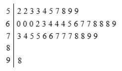 What would be a better way to represent this data set?
A)Display the data in a time plot.
B)Split the stems.
C)Use a pie chart.
D)Use a histogram with class width equal to 10.
What would be a better way to represent this data set?A)Display the data in a time plot.
B)Split the stems.
C)Use a pie chart.
D)Use a histogram with class width equal to 10.
Question
Question
The following is a histogram showing the distribution per year of the cumulative property damage caused by tornadoes, over the period 1950 to 1999, in each of the 50 states and Puerto Rico. The data are in millions of dollars, and the class intervals are 0 to < 10, 10 to < 20, and so forth. 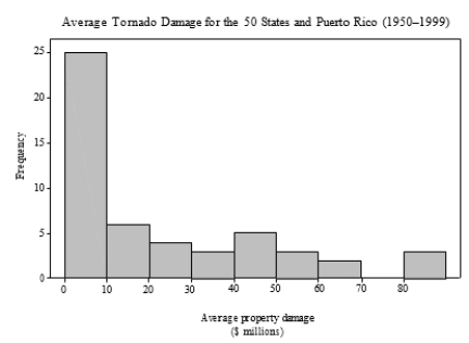 Which of the following statements is true?
A)Approximately 25% of the tornadoes caused less than $10 million in damage.
B)Approximately 25% of the annual reports of property damage were less than $10 million.
C)Approximately 50% of the annual reports of property damage were less than $10 million.
D)None of the answer options is correct.
Which of the following statements is true?A)Approximately 25% of the tornadoes caused less than $10 million in damage.
B)Approximately 25% of the annual reports of property damage were less than $10 million.
C)Approximately 50% of the annual reports of property damage were less than $10 million.
D)None of the answer options is correct.
Question
Question
Consumers' Union measured the gas mileage per gallon of thirty-eight 1998-99 model automobiles on a special test track. The following pie chart provides information about the country of manufacture of the cars that Consumers' Union used. 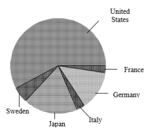 Based on this pie chart, we may conclude that:
A)Japanese cars get significantly lower gas mileage than cars of other countries. We know this because their slice of the pie is at the bottom of the chart.
B)More than half of the cars in the study were from the United States.
C)Swedish cars get gas mileages that are between those of Japanese cars and U.S. cars.
D)Mercedes Benz, Audi, Porsche, and BMW represent approximately one-quarter of the cars tested.
Based on this pie chart, we may conclude that:A)Japanese cars get significantly lower gas mileage than cars of other countries. We know this because their slice of the pie is at the bottom of the chart.
B)More than half of the cars in the study were from the United States.
C)Swedish cars get gas mileages that are between those of Japanese cars and U.S. cars.
D)Mercedes Benz, Audi, Porsche, and BMW represent approximately one-quarter of the cars tested.
Question
A large university is divided into six colleges, with most students graduating from one of four of these colleges. The following bar chart gives the distribution of the percent graduating from each of these four most popular colleges in 2003.  Which of the following is a correct statement?
A)A time plot of the 2003 distribution would be more informative.
B)The bar graph is skewed to the right.
C)The bar graph is skewed to the left.
D)None of the answer options is correct.
Which of the following is a correct statement?A)A time plot of the 2003 distribution would be more informative.
B)The bar graph is skewed to the right.
C)The bar graph is skewed to the left.
D)None of the answer options is correct.
Question
Question
Enteroliths are calcifications that form in the gut of horses. The stones can cause considerable morbidity and mortality. A study was conducted to investigate factors (such as age, diet, and environment) that may be related to the formation of enteroliths. The researchers decided to draw two histograms: one for horses with enteroliths (cases) and one for horses without (controls).  The number of horses 20 years and older:
A)is larger among the cases.
B)is smaller among the cases.
C)is about the same for both.
D)cannot be determined from the histogram.
The number of horses 20 years and older:A)is larger among the cases.
B)is smaller among the cases.
C)is about the same for both.
D)cannot be determined from the histogram.
Question
A survey of radio stations was conducted following the attacks on the World Trade Center in 2001. The station rankings were included in the survey. The histogram below has the interval limits 0 X< 50, 50 X < 100, 100 X < 150, 150 X < 200, and 200 X < 250. 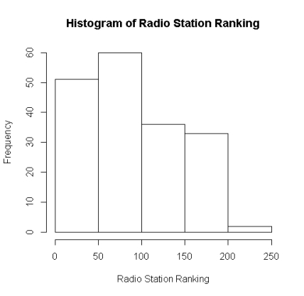 A ranking of 100:
A)will be counted in interval 2.
B)will be counted in interval 3.
C)can be in either interval 2 or 3.
D)cannot be determined from the histogram.
A ranking of 100:A)will be counted in interval 2.
B)will be counted in interval 3.
C)can be in either interval 2 or 3.
D)cannot be determined from the histogram.
Question
Question
A survey of radio stations was conducted following the attacks on the World Trade Center in 2001. One of the variables recorded was the region the station was located in (east, center, or west). 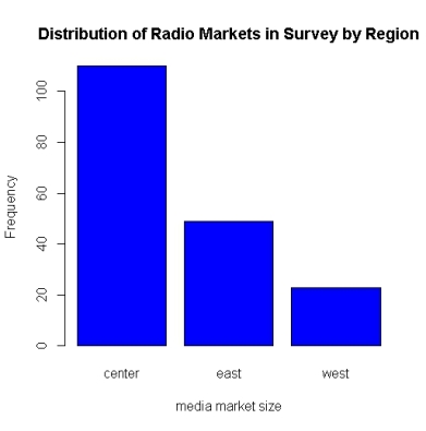 The bar chart above shows that the location of the majority of radio stations:
A)is in the west.
B)is in the center.
C)is in the east.
D)cannot be determined from a bar chart.
The bar chart above shows that the location of the majority of radio stations:A)is in the west.
B)is in the center.
C)is in the east.
D)cannot be determined from a bar chart.
Question
Question
A survey of radio stations was conducted following the attacks on the World Trade Center in 2001. The station rankings were included in the survey. The histogram below has the interval limits 0 X < 50; 50 X < 100, 100 X < 150; 150 X < 200; and 200 X < 250.  A plot of the histogram, above, shows that the approximate number of ranking between 50 and 100 is:
A)at least 50 but less than 65.
B)at least 40 but less than 50.
C)less than 40.
D)more than 65.
A plot of the histogram, above, shows that the approximate number of ranking between 50 and 100 is:A)at least 50 but less than 65.
B)at least 40 but less than 50.
C)less than 40.
D)more than 65.
Question
Veterinary researchers wanted to know if housing might be related to whether or not a horse develops enteroliths. Attached are side-by-side pie charts of housing for horses with enteroliths (cases) and horses without (controls). 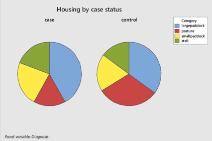 Based on these charts, it is reasonable to conclude that:
A)cases and controls are equally likely to be housed in a pasture.
B)cases are more likely to be housed in a pasture.
C)cases are less likely to be housed in a pasture.
D)the relationship cannot be determined from the pie chart.
Based on these charts, it is reasonable to conclude that:A)cases and controls are equally likely to be housed in a pasture.
B)cases are more likely to be housed in a pasture.
C)cases are less likely to be housed in a pasture.
D)the relationship cannot be determined from the pie chart.
Question
Enteroliths are calcifications that form in the gut of horses. The stones can cause considerable morbidity and mortality. A study was conducted to investigate factors (such as age, diet, and environment) that may be related to the formation of enteroliths. 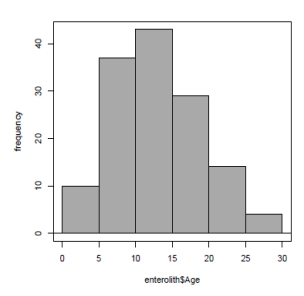 The histogram of age for the horses in the enteroliths study is:
A)slightly left-skewed.
B)symmetric.
C)bimodal.
D)slightly right-skewed.
The histogram of age for the horses in the enteroliths study is:A)slightly left-skewed.
B)symmetric.
C)bimodal.
D)slightly right-skewed.
Question
Question
Consumers' Union measured the gas mileage per gallon of thirty-eight 1998-99 model automobiles on a special test track. The following pie chart provides information about the country of manufacture of the cars that Consumers' Union used.  Which of the following bar graphs is equivalent to the pie chart?
A)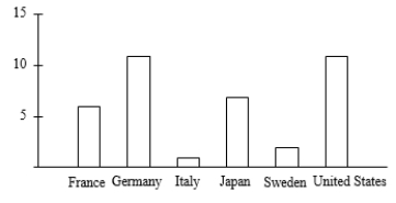
B)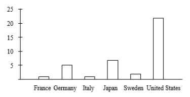
C)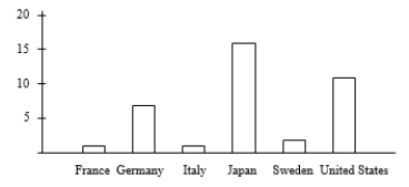
D)
Which of the following bar graphs is equivalent to the pie chart?A)
B)
C)
D)
Question
A survey of radio stations was conducted following the attacks on the World Trade Center in 2001. The station rankings were included in the survey. The attached histogram has the interval limits 0 X < 50; 50 X < 100, 100 X < 150; 150 X < 200; and 200 X < 250.  A plot of the histogram, above, shows the histogram to be:
A)symmetric.
B)left-skewed.
C)right-skewed.
D)bimodal.
A plot of the histogram, above, shows the histogram to be:A)symmetric.
B)left-skewed.
C)right-skewed.
D)bimodal.
Question
A survey of radio stations was conducted following the attacks on the World Trade Center in 2001. 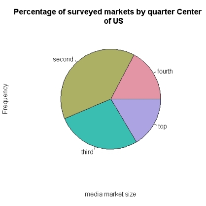 In the pie chart above, the proportion of radio markets in the second quartile in the center of the U.S. is approximately:
A)10%.
B)20%.
C)40%.
D)60%.
In the pie chart above, the proportion of radio markets in the second quartile in the center of the U.S. is approximately:A)10%.
B)20%.
C)40%.
D)60%.
Question
The 137 horses in a study on enteroliths, a type of stone in the gut, were housed either in a small paddock, a large paddock, a stall, or a grass pasture. 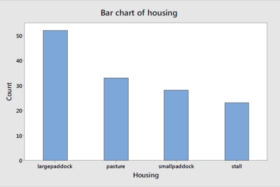 Based on the bar chart, the percent of horses living in paddocks, large or small, is approximately:
A)38%.
B)51%.
C)58%.
D)74%.
Based on the bar chart, the percent of horses living in paddocks, large or small, is approximately:A)38%.
B)51%.
C)58%.
D)74%.
Question
Enteroliths are calcifications that form in the gut of horses. The stones can cause considerable morbidity and mortality. A study was conducted to investigate factors (such as age, diet, and environment) that may be related to the formation of enteroliths. The researchers decided to draw two histograms: one for horses with enteroliths (cases) and one for horses without (controls). 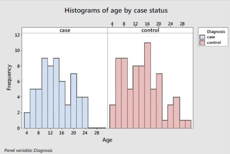 It can be deduced from the histograms that the cases are:
A)slightly younger than the controls.
B)slightly older than the controls.
C)about the same age as the controls.
D)None of the answer options is correct.
It can be deduced from the histograms that the cases are:A)slightly younger than the controls.
B)slightly older than the controls.
C)about the same age as the controls.
D)None of the answer options is correct.
Question

Unlock Deck
Sign up to unlock the cards in this deck!
Unlock Deck
Unlock Deck
1/36
Play
Full screen (f)
Deck 2: Picturing Distributions With Graphs
1
The stemplot below displays midterm exam scores for 34 students taking a calculus course. The highest possible test score was 100. The teacher declared that an exam grade of 65 or higher was good enough for a grade of C or better. The percent of students earning a grade of C or higher (as declared by the teacher) is closest to:
A)35%.
B)50%.
C)65%.
D)80%.
The percent of students earning a grade of C or higher (as declared by the teacher) is closest to:A)35%.
B)50%.
C)65%.
D)80%.
65%.
2
A company has three divisions and three conference rooms for meetings. To keep track of the use of their facilities, for each meeting the company records the name of the division holding the meeting, the conference room used, and the length of time of the meeting. Which of the variables is quantitative?
A)the name of the division holding the meeting
B)the conference room used
C)the length of time of the meeting
D)All of the answer options are correct.
A)the name of the division holding the meeting
B)the conference room used
C)the length of time of the meeting
D)All of the answer options are correct.
the length of time of the meeting
3
The following is a histogram showing the distribution per year of the cumulative property damage caused by tornadoes over the period 1950 to 1999 in each of the 50 states and Puerto Rico. The data are in millions of dollars, and the class intervals are 0 to < 10, 10 to < 20, and so forth. The histogram:
A)is skewed to the right.
B)shows one high outlier.
C)has a center of about $10 million dollars.
D)All of the answer options are correct.
The histogram:A)is skewed to the right.
B)shows one high outlier.
C)has a center of about $10 million dollars.
D)All of the answer options are correct.
All of the answer options are correct.
4
As part of a database of new births at a hospital, some variables recorded are the age of the mother, the marital status of the mother (such as single, married, or divorced), the weight of the baby, and the sex of the baby. Of these variables:
A)the individuals described are mothers and babies involved in births at a hospital.
B)the age of the mother and the weight of the baby are quantitative variables.
C)the sex of the baby and the marital status of the mother are categorical variables.
D)All of the answer options are correct.
A)the individuals described are mothers and babies involved in births at a hospital.
B)the age of the mother and the weight of the baby are quantitative variables.
C)the sex of the baby and the marital status of the mother are categorical variables.
D)All of the answer options are correct.
Unlock Deck
Unlock for access to all 36 flashcards in this deck.
Unlock Deck
k this deck
5
Employees at a large company are surveyed about their health insurance status. Employees are coded as "1" if health insurance is obtained through the company's benefit program, "2" if health insurance is obtained from another source (such as through a spouse's employment benefit program), or "0" if the employee does not have health insurance. This variable is:
A)numerical.
B)categorical.
C)quantitatively categorical.
D)All of the answer options are correct.
A)numerical.
B)categorical.
C)quantitatively categorical.
D)All of the answer options are correct.
Unlock Deck
Unlock for access to all 36 flashcards in this deck.
Unlock Deck
k this deck
6
Some of the variables from a survey conducted by the U.S. Census Bureau are the number of people living in a household, the total household gross income, and the ages of household residents. Which of the variables is quantitative?
A)the number of people living in a household
B)the total household gross income
C)the ages of household residents
D)All of the answer options are correct.
A)the number of people living in a household
B)the total household gross income
C)the ages of household residents
D)All of the answer options are correct.
Unlock Deck
Unlock for access to all 36 flashcards in this deck.
Unlock Deck
k this deck
7
The following is a histogram showing the distribution per year of the cumulative property damage caused by tornadoes, over the period 1950 to 1999, in each of the 50 states and Puerto Rico. The data are in millions of dollars, and the class intervals are 0 to < 10, 10 to < 20, and so forth. The percent of the data with average property damage of under $20 million dollars is about:
A)20%.
B)30%.
C)40%.
D)60%.
The percent of the data with average property damage of under $20 million dollars is about:A)20%.
B)30%.
C)40%.
D)60%.
Unlock Deck
Unlock for access to all 36 flashcards in this deck.
Unlock Deck
k this deck
8
The following histogram represents the distribution of acceptance rates (percent accepted) among 25 business schools in 2004. In each class interval, the left endpoint but not the right is included, so the class intervals are 10 rate < 15, 15 rate < 20, etc. What is the approximate spread of the data?
A)25
B)30
C)40
D)50
What is the approximate spread of the data?A)25
B)30
C)40
D)50
Unlock Deck
Unlock for access to all 36 flashcards in this deck.
Unlock Deck
k this deck
9
The stemplot below displays midterm exam scores for 34 students taking a calculus course. The highest possible test score was 100. The teacher declared that an exam grade of 65 or higher was good enough for a grade of C or better. This stemplot is most similar to:
A)a boxplot of the data.
B)a time plot of the data with the observations taken in increasing order.
C)a histogram with class intervals 30 score < 40, 40 score < 50, etc.
D)reporting the five-number summary for the data, with the mean.
This stemplot is most similar to:A)a boxplot of the data.
B)a time plot of the data with the observations taken in increasing order.
C)a histogram with class intervals 30 score < 40, 40 score < 50, etc.
D)reporting the five-number summary for the data, with the mean.
Unlock Deck
Unlock for access to all 36 flashcards in this deck.
Unlock Deck
k this deck
10
A large university is divided into six colleges, with most students graduating from one of four of these colleges. The following bar chart gives the distribution of the percent graduating from each of these four most popular colleges in 2003. The percent of students graduating from either engineering or business is:
A)approximately 30%.
B)approximately 40%.
C)approximately 50%.
D)over 60%.
The percent of students graduating from either engineering or business is:A)approximately 30%.
B)approximately 40%.
C)approximately 50%.
D)over 60%.
Unlock Deck
Unlock for access to all 36 flashcards in this deck.
Unlock Deck
k this deck
11
A sample of 40 employees from the local Honda plant was obtained, and the length of time (in months) that each employee has worked at the plant was recorded. A stemplot of these data follows. In the stemplot, 5|2 represents 52 months. The percentage of employees in the sample that has worked at the plant for less than five years is:
A)approximately zero.
B)10%.
C)15%.
D)25%.
The percentage of employees in the sample that has worked at the plant for less than five years is:A)approximately zero.
B)10%.
C)15%.
D)25%.
Unlock Deck
Unlock for access to all 36 flashcards in this deck.
Unlock Deck
k this deck
12
A poll was conducted of more than 50,000 buyers of new cars, 90 days after the cars were purchased. The data on problems per 100 vehicles for cars made by Toyota and General Motors (GM) are given in the time plot below for the years 1998-2004. The solid line is for GM and the dashed line is for Toyota. In 2002, the number of problems per 100 vehicles was:
A)about twice as high for GM as for Toyota.
B)about twice as high for Toyota than for GM.
C)about 20% higher for Toyota than for GM.
D)about 20% higher for GM than for Toyota.
In 2002, the number of problems per 100 vehicles was:A)about twice as high for GM as for Toyota.
B)about twice as high for Toyota than for GM.
C)about 20% higher for Toyota than for GM.
D)about 20% higher for GM than for Toyota.
Unlock Deck
Unlock for access to all 36 flashcards in this deck.
Unlock Deck
k this deck
13
A poll was conducted of more than 50,000 buyers of new cars, 90 days after the cars were purchased. The data on problems per 100 vehicles for cars made by Toyota and General Motors (GM) are given in the time plot below for the years 1998-2004. The solid line is for GM and the dashed line is for Toyota. Which of the following is a true statement?
A)The quality of cars is getting poorer for both companies.
B)The number of problems was higher for GM than for Toyota in each year.
C)The difference in the number of problems per 100 vehicles between GM and Toyota is less than 30 for each year.
D)All of the answer options are correct.
Which of the following is a true statement?A)The quality of cars is getting poorer for both companies.
B)The number of problems was higher for GM than for Toyota in each year.
C)The difference in the number of problems per 100 vehicles between GM and Toyota is less than 30 for each year.
D)All of the answer options are correct.
Unlock Deck
Unlock for access to all 36 flashcards in this deck.
Unlock Deck
k this deck
14
A description of different houses for sale includes the square footage of the house, whether or not the house has a finished basement, and the monthly electric bill. Which of the variables is categorical?
A)the square footage of the house
B)whether or not the house has a finished basement
C)the monthly electric bill
D)All of the answer options are correct.
A)the square footage of the house
B)whether or not the house has a finished basement
C)the monthly electric bill
D)All of the answer options are correct.
Unlock Deck
Unlock for access to all 36 flashcards in this deck.
Unlock Deck
k this deck
15
A sample of 40 employees from the local Honda plant was obtained, and the length of time (in months) that each employee has worked at the plant was recorded. A stemplot of these data follows. In the stemplot, 5|2 represents 52 months. What would be a better way to represent this data set?
A)Display the data in a time plot.
B)Split the stems.
C)Use a pie chart.
D)Use a histogram with class width equal to 10.
What would be a better way to represent this data set?A)Display the data in a time plot.
B)Split the stems.
C)Use a pie chart.
D)Use a histogram with class width equal to 10.
Unlock Deck
Unlock for access to all 36 flashcards in this deck.
Unlock Deck
k this deck
16
The difference between a frequency histogram and a relative frequency histogram is that the relative frequency histogram indicates:
A)counts on the vertical (y)axis, whereas a frequency histogram indicates percentages.
B)counts on the horizontal (x)axis, whereas a frequency histogram indicates percentages.
C)percentage of observations on the horizontal (x)axis, whereas a frequency histogram indicates counts.
D)percentage of observations on the vertical (y)axis, whereas a frequency histogram indicates counts.
Unlock Deck
Unlock for access to all 36 flashcards in this deck.
Unlock Deck
k this deck
17
The following is a histogram showing the distribution per year of the cumulative property damage caused by tornadoes, over the period 1950 to 1999, in each of the 50 states and Puerto Rico. The data are in millions of dollars, and the class intervals are 0 to < 10, 10 to < 20, and so forth. Which of the following statements is true?
A)Approximately 25% of the tornadoes caused less than $10 million in damage.
B)Approximately 25% of the annual reports of property damage were less than $10 million.
C)Approximately 50% of the annual reports of property damage were less than $10 million.
D)None of the answer options is correct.
Which of the following statements is true?A)Approximately 25% of the tornadoes caused less than $10 million in damage.
B)Approximately 25% of the annual reports of property damage were less than $10 million.
C)Approximately 50% of the annual reports of property damage were less than $10 million.
D)None of the answer options is correct.
Unlock Deck
Unlock for access to all 36 flashcards in this deck.
Unlock Deck
k this deck
18
What is the difference between a histogram and a bar chart?
A)There is no difference; they are exactly the same.
B)A histogram is a more accurate representation of a bar chart.
C)A bar chart displays a quantitative variable on the horizontal axis, whereas a histogram does not.
D)A bar chart displays a categorical variable on the horizontal axis, whereas a histogram does not.
Unlock Deck
Unlock for access to all 36 flashcards in this deck.
Unlock Deck
k this deck
19
Consumers' Union measured the gas mileage per gallon of thirty-eight 1998-99 model automobiles on a special test track. The following pie chart provides information about the country of manufacture of the cars that Consumers' Union used. Based on this pie chart, we may conclude that:
A)Japanese cars get significantly lower gas mileage than cars of other countries. We know this because their slice of the pie is at the bottom of the chart.
B)More than half of the cars in the study were from the United States.
C)Swedish cars get gas mileages that are between those of Japanese cars and U.S. cars.
D)Mercedes Benz, Audi, Porsche, and BMW represent approximately one-quarter of the cars tested.
Based on this pie chart, we may conclude that:A)Japanese cars get significantly lower gas mileage than cars of other countries. We know this because their slice of the pie is at the bottom of the chart.
B)More than half of the cars in the study were from the United States.
C)Swedish cars get gas mileages that are between those of Japanese cars and U.S. cars.
D)Mercedes Benz, Audi, Porsche, and BMW represent approximately one-quarter of the cars tested.
Unlock Deck
Unlock for access to all 36 flashcards in this deck.
Unlock Deck
k this deck
20
A large university is divided into six colleges, with most students graduating from one of four of these colleges. The following bar chart gives the distribution of the percent graduating from each of these four most popular colleges in 2003. Which of the following is a correct statement?
A)A time plot of the 2003 distribution would be more informative.
B)The bar graph is skewed to the right.
C)The bar graph is skewed to the left.
D)None of the answer options is correct.
Which of the following is a correct statement?A)A time plot of the 2003 distribution would be more informative.
B)The bar graph is skewed to the right.
C)The bar graph is skewed to the left.
D)None of the answer options is correct.
Unlock Deck
Unlock for access to all 36 flashcards in this deck.
Unlock Deck
k this deck
21
Which statement is the most important to consider when creating a pie chart?
A)You should never create a pie chart, because they are inaccurate.
B)The area of each of the slices must be proportional to the frequency with which the observation occurs.
C)Each observation must be contained within one (and only one)slice of the pie.
D)The area of each of the slices must be proportional to the frequency with which the observation occurs, and each observation must be contained within one (and only one)slice of the pie.
Unlock Deck
Unlock for access to all 36 flashcards in this deck.
Unlock Deck
k this deck
22
Enteroliths are calcifications that form in the gut of horses. The stones can cause considerable morbidity and mortality. A study was conducted to investigate factors (such as age, diet, and environment) that may be related to the formation of enteroliths. The researchers decided to draw two histograms: one for horses with enteroliths (cases) and one for horses without (controls). The number of horses 20 years and older:
A)is larger among the cases.
B)is smaller among the cases.
C)is about the same for both.
D)cannot be determined from the histogram.
The number of horses 20 years and older:A)is larger among the cases.
B)is smaller among the cases.
C)is about the same for both.
D)cannot be determined from the histogram.
Unlock Deck
Unlock for access to all 36 flashcards in this deck.
Unlock Deck
k this deck
23
A survey of radio stations was conducted following the attacks on the World Trade Center in 2001. The station rankings were included in the survey. The histogram below has the interval limits 0 X< 50, 50 X < 100, 100 X < 150, 150 X < 200, and 200 X < 250. A ranking of 100:
A)will be counted in interval 2.
B)will be counted in interval 3.
C)can be in either interval 2 or 3.
D)cannot be determined from the histogram.
A ranking of 100:A)will be counted in interval 2.
B)will be counted in interval 3.
C)can be in either interval 2 or 3.
D)cannot be determined from the histogram.
Unlock Deck
Unlock for access to all 36 flashcards in this deck.
Unlock Deck
k this deck
24
A survey of radio stations was conducted following the attacks on the World Trade Center in 2001. One of the variables recorded was the region the station was located in (east, center, or west). The variable "region" is:
A)quantitative, because region is not a number.
B)quantitative, because region is a number.
C)categorical, because region is a not a number.
D)categorical, because region is a number.
A)quantitative, because region is not a number.
B)quantitative, because region is a number.
C)categorical, because region is a not a number.
D)categorical, because region is a number.
Unlock Deck
Unlock for access to all 36 flashcards in this deck.
Unlock Deck
k this deck
25
A survey of radio stations was conducted following the attacks on the World Trade Center in 2001. One of the variables recorded was the region the station was located in (east, center, or west). The bar chart above shows that the location of the majority of radio stations:
A)is in the west.
B)is in the center.
C)is in the east.
D)cannot be determined from a bar chart.
The bar chart above shows that the location of the majority of radio stations:A)is in the west.
B)is in the center.
C)is in the east.
D)cannot be determined from a bar chart.
Unlock Deck
Unlock for access to all 36 flashcards in this deck.
Unlock Deck
k this deck
26
A survey of radio stations was conducted following the attacks on the World Trade Center in 2001. One of the variables recorded was the region the station was located in (east, center, or west). The variable "region" can be summarized in a graph by:
A)a bar chart.
B)a pie chart.
C)a histogram.
D)a bar chart or a pie chart.
A)a bar chart.
B)a pie chart.
C)a histogram.
D)a bar chart or a pie chart.
Unlock Deck
Unlock for access to all 36 flashcards in this deck.
Unlock Deck
k this deck
27
A survey of radio stations was conducted following the attacks on the World Trade Center in 2001. The station rankings were included in the survey. The histogram below has the interval limits 0 X < 50; 50 X < 100, 100 X < 150; 150 X < 200; and 200 X < 250. A plot of the histogram, above, shows that the approximate number of ranking between 50 and 100 is:
A)at least 50 but less than 65.
B)at least 40 but less than 50.
C)less than 40.
D)more than 65.
A plot of the histogram, above, shows that the approximate number of ranking between 50 and 100 is:A)at least 50 but less than 65.
B)at least 40 but less than 50.
C)less than 40.
D)more than 65.
Unlock Deck
Unlock for access to all 36 flashcards in this deck.
Unlock Deck
k this deck
28
Veterinary researchers wanted to know if housing might be related to whether or not a horse develops enteroliths. Attached are side-by-side pie charts of housing for horses with enteroliths (cases) and horses without (controls). Based on these charts, it is reasonable to conclude that:
A)cases and controls are equally likely to be housed in a pasture.
B)cases are more likely to be housed in a pasture.
C)cases are less likely to be housed in a pasture.
D)the relationship cannot be determined from the pie chart.
Based on these charts, it is reasonable to conclude that:A)cases and controls are equally likely to be housed in a pasture.
B)cases are more likely to be housed in a pasture.
C)cases are less likely to be housed in a pasture.
D)the relationship cannot be determined from the pie chart.
Unlock Deck
Unlock for access to all 36 flashcards in this deck.
Unlock Deck
k this deck
29
Enteroliths are calcifications that form in the gut of horses. The stones can cause considerable morbidity and mortality. A study was conducted to investigate factors (such as age, diet, and environment) that may be related to the formation of enteroliths. The histogram of age for the horses in the enteroliths study is:
A)slightly left-skewed.
B)symmetric.
C)bimodal.
D)slightly right-skewed.
The histogram of age for the horses in the enteroliths study is:A)slightly left-skewed.
B)symmetric.
C)bimodal.
D)slightly right-skewed.
Unlock Deck
Unlock for access to all 36 flashcards in this deck.
Unlock Deck
k this deck
30
An appropriate graphical way to display housing (stall, small paddock, large paddock, pasture, or other housing) for horses is given by:
A)a histogram.
B)a pie chart.
C)a stemplot.
D)All of the answer options are correct.
A)a histogram.
B)a pie chart.
C)a stemplot.
D)All of the answer options are correct.
Unlock Deck
Unlock for access to all 36 flashcards in this deck.
Unlock Deck
k this deck
31
Consumers' Union measured the gas mileage per gallon of thirty-eight 1998-99 model automobiles on a special test track. The following pie chart provides information about the country of manufacture of the cars that Consumers' Union used. Which of the following bar graphs is equivalent to the pie chart?
A)
B)
C)
D)
Which of the following bar graphs is equivalent to the pie chart?A)
B)
C)
D)
Unlock Deck
Unlock for access to all 36 flashcards in this deck.
Unlock Deck
k this deck
32
A survey of radio stations was conducted following the attacks on the World Trade Center in 2001. The station rankings were included in the survey. The attached histogram has the interval limits 0 X < 50; 50 X < 100, 100 X < 150; 150 X < 200; and 200 X < 250. A plot of the histogram, above, shows the histogram to be:
A)symmetric.
B)left-skewed.
C)right-skewed.
D)bimodal.
A plot of the histogram, above, shows the histogram to be:A)symmetric.
B)left-skewed.
C)right-skewed.
D)bimodal.
Unlock Deck
Unlock for access to all 36 flashcards in this deck.
Unlock Deck
k this deck
33
A survey of radio stations was conducted following the attacks on the World Trade Center in 2001. In the pie chart above, the proportion of radio markets in the second quartile in the center of the U.S. is approximately:
A)10%.
B)20%.
C)40%.
D)60%.
In the pie chart above, the proportion of radio markets in the second quartile in the center of the U.S. is approximately:A)10%.
B)20%.
C)40%.
D)60%.
Unlock Deck
Unlock for access to all 36 flashcards in this deck.
Unlock Deck
k this deck
34
The 137 horses in a study on enteroliths, a type of stone in the gut, were housed either in a small paddock, a large paddock, a stall, or a grass pasture. Based on the bar chart, the percent of horses living in paddocks, large or small, is approximately:
A)38%.
B)51%.
C)58%.
D)74%.
Based on the bar chart, the percent of horses living in paddocks, large or small, is approximately:A)38%.
B)51%.
C)58%.
D)74%.
Unlock Deck
Unlock for access to all 36 flashcards in this deck.
Unlock Deck
k this deck
35
Enteroliths are calcifications that form in the gut of horses. The stones can cause considerable morbidity and mortality. A study was conducted to investigate factors (such as age, diet, and environment) that may be related to the formation of enteroliths. The researchers decided to draw two histograms: one for horses with enteroliths (cases) and one for horses without (controls). It can be deduced from the histograms that the cases are:
A)slightly younger than the controls.
B)slightly older than the controls.
C)about the same age as the controls.
D)None of the answer options is correct.
It can be deduced from the histograms that the cases are:A)slightly younger than the controls.
B)slightly older than the controls.
C)about the same age as the controls.
D)None of the answer options is correct.
Unlock Deck
Unlock for access to all 36 flashcards in this deck.
Unlock Deck
k this deck
36
Enteroliths are calcifications that form in the gut of horses. The stones can cause considerable morbidity and mortality. A study was conducted to investigate factors (such as diet and environment) that may be related to the formation of enteroliths. Housing is a variable that is coded "1" for horses that live in a stall, "2" for horses that have access to a small paddock, "3" for horses that have a large paddock, "4" for horses that live in pasture, and "5" for other housing. Housing is a:
A)categorical variable.
B)quantitative variable.
C)numerical category.
D)None of the answer options is correct.
A)categorical variable.
B)quantitative variable.
C)numerical category.
D)None of the answer options is correct.
Unlock Deck
Unlock for access to all 36 flashcards in this deck.
Unlock Deck
k this deck
Unlock Deck
Unlock for access to all 36 flashcards in this deck.


