Understanding Basic Statistics 6th Edition by Charles Henry Brase,Corrinne Pellillo Brase
Edition 6ISBN: 978-1111827021Understanding Basic Statistics 6th Edition by Charles Henry Brase,Corrinne Pellillo Brase
Edition 6ISBN: 978-1111827021 Exercise 16
Expand Your Knowledge: Dotplot Another display technique that is somewhat similar to a histogram is a dotplot. In a dotplot, the data values are displayed along the horizontal axis. A dot is then plotted over each data value in the data set.
The next display shows a dotplot generated by Minitab (Graph Dotplot) for the number of licensed drivers per 1000 residents by state, including the District of Columbia (Source: U.S. Department of Transportation).
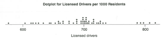
(a) From the dotplot, how many states have 600 or fewer licensed drivers per 1000 residents
(b) About what percentage of the states (out of 51) seem to have close to 800 licensed drivers per 1000 residents
(c) Consider the intervals 550-650, 650-750, and 750-850 licensed drivers per 1000 residents. In which interval do most of the states fall
The next display shows a dotplot generated by Minitab (Graph Dotplot) for the number of licensed drivers per 1000 residents by state, including the District of Columbia (Source: U.S. Department of Transportation).
(a) From the dotplot, how many states have 600 or fewer licensed drivers per 1000 residents
(b) About what percentage of the states (out of 51) seem to have close to 800 licensed drivers per 1000 residents
(c) Consider the intervals 550-650, 650-750, and 750-850 licensed drivers per 1000 residents. In which interval do most of the states fall
Explanation Verified
(a)
From the dotplot, only one state is...
Understanding Basic Statistics 6th Edition by Charles Henry Brase,Corrinne Pellillo Brase
Why don’t you like this exercise?
Other Minimum 8 character and maximum 255 character
Character 255


