Principles of Environmental Science 6th Edition by William Cunningham, Mary Cunningham
Edition 6ISBN: 978-1121779211Principles of Environmental Science 6th Edition by William Cunningham, Mary Cunningham
Edition 6ISBN: 978-1121779211 Exercise 2
Working with Graphs
Do you find it easier to evaluate trends in a graph or in a table of numbers? Many people find the visual presentation of a graph quicker to read than a table. But reading graphs takes practice, and it takes some patience. This exercise asks you to examine different kinds of graphs, as preparation for reading many others that will follow in this book. Solidifying this skill is extremely important for studying environmental science-and many other topics.
Examining Relationships
Many graphs show the relationship between two variables. Usually we want to know whether changes in one variable are associated with changes in the other. For example, has per capita income gone up or down as time has passed ( fig. 1 )? Or does fishing tend to be better or worse where there are more marine preserves ( fig. 2 )?
These two graphs have different styles because they show slightly different kinds of information. In figure 1, lines connect the data points to show that they represent changing values for a place. This graph, of course, shows several places simultaneously. Here, the question the graph answers is whether there is a change in income, and how great the change is. In figure 2, on the other hand, the question is whether there is a relationship between x and y.
Figure 1 Per capita income in different regions (in 2008 dollars). Overall income has climbed, but the gap between rich and poor countries as grown faster. D ata Source: World Bank.
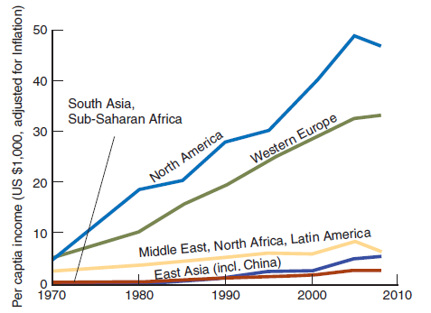
Figure 2 A scatter plot shows the relationship of x and y for many observations. Here each observation is a village.
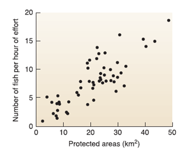
Figure 3 A pie chart shows proportions.
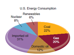
Figure 4 A bar graph shows values for classes or groups.
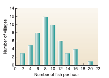
Some graphs ask what is the relative distribution of something? A pie chart is a common, easy-to-read method of showing the sizes of portions of a whole, for example, percentages of total energy consumption ( fig. 3 ). Bar charts also show relative amounts of something. For example, figure 4 shows relative amounts of villages with small and large fish catches. Note that we often use the words "graph" and "chart" interchangeably.
Elements of a Graph
The first step in reading a graph is to look at its elements. By convention, we put the dependent variable on the vertical (Y) axis and the independent (or explanatory) variable on the horizontal (X) axis. Axes are labeled, and tic marks show values along the axes.
Whenever you look at a graph, you should ask yourself a few questions to be sure you understand it. Answer the following questions for figure 1:
What are the units on the X-axis? What is the magnitude of the values (how small and how big are the numbers)?
Do you find it easier to evaluate trends in a graph or in a table of numbers? Many people find the visual presentation of a graph quicker to read than a table. But reading graphs takes practice, and it takes some patience. This exercise asks you to examine different kinds of graphs, as preparation for reading many others that will follow in this book. Solidifying this skill is extremely important for studying environmental science-and many other topics.
Examining Relationships
Many graphs show the relationship between two variables. Usually we want to know whether changes in one variable are associated with changes in the other. For example, has per capita income gone up or down as time has passed ( fig. 1 )? Or does fishing tend to be better or worse where there are more marine preserves ( fig. 2 )?
These two graphs have different styles because they show slightly different kinds of information. In figure 1, lines connect the data points to show that they represent changing values for a place. This graph, of course, shows several places simultaneously. Here, the question the graph answers is whether there is a change in income, and how great the change is. In figure 2, on the other hand, the question is whether there is a relationship between x and y.
Figure 1 Per capita income in different regions (in 2008 dollars). Overall income has climbed, but the gap between rich and poor countries as grown faster. D ata Source: World Bank.
Figure 2 A scatter plot shows the relationship of x and y for many observations. Here each observation is a village.
Figure 3 A pie chart shows proportions.
Figure 4 A bar graph shows values for classes or groups.
Some graphs ask what is the relative distribution of something? A pie chart is a common, easy-to-read method of showing the sizes of portions of a whole, for example, percentages of total energy consumption ( fig. 3 ). Bar charts also show relative amounts of something. For example, figure 4 shows relative amounts of villages with small and large fish catches. Note that we often use the words "graph" and "chart" interchangeably.
Elements of a Graph
The first step in reading a graph is to look at its elements. By convention, we put the dependent variable on the vertical (Y) axis and the independent (or explanatory) variable on the horizontal (X) axis. Axes are labeled, and tic marks show values along the axes.
Whenever you look at a graph, you should ask yourself a few questions to be sure you understand it. Answer the following questions for figure 1:
What are the units on the X-axis? What is the magnitude of the values (how small and how big are the numbers)?
Explanation Verified
The per capita income in different regions are shown in the below graph.
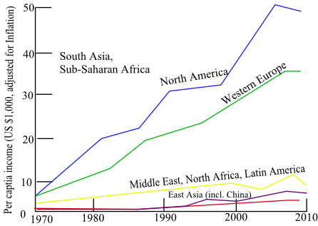 The above graph shows various per capita incomes of different nations in different time line. There blue line indicates the per capita income of North America. Green line indicates Western Europe. Yellow line indicates Middle East, North Africa and Latin America. Red line indicates South Asia and sub-Saharan Africa. Violet line indicates East Asia.
The units on the
 -axis is UD $ 1,000 adjusted for inflation. The magnitudes of the values are the differences of 10. The small number is 0 and the big number is 50.
The above graph shows various per capita incomes of different nations in different time line. There blue line indicates the per capita income of North America. Green line indicates Western Europe. Yellow line indicates Middle East, North Africa and Latin America. Red line indicates South Asia and sub-Saharan Africa. Violet line indicates East Asia. The units on the
-axis is UD $ 1,000 adjusted for inflation. The magnitudes of the values are the differences of 10. The small number is 0 and the big number is 50.Principles of Environmental Science 6th Edition by William Cunningham, Mary Cunningham
Why don’t you like this exercise?
Other Minimum 8 character and maximum 255 character
Character 255


