Principles of Environmental Science 6th Edition by William Cunningham, Mary Cunningham
Edition 6ISBN: 978-1121779211Principles of Environmental Science 6th Edition by William Cunningham, Mary Cunningham
Edition 6ISBN: 978-1121779211 Exercise 26
Communicating with Graphs
Graphs are pictorial representations of data designed to communicate information. They are particularly useful in conveying patterns and relationships. Most of us, when confronted by a page of numbers, tend to roll our eyes and turn to something else. A graph can simplify trends and highlight important information. If you read a newspaper or news magazine these days, you will undoubtedly see numerous graphs portraying a wide variety of statistics. Why are they used so widely and why do they make such powerful impressions on us?
Graphs can be used to explain, persuade, or inform. Like photographs or text, however, they also can be used to manipulate or even mislead the viewer. When you create a graph, you inevitably make decisions about what details to display, and which ones to omit. By selecting certain scales or methods of displaying data, you deliberately choose the message you intend to convey. It takes critical thinking skills to understand what a graph is (and isn't) showing.
Part A
Central questions addressed in this chapter are: How serious is the world population problem? Does it demand action? Many graphs present information about population growth, yet the impressions each conveys to the reader vary considerably, depending on the type of data used and the design of the graph. Reexamine figure 4.3, which presents a historical perspective on human population growth. What impressions do you draw from it? What conclusions do you suppose the person who originally created this graph intended for you to take away from this presentation? There are a number of differences in graphs that control your impressions of the problem. Compare figure 4.3 to figure 1. These two graphs look very different, but look again, carefully.
Figure 1 Growth of the world population, 1950-2050.

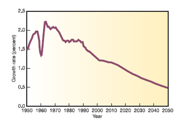
Figure 2 World population growth rates, 1950-2050.
Part B
There are other ways to plot population change. Compare figure 2 to figure 1.
What do the two Y-axes show?
Graphs are pictorial representations of data designed to communicate information. They are particularly useful in conveying patterns and relationships. Most of us, when confronted by a page of numbers, tend to roll our eyes and turn to something else. A graph can simplify trends and highlight important information. If you read a newspaper or news magazine these days, you will undoubtedly see numerous graphs portraying a wide variety of statistics. Why are they used so widely and why do they make such powerful impressions on us?
Graphs can be used to explain, persuade, or inform. Like photographs or text, however, they also can be used to manipulate or even mislead the viewer. When you create a graph, you inevitably make decisions about what details to display, and which ones to omit. By selecting certain scales or methods of displaying data, you deliberately choose the message you intend to convey. It takes critical thinking skills to understand what a graph is (and isn't) showing.
Part A
Central questions addressed in this chapter are: How serious is the world population problem? Does it demand action? Many graphs present information about population growth, yet the impressions each conveys to the reader vary considerably, depending on the type of data used and the design of the graph. Reexamine figure 4.3, which presents a historical perspective on human population growth. What impressions do you draw from it? What conclusions do you suppose the person who originally created this graph intended for you to take away from this presentation? There are a number of differences in graphs that control your impressions of the problem. Compare figure 4.3 to figure 1. These two graphs look very different, but look again, carefully.
Figure 1 Growth of the world population, 1950-2050.
Figure 2 World population growth rates, 1950-2050.
Part B
There are other ways to plot population change. Compare figure 2 to figure 1.
What do the two Y-axes show?
Explanation Verified
In Figure 1,
![]() - axis represe...
- axis represe...
Principles of Environmental Science 6th Edition by William Cunningham, Mary Cunningham
Why don’t you like this exercise?
Other Minimum 8 character and maximum 255 character
Character 255


