Environmental Science: A Global ConcernEnvironmental Science: A Global Concern 11th Edition by William Cunningham, Mary Ann Cunningham
Edition 11ISBN: 978-0697806451Environmental Science: A Global ConcernEnvironmental Science: A Global Concern 11th Edition by William Cunningham, Mary Ann Cunningham
Edition 11ISBN: 978-0697806451 Exercise 14
Graphs are one of the most common and important ways scientists communicate their results. Learning to understand graphing techniques-the language of graphs-will help you better understand this book.
Graphs are visual presentations of data that help us identify trends and understand relationships. We could present a table of numbers, but most of us have difficulty seeing a pattern in a field of numbers. In a graph, we can quickly and easily see trends and relationships.
Below are two graphs that appeared earlier in this chapter. Often we pass quickly over graphs like these that appear in text, but usually it's also rewarding to investigate them more closely, because their relationships can raise interesting questions. Answer the numbered questions below to make sure you understand the graphs shown.
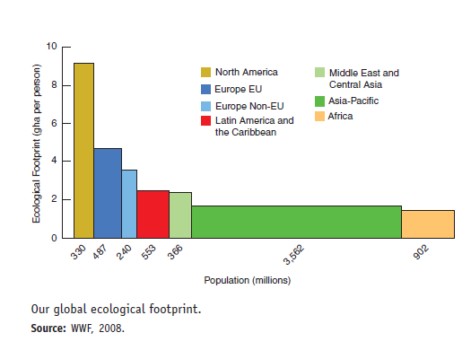
First let's examine the parts of a graph. Usually there is a horizontal axis (also known as the "X-axis") and a vertical axis (the "Y-axis"). Usually, in the relationship shown in a graph, one variable is thought to explain the other. So for example, as time passes, the size of our ecological footprint grows. In this case, time is an independent variable that (at least partly) explains changes in the dependent variable , footprint.
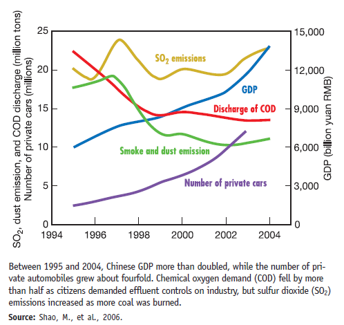
The complex left axis shows number of cars and how many millions of tons of pollutants are produced. The pollutants shown are SO2 and dust (sulfur dioxide and airborne dust are important air pollutants) and COD, or chemical oxygen demand (a measure of water contamination). As GDP has risen, have all three pollutants also risen
Graphs are visual presentations of data that help us identify trends and understand relationships. We could present a table of numbers, but most of us have difficulty seeing a pattern in a field of numbers. In a graph, we can quickly and easily see trends and relationships.
Below are two graphs that appeared earlier in this chapter. Often we pass quickly over graphs like these that appear in text, but usually it's also rewarding to investigate them more closely, because their relationships can raise interesting questions. Answer the numbered questions below to make sure you understand the graphs shown.
First let's examine the parts of a graph. Usually there is a horizontal axis (also known as the "X-axis") and a vertical axis (the "Y-axis"). Usually, in the relationship shown in a graph, one variable is thought to explain the other. So for example, as time passes, the size of our ecological footprint grows. In this case, time is an independent variable that (at least partly) explains changes in the dependent variable , footprint.
The complex left axis shows number of cars and how many millions of tons of pollutants are produced. The pollutants shown are SO2 and dust (sulfur dioxide and airborne dust are important air pollutants) and COD, or chemical oxygen demand (a measure of water contamination). As GDP has risen, have all three pollutants also risen
Explanation Verified
The rapid development in the economy lea...
Environmental Science: A Global ConcernEnvironmental Science: A Global Concern 11th Edition by William Cunningham, Mary Ann Cunningham
Why don’t you like this exercise?
Other Minimum 8 character and maximum 255 character
Character 255


