Environmental Science: A Global ConcernEnvironmental Science: A Global Concern 11th Edition by William Cunningham, Mary Ann Cunningham
Edition 11ISBN: 978-0697806451Environmental Science: A Global ConcernEnvironmental Science: A Global Concern 11th Edition by William Cunningham, Mary Ann Cunningham
Edition 11ISBN: 978-0697806451 Exercise 20
Uncertainty is a key idea in science. We can rarely have absolute proof in experimental results, because our conclusions rest on observations, but we only have a small sample of all possible observations. Because uncertainty is always present, it's useful to describe how much uncertainty you have, relative to what you know. It might seem ironic, but in science, knowing about uncertainty increases our confidence in our conclusions.
The graph in this chapter's opening case study is reproduced at right. This graph shows change in biomass within small, square plots (see plots in figure) after a severe drought. Because more than 200 replicate (repeated test) plots were used, this study was able to give an estimate of uncertainty. This uncertainty is shown with error bars. In this graph, dots show means for groups of test plots; the error bars show the range in which that mean could have fallen, if there had been a slightly different set of test plots.
Often we don't graph uncertainty measures because we want to communicate the overall trend in simplified form. (How often have you seen error bars in a graph in the newspaper ) But error estimates are important if you really want to give readers confidence in your story. Let's examine the error bars in this graph.
To begin, as always, make sure you understand what the axes show. This graph is a relatively complex one, so be patient.
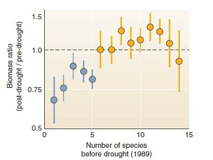
What is the axis label on the Y-axis What does a value of 0.75 mean A value of 1.0
(Note: the Y-axis doesn't change at a constant rate. It changes logarithmically. This means values at the low end are more visible.)
FIGURE
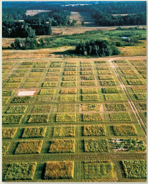
Experimental grassland plots at Cedar Creek.
The graph in this chapter's opening case study is reproduced at right. This graph shows change in biomass within small, square plots (see plots in figure) after a severe drought. Because more than 200 replicate (repeated test) plots were used, this study was able to give an estimate of uncertainty. This uncertainty is shown with error bars. In this graph, dots show means for groups of test plots; the error bars show the range in which that mean could have fallen, if there had been a slightly different set of test plots.
Often we don't graph uncertainty measures because we want to communicate the overall trend in simplified form. (How often have you seen error bars in a graph in the newspaper ) But error estimates are important if you really want to give readers confidence in your story. Let's examine the error bars in this graph.
To begin, as always, make sure you understand what the axes show. This graph is a relatively complex one, so be patient.
What is the axis label on the Y-axis What does a value of 0.75 mean A value of 1.0
(Note: the Y-axis doesn't change at a constant rate. It changes logarithmically. This means values at the low end are more visible.)
FIGURE
Experimental grassland plots at Cedar Creek.
Explanation Verified
With reference to the graph (refer Figur...
Environmental Science: A Global ConcernEnvironmental Science: A Global Concern 11th Edition by William Cunningham, Mary Ann Cunningham
Why don’t you like this exercise?
Other Minimum 8 character and maximum 255 character
Character 255


