
Environmental Science: A Global ConcernEnvironmental Science: A Global Concern 11th Edition by William Cunningham, Mary Ann Cunningham
Edition 11ISBN: 978-0697806451Environmental Science: A Global ConcernEnvironmental Science: A Global Concern 11th Edition by William Cunningham, Mary Ann Cunningham
Edition 11ISBN: 978-0697806451 Exercise 6
Uncertainty is a key idea in science. We can rarely have absolute proof in experimental results, because our conclusions rest on observations, but we only have a small sample of all possible observations. Because uncertainty is always present, it's useful to describe how much uncertainty you have, relative to what you know. It might seem ironic, but in science, knowing about uncertainty increases our confidence in our conclusions.
The graph in this chapter's opening case study is reproduced at right. This graph shows change in biomass within small, square plots (see plots in figure) after a severe drought. Because more than 200 replicate (repeated test) plots were used, this study was able to give an estimate of uncertainty. This uncertainty is shown with error bars. In this graph, dots show means for groups of test plots; the error bars show the range in which that mean could have fallen, if there had been a slightly different set of test plots.
Often we don't graph uncertainty measures because we want to communicate the overall trend in simplified form. (How often have you seen error bars in a graph in the newspaper ) But error estimates are important if you really want to give readers confidence in your story. Let's examine the error bars in this graph.
To begin, as always, make sure you understand what the axes show. This graph is a relatively complex one, so be patient.
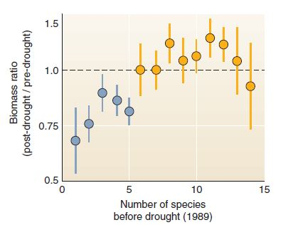
How many of the blue error bars overlap the dotted line (no change in biomass) How many of the yellow error bars overlap the dotted line Are there any yellow bars entirely above the 0 line
Where the error bars fall entirely below 1, we can be quite sure that, even if we had had a different set of plots, the afterdrought biomass would still have declined. Where the error bars include a value of 1, the averages are not significantly different from 1 (or no change).
The conclusions of this study rest on the fact that the blue bars showed nearly-certain declines in biomass, while the yellow (higher-diversity) bars showed either no change or increases in biomass.
Thus the whole paper boiled down to the question of which error bars crossed the dotted line! But the implications of the study are profound: they demonstrate a clear relationship between biodiversity and recovery from drought, at least for this study. One of the exciting things about scientific methods, and of statistics, is that they let us use simple, unambiguous tests to answer important questions.
FIGURE
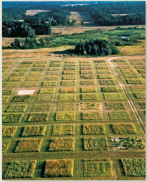
Experimental grassland plots at Cedar Creek.
The graph in this chapter's opening case study is reproduced at right. This graph shows change in biomass within small, square plots (see plots in figure) after a severe drought. Because more than 200 replicate (repeated test) plots were used, this study was able to give an estimate of uncertainty. This uncertainty is shown with error bars. In this graph, dots show means for groups of test plots; the error bars show the range in which that mean could have fallen, if there had been a slightly different set of test plots.
Often we don't graph uncertainty measures because we want to communicate the overall trend in simplified form. (How often have you seen error bars in a graph in the newspaper ) But error estimates are important if you really want to give readers confidence in your story. Let's examine the error bars in this graph.
To begin, as always, make sure you understand what the axes show. This graph is a relatively complex one, so be patient.
How many of the blue error bars overlap the dotted line (no change in biomass) How many of the yellow error bars overlap the dotted line Are there any yellow bars entirely above the 0 line
Where the error bars fall entirely below 1, we can be quite sure that, even if we had had a different set of plots, the afterdrought biomass would still have declined. Where the error bars include a value of 1, the averages are not significantly different from 1 (or no change).
The conclusions of this study rest on the fact that the blue bars showed nearly-certain declines in biomass, while the yellow (higher-diversity) bars showed either no change or increases in biomass.
Thus the whole paper boiled down to the question of which error bars crossed the dotted line! But the implications of the study are profound: they demonstrate a clear relationship between biodiversity and recovery from drought, at least for this study. One of the exciting things about scientific methods, and of statistics, is that they let us use simple, unambiguous tests to answer important questions.
FIGURE
Experimental grassland plots at Cedar Creek.
Explanation Verified
With reference to the graph (refer figur...
Environmental Science: A Global ConcernEnvironmental Science: A Global Concern 11th Edition by William Cunningham, Mary Ann Cunningham
Why don’t you like this exercise?
Other Minimum 8 character and maximum 255 character
Character 255


