Environmental Science: A Global ConcernEnvironmental Science: A Global Concern 11th Edition by William Cunningham, Mary Ann Cunningham
Edition 11ISBN: 978-0697806451Environmental Science: A Global ConcernEnvironmental Science: A Global Concern 11th Edition by William Cunningham, Mary Ann Cunningham
Edition 11ISBN: 978-0697806451 Exercise 14
As you've learned in this chapter, temperature and moisture are critical factors in determining the distribution and health of ecosystems. But how do you read the climate and precipitation graphs that accompany the description of each biome To begin, examine the three climate graphs in this box. These graphs show annual trends in temperature and precipitation (rainfall and snow). They also indicate the relationship between potential evaporation, which depends on temperature and precipitation. When evaporation exceeds precipitation, dry conditions result (yellow areas). Extremely wet months are shaded dark blue on the graphs. Moist climates may vary in precipitation rates, but evaporation rarely exceeds precipitation. Months above freezing temperature (shaded brown on the X-axis) have most evaporation. Comparing these climate graphs helps us understand the different seasonal conditions that control plant and animal lives in different biomes.
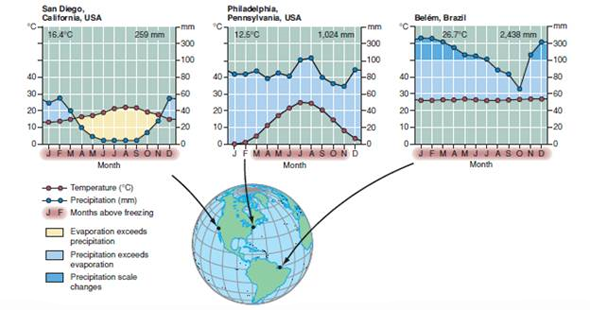
Moisture availability depends on temperature as well as precipitation. The horizontal axis on these climate diagrams shows months of the year; vertical axes show temperature ( left side ) and precipitation ( right ). The number of dry months ( shaded yellow ) and wetter months ( blue ) varies with geographic location. Mean annual temperature (°C) and precipitation (mm) are shown at the top of each graph.
What do these temperatures correspond to in Fahrenheit ( Hint: look at the table in the back of your book).
Explanation Verified
Climate graphs- represent the annual pre...
Environmental Science: A Global ConcernEnvironmental Science: A Global Concern 11th Edition by William Cunningham, Mary Ann Cunningham
Why don’t you like this exercise?
Other Minimum 8 character and maximum 255 character
Character 255


