Environmental Science: A Global ConcernEnvironmental Science: A Global Concern 11th Edition by William Cunningham, Mary Ann Cunningham
Edition 11ISBN: 978-0697806451Environmental Science: A Global ConcernEnvironmental Science: A Global Concern 11th Edition by William Cunningham, Mary Ann Cunningham
Edition 11ISBN: 978-0697806451 Exercise 13
Graphs are pictorial representations of data designed to communicate information. They are particularly useful in conveying patterns and relationships. Most of us, when confronted by a page of numbers, tend to roll our eyes and turn to something else. A graph can simplify trends and highlight important information. If you read a newspaper or news magazine these days, you will undoubtedly see numerous graphs portraying a wide variety of statistics. Why are they used so widely and why do they make such powerful impressions on us
Graphs can be used to explain, persuade, or inform. Like photographs or text, however, they also can be used to manipulate or even mislead the viewer. When you create a graph, you inevitably make decisions about what details to display, and which ones to omit. By selecting certain scales or methods of displaying data, you deliberately choose the message you intend to convey. It takes critical thinking skills to understand what a graph is (and isn't) showing.
Central questions addressed in this chapter are: How serious is the world population problem Does it demand action Many graphs present information about population growth, yet the impressions each conveys to the reader vary considerably, depending on the type of data used and the design of the graph.
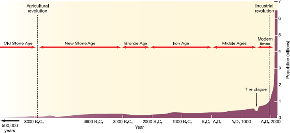
Reexamine figure 7.3, which presents a historical perspective on human population growth. What impressions do you draw from it What conclusions do you suppose the person who originally created this graph intended for you to take away form this presentation Does it give the impression that human numbers are growing explosively Does choosing a 5, 000-year time horizon emphasize this idea
Now look at figure 1. It plots world population growth, as does figure 7.3, but gives a very different picture. By choosing only a 100-year time horizon, the author of figure 1 makes it much easier to see precisely what's happening in this century, but provides a very different emotional reaction than figure 7.3. Clearly, these two graphs were intended to convey different messages. Is one more accurate than the other Not necessarily; they're just showing different aspects of the same data set. But if you weren't aware that there's more than one way to display information, you might think that only one presentation is valid.
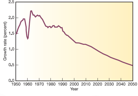
Now study figure 2. Why does it look so different from the other two Notice that the Y-axis is rate of growth rather than total population. Again, this graph can be derived from the same data set, but it gives yet another message. The rate of population growth is slowing. Fifty years from now, we could be approaching a zero growth rate. This doesn't address what the total population will be at that point. It could well be the 9 billion predicted by figure 1.
FIGURE 1
Growth of the world population, 1950-2050.
Source: U.S. Census Bureau, 2006.
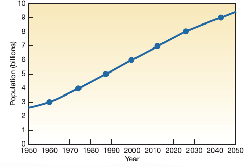
FIGURE 2
World population growth rates, 1950-2050.
Source: U.S. Census Bureau, 2006.
In fact, if you look closely at the curve between 2040 and 2050 in figure 1, you might detect that the rate of growth is slowing, but when the Y-scale is in billions of people, the difference between a 0.7 and 0.5 percent growth rate is very small.
What do we learn from this exercise All three graphs are probably correct, but each was designed to communicate different information. It's helpful to ask yourself, when you look at each graph, what did the author intend to say Are there other ways to display these same data Would it give a different impression, or tell a different story if you did so
FIGURE 7.3
Human population levels through history. Since about A.D. 1000, our population curve has assumed a J shape. Are we on the upward slope of a population overshoot Will we be able to adjust our population growth to an S curve Or can we just continue the present trend indefinitely
Graphs can be used to explain, persuade, or inform. Like photographs or text, however, they also can be used to manipulate or even mislead the viewer. When you create a graph, you inevitably make decisions about what details to display, and which ones to omit. By selecting certain scales or methods of displaying data, you deliberately choose the message you intend to convey. It takes critical thinking skills to understand what a graph is (and isn't) showing.
Central questions addressed in this chapter are: How serious is the world population problem Does it demand action Many graphs present information about population growth, yet the impressions each conveys to the reader vary considerably, depending on the type of data used and the design of the graph.
Reexamine figure 7.3, which presents a historical perspective on human population growth. What impressions do you draw from it What conclusions do you suppose the person who originally created this graph intended for you to take away form this presentation Does it give the impression that human numbers are growing explosively Does choosing a 5, 000-year time horizon emphasize this idea
Now look at figure 1. It plots world population growth, as does figure 7.3, but gives a very different picture. By choosing only a 100-year time horizon, the author of figure 1 makes it much easier to see precisely what's happening in this century, but provides a very different emotional reaction than figure 7.3. Clearly, these two graphs were intended to convey different messages. Is one more accurate than the other Not necessarily; they're just showing different aspects of the same data set. But if you weren't aware that there's more than one way to display information, you might think that only one presentation is valid.
Now study figure 2. Why does it look so different from the other two Notice that the Y-axis is rate of growth rather than total population. Again, this graph can be derived from the same data set, but it gives yet another message. The rate of population growth is slowing. Fifty years from now, we could be approaching a zero growth rate. This doesn't address what the total population will be at that point. It could well be the 9 billion predicted by figure 1.
FIGURE 1
Growth of the world population, 1950-2050.
Source: U.S. Census Bureau, 2006.
FIGURE 2
World population growth rates, 1950-2050.
Source: U.S. Census Bureau, 2006.
In fact, if you look closely at the curve between 2040 and 2050 in figure 1, you might detect that the rate of growth is slowing, but when the Y-scale is in billions of people, the difference between a 0.7 and 0.5 percent growth rate is very small.
What do we learn from this exercise All three graphs are probably correct, but each was designed to communicate different information. It's helpful to ask yourself, when you look at each graph, what did the author intend to say Are there other ways to display these same data Would it give a different impression, or tell a different story if you did so
FIGURE 7.3
Human population levels through history. Since about A.D. 1000, our population curve has assumed a J shape. Are we on the upward slope of a population overshoot Will we be able to adjust our population growth to an S curve Or can we just continue the present trend indefinitely
Explanation Verified
The graphs that are drawn represents a d...
Environmental Science: A Global ConcernEnvironmental Science: A Global Concern 11th Edition by William Cunningham, Mary Ann Cunningham
Why don’t you like this exercise?
Other Minimum 8 character and maximum 255 character
Character 255


