Environmental Science: A Global ConcernEnvironmental Science: A Global Concern 11th Edition by William Cunningham, Mary Ann Cunningham
Edition 11ISBN: 978-0697806451Environmental Science: A Global ConcernEnvironmental Science: A Global Concern 11th Edition by William Cunningham, Mary Ann Cunningham
Edition 11ISBN: 978-0697806451 Exercise 9
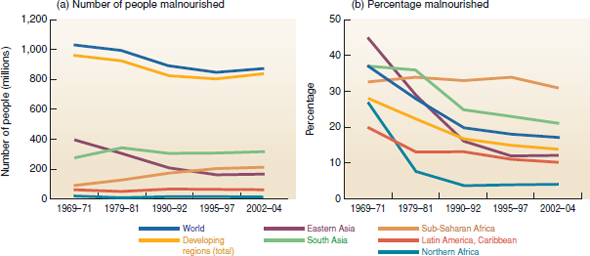
What is the best way to describe trends in an important subject such as world hunger The graphs in figure 9.2 show hunger trends in two ways. Look at those two graphs, and see what the vertical axis (the Y-axis) shows. The graph below shows yet another way to describe trends. In this case, you're looking at index values, that is, values adjusted to be all on the same scale or magnitude.
Why would you want to adjust values to the same magnitude, instead of just showing original numbers One reason might be that values vary a great deal among regions, and it's hard to compare trends on the same graph. Another reason is that you might be more interested in the amount of change than in the absolute numbers. That is, you know there are a lot of undernourished people in sub-Saharan Africa, but you might want to know if the situation is getting worse or better.
In this case, for each region, we simply divided each year's value by the first year's value. This way the index value shows the amount relative to our start point-it shows the amount of change. Look at this graph carefully, and compare it to figure 9.2 as you answer the questions below
.
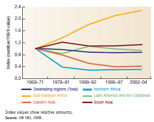
Which region has had the most relative decline Which region has increased most If each point on a line shows how many people were hungry relative to the original point
(1969-1971), then what does a value of 0.8 represent, in terms of percentage A value of 1.6 A value of 1.0
FIGURE 9.2
Changes in numbers and rates of malnourishment, by region.
Why would you want to adjust values to the same magnitude, instead of just showing original numbers One reason might be that values vary a great deal among regions, and it's hard to compare trends on the same graph. Another reason is that you might be more interested in the amount of change than in the absolute numbers. That is, you know there are a lot of undernourished people in sub-Saharan Africa, but you might want to know if the situation is getting worse or better.
In this case, for each region, we simply divided each year's value by the first year's value. This way the index value shows the amount relative to our start point-it shows the amount of change. Look at this graph carefully, and compare it to figure 9.2 as you answer the questions below
.
Which region has had the most relative decline Which region has increased most If each point on a line shows how many people were hungry relative to the original point
(1969-1971), then what does a value of 0.8 represent, in terms of percentage A value of 1.6 A value of 1.0
FIGURE 9.2
Changes in numbers and rates of malnourishment, by region.
Explanation Verified
The graph that is used to express the hu...
Environmental Science: A Global ConcernEnvironmental Science: A Global Concern 11th Edition by William Cunningham, Mary Ann Cunningham
Why don’t you like this exercise?
Other Minimum 8 character and maximum 255 character
Character 255


