
Environmental Science: A Global ConcernEnvironmental Science: A Global Concern 11th Edition by William Cunningham, Mary Ann Cunningham
Edition 11ISBN: 978-0697806451Environmental Science: A Global ConcernEnvironmental Science: A Global Concern 11th Edition by William Cunningham, Mary Ann Cunningham
Edition 11ISBN: 978-0697806451 Exercise 22
We've often used very large numbers in this book. Millions of people suffer from common diseases. Hundreds of millions are moving from the country to the city. Billions of people will probably be added to the world population in the next half century. Cities that didn't exist a few decades ago now have millions of residents. How can we plot such rapid growth and such huge numbers If you use ordinary graph paper, making a scale that goes to millions or billions will run off the edge of the page unless you make the units very large.
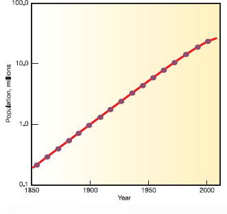
Figure 1, for example, shows the growth of Mumbai, India, over the past 150 years plotted with an arithmetic scale (showing constant intervals) for the Y-axis. It looks as if there is very little growth in the first third of this series and then explosive growth during the last few decades, yet we know that the rate of growth was actually greater at the beginning than at the end of this time. How could we display this differently One way to make the graph easier to interpret is to use a logarithmic scale. A logarithmic scale, or "log scale, " progresses by factor of 10. So the Y-axis would be numbered 0, 1, 10, 100, 1, 000.... The effect on a graph is to spread out the smaller values and compress the larger values.In figure 2, the same data are plotted using a log scale for the Y-axis, which makes it much easier to see what happened throughout this time period.
FIGURE 1
The growth of Mumbai.
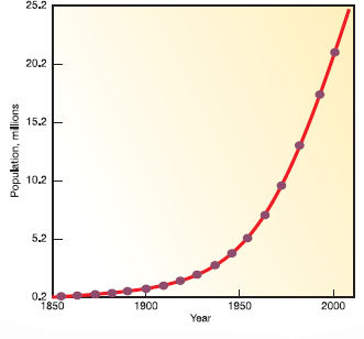
FIGURE 2
The growth of Mumbai.
How many lived there in 2000
Figure 1, for example, shows the growth of Mumbai, India, over the past 150 years plotted with an arithmetic scale (showing constant intervals) for the Y-axis. It looks as if there is very little growth in the first third of this series and then explosive growth during the last few decades, yet we know that the rate of growth was actually greater at the beginning than at the end of this time. How could we display this differently One way to make the graph easier to interpret is to use a logarithmic scale. A logarithmic scale, or "log scale, " progresses by factor of 10. So the Y-axis would be numbered 0, 1, 10, 100, 1, 000.... The effect on a graph is to spread out the smaller values and compress the larger values.In figure 2, the same data are plotted using a log scale for the Y-axis, which makes it much easier to see what happened throughout this time period.
FIGURE 1
The growth of Mumbai.
FIGURE 2
The growth of Mumbai.
How many lived there in 2000
Explanation Verified
The numbers are expressed in millions fo...
Environmental Science: A Global ConcernEnvironmental Science: A Global Concern 11th Edition by William Cunningham, Mary Ann Cunningham
Why don’t you like this exercise?
Other Minimum 8 character and maximum 255 character
Character 255


