Principles of Environmental Science 7th Edition by William Cunningham,Mary Cunningham
Edition 7ISBN: 978-0071314947Principles of Environmental Science 7th Edition by William Cunningham,Mary Cunningham
Edition 7ISBN: 978-0071314947 Exercise 11
Working with Graphs
To understand trends and compare values in environmental science, we need to examine a great many numbers. Most people find it hard to quickly assess large amounts of data in a table. Graphing a set of data makes it easier to see patterns, trends, and relationships. For example, scatter plots show relationships between two variables, while bar graphs show the range of values in a set (figures 1 and 2). Reading graphs takes practice, but it is an essential skill that will serve you well in this course and others.
You will encounter several common types of graphs in this book. Go to the Data Analysis exercise on Connect to practice these skills and demonstrate your knowledge of how to read and use graphs.
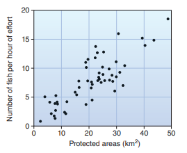
Figure 1 A scatter plot shows the relationship of x and y for many observations. Here each observation is a village.
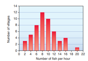
Figure 2 A bar graph shows values by groups or classes.
To understand trends and compare values in environmental science, we need to examine a great many numbers. Most people find it hard to quickly assess large amounts of data in a table. Graphing a set of data makes it easier to see patterns, trends, and relationships. For example, scatter plots show relationships between two variables, while bar graphs show the range of values in a set (figures 1 and 2). Reading graphs takes practice, but it is an essential skill that will serve you well in this course and others.
You will encounter several common types of graphs in this book. Go to the Data Analysis exercise on Connect to practice these skills and demonstrate your knowledge of how to read and use graphs.
Figure 1 A scatter plot shows the relationship of x and y for many observations. Here each observation is a village.
Figure 2 A bar graph shows values by groups or classes.
Explanation

This question doesn’t have an expert verified answer yet, let Examlex AI Copilot help.
Principles of Environmental Science 7th Edition by William Cunningham,Mary Cunningham
Why don’t you like this exercise?
Other Minimum 8 character and maximum 255 character
Character 255


