
Managing for Quality and Performance Excellence 10th Edition by James Evans ,William Lindsay
Edition 10ISBN: 978-1305662544Managing for Quality and Performance Excellence 10th Edition by James Evans ,William Lindsay
Edition 10ISBN: 978-1305662544 Exercise 52
This case study involves a large automotive parts distribution center in Europe. Car dealerships and repair garages from several countries call in orders for replacement parts needed to repair various types of motor vehicles. When an order is received, the distribution center must quickly locate the requested parts and ship them to the repair facility. Time is of the essence because car owners typically become increasingly upset the longer their vehicles are out of service.
Because the distribution center was having trouble shipping orders on time, many of its customers were unhappy and threatening to switch to other part distributors. To appease these customers, the manager of the center promised all orders would be delivered within 24 hours or the customer would get the parts at no charge. The manager then assembled a team to discover ways to reduce order processing time so at least 98 percent of orders would meet the 24-hour deadline.
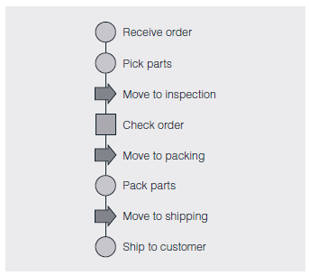
To better understand the situation, the team decided to draw a map showing how an order was received, filled, checked, packed, and finally shipped to the customer. After discussing the required steps and actually following an order from start to finish, the team created a flowchart of the entire order fulfillment process. The diagram, which is shown in Figure 9.19, identifies those activities the team had the power to change and, it was hoped, improve. This type of layout also encouraged every team member to focus on the big picture rather than on only the particular activity in which he or she worked.
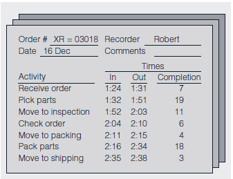
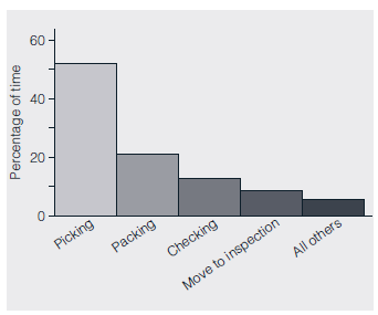
To determine where the longest time delays were occurring, the team randomly chose 50 orders from those received during a one-week period. As members tracked these selected orders through the distribution center, they noted the time each entered and left the various activity areas appearing on the flowchart. To ensure these times were accurately and consistently recorded, the team designed the check sheet shown in Figure 9.20. One sheet was used per order, with the completion time for a given activity computed by subtracting its in time from its out time. For example, order XR-03018 began the "pack parts" activity at 2:16 P.M. and finished at 2:34 P.M. Therefore, the time to complete this particular activity was 18 minutes. At the end of the week, the average completion time for each activity was calculated by adding its 50 completion times-one for each of the 50 orders tracked-and dividing this total by 50. When these average times were analyzed with the Pareto diagram in Figure 9.21, picking time was identified as the largest contributor to order processing delays, representing about 52 percent of the total time needed to process an order.
FIGURE 9.19 Flowchart for the Order Fulfillment Process
Source: Reprinted with permission from Davis R. Bothe, ?Improve Service and Administration,? Quality Progress , September 2003, pp. 53-57.
FIGURE 9.20 Check Sheet for Recording Times
Source: Reprinted with permission from Davis R. Bothe, ?Improve Service and Administration,? Quality Progress , September 2003, pp. 53-57.
Based on this new information, the team refined its original mission statement, ?Reduce the time for processing an order,? to the more specific, ?Reduce the time for picking parts.? With the scope of the search narrowed to just the picking operation, members invited some of the part pickers to join the team because these personnel were the local experts in picking parts and possessed the most knowledge about the function.
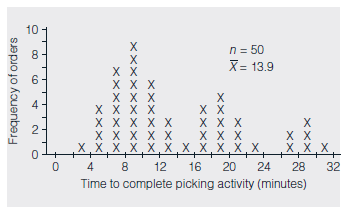
To provide a more detailed analysis of the picking operation, the 50 individual times recorded for picking orders (one from each of the 50 check sheets collected during the team's earlier study) were plotted on the histogram in Figure 9.22. The shape of the histogram-having three humps-was an initial surprise because it implied the existence of three distinct clusters of picking times. With this valuable clue in mind, the team now concentrated on what could be responsible for these three separate time groups.
During a brainstorming session, a part picker suggested the three humps of the histogram reflected the number of trips made to the parts storage area of the distribution center to complete an order. He explained that many orders were filled with just one trip, but two were sometimes required and, on occasion, even three. Thus, the left hump could consist of times an order was completed with only one trip, the middle could represent those requiring two, whereas the third could be those in which three trips were needed. By watching the part picking activity for two days, the team members could verify the part picker's theory was indeed correct.
FIGURE 9.21 Pareto Diagram for Average Time of Each Activity
Source: Reprinted with permission from Davis R. Bothe, ?Improve Service and Administration,? Quality Progress , September 2003, pp. 53-57.
FIGURE 9.22 Histogram of Picking Times
Source: Reprinted with permission from Davis R. Bothe, "Improve Service and Administration," Quality Progress , September, 2003, pp. 53-57.
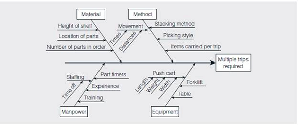
Armed with this additional insight, the team brainstormed reasons multiple trips were needed to complete an order and then organized these ideas on the cause-and-effect diagram in Figure 9.23. After discussion, the team eventually decided that the push carts used by the part pickers to carry the parts were too small (see the equipment branch of Figure 9.23). When part pickers were gathering parts to fill a large order, the cart became full long before all the needed parts were gathered. The picker had to travel to the inspection area to empty the cart and make a return trip to the warehouse to retrieve the remainder of the order.
As a pilot study, a few wider push carts were ordered and put into service for a one-week trial run. Although more parts could fit into these new carts, the pickers complained they were so wide that two of them could not pass each other in the narrow aisles, causing traffic jams and thereby actually increasing picking times. The team then tried using longer carts, which were found to take care of both problems. By watching the part picking activity over the next several days, the team was able to verify the switch to longer carts greatly reduced the number of multiple trips needed. In fact, with the new push carts, a picker could often complete two small orders during the same trip.
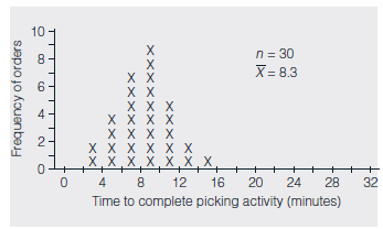
To estimate the decrease in part picking time, the team constructed a histogram of 30 picking times associated with the longer carts (see Figure 9.24).
FIGURE 9.23 Cause-and-Effect Diagram of Potential Causes of Multiple Trips
Source: Reprinted with permission from Davis R. Bothe, ?Improve Service and Administration,? Quality Progress , September 2003, pp. 53-57.
FIGURE 9.24 Histogram of Picking Times with Longer Carts
Source: Adapted from Davis R. Bothe, ?Improve Services and Administration,? Quality Progress , September 2003, pp. 53-57.
This example has a unimodal distribution, with an average picking time of only 8.3 minutes vs. the original average of 13.9 minutes.
Although a reduction of 5.6 minutes (13.9-8.3) per trip doesn't seem like much of a time savings, consider that on an eight-hour shift, a part picker spends about seven hours-420 minutes-actually gathering parts. Using the old push carts, a picker would complete an average of 30.2 orders (420/13.9) per shift. With the longer carts, that same picker could now complete 50.6 orders (420/8.3) per shift. This increase of 20.4 orders (50.6-30.2) per worker meant the four part pickers could fulfill an additional 81 orders (20.4 × 4) during their shift. Thus, the seemingly small reduction in average trip time translated into a fairly significant increase in the throughput of this bottleneck operation.
Suppose packing parts is now the activity responsible for the greatest delays in processing an order. How might this affect the project organization and next steps?
Because the distribution center was having trouble shipping orders on time, many of its customers were unhappy and threatening to switch to other part distributors. To appease these customers, the manager of the center promised all orders would be delivered within 24 hours or the customer would get the parts at no charge. The manager then assembled a team to discover ways to reduce order processing time so at least 98 percent of orders would meet the 24-hour deadline.
To better understand the situation, the team decided to draw a map showing how an order was received, filled, checked, packed, and finally shipped to the customer. After discussing the required steps and actually following an order from start to finish, the team created a flowchart of the entire order fulfillment process. The diagram, which is shown in Figure 9.19, identifies those activities the team had the power to change and, it was hoped, improve. This type of layout also encouraged every team member to focus on the big picture rather than on only the particular activity in which he or she worked.
To determine where the longest time delays were occurring, the team randomly chose 50 orders from those received during a one-week period. As members tracked these selected orders through the distribution center, they noted the time each entered and left the various activity areas appearing on the flowchart. To ensure these times were accurately and consistently recorded, the team designed the check sheet shown in Figure 9.20. One sheet was used per order, with the completion time for a given activity computed by subtracting its in time from its out time. For example, order XR-03018 began the "pack parts" activity at 2:16 P.M. and finished at 2:34 P.M. Therefore, the time to complete this particular activity was 18 minutes. At the end of the week, the average completion time for each activity was calculated by adding its 50 completion times-one for each of the 50 orders tracked-and dividing this total by 50. When these average times were analyzed with the Pareto diagram in Figure 9.21, picking time was identified as the largest contributor to order processing delays, representing about 52 percent of the total time needed to process an order.
FIGURE 9.19 Flowchart for the Order Fulfillment Process
Source: Reprinted with permission from Davis R. Bothe, ?Improve Service and Administration,? Quality Progress , September 2003, pp. 53-57.
FIGURE 9.20 Check Sheet for Recording Times
Source: Reprinted with permission from Davis R. Bothe, ?Improve Service and Administration,? Quality Progress , September 2003, pp. 53-57.
Based on this new information, the team refined its original mission statement, ?Reduce the time for processing an order,? to the more specific, ?Reduce the time for picking parts.? With the scope of the search narrowed to just the picking operation, members invited some of the part pickers to join the team because these personnel were the local experts in picking parts and possessed the most knowledge about the function.
To provide a more detailed analysis of the picking operation, the 50 individual times recorded for picking orders (one from each of the 50 check sheets collected during the team's earlier study) were plotted on the histogram in Figure 9.22. The shape of the histogram-having three humps-was an initial surprise because it implied the existence of three distinct clusters of picking times. With this valuable clue in mind, the team now concentrated on what could be responsible for these three separate time groups.
During a brainstorming session, a part picker suggested the three humps of the histogram reflected the number of trips made to the parts storage area of the distribution center to complete an order. He explained that many orders were filled with just one trip, but two were sometimes required and, on occasion, even three. Thus, the left hump could consist of times an order was completed with only one trip, the middle could represent those requiring two, whereas the third could be those in which three trips were needed. By watching the part picking activity for two days, the team members could verify the part picker's theory was indeed correct.
FIGURE 9.21 Pareto Diagram for Average Time of Each Activity
Source: Reprinted with permission from Davis R. Bothe, ?Improve Service and Administration,? Quality Progress , September 2003, pp. 53-57.
FIGURE 9.22 Histogram of Picking Times
Source: Reprinted with permission from Davis R. Bothe, "Improve Service and Administration," Quality Progress , September, 2003, pp. 53-57.
Armed with this additional insight, the team brainstormed reasons multiple trips were needed to complete an order and then organized these ideas on the cause-and-effect diagram in Figure 9.23. After discussion, the team eventually decided that the push carts used by the part pickers to carry the parts were too small (see the equipment branch of Figure 9.23). When part pickers were gathering parts to fill a large order, the cart became full long before all the needed parts were gathered. The picker had to travel to the inspection area to empty the cart and make a return trip to the warehouse to retrieve the remainder of the order.
As a pilot study, a few wider push carts were ordered and put into service for a one-week trial run. Although more parts could fit into these new carts, the pickers complained they were so wide that two of them could not pass each other in the narrow aisles, causing traffic jams and thereby actually increasing picking times. The team then tried using longer carts, which were found to take care of both problems. By watching the part picking activity over the next several days, the team was able to verify the switch to longer carts greatly reduced the number of multiple trips needed. In fact, with the new push carts, a picker could often complete two small orders during the same trip.
To estimate the decrease in part picking time, the team constructed a histogram of 30 picking times associated with the longer carts (see Figure 9.24).
FIGURE 9.23 Cause-and-Effect Diagram of Potential Causes of Multiple Trips
Source: Reprinted with permission from Davis R. Bothe, ?Improve Service and Administration,? Quality Progress , September 2003, pp. 53-57.
FIGURE 9.24 Histogram of Picking Times with Longer Carts
Source: Adapted from Davis R. Bothe, ?Improve Services and Administration,? Quality Progress , September 2003, pp. 53-57.
This example has a unimodal distribution, with an average picking time of only 8.3 minutes vs. the original average of 13.9 minutes.
Although a reduction of 5.6 minutes (13.9-8.3) per trip doesn't seem like much of a time savings, consider that on an eight-hour shift, a part picker spends about seven hours-420 minutes-actually gathering parts. Using the old push carts, a picker would complete an average of 30.2 orders (420/13.9) per shift. With the longer carts, that same picker could now complete 50.6 orders (420/8.3) per shift. This increase of 20.4 orders (50.6-30.2) per worker meant the four part pickers could fulfill an additional 81 orders (20.4 × 4) during their shift. Thus, the seemingly small reduction in average trip time translated into a fairly significant increase in the throughput of this bottleneck operation.
Suppose packing parts is now the activity responsible for the greatest delays in processing an order. How might this affect the project organization and next steps?
Explanation Verified
Facts:
The case deals with the problem ...
Managing for Quality and Performance Excellence 10th Edition by James Evans ,William Lindsay
Why don’t you like this exercise?
Other Minimum 8 character and maximum 255 character
Character 255


