Environmental Science 12th Edition by William Cunningham,Mary Ann Cunningham
Edition 12ISBN: 978-0077431204Environmental Science 12th Edition by William Cunningham,Mary Ann Cunningham
Edition 12ISBN: 978-0077431204 Exercise 7
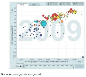
Graphs offer us an easy, intuitive way to understand data. In a glance we can see relationships, connections, and trends in a graph that most of us can't discern in a table of numbers. Among the many sources of data on human populations, one of the most entertaining is the Gapminder Foundation. Founded in Stockholm, Sweden, by Ola Rosling, Anna Rosling Ronnlunnd, and Hans Rosling, Gapminder has created a wonderful interactive graphing program to explore international statistics on health, economics, and other social indicators. To learn about their work, go to www.gapminder.org.
Try exploring the data yourself: Go to www.gapminder.org \world, which provides a graph like the one below.
Click on "Play" in the lower left corner to watch how the global life expectancy and income have changed over the past 200 years. Professor Rosling describes it as a race toward higher incomes and longer lives. Notice that it isn't a simple uniform process. Individual nations shoot ahead and then fall back. You can identify the nations by moving your cursor over the bubbles, or show names using the blue check boxes to the right of the graph. You can even turn on "trails" (lower right corner) to watch progress for selected countries. Notice when you roll over the bubbles, the life expectancy and income values show for that country and year. You can also jump to particular years using the slider bar.
While you're exploring this chart, answer the following questions:
In 2009, which country had the highest per capita GNP
Explanation Verified
Environmental Science 12th Edition by William Cunningham,Mary Ann Cunningham
Why don’t you like this exercise?
Other Minimum 8 character and maximum 255 character
Character 255


