
Campbell Biology 11th Edition by Lisa Urry,Michael Cain,Steven Wasserman,Peter Minorsky,Jane Reece
Edition 11ISBN: 978-0134093413Campbell Biology 11th Edition by Lisa Urry,Michael Cain,Steven Wasserman,Peter Minorsky,Jane Reece
Edition 11ISBN: 978-0134093413 Exercise 2
Does Atmospheric Carbon Dioxide Concentration Affect the Productivity of Agricultural Crops Atmospheric concentration of CO2 has been rising globally, and scientists wondered whether this would affect C3 and C4 plants differently. In this exercise, you will make a scatter plot to examine the relationship between CO2 concentration and growth of corn (maize), a C4 crop plant, and velvetleaf, a C3 weed found in cornfields.
How the Experiment Was Done Researchers grew corn and velvetleaf plants under controlled conditions for 45 days, where all plants received the same amount of water and light. The plants were divided into three groups, each exposed to a different concentration of CO2 in the air: 350, 600, or 1,000 ppm (parts per million).
Data from the Experiment The table shows the dry mass (in grams) of corn and velvetleaf plants grown at the three concentrations of CO2. The dry mass values are averages of the leaves, stems, and roots of eight plants.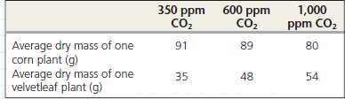
Draw a "best-fit" line for each set of points. A best-fit line does not necessarily pass through all or even most points. It is a straight line that passes as close as possible to all data points from that set. Drawing a best-fit line is a matter of judgment, so two people may draw two slightly different lines. The line that fits best, a regression line, can be identified by squaring the distances of all points to any candidate line, then selecting the line that minimizes the summed distances. (See the graph in the Scientific Skills Exercise in Chapter 2 for an example of a linear regression line.) Excel or other software programs, including those on a graphing calculator, can plot a regression line once data points are entered. Using either Excel or a graphing calculator, enter the data points for each data set and have the program draw the two regression lines. Compare them to the lines you drew.
Explanation Verified
The graph between different concentratio...
Campbell Biology 11th Edition by Lisa Urry,Michael Cain,Steven Wasserman,Peter Minorsky,Jane Reece
Why don’t you like this exercise?
Other Minimum 8 character and maximum 255 character
Character 255


