Environmental Science 12th Edition by William Cunningham,Mary Ann Cunningham
Edition 12ISBN: 978-0077431204Environmental Science 12th Edition by William Cunningham,Mary Ann Cunningham
Edition 12ISBN: 978-0077431204 Exercise 26
Graphs are one of the most common and important ways scientists communicate their results. Learning to understand graphing techniques-the language of graphs-will help you better understand this book.
Graphs are visual presentations of data that help us identify trends and understand relationships. We could present a table of numbers, but most of us have difficulty seeing a pattern in a field of numbers. In a graph, we can quickly and easily see trends and relationships.
Below are two graphs that appeared earlier in this chapter. Often we pass quickly over graphs like these that appear in text, but it's rewarding to investigate them more closely, because their relationships can raise interesting questions. Answer the numbered questions on the next page to make sure you understand the graphs shown.
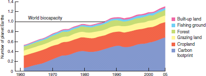
FIGURE 1 Our global ecological footprint has nearly tripled since 1961, when we began to collect global environmental data.
Source: WWF, 2008.
First let's examine the parts of a graph. Usually there is a horizontal axis (also known as the "X-axis") and a vertical axis (the "Y-axis"). Usually, in the relationship shown in a graph, one variable is thought to explain the other. In figure 1, for example, as time passes, the size of our ecological footprint grows. In this case, time is an independent variable that (at least partly) explains changes in the dependent variable, footprint.
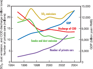
FIGURE 2 Environmental indicators for China, 1994-2005. Income doubled, as measured by gross domestic product (GDP), but the number of cars rose fourfold. Chemical oxygen demand (COD, a measure of water pollution) declined with industrial controls, but sulfer dioxide (SO₂ ) emissions increased as more coal was burned.
Source: Shao, M., et al., 2006.
Based on this graph, would you say that your ecological footprint is probably greater or less than your parents' footprints when they were your age What does that mean about the kinds of goods you consume Are you happier or healthier than your parents were at your age Why or why not
Graphs are visual presentations of data that help us identify trends and understand relationships. We could present a table of numbers, but most of us have difficulty seeing a pattern in a field of numbers. In a graph, we can quickly and easily see trends and relationships.
Below are two graphs that appeared earlier in this chapter. Often we pass quickly over graphs like these that appear in text, but it's rewarding to investigate them more closely, because their relationships can raise interesting questions. Answer the numbered questions on the next page to make sure you understand the graphs shown.
FIGURE 1 Our global ecological footprint has nearly tripled since 1961, when we began to collect global environmental data.
Source: WWF, 2008.
First let's examine the parts of a graph. Usually there is a horizontal axis (also known as the "X-axis") and a vertical axis (the "Y-axis"). Usually, in the relationship shown in a graph, one variable is thought to explain the other. In figure 1, for example, as time passes, the size of our ecological footprint grows. In this case, time is an independent variable that (at least partly) explains changes in the dependent variable, footprint.
FIGURE 2 Environmental indicators for China, 1994-2005. Income doubled, as measured by gross domestic product (GDP), but the number of cars rose fourfold. Chemical oxygen demand (COD, a measure of water pollution) declined with industrial controls, but sulfer dioxide (SO₂ ) emissions increased as more coal was burned.
Source: Shao, M., et al., 2006.
Based on this graph, would you say that your ecological footprint is probably greater or less than your parents' footprints when they were your age What does that mean about the kinds of goods you consume Are you happier or healthier than your parents were at your age Why or why not
Explanation Verified
On average, our ecological foo...
Environmental Science 12th Edition by William Cunningham,Mary Ann Cunningham
Why don’t you like this exercise?
Other Minimum 8 character and maximum 255 character
Character 255


