Exam 22: The Short-Run Trade-Off Between Inflation and Unemployment
Exam 1: Ten Principles of Economics438 Questions
Exam 2: Thinking Like an Economist620 Questions
Exam 3: Interdependence and the Gains From Trade527 Questions
Exam 4: The Market Forces of Supply and Demand700 Questions
Exam 5: Elasticity and Its Application598 Questions
Exam 6: Supply, Demand, and Government Policies648 Questions
Exam 7: Consumers, Producers, and the Efficiency of Markets547 Questions
Exam 8: Application: the Costs of Taxation514 Questions
Exam 9: Application: International Trade496 Questions
Exam 10: Measuring a Nations Income522 Questions
Exam 11: Measuring the Cost of Living545 Questions
Exam 12: Production and Growth507 Questions
Exam 13: Saving, Investment, and the Financial System567 Questions
Exam 14: The Basic Tools of Finance513 Questions
Exam 15: Unemployment699 Questions
Exam 16: The Monetary System517 Questions
Exam 17: Money Growth and Inflation487 Questions
Exam 18: Open-Economy Macroeconomics: Basic Concepts522 Questions
Exam 19: A Macroeconomic Theory of the Open Economy484 Questions
Exam 20: Aggregate Demand and Aggregate Supply563 Questions
Exam 21: The Influence of Monetary and Fiscal Policy on Aggregate Demand511 Questions
Exam 22: The Short-Run Trade-Off Between Inflation and Unemployment516 Questions
Exam 23: Six Debates Over Macroeconomic Policy372 Questions
Select questions type
The analysis of Friedman and Phelps can be summarized in the following equation where a is a positive number:
(Multiple Choice)
4.7/5  (39)
(39)
In the long run, which of the following depends primarily on the growth rate of the money supply?
(Multiple Choice)
4.9/5 (35)
Proponents of rational expectations theory argued that, in the most extreme case, if policymakers are credibly committed to reducing inflation and rational people understand that commitment and quickly lower their inflation expectations, the sacrifice ratio could be as small as
(Multiple Choice)
4.9/5 (40)
The very low inflation that the U.S. experienced in 2009 and 2010
(Multiple Choice)
4.9/5 (29)
If the long-run Phillips curve shifts to the right, then for any given rate of money growth and inflation the economy has
(Multiple Choice)
4.8/5 (33)
The classical notion of monetary neutrality is consistent both with a vertical long-run aggregate-supply curve and with a vertical long-run Phillips curve.
(True/False)
4.8/5 (43)
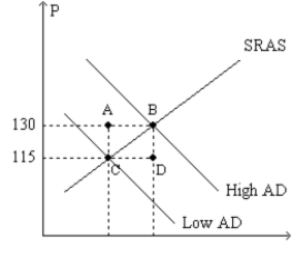
Figure 35-3. The left-hand graph shows a short-run aggregate-supply SRAS) curve and two aggregate-demand AD) curves. On the left-hand diagram, Y represents output and on the right-hand diagram, U represents the unemployment rate. 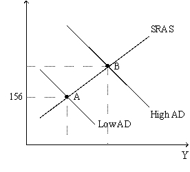
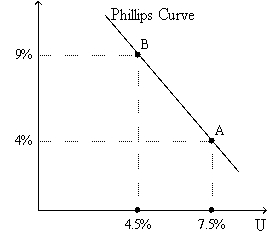 -Refer to Figure 35-3. Assume the figure depicts possible outcomes for the year 2018. In 2018, the economy is at point A on the left-hand graph, which corresponds to point A on the right-hand graph. The price level in the year 2017 was
(Multiple Choice)
4.8/5 (36)
Does a more steeply sloped Phillips curve make the sacrifice ratio smaller or larger than otherwise?
(Essay)
4.9/5 (26)
As the aggregate demand curve shifts to the right, what happens to the price level and output? What do these changes imply happens to the inflation rate and the unemployment rate?
(Essay)
4.8/5 (35)
U.S. net exports fall due to recessions in foreign countries.
A. According to the aggregate demand and supply model, what happens to the price level and output in the short run?
B. According to the short-run Phillips curve what happens to inflation and unemployment in the short run?
C. If the Fed wanted to reverse the effects of this shock on output, what should it do?
(Essay)
4.9/5 (31)
What did Friedman and Phelps predict would happen if policymakers tried to move the economy upward along the Phillips curve? Did the behavior of the economy in the late 1960s and the 1970s prove them wrong?
(Essay)
4.8/5 (37)
Figure 35-1. The left-hand graph shows a short-run aggregate-supply SRAS) curve and two aggregate-demand AD) curves. On the right-hand diagram, U represents the unemployment rate.
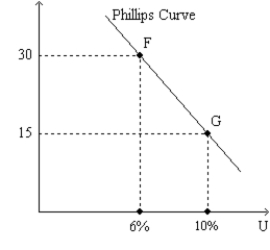
 -Refer to Figure 35-1. Suppose points F and G on the right-hand graph represent two possible outcomes for an imaginary economy in the year 2012, and those two points correspond to points B and C, respectively, on the left- hand graph. Then it is apparent that the price index equaled
(Multiple Choice)
4.8/5 (38)
According to the Phillips curve, policymakers would reduce inflation but raise unemployment if they
(Multiple Choice)
4.7/5 (41)
In the long run, if the Fed increases the growth rate of the money supply,
(Multiple Choice)
4.8/5 (36)
Which of the following would not be associated with a favorable supply shock?
(Multiple Choice)
4.8/5 (44)
Figure 35-5 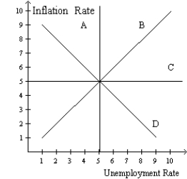 -Refer to figure 35-5. In this order, which curve is a long-run Phillips curve and which is a short-run Phillips curve?
(Multiple Choice)
4.8/5 (35)
The economist A.W. Phillips published a famous article in 1958 in which he showed a
(Multiple Choice)
4.7/5 (38)
Filters
- Essay(0)
- Multiple Choice(0)
- Short Answer(0)
- True False(0)
- Matching(0)