Deck 3: Visual Displays of Data
Full screen (f)
Question
Question
Use the following to answer questions
This graph depicts fictional data that replicate the pattern of performance observed in a study published by Nietfeld and Ender (2003).
Figure: Intelligence and Teaching Efficacy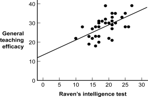
(Figure: Intelligence and Teaching Efficacy) What might be one way of improving the readability of the graph?
A) Add some ducks to the graph.
B) Trim the range represented on both axes so that it depicts only values in the actual data set.
C) Use a computer program to put gridlines on the background of the graph.
D) Expand the range represented on both axes so that it depicts values beyond the actual data set for grounding.
Question
Use the following to answer questions
This graph depicts fictional data that replicate the pattern of performance observed in a study published by Nietfeld and Ender (2003).
Figure: Intelligence and Teaching Efficacy
(Figure: Intelligence and Teaching Efficacy) If the graph creator asserts with certainty that a person with a Raven's intelligence test score of 5 would have a teaching efficacy score of 15, the statement would be which kind of lie?
A) biased scale
B) interpolation
C) inaccurate values
D) extrapolation
Question
Use the following to answer questions
Figure: Class Rank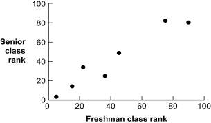
(Figure: Class Rank) Given the construction of this graph, what is the independent variable?
A) junior class rank
B) freshman class rank
C) senior class rank
D) sophomore class rank
Figure: Class Rank
(Figure: Class Rank) Given the construction of this graph, what is the independent variable?
A) junior class rank
B) freshman class rank
C) senior class rank
D) sophomore class rank
Question
Question
Use the following to answer questions
This graph depicts fictional data that replicate the pattern of performance observed in a study published by Nietfeld and Ender (2003).
Figure: Intelligence and Teaching Efficacy
(Figure: Intelligence and Teaching Efficacy) The type of graph depicted in the figure is a:
A) nonlinear relation plot.
B) Pareto chart modified to dot form.
C) scatterplot with a line of best fit.
D) histogram.
Question
Question
Use the following to answer questions
Figure: Class Rank
(Figure: Class Rank) Given the construction of this graph, what is the dependent variable?
A) junior class rank
B) freshman class rank
C) senior class rank
D) sophomore class rank
Figure: Class Rank
(Figure: Class Rank) Given the construction of this graph, what is the dependent variable?
A) junior class rank
B) freshman class rank
C) senior class rank
D) sophomore class rank
Question
Use the following to answer questions
This figure depicts the typical relation found between a person's age (in years) and his or her reaction time in a simple reaction time task (e.g., time to press a button when a light turns green).
Figure: Age and Reaction Time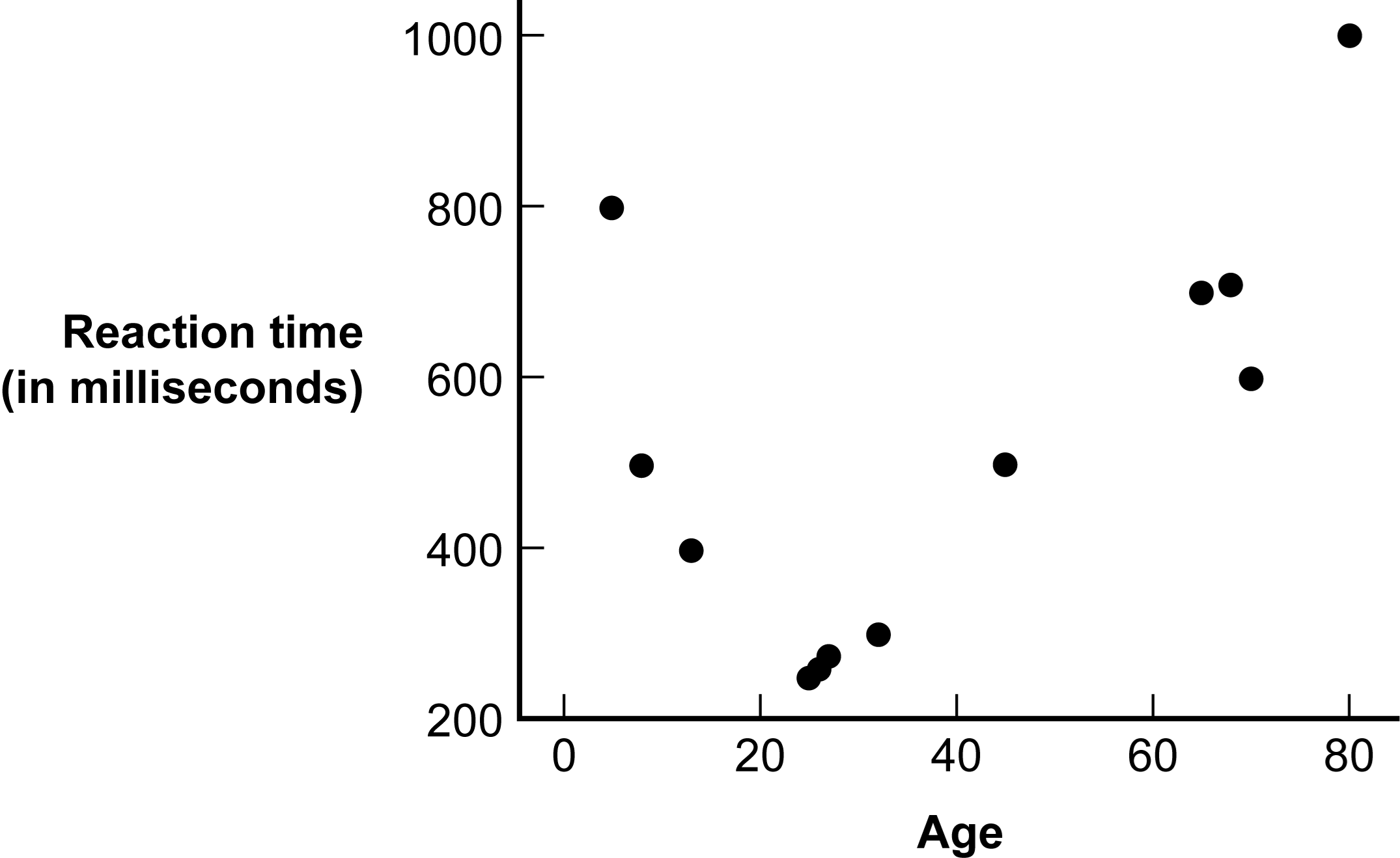
(Figure: Age and Reaction Time) Which statement best captures what the graph depicts?
A) Reaction time decreases throughout childhood and adolescence, becoming fastest in a person's early 20s, but after that point, reaction time slowly increases as a person continues to age.
B) There is a linear relation between age and reaction time such that reaction time increases with increased age.
C) Reaction time increases throughout childhood and adolescence, becoming slowest in a person's early 20s, but after that point, reaction time slowly decreases as a person continues to age.
D) There is no relation between age and reaction time.
Question
Question
Use the following to answer questions
This figure depicts the results of a study by Ahluwalia et al.(2006) investigating the effects of two types of gum (placebo or nicotine) and two types of counseling (educational or motivational) in helping people to stop smoking.
Figure: Smoking Cessation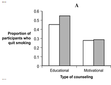
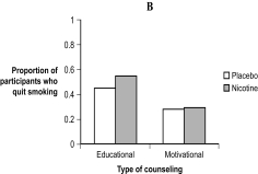
(Figure: Smoking Cessation) Which Figure, A or B, would be the best figure to use when presenting the results of this study and why?
A) Either graph would be perfectly acceptable for presenting the results of the study.
B) Figure A would be the best because it depicts the tallest bars.
C) Figure B would be the best because the y-axis depicts the actual possible values on the dependent measure.
D) Neither graph would be acceptable when presenting the results of the study.
This figure depicts the results of a study by Ahluwalia et al.(2006) investigating the effects of two types of gum (placebo or nicotine) and two types of counseling (educational or motivational) in helping people to stop smoking.
Figure: Smoking Cessation
(Figure: Smoking Cessation) Which Figure, A or B, would be the best figure to use when presenting the results of this study and why?
A) Either graph would be perfectly acceptable for presenting the results of the study.
B) Figure A would be the best because it depicts the tallest bars.
C) Figure B would be the best because the y-axis depicts the actual possible values on the dependent measure.
D) Neither graph would be acceptable when presenting the results of the study.
Question
Question
Use the following to answer questions
This figure depicts the results of a study by Ahluwalia et al.(2006) investigating the effects of two types of gum (placebo or nicotine) and two types of counseling (educational or motivational) in helping people to stop smoking.
Figure: Smoking Cessation
(Figure: Smoking Cessation) What is the difference between the data depicted in Figure A and the data in Figure B?
A) Figure A does not graph the same independent variables as Figure B.
B) Figure A does not graph the same dependent variable as Figure B.
C) The bars in Figure A are more accurate than those in Figure B.
D) The y-axis in Figure A has been shortened, which exaggerates the differences between the groups.
Question
Use the following to answer questions
This figure depicts the typical relation found between a person's age (in years) and his or her reaction time in a simple reaction time task (e.g., time to press a button when a light turns green).
Figure: Age and Reaction Time
(Figure: Age and Reaction Time) Based on the graph, what type of relation exists between age and reaction time?
A) linear
B) nonlinear
C) It is not possible to tell, given the information in the graph.
D) There is no relation between age and reaction time.
Question
Use the following to answer questions
This figure depicts the typical relation found between a person's age (in years) and his or her reaction time in a simple reaction time task (e.g., time to press a button when a light turns green).
Figure: Age and Reaction Time
(Figure: Age and Reaction Time) If one were to assume with certainty that a person who is 2 years old has a reaction time of 9,000 milliseconds, which error would be made?
A) sneaky sample lie
B) interpolation lie
C) extrapolation lie
D) inaccurate values lie
Question
Use the following to answer questions
Figure: Class Rank
(Figure: Class Rank) The type of graph depicted in the figure is a:
A) scatterplot.
B) histogram.
C) Pareto chart.
D) range-frame.
Figure: Class Rank
(Figure: Class Rank) The type of graph depicted in the figure is a:
A) scatterplot.
B) histogram.
C) Pareto chart.
D) range-frame.
Question
Use the following to answer questions
Figure: Class Rank
(Figure: Class Rank) From this graph, one knows with certainty that a person with a class rank of 60 in the freshman year would have a class rank of 60 in his or her senior year.This statement is an example of a(n) _____ lie.
A) extrapolation
B) sneaky sample
C) interpolation
D) inaccurate values
Question
Question
Question
Use the following to answer questions
Figure: Class Rank
(Figure: Class Rank) Based on this graph, what type of relation exists between freshman class rank and senior class rank?
A) linear
B) nonlinear
C) curvilinear
D) negative
Figure: Class Rank
(Figure: Class Rank) Based on this graph, what type of relation exists between freshman class rank and senior class rank?
A) linear
B) nonlinear
C) curvilinear
D) negative
Question
Question
Question
Question
Question
Question
Question
Question
Question
Question
Use the following to answer question
This figure depicts gas prices for the month of August from 1976 to 2004.(Data were extracted from the Bureau of Labor Statistics Web site.)
Figure: Gas Prices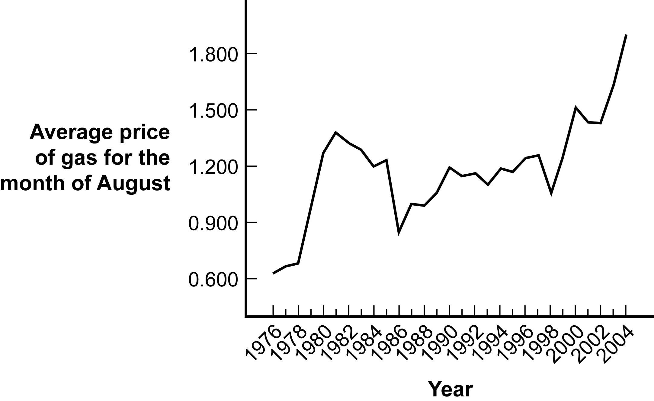
(Figure: Gas Prices) Identify the type of graph depicted in the figure.
A) histogram
B) time series plot
C) Pareto chart
D) line graph
This figure depicts gas prices for the month of August from 1976 to 2004.(Data were extracted from the Bureau of Labor Statistics Web site.)
Figure: Gas Prices
(Figure: Gas Prices) Identify the type of graph depicted in the figure.
A) histogram
B) time series plot
C) Pareto chart
D) line graph
Question
Question
Question
Question
Question
Question
Question
Question
Question
Question
Question
Question
Question
Question
Question
Question
Question
Question
Question
Question
Question
Question
Question
Question
Question
Question
Question
Question
Question
Question
Question
Question
Question
Question
Question
Question
Question
Question
Question
Question
Question
Question
Question
Question
Question
Question
Question
Question
Question
Question

Unlock Deck
Sign up to unlock the cards in this deck!
Unlock Deck
Unlock Deck
1/108
Play
Full screen (f)
Deck 3: Visual Displays of Data
1
At major research institutions, the intense pressure to publish has led a few people to act desperately, creating fake data to impress their reviewers and colleagues.This faking may be demonstrated in the visual distortion of data in graphing.This is an example of a(n) _____ lie.
A) biased sample
B) interpolation
C) sneaky sample
D) inaccurate values
A) biased sample
B) interpolation
C) sneaky sample
D) inaccurate values
inaccurate values
2
Use the following to answer questions
This graph depicts fictional data that replicate the pattern of performance observed in a study published by Nietfeld and Ender (2003).
Figure: Intelligence and Teaching Efficacy
(Figure: Intelligence and Teaching Efficacy) What might be one way of improving the readability of the graph?
A) Add some ducks to the graph.
B) Trim the range represented on both axes so that it depicts only values in the actual data set.
C) Use a computer program to put gridlines on the background of the graph.
D) Expand the range represented on both axes so that it depicts values beyond the actual data set for grounding.
Trim the range represented on both axes so that it depicts only values in the actual data set.
3
Use the following to answer questions
This graph depicts fictional data that replicate the pattern of performance observed in a study published by Nietfeld and Ender (2003).
Figure: Intelligence and Teaching Efficacy
(Figure: Intelligence and Teaching Efficacy) If the graph creator asserts with certainty that a person with a Raven's intelligence test score of 5 would have a teaching efficacy score of 15, the statement would be which kind of lie?
A) biased scale
B) interpolation
C) inaccurate values
D) extrapolation
extrapolation
4
Use the following to answer questions
Figure: Class Rank
(Figure: Class Rank) Given the construction of this graph, what is the independent variable?
A) junior class rank
B) freshman class rank
C) senior class rank
D) sophomore class rank
Figure: Class Rank
(Figure: Class Rank) Given the construction of this graph, what is the independent variable?
A) junior class rank
B) freshman class rank
C) senior class rank
D) sophomore class rank
Unlock Deck
Unlock for access to all 108 flashcards in this deck.
Unlock Deck
k this deck
5
To efficiently conduct an alumni survey, a university collects data on all those who attend the annual alumni reunion on campus.What type of manipulation is this?
A) biased scale lie
B) sneaky sample lie
C) extrapolation lie
D) interpolation lie
A) biased scale lie
B) sneaky sample lie
C) extrapolation lie
D) interpolation lie
Unlock Deck
Unlock for access to all 108 flashcards in this deck.
Unlock Deck
k this deck
6
Use the following to answer questions
This graph depicts fictional data that replicate the pattern of performance observed in a study published by Nietfeld and Ender (2003).
Figure: Intelligence and Teaching Efficacy
(Figure: Intelligence and Teaching Efficacy) The type of graph depicted in the figure is a:
A) nonlinear relation plot.
B) Pareto chart modified to dot form.
C) scatterplot with a line of best fit.
D) histogram.
Unlock Deck
Unlock for access to all 108 flashcards in this deck.
Unlock Deck
k this deck
7
A researcher labels the dependent variable of a bar graph Marital Distress, when what was measured was the number of arguments among couples attending marriage counseling.This misnomer is an example of the _____ lie.
A) interpolation
B) inaccurate values
C) extrapolation
D) sneaky sample
A) interpolation
B) inaccurate values
C) extrapolation
D) sneaky sample
Unlock Deck
Unlock for access to all 108 flashcards in this deck.
Unlock Deck
k this deck
8
Use the following to answer questions
Figure: Class Rank
(Figure: Class Rank) Given the construction of this graph, what is the dependent variable?
A) junior class rank
B) freshman class rank
C) senior class rank
D) sophomore class rank
Figure: Class Rank
(Figure: Class Rank) Given the construction of this graph, what is the dependent variable?
A) junior class rank
B) freshman class rank
C) senior class rank
D) sophomore class rank
Unlock Deck
Unlock for access to all 108 flashcards in this deck.
Unlock Deck
k this deck
9
Use the following to answer questions
This figure depicts the typical relation found between a person's age (in years) and his or her reaction time in a simple reaction time task (e.g., time to press a button when a light turns green).
Figure: Age and Reaction Time
(Figure: Age and Reaction Time) Which statement best captures what the graph depicts?
A) Reaction time decreases throughout childhood and adolescence, becoming fastest in a person's early 20s, but after that point, reaction time slowly increases as a person continues to age.
B) There is a linear relation between age and reaction time such that reaction time increases with increased age.
C) Reaction time increases throughout childhood and adolescence, becoming slowest in a person's early 20s, but after that point, reaction time slowly decreases as a person continues to age.
D) There is no relation between age and reaction time.
Unlock Deck
Unlock for access to all 108 flashcards in this deck.
Unlock Deck
k this deck
10
The interpolation lie can involve:
A) using a biased scale.
B) using a biased sample.
C) graphing extreme data points and assuming a straight line between them.
D) using labels on the graph that do not precisely reflect what data the graph actually display.
A) using a biased scale.
B) using a biased sample.
C) graphing extreme data points and assuming a straight line between them.
D) using labels on the graph that do not precisely reflect what data the graph actually display.
Unlock Deck
Unlock for access to all 108 flashcards in this deck.
Unlock Deck
k this deck
11
Use the following to answer questions
This figure depicts the results of a study by Ahluwalia et al.(2006) investigating the effects of two types of gum (placebo or nicotine) and two types of counseling (educational or motivational) in helping people to stop smoking.
Figure: Smoking Cessation
(Figure: Smoking Cessation) Which Figure, A or B, would be the best figure to use when presenting the results of this study and why?
A) Either graph would be perfectly acceptable for presenting the results of the study.
B) Figure A would be the best because it depicts the tallest bars.
C) Figure B would be the best because the y-axis depicts the actual possible values on the dependent measure.
D) Neither graph would be acceptable when presenting the results of the study.
Unlock Deck
Unlock for access to all 108 flashcards in this deck.
Unlock Deck
k this deck
12
In the _____ lie participants in a study are preselected, resulting in biased results.
A) biased scale
B) extrapolation
C) sneaky sample
D) inaccurate values
A) biased scale
B) extrapolation
C) sneaky sample
D) inaccurate values
Unlock Deck
Unlock for access to all 108 flashcards in this deck.
Unlock Deck
k this deck
13
Use the following to answer questions
This figure depicts the results of a study by Ahluwalia et al.(2006) investigating the effects of two types of gum (placebo or nicotine) and two types of counseling (educational or motivational) in helping people to stop smoking.
Figure: Smoking Cessation
(Figure: Smoking Cessation) What is the difference between the data depicted in Figure A and the data in Figure B?
A) Figure A does not graph the same independent variables as Figure B.
B) Figure A does not graph the same dependent variable as Figure B.
C) The bars in Figure A are more accurate than those in Figure B.
D) The y-axis in Figure A has been shortened, which exaggerates the differences between the groups.
Unlock Deck
Unlock for access to all 108 flashcards in this deck.
Unlock Deck
k this deck
14
Use the following to answer questions
This figure depicts the typical relation found between a person's age (in years) and his or her reaction time in a simple reaction time task (e.g., time to press a button when a light turns green).
Figure: Age and Reaction Time
(Figure: Age and Reaction Time) Based on the graph, what type of relation exists between age and reaction time?
A) linear
B) nonlinear
C) It is not possible to tell, given the information in the graph.
D) There is no relation between age and reaction time.
Unlock Deck
Unlock for access to all 108 flashcards in this deck.
Unlock Deck
k this deck
15
Use the following to answer questions
This figure depicts the typical relation found between a person's age (in years) and his or her reaction time in a simple reaction time task (e.g., time to press a button when a light turns green).
Figure: Age and Reaction Time
(Figure: Age and Reaction Time) If one were to assume with certainty that a person who is 2 years old has a reaction time of 9,000 milliseconds, which error would be made?
A) sneaky sample lie
B) interpolation lie
C) extrapolation lie
D) inaccurate values lie
Unlock Deck
Unlock for access to all 108 flashcards in this deck.
Unlock Deck
k this deck
16
Use the following to answer questions
Figure: Class Rank
(Figure: Class Rank) The type of graph depicted in the figure is a:
A) scatterplot.
B) histogram.
C) Pareto chart.
D) range-frame.
Figure: Class Rank
(Figure: Class Rank) The type of graph depicted in the figure is a:
A) scatterplot.
B) histogram.
C) Pareto chart.
D) range-frame.
Unlock Deck
Unlock for access to all 108 flashcards in this deck.
Unlock Deck
k this deck
17
Use the following to answer questions
Figure: Class Rank
(Figure: Class Rank) From this graph, one knows with certainty that a person with a class rank of 60 in the freshman year would have a class rank of 60 in his or her senior year.This statement is an example of a(n) _____ lie.
A) extrapolation
B) sneaky sample
C) interpolation
D) inaccurate values
Unlock Deck
Unlock for access to all 108 flashcards in this deck.
Unlock Deck
k this deck
18
What type of lie is it when the method of assessment or measure has limited responses, thus creating an imbalance in possible responses?
A) inaccurate values
B) extrapolation
C) biased scale
D) interpolation
A) inaccurate values
B) extrapolation
C) biased scale
D) interpolation
Unlock Deck
Unlock for access to all 108 flashcards in this deck.
Unlock Deck
k this deck
19
A student poll on your university website for athletics asks, "How high do you think the basketball team will finish this year: 1st, 2nd, 3rd, 4th, or 5th?" An article posted a week later reports "Students predict basketball team to finish within the top 5 out of 16 teams in the conference." What kind of manipulation occurred here?
A) an outright lie
B) false face validity
C) biased scale lie
D) interpolation lie
A) an outright lie
B) false face validity
C) biased scale lie
D) interpolation lie
Unlock Deck
Unlock for access to all 108 flashcards in this deck.
Unlock Deck
k this deck
20
Use the following to answer questions
Figure: Class Rank
(Figure: Class Rank) Based on this graph, what type of relation exists between freshman class rank and senior class rank?
A) linear
B) nonlinear
C) curvilinear
D) negative
Figure: Class Rank
(Figure: Class Rank) Based on this graph, what type of relation exists between freshman class rank and senior class rank?
A) linear
B) nonlinear
C) curvilinear
D) negative
Unlock Deck
Unlock for access to all 108 flashcards in this deck.
Unlock Deck
k this deck
21
Which of these would be appropriate to depict on a time series plot?
A) life span duration for different breeds of dogs
B) hours of day and preference for dinner time for males versus females
C) the amount of water used in a shower before and after the installation of water-saving devices
D) airline tickets sales by month of year
A) life span duration for different breeds of dogs
B) hours of day and preference for dinner time for males versus females
C) the amount of water used in a shower before and after the installation of water-saving devices
D) airline tickets sales by month of year
Unlock Deck
Unlock for access to all 108 flashcards in this deck.
Unlock Deck
k this deck
22
Scatterplots are often used to assess what type of pattern the data create.For example, when the data form a pattern that flows downward and toward the right, this is considered to be a(n):
A) increasing nonlinear relation.
B) negative nonlinear relation.
C) positive linear relation.
D) negative linear relation.
A) increasing nonlinear relation.
B) negative nonlinear relation.
C) positive linear relation.
D) negative linear relation.
Unlock Deck
Unlock for access to all 108 flashcards in this deck.
Unlock Deck
k this deck
23
The _____ allows researchers to make predictions from a person's value on one variable to a person's value on another variable.
A) linear relationship line
B) nonlinear relationship line
C) line of best fit
D) time plot line
A) linear relationship line
B) nonlinear relationship line
C) line of best fit
D) time plot line
Unlock Deck
Unlock for access to all 108 flashcards in this deck.
Unlock Deck
k this deck
24
On a histogram the y-axis depicts counts or frequencies, while on a bar graph the y-axis depicts _____.
A) levels of a nominal variable
B) counts or percentages
C) the independent variable
D) the dependent variable
A) levels of a nominal variable
B) counts or percentages
C) the independent variable
D) the dependent variable
Unlock Deck
Unlock for access to all 108 flashcards in this deck.
Unlock Deck
k this deck
25
A graph that depicts the relation between two scale variables is a:
A) frequency table.
B) bar graph.
C) time series plot.
D) scatterplot.
A) frequency table.
B) bar graph.
C) time series plot.
D) scatterplot.
Unlock Deck
Unlock for access to all 108 flashcards in this deck.
Unlock Deck
k this deck
26
A type of line graph used to depict changes in a dependent variable over time is a:
A) scatterplot.
B) histogram.
C) time series plot.
D) line graph.
A) scatterplot.
B) histogram.
C) time series plot.
D) line graph.
Unlock Deck
Unlock for access to all 108 flashcards in this deck.
Unlock Deck
k this deck
27
On a histogram the x-axis depicts the values of a scale variable, while on a bar graph the x-axis depicts the values of _____ variable.
A) the dependent
B) a scale
C) a nominal or ordinal
D) counts or percentages
A) the dependent
B) a scale
C) a nominal or ordinal
D) counts or percentages
Unlock Deck
Unlock for access to all 108 flashcards in this deck.
Unlock Deck
k this deck
28
What is a Pareto chart?
A) a bar graph with the bars ordered from highest (on the left) to lowest (on the right)
B) a line graph with bars depicted in three dimensions
C) a bar graph in which all the bars are stacked on top of one another
D) a pictorial graph that uses a symbol to represent the scale dependent variable
A) a bar graph with the bars ordered from highest (on the left) to lowest (on the right)
B) a line graph with bars depicted in three dimensions
C) a bar graph in which all the bars are stacked on top of one another
D) a pictorial graph that uses a symbol to represent the scale dependent variable
Unlock Deck
Unlock for access to all 108 flashcards in this deck.
Unlock Deck
k this deck
29
A researcher investigated the relationship between IQ and years of education.What type of graph should the researcher use to illustrate his findings?
A) bar graph
B) scatterplot
C) line graph
D) frequency polygon
A) bar graph
B) scatterplot
C) line graph
D) frequency polygon
Unlock Deck
Unlock for access to all 108 flashcards in this deck.
Unlock Deck
k this deck
30
Use the following to answer question
This figure depicts gas prices for the month of August from 1976 to 2004.(Data were extracted from the Bureau of Labor Statistics Web site.)
Figure: Gas Prices
(Figure: Gas Prices) Identify the type of graph depicted in the figure.
A) histogram
B) time series plot
C) Pareto chart
D) line graph
This figure depicts gas prices for the month of August from 1976 to 2004.(Data were extracted from the Bureau of Labor Statistics Web site.)
Figure: Gas Prices
(Figure: Gas Prices) Identify the type of graph depicted in the figure.
A) histogram
B) time series plot
C) Pareto chart
D) line graph
Unlock Deck
Unlock for access to all 108 flashcards in this deck.
Unlock Deck
k this deck
31
A researcher was interested in measuring reaction time differences between men and women on a computerized task.What is the dependent variable?
A) researcher
B) computerized task
C) reaction time
D) gender
A) researcher
B) computerized task
C) reaction time
D) gender
Unlock Deck
Unlock for access to all 108 flashcards in this deck.
Unlock Deck
k this deck
32
The last step in creating a scatterplot is to:
A) make a mark on the graph above each study participant's score on the x- and y-axes.
B) label the horizontal x-axis with the name of the independent variable and its possible values.
C) label the vertical y-axis with the name of the dependent variable and its possible values.
D) organize the data by participant.
Unlock Deck
Unlock for access to all 108 flashcards in this deck.
Unlock Deck
k this deck
33
A time plot is also known as a:
A) scatterplot.
B) time series plot.
C) line graph.
D) bar graph.
A) scatterplot.
B) time series plot.
C) line graph.
D) bar graph.
Unlock Deck
Unlock for access to all 108 flashcards in this deck.
Unlock Deck
k this deck
34
When the data on a scatterplot form a pattern that breaks or bends to form a curve, these data are considered to be related in a(n) _____ way.
A) unmeaningful
B) nonlinear
C) unpredictable
D) linear
A) unmeaningful
B) nonlinear
C) unpredictable
D) linear
Unlock Deck
Unlock for access to all 108 flashcards in this deck.
Unlock Deck
k this deck
35
What is a potential benefit of creating a Pareto chart rather than a bar graph?
A) A Pareto chart is easier to create than a bar graph.
B) A Pareto chart looks more sophisticated than a bar graph.
C) A Pareto chart makes it easier to compare the magnitude of the dependent variable for different levels of the independent variable.
D) A Pareto chart uses pictorial symbols to make it easier to compare results.
Unlock Deck
Unlock for access to all 108 flashcards in this deck.
Unlock Deck
k this deck
36
Scatterplots are often used to assess what type of pattern the data create.For example, when the data form a pattern that flows upward and toward the right, this is considered to be a(n):
A) increasing nonlinear relation.
B) negative nonlinear relation.
C) positive linear relation.
D) negative linear relation.
A) increasing nonlinear relation.
B) negative nonlinear relation.
C) positive linear relation.
D) negative linear relation.
Unlock Deck
Unlock for access to all 108 flashcards in this deck.
Unlock Deck
k this deck
37
Line graphs are used to represent the relation between two scale variables.Two common types of relations depicted in these graphs are:
A) the predicted value of a dependent variable for each value of an independent variable and the change in a variable over time.
B) linear relations and nonlinear relations.
C) the predicted value of a dependent variable for each value of an independent variable and the line of best fit.
D) time and change, as well as nonlinear relations.
Unlock Deck
Unlock for access to all 108 flashcards in this deck.
Unlock Deck
k this deck
38
Cut marks are sometimes used on an axis to indicate that the axis starts at a value other than:
A) zero.
B) the lowest possible score.
C) the largest possible score.
D) a positive number.
A) zero.
B) the lowest possible score.
C) the largest possible score.
D) a positive number.
Unlock Deck
Unlock for access to all 108 flashcards in this deck.
Unlock Deck
k this deck
39
The first step in creating a scatterplot is to:
A) make a mark on the graph above each study participant's score on the x- and y-axes.
B) label the horizontal x-axis with the name of the independent variable and its possible values.
C) label the vertical y-axis with the name of the dependent variable and its possible values.
D) organize the data by participant.
Unlock Deck
Unlock for access to all 108 flashcards in this deck.
Unlock Deck
k this deck
40
Line graphs can offer additional information to scatterplots by including a line:
A) that shows predicted y scores for each x value.
B) of best fit rather than the individual data points.
C) that shows predicted x scores for each y value.
D) representing the relation of variables over time.
A) that shows predicted y scores for each x value.
B) of best fit rather than the individual data points.
C) that shows predicted x scores for each y value.
D) representing the relation of variables over time.
Unlock Deck
Unlock for access to all 108 flashcards in this deck.
Unlock Deck
k this deck
41
Popular magazines and Internet sources often use _____ to display information, which tend to confuse rather than clarify information.
A) pie charts
B) line graphs
C) pictorial graphs
D) scatterplots
A) pie charts
B) line graphs
C) pictorial graphs
D) scatterplots
Unlock Deck
Unlock for access to all 108 flashcards in this deck.
Unlock Deck
k this deck
42
_____ allow one to connect points on a map with data points located in space, such as homes for sale.
A) Pictorial graphs
B) Geographic information systems (GIS)
C) Interactive graphs
D) Word clouds
A) Pictorial graphs
B) Geographic information systems (GIS)
C) Interactive graphs
D) Word clouds
Unlock Deck
Unlock for access to all 108 flashcards in this deck.
Unlock Deck
k this deck
43
Any background pattern on which graphs appear is a form of chartjunk called:
A) background noise.
B) grids.
C) moiré vibrations.
D) ducks.
A) background noise.
B) grids.
C) moiré vibrations.
D) ducks.
Unlock Deck
Unlock for access to all 108 flashcards in this deck.
Unlock Deck
k this deck
44
The term levels refers to:
A) continuous variables.
B) linear relationships.
C) bar graphs.
D) categories.
A) continuous variables.
B) linear relationships.
C) bar graphs.
D) categories.
Unlock Deck
Unlock for access to all 108 flashcards in this deck.
Unlock Deck
k this deck
45
A bubble graph is one that:
A) is similar to a pie chart but is depicted as a bubble.
B) includes captions to explain each data point.
C) can display multiple variables.
D) portrays data such as income and life expectancy.
A) is similar to a pie chart but is depicted as a bubble.
B) includes captions to explain each data point.
C) can display multiple variables.
D) portrays data such as income and life expectancy.
Unlock Deck
Unlock for access to all 108 flashcards in this deck.
Unlock Deck
k this deck
46
In a pictorial graph, images are used at each level of the _____ variable to represent its value on the _____ variable.
A) independent; dependent
B) dependent; independent
C) scale; nominal
D) scale; dependent
A) independent; dependent
B) dependent; independent
C) scale; nominal
D) scale; dependent
Unlock Deck
Unlock for access to all 108 flashcards in this deck.
Unlock Deck
k this deck
47
Pictorial graphs are sometimes used when the independent variables has _____ categories.
A) only a few
B) a great number of
C) more than three
D) scale measurement
A) only a few
B) a great number of
C) more than three
D) scale measurement
Unlock Deck
Unlock for access to all 108 flashcards in this deck.
Unlock Deck
k this deck
48
In a pie chart, the slices represent:
A) categories of the dependent variable.
B) levels of the independent variable.
C) values that would appear on the y-axis.
D) more than bars on a bar chart represent.
A) categories of the dependent variable.
B) levels of the independent variable.
C) values that would appear on the y-axis.
D) more than bars on a bar chart represent.
Unlock Deck
Unlock for access to all 108 flashcards in this deck.
Unlock Deck
k this deck
49
Pie charts represent the percent or proportion of each observed category through the:
A) size of each slice of the pie.
B) color of each slice of the pie.
C) number of slices into which the pie is divided.
D) orientation of the pie on the page.
A) size of each slice of the pie.
B) color of each slice of the pie.
C) number of slices into which the pie is divided.
D) orientation of the pie on the page.
Unlock Deck
Unlock for access to all 108 flashcards in this deck.
Unlock Deck
k this deck
50
In a _____ images are used at each level of the independent variable to represent its value on the dependent variable.
A) scatterplot
B) time series plot
C) pictorial graph
D) bar graph
A) scatterplot
B) time series plot
C) pictorial graph
D) bar graph
Unlock Deck
Unlock for access to all 108 flashcards in this deck.
Unlock Deck
k this deck
51
Data based on a biased scale typically do not convey what the researcher wants to convey.
Unlock Deck
Unlock for access to all 108 flashcards in this deck.
Unlock Deck
k this deck
52
Graphs based on sneaky samples are representative of the population.
Unlock Deck
Unlock for access to all 108 flashcards in this deck.
Unlock Deck
k this deck
53
A bar graph summarizing the height of buildings in a major city depicts the bars as three-dimensional skyscrapers.The appearances of the bars qualify as which type of chartjunk?
A) grids
B) moiré vibrations
C) ducks
D) defaults
A) grids
B) moiré vibrations
C) ducks
D) defaults
Unlock Deck
Unlock for access to all 108 flashcards in this deck.
Unlock Deck
k this deck
54
_____ refer(s) to any unnecessary information in a chart that is distracting.
A) Chartjunk
B) Grids
C) Ducks
D) Moiré vibrations
A) Chartjunk
B) Grids
C) Ducks
D) Moiré vibrations
Unlock Deck
Unlock for access to all 108 flashcards in this deck.
Unlock Deck
k this deck
55
If graphing two or more nominal independent variables and one scale dependent variable, use a:
A) scatterplot or line graph.
B) Pareto chart.
C) histogram or frequency polygon.
D) bar graph.
A) scatterplot or line graph.
B) Pareto chart.
C) histogram or frequency polygon.
D) bar graph.
Unlock Deck
Unlock for access to all 108 flashcards in this deck.
Unlock Deck
k this deck
56
The lie of interpolation assumes that a trend in the data extends beyond the bounds of the measurement scale.
Unlock Deck
Unlock for access to all 108 flashcards in this deck.
Unlock Deck
k this deck
57
To graph the frequencies of one scale variable, use a:
A) scatterplot or line graph.
B) Pareto chart.
C) histogram or frequency polygon.
D) bar graph.
A) scatterplot or line graph.
B) Pareto chart.
C) histogram or frequency polygon.
D) bar graph.
Unlock Deck
Unlock for access to all 108 flashcards in this deck.
Unlock Deck
k this deck
58
When constructing a graph, it is better to make one's own, intentional decisions about its appearance than to rely on computer:
A) defaults.
B) multivariable graphs.
C) programs.
D) interactive graphs.
A) defaults.
B) multivariable graphs.
C) programs.
D) interactive graphs.
Unlock Deck
Unlock for access to all 108 flashcards in this deck.
Unlock Deck
k this deck
59
If graphing one scale independent variable and one scale dependent variable, use a:
A) scatterplot or line graph.
B) Pareto chart.
C) histogram or frequency polygon.
D) bar graph.
A) scatterplot or line graph.
B) Pareto chart.
C) histogram or frequency polygon.
D) bar graph.
Unlock Deck
Unlock for access to all 108 flashcards in this deck.
Unlock Deck
k this deck
60
If graphing one nominal independent variable and one scale dependent variable, use a:
A) scatterplot or line graph.
B) frequency polygon.
C) histogram.
D) bar graph.
A) scatterplot or line graph.
B) frequency polygon.
C) histogram.
D) bar graph.
Unlock Deck
Unlock for access to all 108 flashcards in this deck.
Unlock Deck
k this deck
61
The y-axis of a bar graph indicates discrete levels of a nominal variable.
Unlock Deck
Unlock for access to all 108 flashcards in this deck.
Unlock Deck
k this deck
62
A pie chart is a type of multivariable graph that allows you to plot numerous variables simultaneously.
Unlock Deck
Unlock for access to all 108 flashcards in this deck.
Unlock Deck
k this deck
63
A bar graph is almost always better at presenting data than a pie chart.
Unlock Deck
Unlock for access to all 108 flashcards in this deck.
Unlock Deck
k this deck
64
The lie of interpolation assumes that values beyond the data points will continue indefinitely, while the lie of extrapolation assumes that some value between the data points lies on a straight line between those data points.
Unlock Deck
Unlock for access to all 108 flashcards in this deck.
Unlock Deck
k this deck
65
It is always best to use the program defaults when creating graphs using computer software programs.
Unlock Deck
Unlock for access to all 108 flashcards in this deck.
Unlock Deck
k this deck
66
A duck is a type of chartjunk that takes the form of a background pattern.
Unlock Deck
Unlock for access to all 108 flashcards in this deck.
Unlock Deck
k this deck
67
A graph showing new job growth by month from September 2013 to December 2013 shows a steady increase.A popular news magazine makes the claim that the job outlook is great for the New Year and beyond.This is an example of a(n) _____ lie.
A) sneaky sample
B) extrapolation
C) biased scale
D) interpolation
A) sneaky sample
B) extrapolation
C) biased scale
D) interpolation
Unlock Deck
Unlock for access to all 108 flashcards in this deck.
Unlock Deck
k this deck
68
The y-axis on a graph should start with 0, or have cut marks to indicate that it does not go down to 0.
Unlock Deck
Unlock for access to all 108 flashcards in this deck.
Unlock Deck
k this deck
69
A pictorial graph that shows fire danger levels in Phoenix, Arizona, across the weeks of the summer might portray the risk each week as a flame, with larger flames corresponding to greater risk.However, the size of the flames varies in both height and width, resulting in an exaggerated impression of fire danger levels as the risk increases.This type of pictorial graph misleads readers through the _____ lie.
A) inaccurate values
B) biased scale
C) sneaky sample
D) interpolation
A) inaccurate values
B) biased scale
C) sneaky sample
D) interpolation
Unlock Deck
Unlock for access to all 108 flashcards in this deck.
Unlock Deck
k this deck
70
An inaccurate values lie tells the truth in one part of the data but visually distorts it in another place.
Unlock Deck
Unlock for access to all 108 flashcards in this deck.
Unlock Deck
k this deck
71
A pie chart is almost always better at presenting data than a bar graph.
Unlock Deck
Unlock for access to all 108 flashcards in this deck.
Unlock Deck
k this deck
72
The Pareto chart is a type of bar graph.
Unlock Deck
Unlock for access to all 108 flashcards in this deck.
Unlock Deck
k this deck
73
If two variables are not related linearly, than they must be related nonlinearly.
Unlock Deck
Unlock for access to all 108 flashcards in this deck.
Unlock Deck
k this deck
74
The purpose of a graph is to reveal and clarify relations between variables.
Unlock Deck
Unlock for access to all 108 flashcards in this deck.
Unlock Deck
k this deck
75
When creating a bar graph, the pattern that fills in each bar is a type of moiré vibration.
Unlock Deck
Unlock for access to all 108 flashcards in this deck.
Unlock Deck
k this deck
76
Geographic information systems is an innovation in graphing that has abundant application in geography but not in other social sciences.
Unlock Deck
Unlock for access to all 108 flashcards in this deck.
Unlock Deck
k this deck
77
The lie of extrapolation assumes that values beyond the data points will continue indefinitely, while the lie of interpolation assumes that some value between the data points lies on a straight line between those data points.
Unlock Deck
Unlock for access to all 108 flashcards in this deck.
Unlock Deck
k this deck
78
The x-axis of a bar graph indicates discrete levels of a nominal variable.
Unlock Deck
Unlock for access to all 108 flashcards in this deck.
Unlock Deck
k this deck
79
Multivariable graphs allow for the simultaneous depiction of several variables at once.
Unlock Deck
Unlock for access to all 108 flashcards in this deck.
Unlock Deck
k this deck
80
A scatterplot with a line of best fit is known as a time line plot.
Unlock Deck
Unlock for access to all 108 flashcards in this deck.
Unlock Deck
k this deck
Unlock Deck
Unlock for access to all 108 flashcards in this deck.


