Exam 3: Visual Displays of Data
Exam 1: An Introduction to Statistics and Research Design156 Questions
Exam 2: Frequency Distributions89 Questions
Exam 3: Visual Displays of Data108 Questions
Exam 4: Central Tendency and Variability108 Questions
Exam 5: Sampling and Probability145 Questions
Exam 6: The Normal Curve, Standardization and Z Scores142 Questions
Exam 7: Hypothesis Testing With Z Tests141 Questions
Exam 8: Confidence Intervals, Effect Size, and Statistical Power147 Questions
Exam 9: The Single-Sample T Test124 Questions
Exam 10: The Paired-Samples T Test101 Questions
Exam 11: The Independent-Samples T Test99 Questions
Exam 12: One-Way Between-Groups Anova108 Questions
Exam 13: One-Way Within-Groups Anova102 Questions
Exam 14: Two-Way Between-Groups Anova115 Questions
Exam 15: Correlation139 Questions
Exam 16: Regression113 Questions
Exam 17: Chi-Square Tess120 Questions
Exam 18: Choosing and Reporting Statistics105 Questions
Select questions type
Line graphs can offer additional information to scatterplots by including a line:
Free
(Multiple Choice)
4.9/5  (30)
(30)
Correct Answer: Verified
A
What type of bar graph orders the categories on the x-axis from highest bar on the left to lowest bar on the right?
Free
(Multiple Choice)
4.9/5 (34)
Correct Answer:Verified
B
To graph the frequencies of one scale variable, use a:
Free
(Multiple Choice)
4.9/5 (36)
Correct Answer:Verified
C
When one has a scale variable based on frequencies, what type of graph should be used?
(Multiple Choice)
4.7/5 (31)
Scatterplots visually depict the type of relation between two variables, such as a _____ relation, where the data fall along a straight line, and a _____ relation, where the data follow a curved or broken pattern.
(Multiple Choice)
5.0/5 (34)
An insurance company hires Ulrich to explain car accidents that are the result of people who look at the road while driving but do not see an oncoming car, a type of accident labeled as "driver looked but did not see." Ulrich creates an experiment in which participants see two pictures flashing on a computer screen.Both pictures show the same scene but one is slightly different.Ulrich records how long it takes people to notice the change (reaction time) and how many sets of pictures they view during a 5-minute session.What should Ulrich include on a scatterplot to most effectively describe these data?
(Multiple Choice)
4.9/5 (26)
A pictorial graph that shows fire danger levels in Phoenix, Arizona, across the weeks of the summer might portray the risk each week as a flame, with larger flames corresponding to greater risk.However, the size of the flames varies in both height and width, resulting in an exaggerated impression of fire danger levels as the risk increases.This type of pictorial graph misleads readers through the _____ lie.
(Multiple Choice)
4.7/5 (32)
Use the following to answer question
This figure depicts gas prices for the month of August from 1976 to 2004.(Data were extracted from the Bureau of Labor Statistics Web site.)
Figure: Gas Prices 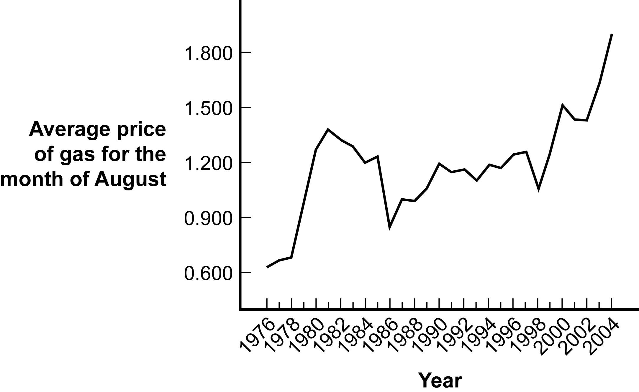 -(Figure: Gas Prices) Identify the type of graph depicted in the figure.
(Multiple Choice)
4.9/5 (33)
Which of these is an example of the clinical application of graphs?
(Multiple Choice)
4.8/5 (25)
Multivariable graphs allow for the simultaneous depiction of several variables at once.
(True/False)
4.8/5 (42)
A group of students graphs the number of gold medals won by each country during the Olympics.What type of graph should be used and what should the x-axis include?
(Multiple Choice)
4.8/5 (36)
_____ allow one to connect points on a map with data points located in space, such as homes for sale.
(Multiple Choice)
4.8/5 (30)
Scatterplots are often used to assess what type of pattern the data create.For example, when the data form a pattern that flows upward and toward the right, this is considered to be a(n):
(Multiple Choice)
4.9/5 (28)
A researcher labels the dependent variable of a bar graph Marital Distress, when what was measured was the number of arguments among couples attending marriage counseling.This misnomer is an example of the _____ lie.
(Multiple Choice)
4.9/5 (36)
Use the following to answer questions
This graph depicts fictional data that replicate the pattern of performance observed in a study published by Nietfeld and Ender (2003).
Figure: Intelligence and Teaching Efficacy 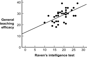 -(Figure: Intelligence and Teaching Efficacy) What might be one way of improving the readability of the graph?
(Multiple Choice)
4.9/5 (33)
A graph showing new job growth by month from September 2013 to December 2013 shows a steady increase.A popular news magazine makes the claim that the job outlook is great for the New Year and beyond.This is an example of a(n) _____ lie.
(Multiple Choice)
4.8/5 (39)
The background images or patterns often included in visual displays of data are known as:
(Multiple Choice)
4.9/5 (33)
Graphs based on sneaky samples are representative of the population.
(True/False)
4.9/5 (32)
It is always best to use the program defaults when creating graphs using computer software programs.
(True/False)
4.8/5 (39)
Viri wants to graph the number of hours of physical activity of a specific group of children over time, following them from the ages of 2 to 17 years.What would be the BEST type of graph for these longitudinal data?
(Multiple Choice)
5.0/5 (37)
Filters
- Essay(0)
- Multiple Choice(0)
- Short Answer(0)
- True False(0)
- Matching(0)