Deck 3: Data Visualization
Full screen (f)
Question
Question
Question
Question
Question
Question
Question
Question
Question
Question
Question
Question
Question
Question
Question
Question
Question
Question
Question
Question
The following image is a 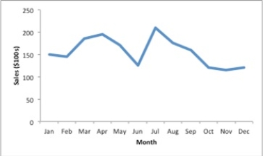
A)sparkline.
B)trendline.
C)gridline.
D)line chart.
A)sparkline.
B)trendline.
C)gridline.
D)line chart.
Question
Consider the clustered bar chart of the dashboard developed to monitor the performance of a call center: 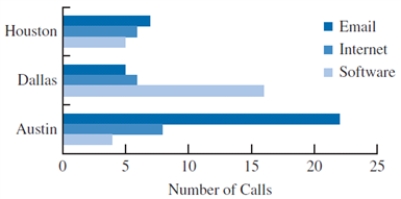 This chart allows the IT manager to
A)identify a particular type of problem by the call volume.
B)identify a particular type of problem by location.
C)identify different types of problems (Email, Internet, or Software) in the call center.
D)identify the frequency of each problem in the call center.
This chart allows the IT manager toA)identify a particular type of problem by the call volume.
B)identify a particular type of problem by location.
C)identify different types of problems (Email, Internet, or Software) in the call center.
D)identify the frequency of each problem in the call center.
Question
Question
Question
The following table is an example of the profit made by Hydro America, a water servicing company, for five different years. 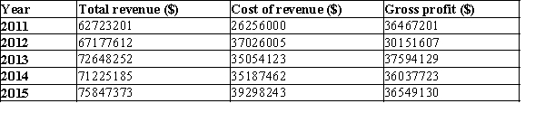 Reformat the table to improve readability and to help the manager identify the year with the highest profit.
Reformat the table to improve readability and to help the manager identify the year with the highest profit. Question
Question
Question
Question
Question
The data on the scores obtained by students in five different entrance exams have been collected from 50 colleges
and they are provided below. Create a PivotTable in Excel to display the number of students who took each exam
and the average score for students in each exam.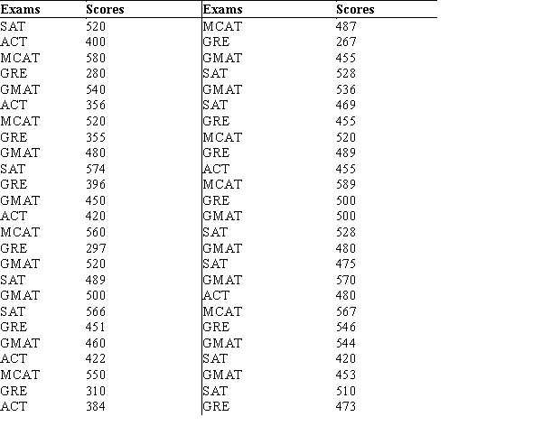
a. Which exam did most students attempt?
b. Which exam has the highest average score?
c. Use the PivotTable to determine the exam attempted by the student with the highest score.What is the exam attempted by the student with the lowest score?
Question
Question
Question
Question
Question
Question
Consider the following table and the line chart on the temperatures in 11 different states of the United States. 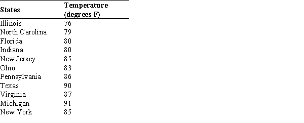
a. What are the problems with the layout and display of this line chart?
b. Create a new line chart for the given data. Format the chart to make it easy to read and interpret.
a. What are the problems with the layout and display of this line chart?
b. Create a new line chart for the given data. Format the chart to make it easy to read and interpret.
Question
Question
Question
Question
Question
Question
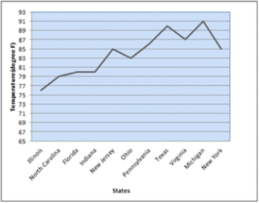
The total number of runs scored by the top five players in a cricket match is 198. The following pie chart shows the percentage of runs scored by each player. 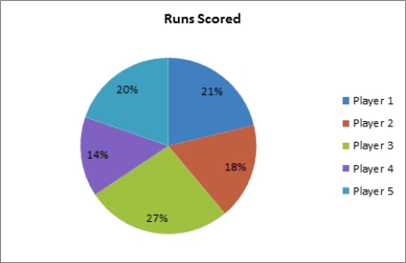
a. What are the problems with using a pie chart to display these data?
b. What type of chart would be preferred for displaying the data in this pie chart?
c. Use a different type of chart to display the percentage of runs scored by each player that conveys the data better than the pie chart. Format the chart and add data labels to improve the chart's readability.
Question
Growth is the primary focus for all companies. A factor that acts as a key term while analyzing the growth of a company is the number of resources/employees working for the company over a period of time. One such study about a start-up company's growth in terms of the increase in the number of employees per month in a span of two years is shown below. 
a. Create a line chart for these time series data. What interpretations can you make about the increase in the number of employees over these 24 months?
b. Fit a linear trendline to the data. What does the trendline indicate about the increase in the number of employees over these 24 months?
a. Create a line chart for these time series data. What interpretations can you make about the increase in the number of employees over these 24 months?
b. Fit a linear trendline to the data. What does the trendline indicate about the increase in the number of employees over these 24 months?
Question
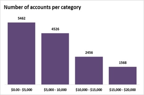
Sadie is constructing a bar chart to describe the average savings account balances for customers at her bank. If the minimum balance is $5.00 and the maximum balance is $18,700, would the following bar chart be a good representation of the data? If not, what would Sadie need to change?
Question
The regional manager of a company wishes to determine the time spent at each division in the car production process. A study was undertaken over a month that resulted in the following data related to the percentage of time spent at three divisions: Car body construction, Paint shop, and Assembly, at four locations of production plants. 
a. Create a stacked-bar chart with production plants along the vertical axis. Reformat the bar chart to best display these data by adding required labels and chart title.
b. Create a clustered-bar chart with production plants along the vertical axis and clusters of divisions. Reformat the bar chart to best display these data by adding required labels and chart title.
c. Create multiple bar charts where each production plant becomes a single bar chart showing the percentage of time spent at the divisions. Reformat the bar charts to best display these data by adding required labels and chart title.
d. Which form of bar chart (stacked, clustered, or multiple) is preferable for these data? Why?
Question
A survey on the average pass percentage achieved by four of the top-ranked colleges of a city for five different years was conducted to rate the quality of teaching in each of these colleges. 
a. Construct a line chart for the time series data for years 1 through 5 showing the average pass percentage in each college. Show the time series for all four colleges on the same graph.
b. What does the line chart indicate about the average pass percentage of the colleges between years 1 through 5? Discuss.
c. Construct a clustered column chart showing average pass percentage in each college using the years 1 through 5 data. Represent the years along the horizontal axis, and cluster the average pass percentages for the four colleges in each year. Which college is leading in each year?
Question
This Excel bar chart displays the demographics of a Business Analysis class. Approximately how many students are in the class? 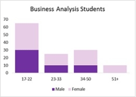
A)15
B)50
C)105
D)30
A)15
B)50
C)105
D)30
Question
Question
Question
The data on the distance walked per week by 20 people of different age groups are given in the table below. 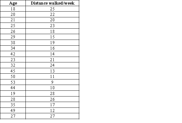
a. Create a scatter chart for these 20 observations.
b. Fit a linear trendline to the 20 observations. What can you say about the relationship between the two quantitative variables?
a. Create a scatter chart for these 20 observations.
b. Fit a linear trendline to the 20 observations. What can you say about the relationship between the two quantitative variables?
Question
The following table shows the average monthly distance travelled (in Billion Miles) by vehicles on urban highways for five different years. 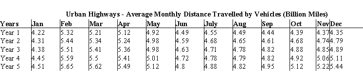
a. Use Excel to create sparklines for the average monthly vehicle distance travelled each year.
b. Which year has decreasing trend of the average distance travelled? Which year has increasing
trend of the average distance travelled?
c. Use Excel to create a heat map for the average distance travelled by vehicles. Do you find the
heat map or the sparklines to be better at communicating the trend of the average vehicle distance
travelled over different years? Why?
Question
Question
The data on the ranks assigned to a random sample of students in a competitive exam based on scores and three different veteran statuses are given below. 
a. Create a parallel-coordinates plot using XLMiner for these data. Include vertical axes for the name, score, and rank. Color the lines by the type of status.
b. According to the parallel-coordinates plot, how are disabled veterans differentiated from veterans?
a. Create a parallel-coordinates plot using XLMiner for these data. Include vertical axes for the name, score, and rank. Color the lines by the type of status.
b. According to the parallel-coordinates plot, how are disabled veterans differentiated from veterans?
Question
This bar chart displays the demographics of a Business Analysis class. How many males students are in the class? 
A)15
B)50
C)75
D)30
A)15
B)50
C)75
D)30
Question
The owner of a grocery store is interested in providing better service to his customers with respect to the wait time at the billing counter. The data on 20 waiting customers are given below. 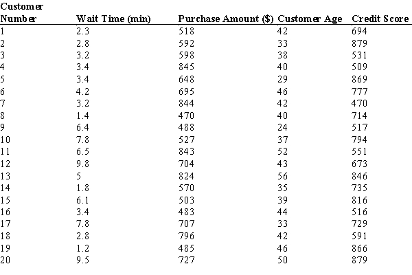
a. Use XLMiner to create a scatter chart matrix for these data. Include the variables wait time, purchase amount, customer age, and credit score.
b. What can you infer about the relationships between these variables from the scatter chart matrix?
a. Use XLMiner to create a scatter chart matrix for these data. Include the variables wait time, purchase amount, customer age, and credit score.
b. What can you infer about the relationships between these variables from the scatter chart matrix?
Question
Consider the following data on 30 different investments and their maturity values after 15 years. 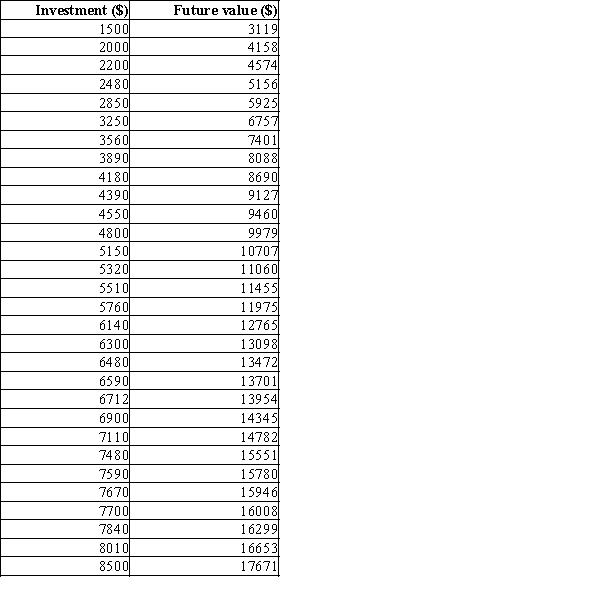
a. Prepare a scatter diagram to show the relationship between the variables Investment and Future value. Comment on any relationship between the variables.
b. Create a trendline for the relationship between Investment and Future value.What does the trendline indicate about this relationship?
a. Prepare a scatter diagram to show the relationship between the variables Investment and Future value. Comment on any relationship between the variables.
b. Create a trendline for the relationship between Investment and Future value.What does the trendline indicate about this relationship?
Question
A local search service company surveys on the number of service centers available in three major cities for different brands of automobiles with an objective to improve the services to its customers. The data on the 20 automobile brands and the number of service centers are given below: 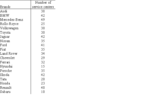
a. How many automobile brands have centers between 20 and 29 in these three cities?
b. How many automobile brands have more than 40 centers in these cities?
a. How many automobile brands have centers between 20 and 29 in these three cities?
b. How many automobile brands have more than 40 centers in these cities?
Question
Consider the following survey results regarding marital status by age. 
a. Construct a stacked-column chart to display the survey data on marital status. Use Age Category as the variable on the horizontal axis.
b. Construct a clustered-column chart to display the survey data. Use Age Category as the variable on the horizontal axis.
c. What can you infer about the relationship between age and marital status from the column charts in parts (a) and (b)? Which column chart (stacked or clustered) is best for interpreting this relationship? Why?
Question
A consumer electronics company, after three months of the launch of five new products in the market, arrived at the following results. 
a. Create a bubble chart where the market share is along the horizontal axis, the profit is on the vertical axis, and the size of the bubbles represents the cost. Format this chart for best presentation by adding axes labels and labelling each bubble with the product name.
b. The manager of the company is interested in producing the product that increases the profit for a given level of market share and cost. From the bubble chart in part a, identify the product which needs to be produced in larger quantity.
c. From the bubble chart in part (a), now identify the product which needs to be produced in larger quantity taking into account its market share, cost, increase in profit.
Question
A summary on commodities below lists the change in price on a particular day for each commodity belonging to three
categories - Base Metals, Precious Metals, and Agricultural & Cattle Futures.
a. Prepare a PivotTable that gives the frequency count of the data by Commodity Type (rows) and the Change (columns). Use classes of -0.25-(-0.15), -0.15-(-0.05), -0.05-0.05, 0.05-0.15, and 0.25-0.35 for the Change (%).
b. What conclusions can you draw about the commodity type and the change (%) in price for that particular day?
Question
POINTS:
1
DIFFICULTY:
Moderate
REFERENCES:
CHARTS, Pages 102-105
NATIONAL STANDARDS:
United States - BUSPROG: Analytic skills - and DISC: Descriptive Statistics
KEYWORDS:
Bloom's: Application
A research was conducted on a sample of 1000 males and 1000 females to study the kind of movie most men and women prefer to watch. The results are shown in the table below.
a. Construct a clustered column chart with the type of movie as the horizontal variable.
b. What can we infer from the clustered bar chart in part (a)?
Question
Data are shown below on the quality rating, volume, average wait time from pull-up to completion, average unit purchase, and revenue tier for franchises of a certain fast food restaurant in Area 6.
Using the table below, complete the crosstabulation chart of quality rating and categorized daily volume.
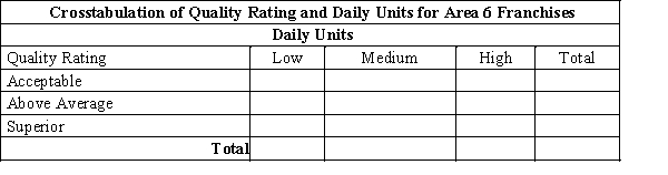
Using the table below, complete the crosstabulation chart of quality rating and categorized daily volume.
Question
Data are show below on the quality rating, volume, average wait time from pull-up to completion, average unit purchase, and revenue tier for franchises of a certain fast food restaurant in Area 6.

Using the table below, complete the crosstabulation chart of Volume Category and Revenue Tier.
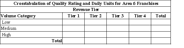
Using the table below, complete the crosstabulation chart of Volume Category and Revenue Tier.
Question
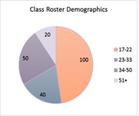
This pie chart describes the age frequencies of students in a Business Analysis class. What is the relative frequency of students who are younger than 23? (Round to a whole number if necessary.)
Question
Question
Construct a scatter chart for the following set of data. Describe the relationship between the two variables.

Question
Question
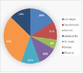
Danah is responsible for reporting the status of sales for his company. The following pie chart shows the percentages of closed sales in each of the top seven cities. Use a different type of chart to display the percentage of sales sold in each city that conveys the data better than the pie chart. Convert the pie chart to a bar chart in order to improve the chart's readability.
Question
Question

Unlock Deck
Sign up to unlock the cards in this deck!
Unlock Deck
Unlock Deck
1/69
Play
Full screen (f)
Deck 3: Data Visualization
1
Deleting the grid lines in a table and the horizontal lines in a chart
A)increases the data-ink ratio.
B)decreases the data-ink ratio.
C)increases the non-data-ink ratio.
D)does not affect the data-ink ratio.
A)increases the data-ink ratio.
B)decreases the data-ink ratio.
C)increases the non-data-ink ratio.
D)does not affect the data-ink ratio.
increases the data-ink ratio.
2
Tables should be used instead of charts when
A)the reader needs relative comparisons of data.
B)there are more than two columns of data.
C)the values being displayed have different units or very different magnitudes.
D)the reader need not differentiate the columns and rows.
A)the reader needs relative comparisons of data.
B)there are more than two columns of data.
C)the values being displayed have different units or very different magnitudes.
D)the reader need not differentiate the columns and rows.
the values being displayed have different units or very different magnitudes.
3
Making visual comparisons between categorical variables is difficult in a
A)scatter chart.
B)pie chart.
C)line chart.
D)column chart.
A)scatter chart.
B)pie chart.
C)line chart.
D)column chart.
pie chart.
4
Using multiple lines on a line chart or employing multiple charts is an alternative to a
A)column chart.
B)line chart.
C)two-dimensional graph.
D)three-dimensional chart.
A)column chart.
B)line chart.
C)two-dimensional graph.
D)three-dimensional chart.
Unlock Deck
Unlock for access to all 69 flashcards in this deck.
Unlock Deck
k this deck
5
Which one of the following statements is not true concerning PivotTables in Excel?
A)PivotTables are also known as crosstabulation tables.
B)PivotTables summarize data for two variables.
C)PivotTables are interactive.
D)PivotTables summarize only categorical and quantitative data.
A)PivotTables are also known as crosstabulation tables.
B)PivotTables summarize data for two variables.
C)PivotTables are interactive.
D)PivotTables summarize only categorical and quantitative data.
Unlock Deck
Unlock for access to all 69 flashcards in this deck.
Unlock Deck
k this deck
6
In many cases, white space in a chart can improve
A)complexity.
B)readability.
C)functionality.
D)stability.
A)complexity.
B)readability.
C)functionality.
D)stability.
Unlock Deck
Unlock for access to all 69 flashcards in this deck.
Unlock Deck
k this deck
7
A _____________ is a graphical presentation of the relationship between two quantitative variables.
A)histogram
B)bar chart
C)pie chart
D)scatter chart
A)histogram
B)bar chart
C)pie chart
D)scatter chart
Unlock Deck
Unlock for access to all 69 flashcards in this deck.
Unlock Deck
k this deck
8
DJ needs to display data over time. Which of the following charts should he use?
A)Scatter chart
B)Pie chart
C)Bar chart
D)Line chart
A)Scatter chart
B)Pie chart
C)Bar chart
D)Line chart
Unlock Deck
Unlock for access to all 69 flashcards in this deck.
Unlock Deck
k this deck
9
A line chart that has no axes but is used to provide information on overall trends for time series data is called a
A)time series plot.
B)sparkline.
C)trendline.
D)bubble chart.
A)time series plot.
B)sparkline.
C)trendline.
D)bubble chart.
Unlock Deck
Unlock for access to all 69 flashcards in this deck.
Unlock Deck
k this deck
10
In order to visualize three variables in a two-dimensional graph, we use a
A)2-D chart.
B)3-D chart.
C)bubble chart.
D)column chart.
A)2-D chart.
B)3-D chart.
C)bubble chart.
D)column chart.
Unlock Deck
Unlock for access to all 69 flashcards in this deck.
Unlock Deck
k this deck
11
The software package most commonly used for creating simple charts is
A)Excel.
B)XLMiner.
C)SAS.
D)R.
A)Excel.
B)XLMiner.
C)SAS.
D)R.
Unlock Deck
Unlock for access to all 69 flashcards in this deck.
Unlock Deck
k this deck
12
______ are visual methods of displaying data.
A)Tables
B)Charts
C)PivotTables
D)Crosstabs
A)Tables
B)Charts
C)PivotTables
D)Crosstabs
Unlock Deck
Unlock for access to all 69 flashcards in this deck.
Unlock Deck
k this deck
13
Fields may be chosen to represent all of the following except ____________ in the body of a PivotTable.
A)rows
B)columns
C)values
D)filters
A)rows
B)columns
C)values
D)filters
Unlock Deck
Unlock for access to all 69 flashcards in this deck.
Unlock Deck
k this deck
14
Bar charts use
A)horizontal bars to display the magnitude of the quantitative variable.
B)vertical bars to display the magnitude of the quantitative variable.
C)horizontal and vertical bars to display the magnitude of the quantitative variable.
D)vertical bars to display the magnitude of the categorical variable.
A)horizontal bars to display the magnitude of the quantitative variable.
B)vertical bars to display the magnitude of the quantitative variable.
C)horizontal and vertical bars to display the magnitude of the quantitative variable.
D)vertical bars to display the magnitude of the categorical variable.
Unlock Deck
Unlock for access to all 69 flashcards in this deck.
Unlock Deck
k this deck
15
A chart that is recommended as an alternative to a pie chart is a
A)bar chart.
B)line chart.
C)stacked column chart.
D)box plot.
A)bar chart.
B)line chart.
C)stacked column chart.
D)box plot.
Unlock Deck
Unlock for access to all 69 flashcards in this deck.
Unlock Deck
k this deck
16
Data-ink is the ink used in a table or chart that
A)does not help in conveying the data to the audience.
B)helps in presenting data when the audience need not know exact values.
C)is necessary to convey the meaning of the data to the audience.
D)increases the non-data-ink ratio.
A)does not help in conveying the data to the audience.
B)helps in presenting data when the audience need not know exact values.
C)is necessary to convey the meaning of the data to the audience.
D)increases the non-data-ink ratio.
Unlock Deck
Unlock for access to all 69 flashcards in this deck.
Unlock Deck
k this deck
17
A time series plot is also known as a
A)boxplot.
B)frequency graph.
C)dot plot
D)line chart.
A)boxplot.
B)frequency graph.
C)dot plot
D)line chart.
Unlock Deck
Unlock for access to all 69 flashcards in this deck.
Unlock Deck
k this deck
18
The charts that are helpful in making comparisons between categorical variables are
A)bar charts and scatter charts.
B)scatter charts and line charts.
C)bar charts and column charts.
D)column charts and line charts.
A)bar charts and scatter charts.
B)scatter charts and line charts.
C)bar charts and column charts.
D)column charts and line charts.
Unlock Deck
Unlock for access to all 69 flashcards in this deck.
Unlock Deck
k this deck
19
A _____________ is a line that provides an approximation of the relationship between the variables.
A)line chart
B)sparkline
C)trendline
D)gridline
A)line chart
B)sparkline
C)trendline
D)gridline
Unlock Deck
Unlock for access to all 69 flashcards in this deck.
Unlock Deck
k this deck
20
The following image is a
A)sparkline.
B)trendline.
C)gridline.
D)line chart.
A)sparkline.
B)trendline.
C)gridline.
D)line chart.
Unlock Deck
Unlock for access to all 69 flashcards in this deck.
Unlock Deck
k this deck
21
Consider the clustered bar chart of the dashboard developed to monitor the performance of a call center: This chart allows the IT manager to
A)identify a particular type of problem by the call volume.
B)identify a particular type of problem by location.
C)identify different types of problems (Email, Internet, or Software) in the call center.
D)identify the frequency of each problem in the call center.
This chart allows the IT manager toA)identify a particular type of problem by the call volume.
B)identify a particular type of problem by location.
C)identify different types of problems (Email, Internet, or Software) in the call center.
D)identify the frequency of each problem in the call center.
Unlock Deck
Unlock for access to all 69 flashcards in this deck.
Unlock Deck
k this deck
22
We create multiple dashboards
A)to help the user scroll vertically and horizontally to see the entire dashboard.
B)so that each dashboard can be viewed on a single screen.
C)to make sure the KPIs are not displayed in the data dashboard.
D)so that all dashboards can be viewed on a single screen.
A)to help the user scroll vertically and horizontally to see the entire dashboard.
B)so that each dashboard can be viewed on a single screen.
C)to make sure the KPIs are not displayed in the data dashboard.
D)so that all dashboards can be viewed on a single screen.
Unlock Deck
Unlock for access to all 69 flashcards in this deck.
Unlock Deck
k this deck
23
A data visualization tool that updates in real time and gives multiple outputs is called
A)a data table.
B)a metrics table.
C)the GIS.
D)a data dashboard.
A)a data table.
B)a metrics table.
C)the GIS.
D)a data dashboard.
Unlock Deck
Unlock for access to all 69 flashcards in this deck.
Unlock Deck
k this deck
24
The following table is an example of the profit made by Hydro America, a water servicing company, for five different years. Reformat the table to improve readability and to help the manager identify the year with the highest profit.
Reformat the table to improve readability and to help the manager identify the year with the highest profit. Unlock Deck
Unlock for access to all 69 flashcards in this deck.
Unlock Deck
k this deck
25
A ______________ is used for examining data with more than two variables, and it includes a different vertical axis for each variable.
A)scatter plot
B)PivotChart
C)column chart
D)parallel-coordinates plot
A)scatter plot
B)PivotChart
C)column chart
D)parallel-coordinates plot
Unlock Deck
Unlock for access to all 69 flashcards in this deck.
Unlock Deck
k this deck
26
A two-dimensional graph representing the data using different shades of color to indicate magnitude is called a
A)heat map.
B)bubble chart.
C)column chart.
D)pie chart.
A)heat map.
B)bubble chart.
C)column chart.
D)pie chart.
Unlock Deck
Unlock for access to all 69 flashcards in this deck.
Unlock Deck
k this deck
27
A PivotChart, in few instances, is the same as a
A)clustered-column chart.
B)bubble chart.
C)stacked-column chart.
D)bar chart.
A)clustered-column chart.
B)bubble chart.
C)stacked-column chart.
D)bar chart.
Unlock Deck
Unlock for access to all 69 flashcards in this deck.
Unlock Deck
k this deck
28
A useful chart for displaying multiple variables is the
A)stacked column and bar chart.
B)scatter chart.
C)scatter chart matrix.
D)two-dimensional graph.
A)stacked column and bar chart.
B)scatter chart.
C)scatter chart matrix.
D)two-dimensional graph.
Unlock Deck
Unlock for access to all 69 flashcards in this deck.
Unlock Deck
k this deck
29
The data on the scores obtained by students in five different entrance exams have been collected from 50 colleges
and they are provided below. Create a PivotTable in Excel to display the number of students who took each exam
and the average score for students in each exam.
a. Which exam did most students attempt?
b. Which exam has the highest average score?
c. Use the PivotTable to determine the exam attempted by the student with the highest score.What is the exam attempted by the student with the lowest score?
and they are provided below. Create a PivotTable in Excel to display the number of students who took each exam
and the average score for students in each exam.
a. Which exam did most students attempt?
b. Which exam has the highest average score?
c. Use the PivotTable to determine the exam attempted by the student with the highest score.What is the exam attempted by the student with the lowest score?
Unlock Deck
Unlock for access to all 69 flashcards in this deck.
Unlock Deck
k this deck
30
A ______________ is useful for visualizing hierarchical data along multiple dimensions.
A)heat map
B)hierarchical map
C)treemap
D)map of multiple hierarchy
A)heat map
B)hierarchical map
C)treemap
D)map of multiple hierarchy
Unlock Deck
Unlock for access to all 69 flashcards in this deck.
Unlock Deck
k this deck
31
An effective display of trend and magnitude is achieved by using a combination of a
A)time series plot and sparklines.
B)line chart and trendlines.
C)heat map and sparklines.
D)bubble chart and trendlines.
A)time series plot and sparklines.
B)line chart and trendlines.
C)heat map and sparklines.
D)bubble chart and trendlines.
Unlock Deck
Unlock for access to all 69 flashcards in this deck.
Unlock Deck
k this deck
32
The best way to differentiate chart elements is using
A)colors.
B)labels.
C)bubbles.
D)chart titles.
A)colors.
B)labels.
C)bubbles.
D)chart titles.
Unlock Deck
Unlock for access to all 69 flashcards in this deck.
Unlock Deck
k this deck
33
To generate a scatter chart matrix, we use
A)native Excel functionality.
B)Excel Add-In XLMiner.
C)Excel Add-In MegaStat.
D)all of these.
A)native Excel functionality.
B)Excel Add-In XLMiner.
C)Excel Add-In MegaStat.
D)all of these.
Unlock Deck
Unlock for access to all 69 flashcards in this deck.
Unlock Deck
k this deck
34
The data dashboard for a marketing manager may have KPIs related to
A)current sales measures and sales by region.
B)current financial standing of the company.
C)data on the company's call center.
D)overall performance of the company's stock over the previous 52 weeks.
A)current sales measures and sales by region.
B)current financial standing of the company.
C)data on the company's call center.
D)overall performance of the company's stock over the previous 52 weeks.
Unlock Deck
Unlock for access to all 69 flashcards in this deck.
Unlock Deck
k this deck
35
Consider the following table and the line chart on the temperatures in 11 different states of the United States.
a. What are the problems with the layout and display of this line chart?
b. Create a new line chart for the given data. Format the chart to make it easy to read and interpret.
a. What are the problems with the layout and display of this line chart?
b. Create a new line chart for the given data. Format the chart to make it easy to read and interpret.
Unlock Deck
Unlock for access to all 69 flashcards in this deck.
Unlock Deck
k this deck
36
To avoid problems in interpreting the differences in color in a heat map, ____________ can be added.
A)a bubble chart
B)a pie chart
C)a scatter chart
D)sparklines
A)a bubble chart
B)a pie chart
C)a scatter chart
D)sparklines
Unlock Deck
Unlock for access to all 69 flashcards in this deck.
Unlock Deck
k this deck
37
In a business, the values indicating the business's current operating characteristics, such as its financial position, the inventory on hand, and customer service metrics, are typically known as
A)company performance indicators.
B)performance indicators.
C)key performance indicators.
D)business performance indicators.
A)company performance indicators.
B)performance indicators.
C)key performance indicators.
D)business performance indicators.
Unlock Deck
Unlock for access to all 69 flashcards in this deck.
Unlock Deck
k this deck
38
An alternative for a stacked column chart when comparing more than a couple of quantitative variables in each category is a
A)stacked bar chart.
B)clustered column chart.
C)pie chart.
D)clustered bar chart.
A)stacked bar chart.
B)clustered column chart.
C)pie chart.
D)clustered bar chart.
Unlock Deck
Unlock for access to all 69 flashcards in this deck.
Unlock Deck
k this deck
39
To summarize and analyze data with both a crosstabulation and charting, Excel typically pairs
A)PivotCharts with PivotTables.
B)stacked column charts with PivotTables.
C)heat maps with trendlines.
D)bubble charts with trendlines.
A)PivotCharts with PivotTables.
B)stacked column charts with PivotTables.
C)heat maps with trendlines.
D)bubble charts with trendlines.
Unlock Deck
Unlock for access to all 69 flashcards in this deck.
Unlock Deck
k this deck
40
_____ merges maps and statistics to present data collected over different geographies.
A)The heat map
B)The geographic information system
C)A geographical map
D)The statistical information system
A)The heat map
B)The geographic information system
C)A geographical map
D)The statistical information system
Unlock Deck
Unlock for access to all 69 flashcards in this deck.
Unlock Deck
k this deck
41
The total number of runs scored by the top five players in a cricket match is 198. The following pie chart shows the percentage of runs scored by each player.
a. What are the problems with using a pie chart to display these data?
b. What type of chart would be preferred for displaying the data in this pie chart?
c. Use a different type of chart to display the percentage of runs scored by each player that conveys the data better than the pie chart. Format the chart and add data labels to improve the chart's readability.
Unlock Deck
Unlock for access to all 69 flashcards in this deck.
Unlock Deck
k this deck
42
Growth is the primary focus for all companies. A factor that acts as a key term while analyzing the growth of a company is the number of resources/employees working for the company over a period of time. One such study about a start-up company's growth in terms of the increase in the number of employees per month in a span of two years is shown below.
a. Create a line chart for these time series data. What interpretations can you make about the increase in the number of employees over these 24 months?
b. Fit a linear trendline to the data. What does the trendline indicate about the increase in the number of employees over these 24 months?
a. Create a line chart for these time series data. What interpretations can you make about the increase in the number of employees over these 24 months?
b. Fit a linear trendline to the data. What does the trendline indicate about the increase in the number of employees over these 24 months?
Unlock Deck
Unlock for access to all 69 flashcards in this deck.
Unlock Deck
k this deck
43
Sadie is constructing a bar chart to describe the average savings account balances for customers at her bank. If the minimum balance is $5.00 and the maximum balance is $18,700, would the following bar chart be a good representation of the data? If not, what would Sadie need to change?
Unlock Deck
Unlock for access to all 69 flashcards in this deck.
Unlock Deck
k this deck
44
The regional manager of a company wishes to determine the time spent at each division in the car production process. A study was undertaken over a month that resulted in the following data related to the percentage of time spent at three divisions: Car body construction, Paint shop, and Assembly, at four locations of production plants.
a. Create a stacked-bar chart with production plants along the vertical axis. Reformat the bar chart to best display these data by adding required labels and chart title.
b. Create a clustered-bar chart with production plants along the vertical axis and clusters of divisions. Reformat the bar chart to best display these data by adding required labels and chart title.
c. Create multiple bar charts where each production plant becomes a single bar chart showing the percentage of time spent at the divisions. Reformat the bar charts to best display these data by adding required labels and chart title.
d. Which form of bar chart (stacked, clustered, or multiple) is preferable for these data? Why?
Unlock Deck
Unlock for access to all 69 flashcards in this deck.
Unlock Deck
k this deck
45
A survey on the average pass percentage achieved by four of the top-ranked colleges of a city for five different years was conducted to rate the quality of teaching in each of these colleges.
a. Construct a line chart for the time series data for years 1 through 5 showing the average pass percentage in each college. Show the time series for all four colleges on the same graph.
b. What does the line chart indicate about the average pass percentage of the colleges between years 1 through 5? Discuss.
c. Construct a clustered column chart showing average pass percentage in each college using the years 1 through 5 data. Represent the years along the horizontal axis, and cluster the average pass percentages for the four colleges in each year. Which college is leading in each year?
Unlock Deck
Unlock for access to all 69 flashcards in this deck.
Unlock Deck
k this deck
46
This Excel bar chart displays the demographics of a Business Analysis class. Approximately how many students are in the class?
A)15
B)50
C)105
D)30
A)15
B)50
C)105
D)30
Unlock Deck
Unlock for access to all 69 flashcards in this deck.
Unlock Deck
k this deck
47
Natalie needs to compare the number of employees by job title for the last five years. Which of the following charts should Natalie use?
A)scatter chart
B)bubble chart
C)clustered-column (bar) chart
D)line chart
A)scatter chart
B)bubble chart
C)clustered-column (bar) chart
D)line chart
Unlock Deck
Unlock for access to all 69 flashcards in this deck.
Unlock Deck
k this deck
48
The income levels vary by race and educational attainment. To examine this inequality in the income, data have been collected for seven different years on the median income earned by an individual based on the race and education.
a. Sort the PivotTable data to display the years with the smallest sum of median income on top and the largest on the bottom. Which year had the smallest sum of median income? What is the total income in the year with the smallest sum of median income?
b. Add the Racial Demographic to the Row Labels in the PivotTable. Sort the Racial Demographic by Sum of Median Income with the lowest values on top and the highest values on bottom. Filter the Row Labels so that only the year 2003 is displayed. Which Racial demography had the smallest sum of median income in the year 2003? Which Racial demography had the largest sum of median income in the year 2003?
Unlock Deck
Unlock for access to all 69 flashcards in this deck.
Unlock Deck
k this deck
49
The data on the distance walked per week by 20 people of different age groups are given in the table below.
a. Create a scatter chart for these 20 observations.
b. Fit a linear trendline to the 20 observations. What can you say about the relationship between the two quantitative variables?
a. Create a scatter chart for these 20 observations.
b. Fit a linear trendline to the 20 observations. What can you say about the relationship between the two quantitative variables?
Unlock Deck
Unlock for access to all 69 flashcards in this deck.
Unlock Deck
k this deck
50
The following table shows the average monthly distance travelled (in Billion Miles) by vehicles on urban highways for five different years.
a. Use Excel to create sparklines for the average monthly vehicle distance travelled each year.
b. Which year has decreasing trend of the average distance travelled? Which year has increasing
trend of the average distance travelled?
c. Use Excel to create a heat map for the average distance travelled by vehicles. Do you find the
heat map or the sparklines to be better at communicating the trend of the average vehicle distance
travelled over different years? Why?
Unlock Deck
Unlock for access to all 69 flashcards in this deck.
Unlock Deck
k this deck
51
The project lead in an MNC decides to assign every member of his team to a new project and monitors their performance on a customized scale of scores. The data on their performance over a period of six months are shown below
a. Create a heat map in Excel that shades the cells with negative performance scores. Use Excel's Conditional Formatting function to create this heat map.
b. For each month, identify the team members who scored negative. Which month has the highest negative performance scores?
a. Create a heat map in Excel that shades the cells with negative performance scores. Use Excel's Conditional Formatting function to create this heat map.
b. For each month, identify the team members who scored negative. Which month has the highest negative performance scores?
Unlock Deck
Unlock for access to all 69 flashcards in this deck.
Unlock Deck
k this deck
52
The data on the ranks assigned to a random sample of students in a competitive exam based on scores and three different veteran statuses are given below.
a. Create a parallel-coordinates plot using XLMiner for these data. Include vertical axes for the name, score, and rank. Color the lines by the type of status.
b. According to the parallel-coordinates plot, how are disabled veterans differentiated from veterans?
a. Create a parallel-coordinates plot using XLMiner for these data. Include vertical axes for the name, score, and rank. Color the lines by the type of status.
b. According to the parallel-coordinates plot, how are disabled veterans differentiated from veterans?
Unlock Deck
Unlock for access to all 69 flashcards in this deck.
Unlock Deck
k this deck
53
This bar chart displays the demographics of a Business Analysis class. How many males students are in the class?
A)15
B)50
C)75
D)30
A)15
B)50
C)75
D)30
Unlock Deck
Unlock for access to all 69 flashcards in this deck.
Unlock Deck
k this deck
54
The owner of a grocery store is interested in providing better service to his customers with respect to the wait time at the billing counter. The data on 20 waiting customers are given below.
a. Use XLMiner to create a scatter chart matrix for these data. Include the variables wait time, purchase amount, customer age, and credit score.
b. What can you infer about the relationships between these variables from the scatter chart matrix?
a. Use XLMiner to create a scatter chart matrix for these data. Include the variables wait time, purchase amount, customer age, and credit score.
b. What can you infer about the relationships between these variables from the scatter chart matrix?
Unlock Deck
Unlock for access to all 69 flashcards in this deck.
Unlock Deck
k this deck
55
Consider the following data on 30 different investments and their maturity values after 15 years.
a. Prepare a scatter diagram to show the relationship between the variables Investment and Future value. Comment on any relationship between the variables.
b. Create a trendline for the relationship between Investment and Future value.What does the trendline indicate about this relationship?
a. Prepare a scatter diagram to show the relationship between the variables Investment and Future value. Comment on any relationship between the variables.
b. Create a trendline for the relationship between Investment and Future value.What does the trendline indicate about this relationship?
Unlock Deck
Unlock for access to all 69 flashcards in this deck.
Unlock Deck
k this deck
56
A local search service company surveys on the number of service centers available in three major cities for different brands of automobiles with an objective to improve the services to its customers. The data on the 20 automobile brands and the number of service centers are given below:
a. How many automobile brands have centers between 20 and 29 in these three cities?
b. How many automobile brands have more than 40 centers in these cities?
a. How many automobile brands have centers between 20 and 29 in these three cities?
b. How many automobile brands have more than 40 centers in these cities?
Unlock Deck
Unlock for access to all 69 flashcards in this deck.
Unlock Deck
k this deck
57
Consider the following survey results regarding marital status by age.
a. Construct a stacked-column chart to display the survey data on marital status. Use Age Category as the variable on the horizontal axis.
b. Construct a clustered-column chart to display the survey data. Use Age Category as the variable on the horizontal axis.
c. What can you infer about the relationship between age and marital status from the column charts in parts (a) and (b)? Which column chart (stacked or clustered) is best for interpreting this relationship? Why?
Unlock Deck
Unlock for access to all 69 flashcards in this deck.
Unlock Deck
k this deck
58
A consumer electronics company, after three months of the launch of five new products in the market, arrived at the following results.
a. Create a bubble chart where the market share is along the horizontal axis, the profit is on the vertical axis, and the size of the bubbles represents the cost. Format this chart for best presentation by adding axes labels and labelling each bubble with the product name.
b. The manager of the company is interested in producing the product that increases the profit for a given level of market share and cost. From the bubble chart in part a, identify the product which needs to be produced in larger quantity.
c. From the bubble chart in part (a), now identify the product which needs to be produced in larger quantity taking into account its market share, cost, increase in profit.
Unlock Deck
Unlock for access to all 69 flashcards in this deck.
Unlock Deck
k this deck
59
A summary on commodities below lists the change in price on a particular day for each commodity belonging to three
categories - Base Metals, Precious Metals, and Agricultural & Cattle Futures.
a. Prepare a PivotTable that gives the frequency count of the data by Commodity Type (rows) and the Change (columns). Use classes of -0.25-(-0.15), -0.15-(-0.05), -0.05-0.05, 0.05-0.15, and 0.25-0.35 for the Change (%).
b. What conclusions can you draw about the commodity type and the change (%) in price for that particular day?
categories - Base Metals, Precious Metals, and Agricultural & Cattle Futures.
a. Prepare a PivotTable that gives the frequency count of the data by Commodity Type (rows) and the Change (columns). Use classes of -0.25-(-0.15), -0.15-(-0.05), -0.05-0.05, 0.05-0.15, and 0.25-0.35 for the Change (%).
b. What conclusions can you draw about the commodity type and the change (%) in price for that particular day?
Unlock Deck
Unlock for access to all 69 flashcards in this deck.
Unlock Deck
k this deck
60
POINTS:
1
DIFFICULTY:
Moderate
REFERENCES:
CHARTS, Pages 102-105
NATIONAL STANDARDS:
United States - BUSPROG: Analytic skills - and DISC: Descriptive Statistics
KEYWORDS:
Bloom's: Application
A research was conducted on a sample of 1000 males and 1000 females to study the kind of movie most men and women prefer to watch. The results are shown in the table below.
a. Construct a clustered column chart with the type of movie as the horizontal variable.
b. What can we infer from the clustered bar chart in part (a)?
1
DIFFICULTY:
Moderate
REFERENCES:
CHARTS, Pages 102-105
NATIONAL STANDARDS:
United States - BUSPROG: Analytic skills - and DISC: Descriptive Statistics
KEYWORDS:
Bloom's: Application
A research was conducted on a sample of 1000 males and 1000 females to study the kind of movie most men and women prefer to watch. The results are shown in the table below.
a. Construct a clustered column chart with the type of movie as the horizontal variable.
b. What can we infer from the clustered bar chart in part (a)?
Unlock Deck
Unlock for access to all 69 flashcards in this deck.
Unlock Deck
k this deck
61
Data are shown below on the quality rating, volume, average wait time from pull-up to completion, average unit purchase, and revenue tier for franchises of a certain fast food restaurant in Area 6.
Using the table below, complete the crosstabulation chart of quality rating and categorized daily volume.
Using the table below, complete the crosstabulation chart of quality rating and categorized daily volume.
Unlock Deck
Unlock for access to all 69 flashcards in this deck.
Unlock Deck
k this deck
62
Data are show below on the quality rating, volume, average wait time from pull-up to completion, average unit purchase, and revenue tier for franchises of a certain fast food restaurant in Area 6.
Using the table below, complete the crosstabulation chart of Volume Category and Revenue Tier.
Using the table below, complete the crosstabulation chart of Volume Category and Revenue Tier.
Unlock Deck
Unlock for access to all 69 flashcards in this deck.
Unlock Deck
k this deck
63
This pie chart describes the age frequencies of students in a Business Analysis class. What is the relative frequency of students who are younger than 23? (Round to a whole number if necessary.)
Unlock Deck
Unlock for access to all 69 flashcards in this deck.
Unlock Deck
k this deck
64
A graphical presentation that uses vertical bars to display the magnitude of quantitative data is known as a
A)scatter chart.
B)bubble chart.
C)clustered column chart.
D)column chart.
A)scatter chart.
B)bubble chart.
C)clustered column chart.
D)column chart.
Unlock Deck
Unlock for access to all 69 flashcards in this deck.
Unlock Deck
k this deck
65
Construct a scatter chart for the following set of data. Describe the relationship between the two variables.
Unlock Deck
Unlock for access to all 69 flashcards in this deck.
Unlock Deck
k this deck
66
The ratio of the amount of ink used in a table or chart that is necessary to convey information to the total amount of ink used in the table and chart is known as data-ink ratio. Using additional ink that is not necessary to convey information has what effect on the data-ink ratio?
A)reduces
B)increases
C)it doesn't change the data-ink ratio
D)the data-ink ratio becomes zero
A)reduces
B)increases
C)it doesn't change the data-ink ratio
D)the data-ink ratio becomes zero
Unlock Deck
Unlock for access to all 69 flashcards in this deck.
Unlock Deck
k this deck
67
Danah is responsible for reporting the status of sales for his company. The following pie chart shows the percentages of closed sales in each of the top seven cities. Use a different type of chart to display the percentage of sales sold in each city that conveys the data better than the pie chart. Convert the pie chart to a bar chart in order to improve the chart's readability.
Unlock Deck
Unlock for access to all 69 flashcards in this deck.
Unlock Deck
k this deck
68
Never use a ________ chart when a __________ chart will suffice.
A)3-D; 2-D
B)2-D; 3-D
C)color; black and white
D)bar; pie
A)3-D; 2-D
B)2-D; 3-D
C)color; black and white
D)bar; pie
Unlock Deck
Unlock for access to all 69 flashcards in this deck.
Unlock Deck
k this deck
69
DJ needs to display data over time. Which of the following charts should DJ use?
A)scatter chart
B)pie chart
C)bar chart
D)line chart
A)scatter chart
B)pie chart
C)bar chart
D)line chart
Unlock Deck
Unlock for access to all 69 flashcards in this deck.
Unlock Deck
k this deck
Unlock Deck
Unlock for access to all 69 flashcards in this deck.


