Exam 3: Data Visualization
Exam 1: Introduction49 Questions
Exam 2: Descriptive Statistics84 Questions
Exam 3: Data Visualization69 Questions
Exam 4: Descriptive Data Mining56 Questions
Exam 5: Probability: an Introduction to Modeling Uncertainty62 Questions
Exam 6: Statistical Inference62 Questions
Exam 7: Linear Regression71 Questions
Exam 8: Time Series Analysis and Forecasting58 Questions
Exam 9: Predictive Data Mining40 Questions
Exam 10: Spreadsheet Models64 Questions
Exam 11: Linear Optimization Models58 Questions
Exam 12: Integer Linear Optimization Models56 Questions
Exam 13: Nonlinear Optimization Models55 Questions
Exam 14: Monte Carlo Simulation59 Questions
Exam 15: Decision Analysis58 Questions
Select questions type
A data visualization tool that updates in real time and gives multiple outputs is called
Free
(Multiple Choice)
4.7/5  (30)
(30)
Correct Answer: Verified
D
Consider the following data on 30 different investments and their maturity values after 15 years.
a. Prepare a scatter diagram to show the relationship between the variables Investment and Future value. Comment on any relationship between the variables.
b. Create a trendline for the relationship between Investment and Future value.What does the trendline indicate about this relationship?
Free
(Essay)
4.7/5 (45)
Correct Answer:Verified
a. 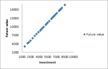 There appears to be a positive linear relationship between Investment and Future value. As Investment increases, Future value also increases.
b. 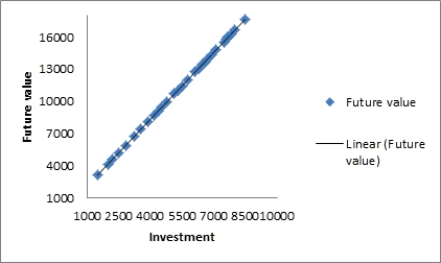 The trendline confirms that there is a positive linear trend between Investment and Future value.
A _____________ is a line that provides an approximation of the relationship between the variables.
Free
(Multiple Choice)
4.9/5 (37)
Correct Answer:Verified
C
In order to visualize three variables in a two-dimensional graph, we use a
(Multiple Choice)
4.9/5 (33)
To avoid problems in interpreting the differences in color in a heat map, ____________ can be added.
(Multiple Choice)
4.9/5 (33)
A summary on commodities below lists the change in price on a particular day for each commodity belonging to three
categories - Base Metals, Precious Metals, and Agricultural & Cattle Futures. Commodity Summary Commodity Type of Commodity Price Change (\%) Aluminu Base metals 1700 0.0750 Gold Precious metals 1229 -0.2300 Corn Agricultural \& Cattle Futures 400 0.0125 Silver Precious metals 1975 -0.1800 Aluminu Base metals 1750 -0.1000 Wheat Agricultural \& Cattle Futures 640 -0.0425 Soybeans Agricultural \& Cattle Futures 1300 -0.1250 Copper Base metals 7012 -0.1700 Platinum Precious metals 1357 -0.1900 Cocoa Agricultural \& Cattle Futures 2.8 0.0000 Coffee Agricultural \& Cattle Futures 109 -0.0085 Lead Base metals 2065 -0.1000 White Sugar Agricultural \& Cattle Futures 450 -0.0900 Sugar 11 Agricultural \& Cattle Futures 20.19 -0.0087 Nickel Base metals 13300 -0.2500 Cotton Agricultural \& Cattle Futures 77.39 -0.0087 Oranges Agricultural \& Cattle Futures 139.62 -0.0040 Tin Base metals 22600 0.3000 Palladium Precious metals 717 -0.0700 Palm oil Agricultural \& Cattle Futures 930 0.0500 Zinc Base metals 1800 -0.0100
a. Prepare a PivotTable that gives the frequency count of the data by Commodity Type (rows) and the Change (columns). Use classes of -0.25-(-0.15), -0.15-(-0.05), -0.05-0.05, 0.05-0.15, and 0.25-0.35 for the Change (%).
b. What conclusions can you draw about the commodity type and the change (%) in price for that particular day?
(Essay)
4.9/5 (34)
A two-dimensional graph representing the data using different shades of color to indicate magnitude is called a
(Multiple Choice)
4.8/5 (28)
The data dashboard for a marketing manager may have KPIs related to
(Multiple Choice)
4.9/5 (42)
Growth is the primary focus for all companies. A factor that acts as a key term while analyzing the growth of a company is the number of resources/employees working for the company over a period of time. One such study about a start-up company's growth in terms of the increase in the number of employees per month in a span of two years is shown below. Month Number of employees 1 40 2 48 3 50 4 52 5 49 6 54 7 57 8 53 9 60 10 64 11 68 12 70 13 73 14 76 15 72 16 75 17 79 18 80 19 84 20 82 21 86 22 89 23 94 24 100
a. Create a line chart for these time series data. What interpretations can you make about the increase in the number of employees over these 24 months?
b. Fit a linear trendline to the data. What does the trendline indicate about the increase in the number of employees over these 24 months?
(Essay)
4.9/5 (35)
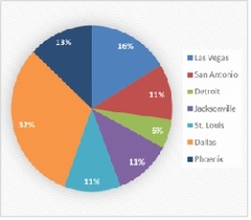
Danah is responsible for reporting the status of sales for his company. The following pie chart shows the percentages of closed sales in each of the top seven cities. Use a different type of chart to display the percentage of sales sold in each city that conveys the data better than the pie chart. Convert the pie chart to a bar chart in order to improve the chart's readability.
(Essay)
4.8/5 (39)
Consider the following table and the line chart on the temperatures in 11 different states of the United States. States Temperature (degrees F) Illinois 76 North Carolina 79 Florida 80 Indiana 80 New Jersey 85 Ohio 83 Pennsylvania 86 Texas 90 Virginia 87 Michigan 91 New York 85 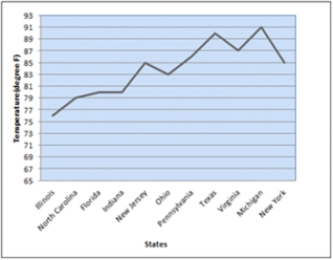 a. What are the problems with the layout and display of this line chart?
b. Create a new line chart for the given data. Format the chart to make it easy to read and interpret.
a. What are the problems with the layout and display of this line chart?
b. Create a new line chart for the given data. Format the chart to make it easy to read and interpret.
(Essay)
4.9/5 (36)
Deleting the grid lines in a table and the horizontal lines in a chart
(Multiple Choice)
4.8/5 (33)
This bar chart displays the demographics of a Business Analysis class. How many males students are in the class? 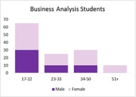
(Multiple Choice)
4.7/5 (37)
Using multiple lines on a line chart or employing multiple charts is an alternative to a
(Multiple Choice)
4.8/5 (27)
Making visual comparisons between categorical variables is difficult in a
(Multiple Choice)
4.8/5 (32)
Never use a ________ chart when a __________ chart will suffice.
(Multiple Choice)
4.8/5 (32)
The regional manager of a company wishes to determine the time spent at each division in the car production process. A study was undertaken over a month that resulted in the following data related to the percentage of time spent at three divisions: Car body construction, Paint shop, and Assembly, at four locations of production plants. Production Plants Car Body Constuction (\%) Paint Shop (\%) Assembly (\%) Michigan 35 45 20 Kentucky 37 41 22 Illinois 33 39 28 Ohio 36 40 24
a. Create a stacked-bar chart with production plants along the vertical axis. Reformat the bar chart to best display these data by adding required labels and chart title.
b. Create a clustered-bar chart with production plants along the vertical axis and clusters of divisions. Reformat the bar chart to best display these data by adding required labels and chart title.
c. Create multiple bar charts where each production plant becomes a single bar chart showing the percentage of time spent at the divisions. Reformat the bar charts to best display these data by adding required labels and chart title.
d. Which form of bar chart (stacked, clustered, or multiple) is preferable for these data? Why?
(Essay)
4.8/5 (32)
Filters
- Essay(0)
- Multiple Choice(0)
- Short Answer(0)
- True False(0)
- Matching(0)