Deck 2: Psychosocial Health
Full screen (f)
Question
Question
Question
Question
The following graph shows the average grade point average for a particular college from 2006 until 2013.
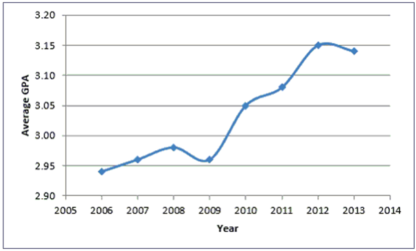
A)Average GPA is the dependent variable in the graph.
B)Historically, the Average GPA of the college tends to decrease.
C)There appears to be no relationship between Year and Average GPA.
D)Year is the dependent variable in the graph.
A)Average GPA is the dependent variable in the graph.
B)Historically, the Average GPA of the college tends to decrease.
C)There appears to be no relationship between Year and Average GPA.
D)Year is the dependent variable in the graph.
Question
Question
Question
Question
Question
Question
Question
Question
Question
Question
Question
Question
Question
Question
The following graph shows the curb weight of seven cars, in pounds, along with their corresponding highway miles per gallon.
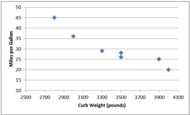
A)Miles per gallon is the independent variable in the graph.
B)As the curb weight increases, the highway miles per gallon tend to increase.
C)Curb weight is the dependent variable in the graph.
D)As the curb weight increases, the highway miles per gallon tend to decrease.
A)Miles per gallon is the independent variable in the graph.
B)As the curb weight increases, the highway miles per gallon tend to increase.
C)Curb weight is the dependent variable in the graph.
D)As the curb weight increases, the highway miles per gallon tend to decrease.
Question
The following graph shows the curb weight of seven cars, in pounds, along with their corresponding highway miles per gallon.
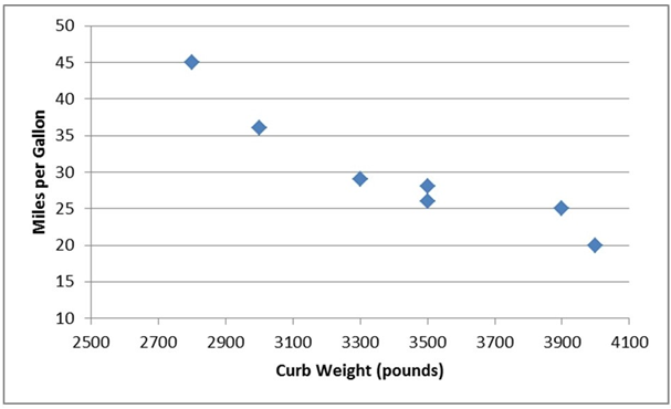
A)Pareto chart
B)scatter plot
C)line chart
D)histogram
A)Pareto chart
B)scatter plot
C)line chart
D)histogram
Question
Question
Question
Question
Question
Question
Question
Question
Question
Question
Question
Question
The following chart shows the average number of hours commuters spend in traffic delays per year at the six most congested cities in the U.S.
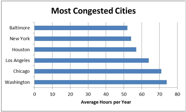
A)vertical bar chart.
B)horizontal bar chart.
C)Pareto chart.
D)stacked bar chart.
A)vertical bar chart.
B)horizontal bar chart.
C)Pareto chart.
D)stacked bar chart.
Question
Question
Question
Question
Question
Question
Question
The following chart shows the average number of hours commuters spend in traffic delays per year at the six most congested cities in the U.S.
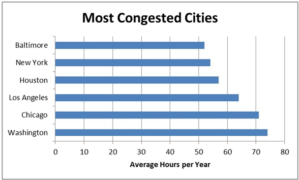
A)Houston commuters have a higher average number of hours spent per year in traffic delays when compared to New York commuters.
B)Chicago commuters have the highest average number of hours spent per year in traffic delays.
C)Baltimore commuters have the lowest average number of hours spent per year in traffic delays.
D)Los Angeles commuters have a lower average number of hours spent per year in traffic delays when compared to Washington commuters.
Question
Question
Question
Question
Question
Question
Question
Question
Question
Question
Question
Question
Question
Question
Question
Question
Question
Question
Question
Question
Question
Question
Question
Question
Question
Question
Question
Question
Question
Question
Question
Question
Question
Question
Question
Question
Question

Unlock Deck
Sign up to unlock the cards in this deck!
Unlock Deck
Unlock Deck
1/75
Play
Full screen (f)
Deck 2: Psychosocial Health
1
---------charts are a specific type of bar chart used in quality control programs by businesses to graphically display the causes of problems.
A)Stacked bar
B)Pareto
C)Clustered bar
D)Pie
A)Stacked bar
B)Pareto
C)Clustered bar
D)Pie
Pareto
2
The ---------- graphs the midpoint of each class as a line rather than a column.
A)bar chart
B)scatter plot
C)histogram
D)percentage polygon
A)bar chart
B)scatter plot
C)histogram
D)percentage polygon
percentage polygon
3
A stem and leaf display most resembles a _____ .
A)histogram
B)pie chart
C)relative frequency distribution
D)contingency table
A)histogram
B)pie chart
C)relative frequency distribution
D)contingency table
histogram
4
The following graph shows the average grade point average for a particular college from 2006 until 2013.
A)Average GPA is the dependent variable in the graph.
B)Historically, the Average GPA of the college tends to decrease.
C)There appears to be no relationship between Year and Average GPA.
D)Year is the dependent variable in the graph.
A)Average GPA is the dependent variable in the graph.
B)Historically, the Average GPA of the college tends to decrease.
C)There appears to be no relationship between Year and Average GPA.
D)Year is the dependent variable in the graph.
Unlock Deck
Unlock for access to all 75 flashcards in this deck.
Unlock Deck
k this deck
5
The class---------- is the breadth, or range, of numbers we plan to put into each class of a frequency distribution using grouped quantitative data.
A)frequency
B)width
C)number
D)boundary
A)frequency
B)width
C)number
D)boundary
Unlock Deck
Unlock for access to all 75 flashcards in this deck.
Unlock Deck
k this deck
6
The class------- represent the minimum and maximum values for each class of a frequency distribution using grouped quantitative data.
A)numbers
B)boundaries
C)frequencies
D)width
A)numbers
B)boundaries
C)frequencies
D)width
Unlock Deck
Unlock for access to all 75 flashcards in this deck.
Unlock Deck
k this deck
7
Class ------ are the number of observations for each class of a frequency distribution using grouped quantitative data.
A)width s
A)width s
Unlock Deck
Unlock for access to all 75 flashcards in this deck.
Unlock Deck
k this deck
8
When you want to compare the shape of two or more distributions on one graph, a ------------ is your best choice
A)frequency distribution
B)percentage polygon
C)relative frequency distribution
D)histogram
A)frequency distribution
B)percentage polygon
C)relative frequency distribution
D)histogram
Unlock Deck
Unlock for access to all 75 flashcards in this deck.
Unlock Deck
k this deck
9
Which of the following is not a rule for constructing a frequency distribution using grouped quantitative data?
A)Avoid empty classes.
B)Avoid close- ended classes.
C)Use equal- size classes.
D)Use mutually exclusive classes.
A)Avoid empty classes.
B)Avoid close- ended classes.
C)Use equal- size classes.
D)Use mutually exclusive classes.
Unlock Deck
Unlock for access to all 75 flashcards in this deck.
Unlock Deck
k this deck
10
In Excel, contingency tables are known as --------.
A)pivot tables
B)frequency distributions
C)bar charts
D)bins
A)pivot tables
B)frequency distributions
C)bar charts
D)bins
Unlock Deck
Unlock for access to all 75 flashcards in this deck.
Unlock Deck
k this deck
11
--------totals the proportion of observations that are less than or equal to the class at which you are looking.
A)Histograms
B)Relative frequency distributions
C)Cumulative relative frequency distributions
D)Frequency distributions
A)Histograms
B)Relative frequency distributions
C)Cumulative relative frequency distributions
D)Frequency distributions
Unlock Deck
Unlock for access to all 75 flashcards in this deck.
Unlock Deck
k this deck
12
------provide a picture of the relationship between two data points that are paired together.
A)Histograms
B)Scatter plots
C)Pareto charts
D)Pie charts
A)Histograms
B)Scatter plots
C)Pareto charts
D)Pie charts
Unlock Deck
Unlock for access to all 75 flashcards in this deck.
Unlock Deck
k this deck
13
A data set has 60 observations with a minimum value equal to 30 and a maximum value equal to 72. The estimated class width using the 2k c n rule to determine the number of classes is
A)9.
B)12.
C)10.
D)7.
A)9.
B)12.
C)10.
D)7.
Unlock Deck
Unlock for access to all 75 flashcards in this deck.
Unlock Deck
k this deck
14
A--------- chart is a special type of scatter plot in which the data points in the scatter plot are connected with a line.
A)pie
B)Pareto
C)bar
D)line
A)pie
B)Pareto
C)bar
D)line
Unlock Deck
Unlock for access to all 75 flashcards in this deck.
Unlock Deck
k this deck
15
A(n)---------- is a category in a frequency distribution.
A)histogram
B)class
C)ogive
D)polygon
A)histogram
B)class
C)ogive
D)polygon
Unlock Deck
Unlock for access to all 75 flashcards in this deck.
Unlock Deck
k this deck
16
--------------data are values based on observations that can be counted and are typically represented by whole numbers.
A)Continuous
B)Nominal
C)Discrete
D)Time series
A)Continuous
B)Nominal
C)Discrete
D)Time series
Unlock Deck
Unlock for access to all 75 flashcards in this deck.
Unlock Deck
k this deck
17
---------group several values in a single column within the same category in a vertical direction.
A)Pie charts
B)Clustered bar charts
C)Scatter plots
D)Stacked bar charts
A)Pie charts
B)Clustered bar charts
C)Scatter plots
D)Stacked bar charts
Unlock Deck
Unlock for access to all 75 flashcards in this deck.
Unlock Deck
k this deck
18
The following graph shows the curb weight of seven cars, in pounds, along with their corresponding highway miles per gallon.
A)Miles per gallon is the independent variable in the graph.
B)As the curb weight increases, the highway miles per gallon tend to increase.
C)Curb weight is the dependent variable in the graph.
D)As the curb weight increases, the highway miles per gallon tend to decrease.
A)Miles per gallon is the independent variable in the graph.
B)As the curb weight increases, the highway miles per gallon tend to increase.
C)Curb weight is the dependent variable in the graph.
D)As the curb weight increases, the highway miles per gallon tend to decrease.
Unlock Deck
Unlock for access to all 75 flashcards in this deck.
Unlock Deck
k this deck
19
The following graph shows the curb weight of seven cars, in pounds, along with their corresponding highway miles per gallon.
A)Pareto chart
B)scatter plot
C)line chart
D)histogram
A)Pareto chart
B)scatter plot
C)line chart
D)histogram
Unlock Deck
Unlock for access to all 75 flashcards in this deck.
Unlock Deck
k this deck
20
--------display the proportion of observations of each class relative to the total number of observations.
A)Cumulative relative frequency distributions
B)Frequency distributions
C)Histograms
D)Relative frequency distributions
A)Cumulative relative frequency distributions
B)Frequency distributions
C)Histograms
D)Relative frequency distributions
Unlock Deck
Unlock for access to all 75 flashcards in this deck.
Unlock Deck
k this deck
21
A data set has 60 observations with a minimum value equal to 30 and a maximum value equal to 72. The number of classes using the 2k c n rule is
A)6.
B)7.
C)8.
D)5.
A)6.
B)7.
C)8.
D)5.
Unlock Deck
Unlock for access to all 75 flashcards in this deck.
Unlock Deck
k this deck
22
The----- is a line graph that plots the cumulative relative frequency distribution.
A)scatter plot
B)percentage polygon
C)ogive
D)histogram
A)scatter plot
B)percentage polygon
C)ogive
D)histogram
Unlock Deck
Unlock for access to all 75 flashcards in this deck.
Unlock Deck
k this deck
23
The goal of constructing a frequency distribution is to identify a useful pattern in the data and often there is more than one acceptable way to accomplish this with grouped quantitative data.
Unlock Deck
Unlock for access to all 75 flashcards in this deck.
Unlock Deck
k this deck
24
------provide a format to display observations that have more than one value associated with them.
A)Histograms
B)Contingency tables
C)Pie charts
D)Frequency distributions
A)Histograms
B)Contingency tables
C)Pie charts
D)Frequency distributions
Unlock Deck
Unlock for access to all 75 flashcards in this deck.
Unlock Deck
k this deck
25
A ________ is a table that shows the number of data observations that fall into specific intervals.
A)histogram
B)percent polygon
C)frequency distribution
D)Pareto chart
A)histogram
B)percent polygon
C)frequency distribution
D)Pareto chart
Unlock Deck
Unlock for access to all 75 flashcards in this deck.
Unlock Deck
k this deck
26
Under no circumstances should open- ended classes be used for a frequency distribution using grouped quantitative data.
Unlock Deck
Unlock for access to all 75 flashcards in this deck.
Unlock Deck
k this deck
27
A------- is a graph showing the number of observations in each class of a frequency distribution.
A)relative frequency distribution
B)polygon
C)histogram
D)frequency distribution
A)relative frequency distribution
B)polygon
C)histogram
D)frequency distribution
Unlock Deck
Unlock for access to all 75 flashcards in this deck.
Unlock Deck
k this deck
28
Use a------- chart if you want to compare the relative sizes of the classes in a frequency distribution and together they comprise all possible categories.
A)Pareto
B)horizontal bar
C)vertical bar
D)pie
A)Pareto
B)horizontal bar
C)vertical bar
D)pie
Unlock Deck
Unlock for access to all 75 flashcards in this deck.
Unlock Deck
k this deck
29
----------are values that can take on any real numbers, including numbers that contain decimal points. This data is often the result of measuring observations rather than counting them.
A)Discrete
B)Ordinal
C)Cross- sectional
D)Continuous
A)Discrete
B)Ordinal
C)Cross- sectional
D)Continuous
Unlock Deck
Unlock for access to all 75 flashcards in this deck.
Unlock Deck
k this deck
30
Bins in Excel represent the
A)upper boundary of each class in a frequency distribution.
B)width of each class in a frequency distribution.
C)number of classes in a frequency distribution.
D)lower boundary of each class in a frequency distribution.
A)upper boundary of each class in a frequency distribution.
B)width of each class in a frequency distribution.
C)number of classes in a frequency distribution.
D)lower boundary of each class in a frequency distribution.
Unlock Deck
Unlock for access to all 75 flashcards in this deck.
Unlock Deck
k this deck
31
The following chart shows the average number of hours commuters spend in traffic delays per year at the six most congested cities in the U.S.
A)vertical bar chart.
B)horizontal bar chart.
C)Pareto chart.
D)stacked bar chart.
A)vertical bar chart.
B)horizontal bar chart.
C)Pareto chart.
D)stacked bar chart.
Unlock Deck
Unlock for access to all 75 flashcards in this deck.
Unlock Deck
k this deck
32
---------group several values side by side within the same category in a vertical direction.
A)Pie charts
B)Stacked bar charts
C)Clustered bar charts
D)Scatter plots
A)Pie charts
B)Stacked bar charts
C)Clustered bar charts
D)Scatter plots
Unlock Deck
Unlock for access to all 75 flashcards in this deck.
Unlock Deck
k this deck
33
Pareto charts also plot the cumulative relative frequency as a line on the chart. This line is known as a(n)----------.
A)frequency distribution
B)histogram
C)scatter plot
D)ogive
A)frequency distribution
B)histogram
C)scatter plot
D)ogive
Unlock Deck
Unlock for access to all 75 flashcards in this deck.
Unlock Deck
k this deck
34
----------classes are classes with boundaries that do not overlap.
A)Equal- size
B)Open- ended
C)Close- ended
D)Mutually exclusive
A)Equal- size
B)Open- ended
C)Close- ended
D)Mutually exclusive
Unlock Deck
Unlock for access to all 75 flashcards in this deck.
Unlock Deck
k this deck
35
The dependent variable in a scatter plot is influenced by changes in the independent variable.
Unlock Deck
Unlock for access to all 75 flashcards in this deck.
Unlock Deck
k this deck
36
Fifty employees at CSC Corporation responded to a survey asking for the number of minutes they commute to work in the morning. Management would like to know the proportion of employees whose commute is less than 30 minutes. A cumulative relative frequency distribution using grouped data would provide the information to answer this question.
Unlock Deck
Unlock for access to all 75 flashcards in this deck.
Unlock Deck
k this deck
37
Clustered bar charts are preferred over stacked bar charts when you are comparing data within categories, such as which team scored more points in 2009 when compared to 2010.
Unlock Deck
Unlock for access to all 75 flashcards in this deck.
Unlock Deck
k this deck
38
The following chart shows the average number of hours commuters spend in traffic delays per year at the six most congested cities in the U.S.
A)Houston commuters have a higher average number of hours spent per year in traffic delays when compared to New York commuters.
B)Chicago commuters have the highest average number of hours spent per year in traffic delays.
C)Baltimore commuters have the lowest average number of hours spent per year in traffic delays.
D)Los Angeles commuters have a lower average number of hours spent per year in traffic delays when compared to Washington commuters.
Unlock Deck
Unlock for access to all 75 flashcards in this deck.
Unlock Deck
k this deck
39
Histograms displaying continuous data have gaps between their bars.
Unlock Deck
Unlock for access to all 75 flashcards in this deck.
Unlock Deck
k this deck
40
Empty classes for a frequency distribution using grouped quantitative data result from class widths that are too wide.
Unlock Deck
Unlock for access to all 75 flashcards in this deck.
Unlock Deck
k this deck
41
When creating a frequency distribution with grouped qualitative data and 45 data points, five classes should be set up using the 2k c n rule.
Unlock Deck
Unlock for access to all 75 flashcards in this deck.
Unlock Deck
k this deck
42
Choose a pie chart rather than a bar chart if you want to highlight the actual data values and when the classes combined don't form a whole.
Unlock Deck
Unlock for access to all 75 flashcards in this deck.
Unlock Deck
k this deck
43
The cumulative percentage polygon is a line graph that plots the cumulative relative frequency distribution.
Unlock Deck
Unlock for access to all 75 flashcards in this deck.
Unlock Deck
k this deck
44
The estimated class width for a frequency distribution using grouped quantitative data should be rounded to an integer value to make the class boundaries more readable.
Unlock Deck
Unlock for access to all 75 flashcards in this deck.
Unlock Deck
k this deck
45
When graphing a time series, the convention is to place the time data on the vertical axis of the graph.
Unlock Deck
Unlock for access to all 75 flashcards in this deck.
Unlock Deck
k this deck
46
The sum of the cumulative relative frequencies for the cumulative relative frequency distribution should be equal to or very close to 1.0 due to rounding.
Unlock Deck
Unlock for access to all 75 flashcards in this deck.
Unlock Deck
k this deck
47
When constructing a pie chart, all categories in the data set must be included in the pie.
Unlock Deck
Unlock for access to all 75 flashcards in this deck.
Unlock Deck
k this deck
48
Pareto charts are a specific type of bar chart used in quality control programs by businesses to graphically display the causes of problems.
Unlock Deck
Unlock for access to all 75 flashcards in this deck.
Unlock Deck
k this deck
49
Contingency tables help us identify relationships between two or more variables.
Unlock Deck
Unlock for access to all 75 flashcards in this deck.
Unlock Deck
k this deck
50
Income and age are examples of data that are technically discrete but are normally displayed in a continuous format.
Unlock Deck
Unlock for access to all 75 flashcards in this deck.
Unlock Deck
k this deck
51
The stem and leaf display is a graphical technique that can used to display qualitative data.
Unlock Deck
Unlock for access to all 75 flashcards in this deck.
Unlock Deck
k this deck
52
A histogram is the appropriate type of graph to display both quantitative and qualitative data.
Unlock Deck
Unlock for access to all 75 flashcards in this deck.
Unlock Deck
k this deck
53
When constructing a frequency distribution with grouped qualitative data, occasionally you will end up with k + 1 or k - 1 classes to cover the entire data set.
Unlock Deck
Unlock for access to all 75 flashcards in this deck.
Unlock Deck
k this deck
54
Discrete data can have an infinite number of values within a specific interval.
Unlock Deck
Unlock for access to all 75 flashcards in this deck.
Unlock Deck
k this deck
55
Continuous data are values based on observations that can be counted and are typically represented by whole numbers.
Unlock Deck
Unlock for access to all 75 flashcards in this deck.
Unlock Deck
k this deck
56
The sum of the relative frequencies for the relative frequency distribution should be equal to or very close to 1.0 due to rounding.
Unlock Deck
Unlock for access to all 75 flashcards in this deck.
Unlock Deck
k this deck
57
A stem and leaf display allows you to observe individual data values while a histogram groups data values together.
Unlock Deck
Unlock for access to all 75 flashcards in this deck.
Unlock Deck
k this deck
58
The only limitation in the number of continuous values within an interval is the level of precision of the measuring instrument.
Unlock Deck
Unlock for access to all 75 flashcards in this deck.
Unlock Deck
k this deck
59
Each category of a pie chart occupies a segment of the pie that represents the cumulative relative frequency of that category.
Unlock Deck
Unlock for access to all 75 flashcards in this deck.
Unlock Deck
k this deck
60
A data set is known as a times series when each data point is associated with a specific point in time.
Unlock Deck
Unlock for access to all 75 flashcards in this deck.
Unlock Deck
k this deck
61
Bar charts can display data either horizontally or vertically.
Unlock Deck
Unlock for access to all 75 flashcards in this deck.
Unlock Deck
k this deck
62
A symmetrical distribution is one in which the right side of the distribution looks like the mirror image of the left side of the distribution.
Unlock Deck
Unlock for access to all 75 flashcards in this deck.
Unlock Deck
k this deck
63
Pie charts are an excellent tool for comparing proportions for qualitative (categorical)data.
Unlock Deck
Unlock for access to all 75 flashcards in this deck.
Unlock Deck
k this deck
64
A frequency distribution is a table that shows the number of data observations that fall into specific intervals.
Unlock Deck
Unlock for access to all 75 flashcards in this deck.
Unlock Deck
k this deck
65
If the class sizes are not equal for a frequency distribution using grouped quantitative data, patterns in the distribution could be misleading.
Unlock Deck
Unlock for access to all 75 flashcards in this deck.
Unlock Deck
k this deck
66
Choose a pie chart rather than a bar chart if you want to compare the relative sizes of the classes to one another and together they comprise all possible categories.
Unlock Deck
Unlock for access to all 75 flashcards in this deck.
Unlock Deck
k this deck
67
The independent variable on scatter plots is placed on the vertical axis on the graph.
Unlock Deck
Unlock for access to all 75 flashcards in this deck.
Unlock Deck
k this deck
68
Clustered bar charts are preferred over stacked bar charts when you are displaying totals in each category, such as what team scored the most points over the two- year period.
Unlock Deck
Unlock for access to all 75 flashcards in this deck.
Unlock Deck
k this deck
69
Pareto charts display the categories in an increasing order with the least problematic categories shown first.
Unlock Deck
Unlock for access to all 75 flashcards in this deck.
Unlock Deck
k this deck
70
Fifty employees at CSC Corporation responded to a survey asking for the number of minutes they commute to work in the morning. Eighteen employees indicated that their commutes are 15 to less than 20 minutes. The relative frequency for this class in a frequency distribution would be 0.18.
Unlock Deck
Unlock for access to all 75 flashcards in this deck.
Unlock Deck
k this deck
71
Continuous data is often the result of measuring observations rather than counting them.
Unlock Deck
Unlock for access to all 75 flashcards in this deck.
Unlock Deck
k this deck
72
Histograms displaying discrete data usually have gaps between their bars.
Unlock Deck
Unlock for access to all 75 flashcards in this deck.
Unlock Deck
k this deck
73
Quantitative data are values that are categorical, describing a characteristic such as gender or level of education.
Unlock Deck
Unlock for access to all 75 flashcards in this deck.
Unlock Deck
k this deck
74
Equal- size classes refer to classes for a frequency distribution using grouped quantitative data that do not overlap.
Unlock Deck
Unlock for access to all 75 flashcards in this deck.
Unlock Deck
k this deck
75
The dependent variable on scatter plots is placed on the horizontal axis on the graph.
Unlock Deck
Unlock for access to all 75 flashcards in this deck.
Unlock Deck
k this deck
Unlock Deck
Unlock for access to all 75 flashcards in this deck.


