Deck 3: Data Presentation
Full screen (f)
Question
Question
Question
Question
Question
Question
Question
Question
Question
Question
Question
Question
Question
Question
Question
Question
Question
Question
Question
Question
Question
Question
Question
Question
Question
Question
Question
Question
Question
Question
Question
Question
Question
Question
Question
Question
Question
Question
Question
Question
Question
Which type of data presentation method is below? 
A) Bar graph
B) Scatter diagram
C) Pie chart
D) Line graph
A) Bar graph
B) Scatter diagram
C) Pie chart
D) Line graph
Question
Based on the chart below, if Small Town, OK desires to have between three and five physicians for each practice type, which type of specialty needs to hire more physicians to meet this quota? 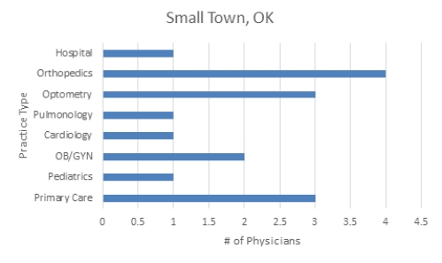
A) Orthopedics
B) Optometry
C) Primary Care
D) Pediatrics
A) Orthopedics
B) Optometry
C) Primary Care
D) Pediatrics
Question
Which weight category in the chart below has the largest number of student athletes? 
A) 51-100 pounds
B) 101-150 pounds
C) 151-200 pounds
D) 201-250 pounds
A) 51-100 pounds
B) 101-150 pounds
C) 151-200 pounds
D) 201-250 pounds
Question
Which type of data presentation method is below? 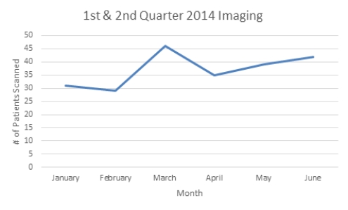
A) Bar graph
B) Pictogram
C) Pie chart
D) Line graph
A) Bar graph
B) Pictogram
C) Pie chart
D) Line graph
Question
Which type of data presentation method is below? Small Town has a small number of physicians. 
A) Bar graph
B) Pictogram
C) Pie chart
D) Histogram
A) Bar graph
B) Pictogram
C) Pie chart
D) Histogram
Question
Use the graph below to answer this question: Around what time did the patient reach the maximum beats per minute? 
A) 60 seconds
B) 80 seconds
C) 100 seconds
D) 120 seconds
A) 60 seconds
B) 80 seconds
C) 100 seconds
D) 120 seconds
Question
Which type of data presentation method is below? 
A) Pictogram
B) Scatter diagram
C) Pie chart
D) Line graph
A) Pictogram
B) Scatter diagram
C) Pie chart
D) Line graph
Question
Which month had the lowest number of patient scans (X-rays, CT scans, etc.)? 
A) January
B) February
C) March
D) April
A) January
B) February
C) March
D) April
Question
Use the graph below to answer this question: Which bpm interval contains the most data points? 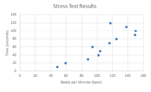
A) 40-60 bpm
B) 80-100 bpm
C) 100-120 bpm
D) 120-140 bpm
A) 40-60 bpm
B) 80-100 bpm
C) 100-120 bpm
D) 120-140 bpm
Question
Which type of data presentation method is below? A group of 100 student athletes were surveyed regarding their weights: 
A) scatter diagram.
B) pictogram.
C) pie chart.
D) histogram.
A) scatter diagram.
B) pictogram.
C) pie chart.
D) histogram.

Unlock Deck
Sign up to unlock the cards in this deck!
Unlock Deck
Unlock Deck
1/50
Play
Full screen (f)
Deck 3: Data Presentation
1
The ________ of a table needs to give a quick and complete snapshot of the data within.
A) table shell
B) box head
C) title
D) cells
A) table shell
B) box head
C) title
D) cells
title
2
A ______ presents data categories in percentages of a whole.
A) scatter diagram
B) bar graph
C) pie chart
D) line graph
A) scatter diagram
B) bar graph
C) pie chart
D) line graph
pie chart
3
A ______ is best used to illustrate trends in the frequency of data.
A) scatter diagram
B) bar graph
C) pie chart
D) line graph
A) scatter diagram
B) bar graph
C) pie chart
D) line graph
line graph
4
What are used to display continuous data that has been organized into a series of intervals?
A) Scatter diagrams
B) Histograms
C) Pie charts
D) Line graphs
A) Scatter diagrams
B) Histograms
C) Pie charts
D) Line graphs
Unlock Deck
Unlock for access to all 50 flashcards in this deck.
Unlock Deck
k this deck
5
What is it called when all the data you have fits into all the categories you have?
A) Mutually exhaustive
B) Exhaustive
C) Justified
D) Empty
A) Mutually exhaustive
B) Exhaustive
C) Justified
D) Empty
Unlock Deck
Unlock for access to all 50 flashcards in this deck.
Unlock Deck
k this deck
6
This names the individual columns by captions or column titles.
A) Table shell
B) Box head
C) Title
D) Cells
A) Table shell
B) Box head
C) Title
D) Cells
Unlock Deck
Unlock for access to all 50 flashcards in this deck.
Unlock Deck
k this deck
7
Two variable tables (like the number of discharges by gender and month) are referred to as what type of tables?
A) Frequency table
B) Contingency table
C) Precision table
D) Pivot table
A) Frequency table
B) Contingency table
C) Precision table
D) Pivot table
Unlock Deck
Unlock for access to all 50 flashcards in this deck.
Unlock Deck
k this deck
8
What is it called when no piece of data can fit into more than one category?
A) Mutually exclusive
B) Exhaustive
C) Justified
D) Empty
A) Mutually exclusive
B) Exhaustive
C) Justified
D) Empty
Unlock Deck
Unlock for access to all 50 flashcards in this deck.
Unlock Deck
k this deck
9
The general structure of the table is referred to as what?
A) Table shell
B) Box head
C) Title
D) Cells
A) Table shell
B) Box head
C) Title
D) Cells
Unlock Deck
Unlock for access to all 50 flashcards in this deck.
Unlock Deck
k this deck
10
The _____ of the data tells the reader the origin of the data and allows him or her to reproduce the study using the same data if necessary or desired.
A) footnotes
B) appendices
C) figures
D) source
A) footnotes
B) appendices
C) figures
D) source
Unlock Deck
Unlock for access to all 50 flashcards in this deck.
Unlock Deck
k this deck
11
You cannot perform mathematical calculations on which type of data?
A) Integral
B) Categorical
C) Discrete
D) Continuous
A) Integral
B) Categorical
C) Discrete
D) Continuous
Unlock Deck
Unlock for access to all 50 flashcards in this deck.
Unlock Deck
k this deck
12
The significant figures, or the number of digits for decimal places, are referred to as ______ and should be the same for any decimals used.
A) frequency
B) contingency
C) precision
D) pivot
A) frequency
B) contingency
C) precision
D) pivot
Unlock Deck
Unlock for access to all 50 flashcards in this deck.
Unlock Deck
k this deck
13
Additional explanations for elements of the table or anything that is not displayed within the body of the table or the source explanation are called what?
A) Footnotes
B) Appendices
C) References
D) Figures
A) Footnotes
B) Appendices
C) References
D) Figures
Unlock Deck
Unlock for access to all 50 flashcards in this deck.
Unlock Deck
k this deck
14
A _____ table works by automatically extracting the information you want to see and summarizing the information in a smaller, separate table.
A) frequency
B) contingency
C) precision
D) pivot
A) frequency
B) contingency
C) precision
D) pivot
Unlock Deck
Unlock for access to all 50 flashcards in this deck.
Unlock Deck
k this deck
15
The intersection of a column and a row is referred to as a ________.
A) table shell
B) box head
C) title
D) cell
A) table shell
B) box head
C) title
D) cell
Unlock Deck
Unlock for access to all 50 flashcards in this deck.
Unlock Deck
k this deck
16
One feature that data analysts use frequently to summarize the data in a lengthy table is called a ______ table.
A) frequency table
B) contingency table
C) precision table
D) pivot table
A) frequency table
B) contingency table
C) precision table
D) pivot table
Unlock Deck
Unlock for access to all 50 flashcards in this deck.
Unlock Deck
k this deck
17
_______ tables are obvious displays of data that show how many of a category appears for each class interval.
A) Frequency
B) Contingency
C) Precision
D) Pivot
A) Frequency
B) Contingency
C) Precision
D) Pivot
Unlock Deck
Unlock for access to all 50 flashcards in this deck.
Unlock Deck
k this deck
18
A ______ helps visualize suspected cause and effect relationships between independent and dependent variables.
A) scatter diagram
B) bar graph
C) pie chart
D) line graph
A) scatter diagram
B) bar graph
C) pie chart
D) line graph
Unlock Deck
Unlock for access to all 50 flashcards in this deck.
Unlock Deck
k this deck
19
A ____ also uses the x and y axis but uses columns instead of a coordinate of the two axes.
A) scatter diagram
B) bar graph
C) pie chart
D) line graph
A) scatter diagram
B) bar graph
C) pie chart
D) line graph
Unlock Deck
Unlock for access to all 50 flashcards in this deck.
Unlock Deck
k this deck
20
A _______ is an excellent choice for representing categorical or nominal data, like gender, race, marital status, and zip code, where the bars do not touch because the data is not continuous.
A) scatter diagram
B) bar chart
C) pie chart
D) line graph
A) scatter diagram
B) bar chart
C) pie chart
D) line graph
Unlock Deck
Unlock for access to all 50 flashcards in this deck.
Unlock Deck
k this deck
21
If you were tasked with displaying the results of a Likert scale, (survey method of answering as in "strongly agree, agree, no opinion, disagree, strongly disagree") which presentation type would you use?
A) Scatter diagram
B) Bar graph
C) Pie chart
D) Line graph
A) Scatter diagram
B) Bar graph
C) Pie chart
D) Line graph
Unlock Deck
Unlock for access to all 50 flashcards in this deck.
Unlock Deck
k this deck
22
In a pie chart, all the slices will always add up to what percent?
A) 25%
B) 50%
C) 75%
D) 100%
A) 25%
B) 50%
C) 75%
D) 100%
Unlock Deck
Unlock for access to all 50 flashcards in this deck.
Unlock Deck
k this deck
23
Which of the following is a disadvantage of a line graph?
A) It provides a quick picture of the trend increase, decrease, or no change in your data.
B) It's easy to graph.
C) Exact data values may not be available.
D) It provides a quick picture of the trend over time.
A) It provides a quick picture of the trend increase, decrease, or no change in your data.
B) It's easy to graph.
C) Exact data values may not be available.
D) It provides a quick picture of the trend over time.
Unlock Deck
Unlock for access to all 50 flashcards in this deck.
Unlock Deck
k this deck
24
Which type of presentation method shows actual data points that can be used to examine relationships (like medicine and test results)?
A) Scatter diagram
B) Histogram
C) Pie chart
D) Line graph
A) Scatter diagram
B) Histogram
C) Pie chart
D) Line graph
Unlock Deck
Unlock for access to all 50 flashcards in this deck.
Unlock Deck
k this deck
25
A coding supervisor has been trying to manage the workload of an increase in the number of charts that need to be coded from a recent corresponding increase in admissions. While her coders have been getting the charts coded, she has also seen the percentage of miscoded charts increase. She suspects that it might be from the charts coded with overtime hours. What is the independent variable?
A) Number of charts
B) Overtime hours
C) Increase in admissions
D) Number of errors
A) Number of charts
B) Overtime hours
C) Increase in admissions
D) Number of errors
Unlock Deck
Unlock for access to all 50 flashcards in this deck.
Unlock Deck
k this deck
26
You are asked to build a graphic display of data showing the frequency of cancer incidence among age groups ranging from 1 to 10, 11 to 20, 21 to 30, 31 to 40, 41 to 50, 51 to 60, 61 to 70, 71 to 80, and 81 to 90. Which data presentation method would you choose?
A) Pictogram
B) Histogram
C) Scatter diagram
D) Bar graph
A) Pictogram
B) Histogram
C) Scatter diagram
D) Bar graph
Unlock Deck
Unlock for access to all 50 flashcards in this deck.
Unlock Deck
k this deck
27
Which data presentation method would you choose for the following health care data? A primary care facility compiled data for the month of February and found that 8% of patients needed a referral to a specialist, 12% required further imaging services (X-rays, CT scans, etc.), 58% needed a prescription, 5% were there for a follow-up appointment, 7% needed physicals, and 10% needed immunizations.
A) Scatter diagram
B) Pictogram
C) Pie chart
D) Line graph
A) Scatter diagram
B) Pictogram
C) Pie chart
D) Line graph
Unlock Deck
Unlock for access to all 50 flashcards in this deck.
Unlock Deck
k this deck
28
Which of the following is an advantage of pictograms?
A) They may possibly distort the data.
B) They are an attractive way to present data.
C) Data is often rounded off to fit into the units that are being used.
D) It can be confusing when used to compare one pictogram to another.
A) They may possibly distort the data.
B) They are an attractive way to present data.
C) Data is often rounded off to fit into the units that are being used.
D) It can be confusing when used to compare one pictogram to another.
Unlock Deck
Unlock for access to all 50 flashcards in this deck.
Unlock Deck
k this deck
29
If you were tasked with displaying census data over a 50-year interval, which data presentation method would you choose to display it?
A) Scatter diagram
B) Pictogram
C) Pie chart
D) Line graph
A) Scatter diagram
B) Pictogram
C) Pie chart
D) Line graph
Unlock Deck
Unlock for access to all 50 flashcards in this deck.
Unlock Deck
k this deck
30
Which of the following is a disadvantage of pictograms?
A) They convey a sense of large findings by using icons to represent units.
B) They are incredibly engaging.
C) They may possibly distort the data.
D) They are an attractive way to present data.
A) They convey a sense of large findings by using icons to represent units.
B) They are incredibly engaging.
C) They may possibly distort the data.
D) They are an attractive way to present data.
Unlock Deck
Unlock for access to all 50 flashcards in this deck.
Unlock Deck
k this deck
31
The vertical axis that records the frequency of the dependent variable is also called what?
A) x axis
B) z axis
C) y axis
D) Coordinates
A) x axis
B) z axis
C) y axis
D) Coordinates
Unlock Deck
Unlock for access to all 50 flashcards in this deck.
Unlock Deck
k this deck
32
What uses icons instead of numbers to represent units of data?
A) Pictograms
B) Histograms
C) Scatter diagrams
D) Bar graphs
A) Pictograms
B) Histograms
C) Scatter diagrams
D) Bar graphs
Unlock Deck
Unlock for access to all 50 flashcards in this deck.
Unlock Deck
k this deck
33
The data displayed on a heart rate monitor machine is an example of what?
A) Scatter diagram
B) Histogram
C) Pie chart
D) Line graph
A) Scatter diagram
B) Histogram
C) Pie chart
D) Line graph
Unlock Deck
Unlock for access to all 50 flashcards in this deck.
Unlock Deck
k this deck
34
You have collected nutritional information. Which data presentation method would you choose to display it?
A) Scatter diagram
B) Table
C) Pie chart
D) Line graph
A) Scatter diagram
B) Table
C) Pie chart
D) Line graph
Unlock Deck
Unlock for access to all 50 flashcards in this deck.
Unlock Deck
k this deck
35
Which type of presentation method shows the minimum, maximum, and outliers?
A) Scatter diagram
B) Histogram
C) Pie chart
D) Line graph
A) Scatter diagram
B) Histogram
C) Pie chart
D) Line graph
Unlock Deck
Unlock for access to all 50 flashcards in this deck.
Unlock Deck
k this deck
36
Which presentation type is NOT continuous?
A) Scatter diagram
B) Histogram
C) Bar graph
D) Line graph
A) Scatter diagram
B) Histogram
C) Bar graph
D) Line graph
Unlock Deck
Unlock for access to all 50 flashcards in this deck.
Unlock Deck
k this deck
37
Which type of data representation is best used to show comparisons of the proportions of categories to each other?
A) Scatter diagram
B) Histogram
C) Pie chart
D) Line graph
A) Scatter diagram
B) Histogram
C) Pie chart
D) Line graph
Unlock Deck
Unlock for access to all 50 flashcards in this deck.
Unlock Deck
k this deck
38
The horizontal axis that is used to place the independent variables is also called what?
A) x axis
B) z axis
C) y axis
D) Coordinates
A) x axis
B) z axis
C) y axis
D) Coordinates
Unlock Deck
Unlock for access to all 50 flashcards in this deck.
Unlock Deck
k this deck
39
A coding supervisor has been trying to manage the workload of an increase in the number of charts that need to be coded from a recent corresponding increase in admissions. While her coders have been getting the charts coded, she has also seen the percentage of miscoded charts increase. She suspects that it might be from the charts coded with overtime hours. What is the dependent variable?
A) Number of charts
B) Overtime hours
C) Increase in admissions
D) Number of errors
A) Number of charts
B) Overtime hours
C) Increase in admissions
D) Number of errors
Unlock Deck
Unlock for access to all 50 flashcards in this deck.
Unlock Deck
k this deck
40
The location of the data point that is to be plotted is called a _______.
A) x axis
B) z axis
C) y axis
D) Coordinate
A) x axis
B) z axis
C) y axis
D) Coordinate
Unlock Deck
Unlock for access to all 50 flashcards in this deck.
Unlock Deck
k this deck
41
Which type of data presentation method is below?
A) Bar graph
B) Scatter diagram
C) Pie chart
D) Line graph
A) Bar graph
B) Scatter diagram
C) Pie chart
D) Line graph
Unlock Deck
Unlock for access to all 50 flashcards in this deck.
Unlock Deck
k this deck
42
Based on the chart below, if Small Town, OK desires to have between three and five physicians for each practice type, which type of specialty needs to hire more physicians to meet this quota?
A) Orthopedics
B) Optometry
C) Primary Care
D) Pediatrics
A) Orthopedics
B) Optometry
C) Primary Care
D) Pediatrics
Unlock Deck
Unlock for access to all 50 flashcards in this deck.
Unlock Deck
k this deck
43
Which weight category in the chart below has the largest number of student athletes?
A) 51-100 pounds
B) 101-150 pounds
C) 151-200 pounds
D) 201-250 pounds
A) 51-100 pounds
B) 101-150 pounds
C) 151-200 pounds
D) 201-250 pounds
Unlock Deck
Unlock for access to all 50 flashcards in this deck.
Unlock Deck
k this deck
44
Which type of data presentation method is below?
A) Bar graph
B) Pictogram
C) Pie chart
D) Line graph
A) Bar graph
B) Pictogram
C) Pie chart
D) Line graph
Unlock Deck
Unlock for access to all 50 flashcards in this deck.
Unlock Deck
k this deck
45
Which type of data presentation method is below? Small Town has a small number of physicians.
A) Bar graph
B) Pictogram
C) Pie chart
D) Histogram
A) Bar graph
B) Pictogram
C) Pie chart
D) Histogram
Unlock Deck
Unlock for access to all 50 flashcards in this deck.
Unlock Deck
k this deck
46
Use the graph below to answer this question: Around what time did the patient reach the maximum beats per minute?
A) 60 seconds
B) 80 seconds
C) 100 seconds
D) 120 seconds
A) 60 seconds
B) 80 seconds
C) 100 seconds
D) 120 seconds
Unlock Deck
Unlock for access to all 50 flashcards in this deck.
Unlock Deck
k this deck
47
Which type of data presentation method is below?
A) Pictogram
B) Scatter diagram
C) Pie chart
D) Line graph
A) Pictogram
B) Scatter diagram
C) Pie chart
D) Line graph
Unlock Deck
Unlock for access to all 50 flashcards in this deck.
Unlock Deck
k this deck
48
Which month had the lowest number of patient scans (X-rays, CT scans, etc.)?
A) January
B) February
C) March
D) April
A) January
B) February
C) March
D) April
Unlock Deck
Unlock for access to all 50 flashcards in this deck.
Unlock Deck
k this deck
49
Use the graph below to answer this question: Which bpm interval contains the most data points?
A) 40-60 bpm
B) 80-100 bpm
C) 100-120 bpm
D) 120-140 bpm
A) 40-60 bpm
B) 80-100 bpm
C) 100-120 bpm
D) 120-140 bpm
Unlock Deck
Unlock for access to all 50 flashcards in this deck.
Unlock Deck
k this deck
50
Which type of data presentation method is below? A group of 100 student athletes were surveyed regarding their weights:
A) scatter diagram.
B) pictogram.
C) pie chart.
D) histogram.
A) scatter diagram.
B) pictogram.
C) pie chart.
D) histogram.
Unlock Deck
Unlock for access to all 50 flashcards in this deck.
Unlock Deck
k this deck
Unlock Deck
Unlock for access to all 50 flashcards in this deck.


