Deck 2: Economic Models: Trade-Offs and Trade
Full screen (f)
Question
Question
Question
Question
Figure: Hot Drinks Sold and Temperature
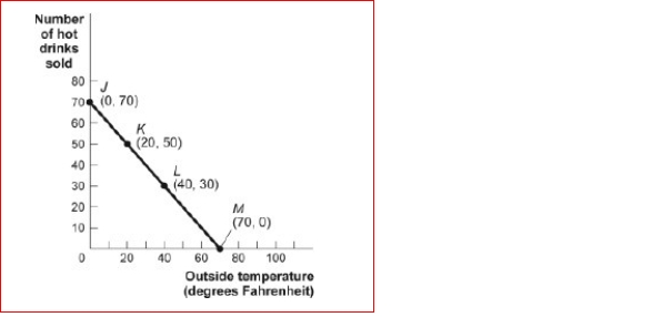 (Figure: Hot Drinks Sold and Temperature) Look at the figure Hot Drinks Sold and Temperature.If we move from point J to point L in the figure, the outside temperature has and the
number of hot drinks sold has _.
A.decreased by 30 degrees; increased by 30 drinks
B.increased by 20 degrees; decreased by 20 drinks
C.increased by 30 degrees; decreased by 30 drinks
D.increased by 40 degrees; decreased by 40 drinks
(Figure: Hot Drinks Sold and Temperature) Look at the figure Hot Drinks Sold and Temperature.If we move from point J to point L in the figure, the outside temperature has and thenumber of hot drinks sold has _.
A.decreased by 30 degrees; increased by 30 drinks
B.increased by 20 degrees; decreased by 20 drinks
C.increased by 30 degrees; decreased by 30 drinks
D.increased by 40 degrees; decreased by 40 drinks
Question
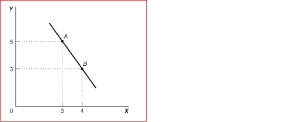
Figure: Good X and Good Y
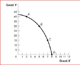
 (Figure: Good X and Good Y) Look at the figure Good X and Good Y.If we move from point C
to point B in the figure, the x-variable has and the y-variable has _.
A.decreased by 2 units; increased by 15 units
B.increased by 2 units; decreased by 15 units
C.decreased by 15 units; increased by 2 units
D.increased by 15 units; decreased by 2 units
(Figure: Good X and Good Y) Look at the figure Good X and Good Y.If we move from point Cto point B in the figure, the x-variable has and the y-variable has _.
A.decreased by 2 units; increased by 15 units
B.increased by 2 units; decreased by 15 units
C.decreased by 15 units; increased by 2 units
D.increased by 15 units; decreased by 2 units
Question
Figure: Cold Drinks Sold and Temperature
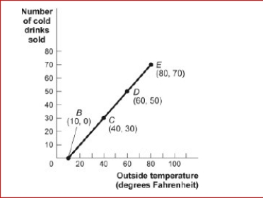
 (Figure: Cold Drinks Sold and Temperature) Look at the figure Cold Drinks Sold and Temperature.If we move from point C to point E in the figure, the outside temperature has
________ and the number of cold drinks sold has _.
A.decreased by 30 degrees; decreased by 30
B.drinks increased by 20 degrees; increased by 20
C.drinks increased by 30 degrees; increased by 30 drinks
D.increased by 40 degrees; increased by 40 drinks
(Figure: Cold Drinks Sold and Temperature) Look at the figure Cold Drinks Sold and Temperature.If we move from point C to point E in the figure, the outside temperature has________ and the number of cold drinks sold has _.
A.decreased by 30 degrees; decreased by 30
B.drinks increased by 20 degrees; increased by 20
C.drinks increased by 30 degrees; increased by 30 drinks
D.increased by 40 degrees; increased by 40 drinks
Question
Question
Question
Question
Figure: Cold Drinks Sold and Temperature
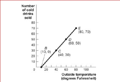
 (Figure: Cold Drinks Sold and Temperature) Look at the figure Cold Drinks Sold and Temperature.If we move from point B to point C in the figure, the outside temperature has
________ and the number of cold drinks sold has _.
A.decreased by 30 degrees; decreased by 30 drinks
B.increased by 20 degrees; increased by 20 drinks
C.increased by 30 degrees; increased by 30 drinks
D.increased by 40 degrees; increased by 40 drinks
(Figure: Cold Drinks Sold and Temperature) Look at the figure Cold Drinks Sold and Temperature.If we move from point B to point C in the figure, the outside temperature has________ and the number of cold drinks sold has _.
A.decreased by 30 degrees; decreased by 30 drinks
B.increased by 20 degrees; increased by 20 drinks
C.increased by 30 degrees; increased by 30 drinks
D.increased by 40 degrees; increased by 40 drinks
Question
Question
Question
Figure: Good X and Good Y
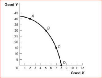
 (Figure: Good X and Good Y) Look at the figure Good X and Good Y.If we move from point B
to point C in the figure, the x-variable has and the y-variable has _.
A.decreased by 2 units; increased by 15 units
B.increased by 2 units; decreased by 15 units
C.decreased by 15 units; increased by 2
D.units increased by 15 units; decreased by 2 units
(Figure: Good X and Good Y) Look at the figure Good X and Good Y.If we move from point Bto point C in the figure, the x-variable has and the y-variable has _.
A.decreased by 2 units; increased by 15 units
B.increased by 2 units; decreased by 15 units
C.decreased by 15 units; increased by 2
D.units increased by 15 units; decreased by 2 units
Question
Question
Figure: Demand and Supply of Shirts
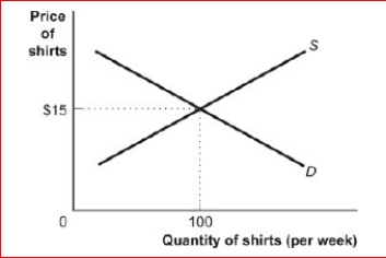
 (Figure: Demand and Supply of Shirts) Look at the figure Demand and Supply of Shirts.In the graph, if the line labeled D is a demand curve for shirts showing how many shirts per week will be demanded at various prices, then it is clear that as the price of shirts falls:
A.fewer shirts will be demanded.
B.more shirts will be demanded.
C.the same quantity of shirts will be demanded.
D.it is unclear what will happen to the demand for shirts.
(Figure: Demand and Supply of Shirts) Look at the figure Demand and Supply of Shirts.In the graph, if the line labeled D is a demand curve for shirts showing how many shirts per week will be demanded at various prices, then it is clear that as the price of shirts falls: A.fewer shirts will be demanded.
B.more shirts will be demanded.
C.the same quantity of shirts will be demanded.
D.it is unclear what will happen to the demand for shirts.
Question
Question
Figure: Hot Drinks Sold and Temperature
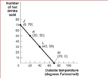
 (Figure: Hot Drinks Sold and Temperature) Look at the figure Hot Drinks Sold and Temperature.If we move from point K to point L in the figure, the outside temperature has and the
number of hot drinks sold has _.
A.decreased by 30 degrees; increased by 30 drinks
B.increased by 20 degrees; decreased by 20 drinks
C.increased by 30 degrees; decreased by 30 drinks
D.increased by 40 degrees; decreased by 40 drinks
(Figure: Hot Drinks Sold and Temperature) Look at the figure Hot Drinks Sold and Temperature.If we move from point K to point L in the figure, the outside temperature has and thenumber of hot drinks sold has _.
A.decreased by 30 degrees; increased by 30 drinks
B.increased by 20 degrees; decreased by 20 drinks
C.increased by 30 degrees; decreased by 30 drinks
D.increased by 40 degrees; decreased by 40 drinks
Question
Question
Figure: Cold Drinks Sold and Temperature
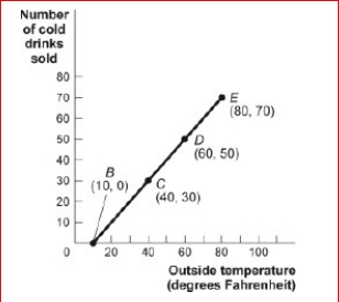
 (Figure: Cold Drinks Sold and Temperature) Look at the figure Cold Drinks Sold and Temperature.If we move from point C to point D in the figure, the outside temperature has
________ and the number of cold drinks sold has _.
A.decreased by 30 degrees; decreased by 30 drinks
B.increased by 20 degrees; increased by 20 drinks
C.increased by 30 degrees; increased by 30 drinks
D.increased by 40 degrees; increased by 40 drinks
(Figure: Cold Drinks Sold and Temperature) Look at the figure Cold Drinks Sold and Temperature.If we move from point C to point D in the figure, the outside temperature has________ and the number of cold drinks sold has _.
A.decreased by 30 degrees; decreased by 30 drinks
B.increased by 20 degrees; increased by 20 drinks
C.increased by 30 degrees; increased by 30 drinks
D.increased by 40 degrees; increased by 40 drinks
Question
Question
Question
Figure: Illustrating Slope
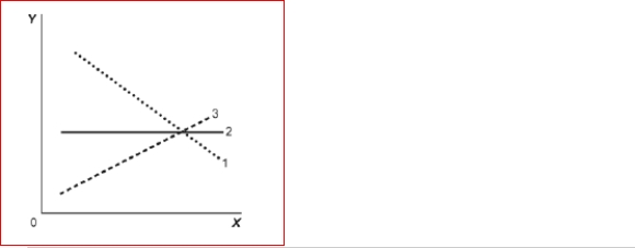 (Figure: Illustrating Slope) Look at the figure Illustrating Slope.In the graph, line 3 depicts X and
Y to be:
A.positively related.
B.unrelated.
C.negatively related.
D.both constants.
(Figure: Illustrating Slope) Look at the figure Illustrating Slope.In the graph, line 3 depicts X andY to be:
A.positively related.
B.unrelated.
C.negatively related.
D.both constants.
Question
Question
Question
Question
Question
Question
Figure: Illustrating Slope 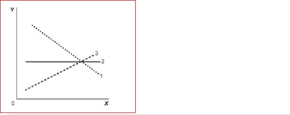 (Figure: Illustrating Slope) Look at the figure Illustrating Slope.In the graph, line 2 has a slope of:
A)+1.
B)0.
C)-1.
D)infinity.
(Figure: Illustrating Slope) Look at the figure Illustrating Slope.In the graph, line 2 has a slope of:A)+1.
B)0.
C)-1.
D)infinity.
Question
Question
Question
Figure: Illustrating Slope
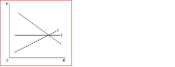 (Figure: Illustrating Slope) Look at the figure Illustrating Slope.In the graph, line 1 depicts X and
Y to be:
A.positively related.
B.nonlinearly related.
C.unrelated.
D.negatively related.
(Figure: Illustrating Slope) Look at the figure Illustrating Slope.In the graph, line 1 depicts X andY to be:
A.positively related.
B.nonlinearly related.
C.unrelated.
D.negatively related.
Question
Figure: Slope
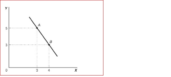 (Figure: Slope) Look at the figure Slope.In the graph, the slope of the line between points A
and B is:
A.+8.
B.-8.
C.-2.
D.+2.
(Figure: Slope) Look at the figure Slope.In the graph, the slope of the line between points Aand B is:
A.+8.
B.-8.
C.-2.
D.+2.
Question
Figure: Demand and Supply 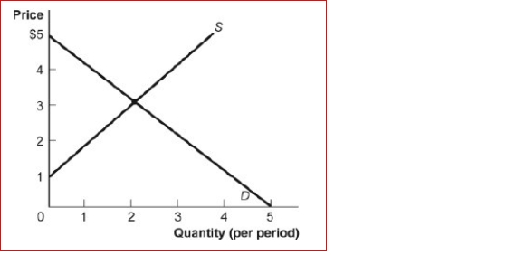 (Figure: Demand and Supply) Look at the figure Demand and Supply.The slope of the curve labeled S is:
A)-1.
B)0.
C)1.
D)3.
(Figure: Demand and Supply) Look at the figure Demand and Supply.The slope of the curve labeled S is:A)-1.
B)0.
C)1.
D)3.
Question
Figure: Demand and Supply of Shirts
 (Figure: Demand and Supply of Shirts) Look at the figure Demand and Supply of Shirts.If the line labeled S is the supply curve for shirts that shows how many shirts per week will be offered for sale at various prices, then it is clear that for supply, quantity and price are:
A.the same.
B.positively related.
C.negatively related.
D.not related.
(Figure: Demand and Supply of Shirts) Look at the figure Demand and Supply of Shirts.If the line labeled S is the supply curve for shirts that shows how many shirts per week will be offered for sale at various prices, then it is clear that for supply, quantity and price are: A.the same.
B.positively related.
C.negatively related.
D.not related.
Question
Figure: Demand and Supply
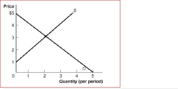 (Figure: Demand and Supply) Look at the figure Demand and Supply.The slope of the curve labeled D is:
(Figure: Demand and Supply) Look at the figure Demand and Supply.The slope of the curve labeled D is: Question
Question
Question
Figure: Slope
 (Figure: Slope) Look at the figure Slope.The slope of the line in the graph can be calculated by taking the:
A.horizontal change and dividing it by the vertical change.
B.vertical change and dividing it by the horizontal change.
C.sum of the Y values subtracted from the sum of the X values.
D.sum of the X values added to the sum of the Y values.
(Figure: Slope) Look at the figure Slope.The slope of the line in the graph can be calculated by taking the: A.horizontal change and dividing it by the vertical change.
B.vertical change and dividing it by the horizontal change.
C.sum of the Y values subtracted from the sum of the X values.
D.sum of the X values added to the sum of the Y values.
Question
Figure: Demand and Supply 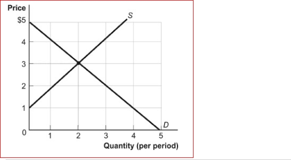 (Figure: Demand and Supply) Look at the figure Demand and Supply.The curve labeled S
Indicates that a price of $2 is related to a quantity of:
A)0.
B)1.
C)2.
D)3.
(Figure: Demand and Supply) Look at the figure Demand and Supply.The curve labeled SIndicates that a price of $2 is related to a quantity of:
A)0.
B)1.
C)2.
D)3.
Question
Question
Question
Question
Figure: Unemployment Rate over Time
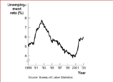
 (Figure: Unemployment Rate over Time) Look at the figure Unemployment Rate over Time.In the time-series graph, as we move from the beginning of 2001 to the beginning of 2003, we see that the unemployment rate has:
A.decreased from approximately 5% to approximately 4%.
B.increased from approximately 5.3% to approximately 7.3%.
C.decreased from approximately 7.7% to approximately 5.5%.
D.increased from approximately 4% to approximately 6%.
(Figure: Unemployment Rate over Time) Look at the figure Unemployment Rate over Time.In the time-series graph, as we move from the beginning of 2001 to the beginning of 2003, we see that the unemployment rate has: A.decreased from approximately 5% to approximately 4%.
B.increased from approximately 5.3% to approximately 7.3%.
C.decreased from approximately 7.7% to approximately 5.5%.
D.increased from approximately 4% to approximately 6%.
Question
Question
Question
Question
Question
Figure: Labor Force Participation Rate
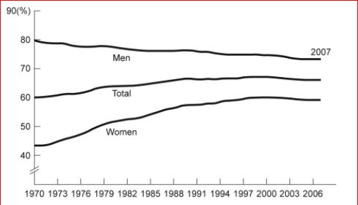
 (Figure: Labor Force Participation Rate) Look at the figure Labor Force Participation Rate.During 1970-1985, the labor force participation rate was _______ for women and for
men.
A.increasing; decreasing
B.increasing; increasing
C.decreasing; increasing
(Figure: Labor Force Participation Rate) Look at the figure Labor Force Participation Rate.During 1970-1985, the labor force participation rate was _______ for women and formen.
A.increasing; decreasing
B.increasing; increasing
C.decreasing; increasing
Question
Question
Question
Figure: Y = f(X)
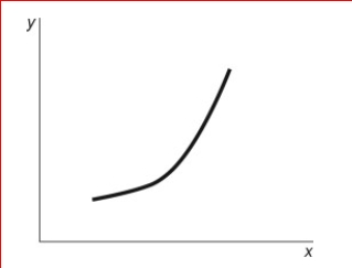
 (Figure: Y = f(X) Look at the figure Y = f(X).In the figure, what best describes the slope of the relation between x and y?
A.A positive and constant slope.
B.A negative slope that is getting steeper.
C.A positive slope that is getting steeper.
D.A positive slope that is getting flatter.
(Figure: Y = f(X) Look at the figure Y = f(X).In the figure, what best describes the slope of the relation between x and y? A.A positive and constant slope.
B.A negative slope that is getting steeper.
C.A positive slope that is getting steeper.
D.A positive slope that is getting flatter.
Question
Question
Question
Question
Figure: Labor Force Participation Rate
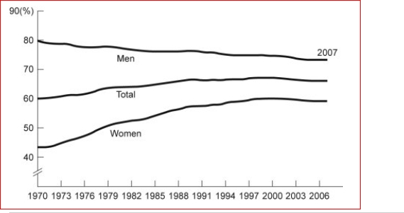 (Figure: Labor Force Participation Rate) Look at the figure Labor Force Participation Rate.Using the figure, the labor force participation rate for women was during 1970-1985
and during 1998-2006.
A.increasing; slightly decreasing
B.increasing; increasing
C.decreasing; increasing
D.decreasing; constant
(Figure: Labor Force Participation Rate) Look at the figure Labor Force Participation Rate.Using the figure, the labor force participation rate for women was during 1970-1985and during 1998-2006.
A.increasing; slightly decreasing
B.increasing; increasing
C.decreasing; increasing
D.decreasing; constant
Question
Question
Figure: Unemployment Rate over Time
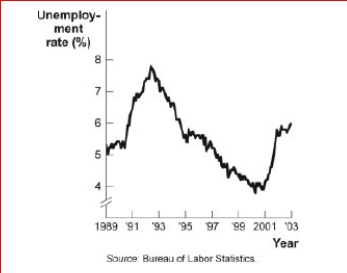
 (Figure: Unemployment Rate over Time) Look again at the figure Unemployment Rate over Time.In the time-series graph, as we move from 1993 to 1995, we see that the unemployment rate has:
A.decreased from approximately 5% to approximately
B.4%.increased from approximately 5.3% to approximately 7.3%.
C.decreased from approximately 7% to approximately 5.5%.
D.increased from approximately 4% to approximately 6.3%.
(Figure: Unemployment Rate over Time) Look again at the figure Unemployment Rate over Time.In the time-series graph, as we move from 1993 to 1995, we see that the unemployment rate has: A.decreased from approximately 5% to approximately
B.4%.increased from approximately 5.3% to approximately 7.3%.
C.decreased from approximately 7% to approximately 5.5%.
D.increased from approximately 4% to approximately 6.3%.
Question
Question
Question
Question
Question
Question
Question
Question
Figure: Unemployment Rate over Time
 (Figure: Unemployment Rate over Time) Look again at the figure Unemployment Rate over Time.In the time-series graph, as we move from 1997 to 2001, we see that the unemployment rate has:
A.decreased from approximately 5% to approximately 4%.
B.increased from approximately 5.3% to approximately 7.3%.
C.decreased from approximately 7.8% to approximately 5.5%.
D.increased from approximately 4% to approximately 6.3%.
(Figure: Unemployment Rate over Time) Look again at the figure Unemployment Rate over Time.In the time-series graph, as we move from 1997 to 2001, we see that the unemployment rate has: A.decreased from approximately 5% to approximately 4%.
B.increased from approximately 5.3% to approximately 7.3%.
C.decreased from approximately 7.8% to approximately 5.5%.
D.increased from approximately 4% to approximately 6.3%.
Question
Question
Question
Question
Question
Question
Question

Unlock Deck
Sign up to unlock the cards in this deck!
Unlock Deck
Unlock Deck
1/72
Play
Full screen (f)
Deck 2: Economic Models: Trade-Offs and Trade
1
Figure: Hot Drinks Sold and Temperature
(Figure: Hot Drinks Sold and Temperature) Look at the figure Hot Drinks Sold and Temperature.If we move from point L to point M in the figure, the outside temperature has and the
number of hot drinks sold has _.
A.decreased by 30 degrees; increased by 30 drinks
B.increased by 20 degrees; decreased by 20 drinks
C.increased by 30 degrees; decreased by 30
drinks
D.increased by 40 degrees; decreased by 40 drinks
increased by 30 degrees; decreased by 30 drinks
2
If two variables are positively related:
A.as one goes up in value, the other must go up in value, too.
B.as one goes up in value, the other must go down in value.
C.there is always a trade-off between the two.
D.one variable is always the reciprocal of the other.
A.as one goes up in value, the other must go up in value, too.
B.as one goes up in value, the other must go down in value.
C.there is always a trade-off between the two.
D.one variable is always the reciprocal of the other.
as one goes up in value, the other must go up in value, too.
3
If two variables are positively related, on a graph they will always be represented by:
A)a line or curve that slopes downward.
B)a straight line.
C)a horizontal line.
D)a line or curve that slopes upward.
A)a line or curve that slopes downward.
B)a straight line.
C)a horizontal line.
D)a line or curve that slopes upward.
D
4
Figure: Hot Drinks Sold and Temperature
(Figure: Hot Drinks Sold and Temperature) Look at the figure Hot Drinks Sold and Temperature.If we move from point J to point L in the figure, the outside temperature has and the
number of hot drinks sold has _.
A.decreased by 30 degrees; increased by 30 drinks
B.increased by 20 degrees; decreased by 20 drinks
C.increased by 30 degrees; decreased by 30 drinks
D.increased by 40 degrees; decreased by 40 drinks
(Figure: Hot Drinks Sold and Temperature) Look at the figure Hot Drinks Sold and Temperature.If we move from point J to point L in the figure, the outside temperature has and thenumber of hot drinks sold has _.
A.decreased by 30 degrees; increased by 30 drinks
B.increased by 20 degrees; decreased by 20 drinks
C.increased by 30 degrees; decreased by 30 drinks
D.increased by 40 degrees; decreased by 40 drinks
Unlock Deck
Unlock for access to all 72 flashcards in this deck.
Unlock Deck
k this deck
5
Figure: Good X and Good Y
(Figure: Good X and Good Y) Look at the figure Good X and Good Y.If we move from point C
to point B in the figure, the x-variable has and the y-variable has _.
A.decreased by 2 units; increased by 15 units
B.increased by 2 units; decreased by 15 units
C.decreased by 15 units; increased by 2 units
D.increased by 15 units; decreased by 2 units
(Figure: Good X and Good Y) Look at the figure Good X and Good Y.If we move from point Cto point B in the figure, the x-variable has and the y-variable has _.
A.decreased by 2 units; increased by 15 units
B.increased by 2 units; decreased by 15 units
C.decreased by 15 units; increased by 2 units
D.increased by 15 units; decreased by 2 units
Unlock Deck
Unlock for access to all 72 flashcards in this deck.
Unlock Deck
k this deck
6
Figure: Cold Drinks Sold and Temperature
(Figure: Cold Drinks Sold and Temperature) Look at the figure Cold Drinks Sold and Temperature.If we move from point C to point E in the figure, the outside temperature has
________ and the number of cold drinks sold has _.
A.decreased by 30 degrees; decreased by 30
B.drinks increased by 20 degrees; increased by 20
C.drinks increased by 30 degrees; increased by 30 drinks
D.increased by 40 degrees; increased by 40 drinks
(Figure: Cold Drinks Sold and Temperature) Look at the figure Cold Drinks Sold and Temperature.If we move from point C to point E in the figure, the outside temperature has________ and the number of cold drinks sold has _.
A.decreased by 30 degrees; decreased by 30
B.drinks increased by 20 degrees; increased by 20
C.drinks increased by 30 degrees; increased by 30 drinks
D.increased by 40 degrees; increased by 40 drinks
Unlock Deck
Unlock for access to all 72 flashcards in this deck.
Unlock Deck
k this deck
7
If two variables are negatively related, they will always be represented by:
A.a line or curve that slopes downward.
B.a straight line.
C.a horizontal line.
D.a line or curve that slopes upward.
A.a line or curve that slopes downward.
B.a straight line.
C.a horizontal line.
D.a line or curve that slopes upward.
Unlock Deck
Unlock for access to all 72 flashcards in this deck.
Unlock Deck
k this deck
8
The relation between two variables that move in the same direction is said to be:
A.independent.
B.neutral.
C.positive.
D.indirect.
A.independent.
B.neutral.
C.positive.
D.indirect.
Unlock Deck
Unlock for access to all 72 flashcards in this deck.
Unlock Deck
k this deck
9
The point at which the axes of a graph intersect is called the:
A)slope.
B)origin.
C)graph.
D)intercept.
A)slope.
B)origin.
C)graph.
D)intercept.
Unlock Deck
Unlock for access to all 72 flashcards in this deck.
Unlock Deck
k this deck
10
Figure: Cold Drinks Sold and Temperature
(Figure: Cold Drinks Sold and Temperature) Look at the figure Cold Drinks Sold and Temperature.If we move from point B to point C in the figure, the outside temperature has
________ and the number of cold drinks sold has _.
A.decreased by 30 degrees; decreased by 30 drinks
B.increased by 20 degrees; increased by 20 drinks
C.increased by 30 degrees; increased by 30 drinks
D.increased by 40 degrees; increased by 40 drinks
(Figure: Cold Drinks Sold and Temperature) Look at the figure Cold Drinks Sold and Temperature.If we move from point B to point C in the figure, the outside temperature has________ and the number of cold drinks sold has _.
A.decreased by 30 degrees; decreased by 30 drinks
B.increased by 20 degrees; increased by 20 drinks
C.increased by 30 degrees; increased by 30 drinks
D.increased by 40 degrees; increased by 40 drinks
Unlock Deck
Unlock for access to all 72 flashcards in this deck.
Unlock Deck
k this deck
11
On a graph representing two variables:
A.a positive slope of a curve means the variables are negatively related.
B.a negative slope of a curve means the two variables are positively related.
C.a line that is horizontal has a zero slope.
D.a line that is vertical has a zero slope.
A.a positive slope of a curve means the variables are negatively related.
B.a negative slope of a curve means the two variables are positively related.
C.a line that is horizontal has a zero slope.
D.a line that is vertical has a zero slope.
Unlock Deck
Unlock for access to all 72 flashcards in this deck.
Unlock Deck
k this deck
12
The of a curve shows the point at which the curve intersects an axis.
A)slope
B)steepness
C)intercept
D)origin
A)slope
B)steepness
C)intercept
D)origin
Unlock Deck
Unlock for access to all 72 flashcards in this deck.
Unlock Deck
k this deck
13
Figure: Good X and Good Y
(Figure: Good X and Good Y) Look at the figure Good X and Good Y.If we move from point B
to point C in the figure, the x-variable has and the y-variable has _.
A.decreased by 2 units; increased by 15 units
B.increased by 2 units; decreased by 15 units
C.decreased by 15 units; increased by 2
D.units increased by 15 units; decreased by 2 units
(Figure: Good X and Good Y) Look at the figure Good X and Good Y.If we move from point Bto point C in the figure, the x-variable has and the y-variable has _.
A.decreased by 2 units; increased by 15 units
B.increased by 2 units; decreased by 15 units
C.decreased by 15 units; increased by 2
D.units increased by 15 units; decreased by 2 units
Unlock Deck
Unlock for access to all 72 flashcards in this deck.
Unlock Deck
k this deck
14
(Table: Hours Studied and Quiz Score) Look at the table Hours Studied and Quiz Score.The
table shows data for students in an economics class.If we were to graph these data and draw a line through the points, we would choose to be the independent variable; the vertical
intercept of our line would be ________; and the slope of our line would be _.
A.Quiz score; y = 2; -2
B.Quiz score; x = 0; -2
C.Hours studied; y = 0; +2
D.Hours studied; y = 2; +2
Unlock Deck
Unlock for access to all 72 flashcards in this deck.
Unlock Deck
k this deck
15
Figure: Demand and Supply of Shirts
(Figure: Demand and Supply of Shirts) Look at the figure Demand and Supply of Shirts.In the graph, if the line labeled D is a demand curve for shirts showing how many shirts per week will be demanded at various prices, then it is clear that as the price of shirts falls:
A.fewer shirts will be demanded.
B.more shirts will be demanded.
C.the same quantity of shirts will be demanded.
D.it is unclear what will happen to the demand for shirts.
(Figure: Demand and Supply of Shirts) Look at the figure Demand and Supply of Shirts.In the graph, if the line labeled D is a demand curve for shirts showing how many shirts per week will be demanded at various prices, then it is clear that as the price of shirts falls: A.fewer shirts will be demanded.
B.more shirts will be demanded.
C.the same quantity of shirts will be demanded.
D.it is unclear what will happen to the demand for shirts.
Unlock Deck
Unlock for access to all 72 flashcards in this deck.
Unlock Deck
k this deck
16
If two variables are negatively related:
A.as one goes up in value, the other must go up in value, too.
B.as one goes up in value, the other must go down in value.
C.there can never be a trade-off between the two.
D.one variable is always the reciprocal of the other.
A.as one goes up in value, the other must go up in value, too.
B.as one goes up in value, the other must go down in value.
C.there can never be a trade-off between the two.
D.one variable is always the reciprocal of the other.
Unlock Deck
Unlock for access to all 72 flashcards in this deck.
Unlock Deck
k this deck
17
Figure: Hot Drinks Sold and Temperature
(Figure: Hot Drinks Sold and Temperature) Look at the figure Hot Drinks Sold and Temperature.If we move from point K to point L in the figure, the outside temperature has and the
number of hot drinks sold has _.
A.decreased by 30 degrees; increased by 30 drinks
B.increased by 20 degrees; decreased by 20 drinks
C.increased by 30 degrees; decreased by 30 drinks
D.increased by 40 degrees; decreased by 40 drinks
(Figure: Hot Drinks Sold and Temperature) Look at the figure Hot Drinks Sold and Temperature.If we move from point K to point L in the figure, the outside temperature has and thenumber of hot drinks sold has _.
A.decreased by 30 degrees; increased by 30 drinks
B.increased by 20 degrees; decreased by 20 drinks
C.increased by 30 degrees; decreased by 30 drinks
D.increased by 40 degrees; decreased by 40 drinks
Unlock Deck
Unlock for access to all 72 flashcards in this deck.
Unlock Deck
k this deck
18
The relationship between two variables that move in opposite directions is said to be:
A.independent.
B.positive.
C.direct.
D.negative.
A.independent.
B.positive.
C.direct.
D.negative.
Unlock Deck
Unlock for access to all 72 flashcards in this deck.
Unlock Deck
k this deck
19
Figure: Cold Drinks Sold and Temperature
(Figure: Cold Drinks Sold and Temperature) Look at the figure Cold Drinks Sold and Temperature.If we move from point C to point D in the figure, the outside temperature has
________ and the number of cold drinks sold has _.
A.decreased by 30 degrees; decreased by 30 drinks
B.increased by 20 degrees; increased by 20 drinks
C.increased by 30 degrees; increased by 30 drinks
D.increased by 40 degrees; increased by 40 drinks
(Figure: Cold Drinks Sold and Temperature) Look at the figure Cold Drinks Sold and Temperature.If we move from point C to point D in the figure, the outside temperature has________ and the number of cold drinks sold has _.
A.decreased by 30 degrees; decreased by 30 drinks
B.increased by 20 degrees; increased by 20 drinks
C.increased by 30 degrees; increased by 30 drinks
D.increased by 40 degrees; increased by 40 drinks
Unlock Deck
Unlock for access to all 72 flashcards in this deck.
Unlock Deck
k this deck
20
When graphing a curve, the vertical intercept is:
A.the value of the y-variable when the value of the x-variable is equal to zero.
B.the change in the y-variable between two points divided by the change in the
x-variable between those same two points.
C.the value of the y-variable when the value of the slope is equal to zero.
D.the value of the x-variable when the value of the y-variable is equal to zero.
Unlock Deck
Unlock for access to all 72 flashcards in this deck.
Unlock Deck
k this deck
21
Figure: Demand and Supply
(Figure: Demand and Supply) Look at the figure Demand and Supply.The curve labeled D
Indicates that a price of $2 is related to a quantity of:
A)0.
B)1.
C)2.
D)3.
(Figure: Demand and Supply) Look at the figure Demand and Supply.The curve labeled D
Indicates that a price of $2 is related to a quantity of:
A)0.
B)1.
C)2.
D)3.
Unlock Deck
Unlock for access to all 72 flashcards in this deck.
Unlock Deck
k this deck
22
Figure: Illustrating Slope
(Figure: Illustrating Slope) Look at the figure Illustrating Slope.In the graph, line 3 depicts X and
Y to be:
A.positively related.
B.unrelated.
C.negatively related.
D.both constants.
(Figure: Illustrating Slope) Look at the figure Illustrating Slope.In the graph, line 3 depicts X andY to be:
A.positively related.
B.unrelated.
C.negatively related.
D.both constants.
Unlock Deck
Unlock for access to all 72 flashcards in this deck.
Unlock Deck
k this deck
23
Which of the following statements about a graph drawn with X on the horizontal axis and Y on the vertical axis is correct?
A.If two points on the graph are (0,8) and (12,15), X is 0 when Y is 12.
B.If two points on the graph are (0, 8) and (12, 15), X and Y have a positive relation.
C.If two points on the graph are (0, 8) and (12, 15), the horizontal intercept is given by the point (0, 8).
D.If two points on the graph are (0, 8) and (12, 15), the slope of a line connecting the two points is negative.
Unlock Deck
Unlock for access to all 72 flashcards in this deck.
Unlock Deck
k this deck
24
(Table: Price, Quantity Demanded, and Quantity Supplied) Look at the table Price, Quantity Demanded, and Quantity Supplied.A straight line represents the relation between:
A.price and quantity demanded.
B.price and quantity supplied.
C.price and quantity demanded minus quantity supplied.
D.quantity demanded and quantity supplied.
A.price and quantity demanded.
B.price and quantity supplied.
C.price and quantity demanded minus quantity supplied.
D.quantity demanded and quantity supplied.
Unlock Deck
Unlock for access to all 72 flashcards in this deck.
Unlock Deck
k this deck
25
Table: Wages and Hours Willing to Work
(Table: Wages and Hours Willing to Work) Look at the table Wages and Hours Willing to Work, which shows data on wage per hour and the number of hours someone is willing to work.Which variable would economists put on the vertical axis?
A.Either variable
B.the wage, because even though it is the independent variable, it is a price
C.hours willing to work, because it is the dependent variable
D.neither variable
Unlock Deck
Unlock for access to all 72 flashcards in this deck.
Unlock Deck
k this deck
26
Two points on a nonlinear curve have coordinates given by (5, 15) and (17, 13).The average slope of the curve between these points is:
A.-1/6.
B.-6.
C.1/4.
D.2.5.
A.-1/6.
B.-6.
C.1/4.
D.2.5.
Unlock Deck
Unlock for access to all 72 flashcards in this deck.
Unlock Deck
k this deck
27
The slope of a straight line is the ratio of the:
A.vertical change to the horizontal change.
B.horizontal change to the vertical
C.change.run over the rise.
D.vertical change to the horizontal change, and it must be positive.
A.vertical change to the horizontal change.
B.horizontal change to the vertical
C.change.run over the rise.
D.vertical change to the horizontal change, and it must be positive.
Unlock Deck
Unlock for access to all 72 flashcards in this deck.
Unlock Deck
k this deck
28
Figure: Illustrating Slope (Figure: Illustrating Slope) Look at the figure Illustrating Slope.In the graph, line 2 has a slope of:
A)+1.
B)0.
C)-1.
D)infinity.
(Figure: Illustrating Slope) Look at the figure Illustrating Slope.In the graph, line 2 has a slope of:A)+1.
B)0.
C)-1.
D)infinity.
Unlock Deck
Unlock for access to all 72 flashcards in this deck.
Unlock Deck
k this deck
29
The ratio of the change in the variable on the vertical axis to the change in the variable on the horizontal axis, measured between two points on the curve, is the:
A.axis.
B.slope.
C.dependent variable.
D.independent variable.
A.axis.
B.slope.
C.dependent variable.
D.independent variable.
Unlock Deck
Unlock for access to all 72 flashcards in this deck.
Unlock Deck
k this deck
30
(Table: Wages and Hours Worked) Look at the table Wages and Hours Worked.Graphing the relation with wages on the vertical axis and hours worked on the horizontal axis, the slope between point A and point B is:
A)2.5.
B)5.
C)2.
D)2/5.
A)2.5.
B)5.
C)2.
D)2/5.
Unlock Deck
Unlock for access to all 72 flashcards in this deck.
Unlock Deck
k this deck
31
Figure: Illustrating Slope
(Figure: Illustrating Slope) Look at the figure Illustrating Slope.In the graph, line 1 depicts X and
Y to be:
A.positively related.
B.nonlinearly related.
C.unrelated.
D.negatively related.
(Figure: Illustrating Slope) Look at the figure Illustrating Slope.In the graph, line 1 depicts X andY to be:
A.positively related.
B.nonlinearly related.
C.unrelated.
D.negatively related.
Unlock Deck
Unlock for access to all 72 flashcards in this deck.
Unlock Deck
k this deck
32
Figure: Slope
(Figure: Slope) Look at the figure Slope.In the graph, the slope of the line between points A
and B is:
A.+8.
B.-8.
C.-2.
D.+2.
(Figure: Slope) Look at the figure Slope.In the graph, the slope of the line between points Aand B is:
A.+8.
B.-8.
C.-2.
D.+2.
Unlock Deck
Unlock for access to all 72 flashcards in this deck.
Unlock Deck
k this deck
33
Figure: Demand and Supply (Figure: Demand and Supply) Look at the figure Demand and Supply.The slope of the curve labeled S is:
A)-1.
B)0.
C)1.
D)3.
(Figure: Demand and Supply) Look at the figure Demand and Supply.The slope of the curve labeled S is:A)-1.
B)0.
C)1.
D)3.
Unlock Deck
Unlock for access to all 72 flashcards in this deck.
Unlock Deck
k this deck
34
Figure: Demand and Supply of Shirts
(Figure: Demand and Supply of Shirts) Look at the figure Demand and Supply of Shirts.If the line labeled S is the supply curve for shirts that shows how many shirts per week will be offered for sale at various prices, then it is clear that for supply, quantity and price are:
A.the same.
B.positively related.
C.negatively related.
D.not related.
(Figure: Demand and Supply of Shirts) Look at the figure Demand and Supply of Shirts.If the line labeled S is the supply curve for shirts that shows how many shirts per week will be offered for sale at various prices, then it is clear that for supply, quantity and price are: A.the same.
B.positively related.
C.negatively related.
D.not related.
Unlock Deck
Unlock for access to all 72 flashcards in this deck.
Unlock Deck
k this deck
35
Figure: Demand and Supply
(Figure: Demand and Supply) Look at the figure Demand and Supply.The slope of the curve labeled D is:
(Figure: Demand and Supply) Look at the figure Demand and Supply.The slope of the curve labeled D is: Unlock Deck
Unlock for access to all 72 flashcards in this deck.
Unlock Deck
k this deck
36
(Table: Wages and Hours Worked) Look at the table Wages and Hours Worked.Graphing the relation with wages on the vertical axis and hours worked on the horizontal axis, the slope between point D and point E is:
A)0.5.
B)5.
C)45.
C)2.
A)0.5.
B)5.
C)45.
C)2.
Unlock Deck
Unlock for access to all 72 flashcards in this deck.
Unlock Deck
k this deck
37
Table: Wages and Hours Willing to Work
(Table: Wages and Hours Willing to Work) Look at the table Wages and Hours Willing to Work.If graphed, the relationship between wage per hour and hours willing to work is:
A.linear.
B.coordinated.
C.nonlinear.
D.negatively sloped.
(Table: Wages and Hours Willing to Work) Look at the table Wages and Hours Willing to Work.If graphed, the relationship between wage per hour and hours willing to work is:
A.linear.
B.coordinated.
C.nonlinear.
D.negatively sloped.
Unlock Deck
Unlock for access to all 72 flashcards in this deck.
Unlock Deck
k this deck
38
Figure: Slope
(Figure: Slope) Look at the figure Slope.The slope of the line in the graph can be calculated by taking the:
A.horizontal change and dividing it by the vertical change.
B.vertical change and dividing it by the horizontal change.
C.sum of the Y values subtracted from the sum of the X values.
D.sum of the X values added to the sum of the Y values.
(Figure: Slope) Look at the figure Slope.The slope of the line in the graph can be calculated by taking the: A.horizontal change and dividing it by the vertical change.
B.vertical change and dividing it by the horizontal change.
C.sum of the Y values subtracted from the sum of the X values.
D.sum of the X values added to the sum of the Y values.
Unlock Deck
Unlock for access to all 72 flashcards in this deck.
Unlock Deck
k this deck
39
Figure: Demand and Supply (Figure: Demand and Supply) Look at the figure Demand and Supply.The curve labeled S
Indicates that a price of $2 is related to a quantity of:
A)0.
B)1.
C)2.
D)3.
(Figure: Demand and Supply) Look at the figure Demand and Supply.The curve labeled SIndicates that a price of $2 is related to a quantity of:
A)0.
B)1.
C)2.
D)3.
Unlock Deck
Unlock for access to all 72 flashcards in this deck.
Unlock Deck
k this deck
40
Figure: Slope
(Figure: Slope) Look at the figure Slope.This graph depicts relation between X and
Y)
A)a positive
B)a negative
C)an independent
D)a lack of any
(Figure: Slope) Look at the figure Slope.This graph depicts relation between X and
Y)
A)a positive
B)a negative
C)an independent
D)a lack of any
Unlock Deck
Unlock for access to all 72 flashcards in this deck.
Unlock Deck
k this deck
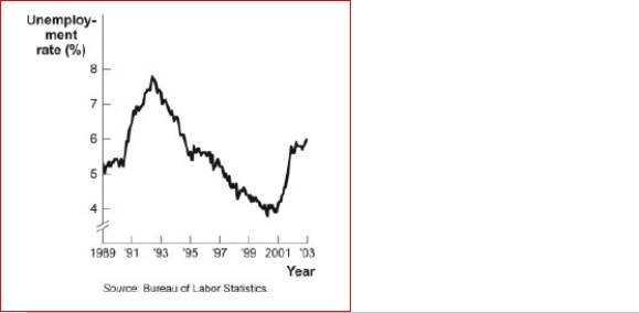
41
Figure: Seasonally Adjusted Unemployment Rate
(Figure: Seasonally Adjusted Unemployment Rate) Look again at the figure Seasonally Adjusted Unemployment Rate.The distance between each labeled point on the horizontal axis is one year.What is the approximate slope of the graph between 1/2001 and 1/2003?
A.2
B.1
C.-1
D.-2
(Figure: Seasonally Adjusted Unemployment Rate) Look again at the figure Seasonally Adjusted Unemployment Rate.The distance between each labeled point on the horizontal axis is one year.What is the approximate slope of the graph between 1/2001 and 1/2003?
A.2
B.1
C.-1
D.-2
Unlock Deck
Unlock for access to all 72 flashcards in this deck.
Unlock Deck
k this deck
42
(Table: Price, Quantity Demanded, and Quantity Supplied) Look at the table Price, Quantity Demanded, and Quantity Supplied.The slope of the line representing the relation between price on the vertical axis and quantity supplied on the horizontal axis is:
A.equal to 1/2.
B.equal to 1.
C.equal to 2.
D.different at different points on the line.
A.equal to 1/2.
B.equal to 1.
C.equal to 2.
D.different at different points on the line.
Unlock Deck
Unlock for access to all 72 flashcards in this deck.
Unlock Deck
k this deck
43
Figure: Unemployment Rate over Time
(Figure: Unemployment Rate over Time) Look at the figure Unemployment Rate over Time.In the time-series graph, as we move from the beginning of 2001 to the beginning of 2003, we see that the unemployment rate has:
A.decreased from approximately 5% to approximately 4%.
B.increased from approximately 5.3% to approximately 7.3%.
C.decreased from approximately 7.7% to approximately 5.5%.
D.increased from approximately 4% to approximately 6%.
(Figure: Unemployment Rate over Time) Look at the figure Unemployment Rate over Time.In the time-series graph, as we move from the beginning of 2001 to the beginning of 2003, we see that the unemployment rate has: A.decreased from approximately 5% to approximately 4%.
B.increased from approximately 5.3% to approximately 7.3%.
C.decreased from approximately 7.7% to approximately 5.5%.
D.increased from approximately 4% to approximately 6%.
Unlock Deck
Unlock for access to all 72 flashcards in this deck.
Unlock Deck
k this deck
44
Figure: Seasonally Adjusted Unemployment Rate
(Figure: Seasonally Adjusted Unemployment Rate) Look again at the figure Seasonally Adjusted Unemployment Rate.The distance between each labeled point on the horizontal axis is one year.Using this graph, the unemployment rate was at a minimum in and a
maximum in _.
A.2003; 2000
B.2007; 2001
C.2003; 1999
D.2000; 2003
Unlock Deck
Unlock for access to all 72 flashcards in this deck.
Unlock Deck
k this deck
45
Figure: Seasonally Adjusted Unemployment Rate
(Figure: Seasonally Adjusted Unemployment Rate) Look again at the figure Seasonally Adjusted Unemployment Rate.The distance between each labeled point on the horizontal axis is one year.Unemployment was ________ between 2001-2002 and between
1999-2000.
A)increasing; decreasing
B)increasing; increasing
C)decreasing; increasing
D)decreasing; decreasing
Unlock Deck
Unlock for access to all 72 flashcards in this deck.
Unlock Deck
k this deck
46
Figure: Unemployment Rate over Time
(Figure: Unemployment Rate over Time) Look again at the figure Unemployment Rate over Time.In the time-series graph, as we move from 1991 to 1993, we see that the unemployment rate has:
A.decreased from approximately 5% to approximately 4%.
B.increased from approximately 5.5% to approximately 7%.
C.decreased from approximately 7.8% to approximately 5%.
D.increased from approximately 4% to approximately 6.3%.
Unlock Deck
Unlock for access to all 72 flashcards in this deck.
Unlock Deck
k this deck
47
(Table: Price, Quantity Demanded, and Quantity Supplied) Look at the table Price, Quantity Demanded, and Quantity Supplied.The slope of the line representing the relationship between price on the vertical axis and quantity demanded on the horizontal axis is:
A.equal to 1/2.
B.equal to 1.
C.equal to 2.
D.different at different points on the line.
A.equal to 1/2.
B.equal to 1.
C.equal to 2.
D.different at different points on the line.
Unlock Deck
Unlock for access to all 72 flashcards in this deck.
Unlock Deck
k this deck
48
Figure: Labor Force Participation Rate
(Figure: Labor Force Participation Rate) Look at the figure Labor Force Participation Rate.During 1970-1985, the labor force participation rate was _______ for women and for
men.
A.increasing; decreasing
B.increasing; increasing
C.decreasing; increasing
(Figure: Labor Force Participation Rate) Look at the figure Labor Force Participation Rate.During 1970-1985, the labor force participation rate was _______ for women and formen.
A.increasing; decreasing
B.increasing; increasing
C.decreasing; increasing
Unlock Deck
Unlock for access to all 72 flashcards in this deck.
Unlock Deck
k this deck
49
Your boss asks you to graph company profits for the past 10 years.The best way to show this information is with:
A.a scatter diagram.
B.a pie chart.
C.a time-series graph.
D.an independent graph.
A.a scatter diagram.
B.a pie chart.
C.a time-series graph.
D.an independent graph.
Unlock Deck
Unlock for access to all 72 flashcards in this deck.
Unlock Deck
k this deck
50
Figure: Seasonally Adjusted Unemployment Rate
(Figure: Seasonally Adjusted Unemployment Rate) Look again at the figure Seasonally Adjusted Unemployment Rate.The distance between each labeled point on the horizontal axis is one year.Unemployment was ________ between 2001-2003 and between
2007-2008.
A)increasing; decreasing
B)increasing; increasing
C)decreasing; increasing
D)decreasing; decreasing
Unlock Deck
Unlock for access to all 72 flashcards in this deck.
Unlock Deck
k this deck
51
Figure: Y = f(X)
(Figure: Y = f(X) Look at the figure Y = f(X).In the figure, what best describes the slope of the relation between x and y?
A.A positive and constant slope.
B.A negative slope that is getting steeper.
C.A positive slope that is getting steeper.
D.A positive slope that is getting flatter.
(Figure: Y = f(X) Look at the figure Y = f(X).In the figure, what best describes the slope of the relation between x and y? A.A positive and constant slope.
B.A negative slope that is getting steeper.
C.A positive slope that is getting steeper.
D.A positive slope that is getting flatter.
Unlock Deck
Unlock for access to all 72 flashcards in this deck.
Unlock Deck
k this deck
52
Professor Macro wants to use a numerical graph to show the percentage of government spending accounted for by its various components.Which of the following graphs is most suitable for this purpose?
A.bar graph
B.pie chart
C.time-series graph
D.scatter diagram
A.bar graph
B.pie chart
C.time-series graph
D.scatter diagram
Unlock Deck
Unlock for access to all 72 flashcards in this deck.
Unlock Deck
k this deck
53
A positive relationship between swimsuits purchased and ice cream purchased could be the result of:
A.reverse causality.
B.a magnified scale on the swimsuit axis.
C.a truncation of the ice cream axis.
D.an omitted variable, such as the external temperature.
A.reverse causality.
B.a magnified scale on the swimsuit axis.
C.a truncation of the ice cream axis.
D.an omitted variable, such as the external temperature.
Unlock Deck
Unlock for access to all 72 flashcards in this deck.
Unlock Deck
k this deck
54
Taylor sees a bar graph showing the average weight of adult males over the past 200 years and concludes that men get more obese over time.Taylor's conclusion may be wrong, since she did not consider:
A.the features of construction.
B.omitted variables.
C.reverse causality.
D.tangent lines.
A.the features of construction.
B.omitted variables.
C.reverse causality.
D.tangent lines.
Unlock Deck
Unlock for access to all 72 flashcards in this deck.
Unlock Deck
k this deck
55
Figure: Labor Force Participation Rate
(Figure: Labor Force Participation Rate) Look at the figure Labor Force Participation Rate.Using the figure, the labor force participation rate for women was during 1970-1985
and during 1998-2006.
A.increasing; slightly decreasing
B.increasing; increasing
C.decreasing; increasing
D.decreasing; constant
(Figure: Labor Force Participation Rate) Look at the figure Labor Force Participation Rate.Using the figure, the labor force participation rate for women was during 1970-1985and during 1998-2006.
A.increasing; slightly decreasing
B.increasing; increasing
C.decreasing; increasing
D.decreasing; constant
Unlock Deck
Unlock for access to all 72 flashcards in this deck.
Unlock Deck
k this deck
56
The owner of the Dismal Philosopher, one of five bookstores on College Road, asks you to make a graph showing each bookstore's share of all book purchases on College Road.The best way to show this information is with:
A.a scatter diagram.
B.a pie chart.
C.a time-series graph.
D.an independent graph.
A.a scatter diagram.
B.a pie chart.
C.a time-series graph.
D.an independent graph.
Unlock Deck
Unlock for access to all 72 flashcards in this deck.
Unlock Deck
k this deck
57
Figure: Unemployment Rate over Time
(Figure: Unemployment Rate over Time) Look again at the figure Unemployment Rate over Time.In the time-series graph, as we move from 1993 to 1995, we see that the unemployment rate has:
A.decreased from approximately 5% to approximately
B.4%.increased from approximately 5.3% to approximately 7.3%.
C.decreased from approximately 7% to approximately 5.5%.
D.increased from approximately 4% to approximately 6.3%.
(Figure: Unemployment Rate over Time) Look again at the figure Unemployment Rate over Time.In the time-series graph, as we move from 1993 to 1995, we see that the unemployment rate has: A.decreased from approximately 5% to approximately
B.4%.increased from approximately 5.3% to approximately 7.3%.
C.decreased from approximately 7% to approximately 5.5%.
D.increased from approximately 4% to approximately 6.3%.
Unlock Deck
Unlock for access to all 72 flashcards in this deck.
Unlock Deck
k this deck
58
(Table: Price, Quantity Demanded, and Quantity Supplied) Look at the table Price, Quantity Demanded, and Quantity Supplied.The data in the figure suggest a nonlinear relation between:
A.price and quantity demanded.
B.price and quantity supplied.
C.quantity demanded and quantity supplied.
D.A nonlinear relationship does not exist.
A.price and quantity demanded.
B.price and quantity supplied.
C.quantity demanded and quantity supplied.
D.A nonlinear relationship does not exist.
Unlock Deck
Unlock for access to all 72 flashcards in this deck.
Unlock Deck
k this deck
59
If a supply curve is represented by the equation Q = 10 + 2P, what is its slope?
A.½
B.1
C.2
D.5
A.½
B.1
C.2
D.5
Unlock Deck
Unlock for access to all 72 flashcards in this deck.
Unlock Deck
k this deck
60
Figure: Seasonally Adjusted Unemployment Rate
(Figure: Seasonally Adjusted Unemployment Rate) Look at the figure Seasonally Adjusted Unemployment Rate.The distance between each labeled point on the horizontal axis is one year.What is the approximate slope of the graph between 1/2004 and 1/2006?
A.½
B.1
C.-1/2
D.-2
(Figure: Seasonally Adjusted Unemployment Rate) Look at the figure Seasonally Adjusted Unemployment Rate.The distance between each labeled point on the horizontal axis is one year.What is the approximate slope of the graph between 1/2004 and 1/2006?
A.½
B.1
C.-1/2
D.-2
Unlock Deck
Unlock for access to all 72 flashcards in this deck.
Unlock Deck
k this deck
61
The scaling of the axes of a time-series graph:
A.is not a critical element in presenting the intended information.
B.may change the interpretation of the data presented.
C.generally places the time period on the vertical axis.
D.generally puts values of a variable, such as the unemployment rate, on the vertical axis.
A.is not a critical element in presenting the intended information.
B.may change the interpretation of the data presented.
C.generally places the time period on the vertical axis.
D.generally puts values of a variable, such as the unemployment rate, on the vertical axis.
Unlock Deck
Unlock for access to all 72 flashcards in this deck.
Unlock Deck
k this deck
62
The fact that two variables always move together over time:
A.does not prove that one of the variables is dependent on the other.
B.proves that one of the variables is dependent on the other.
C.proves that changes in one variable cause changes in the other.
D.is often illustrated or depicted using either a pie chart or a bar chart.
A.does not prove that one of the variables is dependent on the other.
B.proves that one of the variables is dependent on the other.
C.proves that changes in one variable cause changes in the other.
D.is often illustrated or depicted using either a pie chart or a bar chart.
Unlock Deck
Unlock for access to all 72 flashcards in this deck.
Unlock Deck
k this deck
63
A linear curve has the same slope between every pair of points.
Unlock Deck
Unlock for access to all 72 flashcards in this deck.
Unlock Deck
k this deck
64
A graph shows how the value of one or more variables have changed over some
period.
A.linear
B.time-series
C.nonlinear
D.periodic table
period.
A.linear
B.time-series
C.nonlinear
D.periodic table
Unlock Deck
Unlock for access to all 72 flashcards in this deck.
Unlock Deck
k this deck
65
Figure: Unemployment Rate over Time
(Figure: Unemployment Rate over Time) Look again at the figure Unemployment Rate over Time.In the time-series graph, as we move from 1997 to 2001, we see that the unemployment rate has:
A.decreased from approximately 5% to approximately 4%.
B.increased from approximately 5.3% to approximately 7.3%.
C.decreased from approximately 7.8% to approximately 5.5%.
D.increased from approximately 4% to approximately 6.3%.
(Figure: Unemployment Rate over Time) Look again at the figure Unemployment Rate over Time.In the time-series graph, as we move from 1997 to 2001, we see that the unemployment rate has: A.decreased from approximately 5% to approximately 4%.
B.increased from approximately 5.3% to approximately 7.3%.
C.decreased from approximately 7.8% to approximately 5.5%.
D.increased from approximately 4% to approximately 6.3%.
Unlock Deck
Unlock for access to all 72 flashcards in this deck.
Unlock Deck
k this deck
66
An economist wishes to build a model to explain the relationship between the number of diamonds purchased every year and the average income of consumers in that year.Which variable should be the dependent variable and which should be the independent variable? All else equal, do you expect this relationship to be positive or negative? Explain.
Unlock Deck
Unlock for access to all 72 flashcards in this deck.
Unlock Deck
k this deck
67
A scatter diagram shows:
A.how far apart dependent variables are.
B.individual points of data showing both variable values.
C.the slope of a line.
D.the intercept of a curve.
A.how far apart dependent variables are.
B.individual points of data showing both variable values.
C.the slope of a line.
D.the intercept of a curve.
Unlock Deck
Unlock for access to all 72 flashcards in this deck.
Unlock Deck
k this deck
68
In a time-series graph, large changes can be made to appear trivial by:
A.changing the scale of the axes.
B.labeling more intervals.
C.defining the dependent variable.
D.defining the independent variable.
A.changing the scale of the axes.
B.labeling more intervals.
C.defining the dependent variable.
D.defining the independent variable.
Unlock Deck
Unlock for access to all 72 flashcards in this deck.
Unlock Deck
k this deck
69
Figure: Consumption of Pizza and Tacos
(Figure: Consumption of Pizza and Tacos) Look at the figure Consumption of Pizza & Tacos.The figure shows the number of tacos and pizza slices Matt can eat in a day.The relation is nonlinear, and there is a negative relation between the number of tacos and pizza slices that Matt can eat in a day.
(Figure: Consumption of Pizza and Tacos) Look at the figure Consumption of Pizza & Tacos.The figure shows the number of tacos and pizza slices Matt can eat in a day.The relation is nonlinear, and there is a negative relation between the number of tacos and pizza slices that Matt can eat in a day.
Unlock Deck
Unlock for access to all 72 flashcards in this deck.
Unlock Deck
k this deck
70
In looking at a chart of the positive relationship between police officers and crime, the mayor remarks that more police officers create more crime.The mayor may be wrong because she did not consider:
A.the features of construction.
B.omitted variables.
C.reverse causality.
D.tangent lines.
A.the features of construction.
B.omitted variables.
C.reverse causality.
D.tangent lines.
Unlock Deck
Unlock for access to all 72 flashcards in this deck.
Unlock Deck
k this deck
71
A pie chart is used to depict information about:
A.the relative shares of categories of data.
B.the changes of a particular variable over time.
C.positive, not negative, relationships among variables.
D.the changes of a particular variable over time and positive relationships.
A.the relative shares of categories of data.
B.the changes of a particular variable over time.
C.positive, not negative, relationships among variables.
D.the changes of a particular variable over time and positive relationships.
Unlock Deck
Unlock for access to all 72 flashcards in this deck.
Unlock Deck
k this deck
72
The owner of the Dismal Philosopher, one of the five bookstores on College Road, asks you to make a graph showing each bookstore's share of all book purchases on College Road.A good way to show this information is with a pie chart.
Unlock Deck
Unlock for access to all 72 flashcards in this deck.
Unlock Deck
k this deck
Unlock Deck
Unlock for access to all 72 flashcards in this deck.


