Exam 2: Economic Models: Trade-Offs and Trade
Exam 1: First Principles246 Questions
Exam 2: Economic Models: Trade-Offs and Trade72 Questions
Exam 3: Supply and Demand266 Questions
Exam 4: Consumer and Producer Surplus196 Questions
Exam 5: Price Controls and Quotas: Meddling With Markets203 Questions
Exam 6: Elasticity329 Questions
Exam 7: Taxes284 Questions
Exam 8: International Trade265 Questions
Exam 9: Decision Making by Individuals and Firms209 Questions
Exam 10: The Rational Consumer477 Questions
Exam 11: Behind the Supply Curve: Inputs and Costs282 Questions
Exam 12: Perfect Competition and the Supply Curve320 Questions
Exam 13: Monopoly258 Questions
Exam 14: Oligopoly212 Questions
Exam 15: Monopolistic Competition and Product Differentiation223 Questions
Exam 16: Externalities234 Questions
Exam 17: Public Goods and Common Resources237 Questions
Exam 18: The Economics of the Welfare State144 Questions
Exam 19: Factor Markets and the Distribution of Income241 Questions
Exam 20: Uncertainty, Risk, and Private Information199 Questions
Select questions type
The relation between two variables that move in the same direction is said to be:
A.independent.
B.neutral.
C.positive.
D.indirect.
Free
(Essay)
4.8/5  (33)
(33)
Correct Answer: Verified
positive.
Figure: Demand and Supply of Shirts
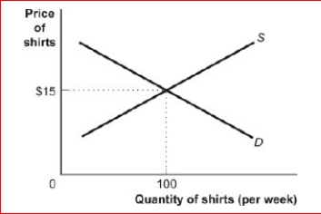
 (Figure: Demand and Supply of Shirts) Look at the figure Demand and Supply of Shirts.In the graph, if the line labeled D is a demand curve for shirts showing how many shirts per week will be demanded at various prices, then it is clear that as the price of shirts falls:
A.fewer shirts will be demanded.
B.more shirts will be demanded.
C.the same quantity of shirts will be demanded.
D.it is unclear what will happen to the demand for shirts.
(Figure: Demand and Supply of Shirts) Look at the figure Demand and Supply of Shirts.In the graph, if the line labeled D is a demand curve for shirts showing how many shirts per week will be demanded at various prices, then it is clear that as the price of shirts falls:
A.fewer shirts will be demanded.
B.more shirts will be demanded.
C.the same quantity of shirts will be demanded.
D.it is unclear what will happen to the demand for shirts.
Free
(Essay)
4.8/5 (32)
Correct Answer:Verified
more shirts will be demanded.
Figure: Labor Force Participation Rate
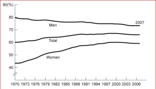
 (Figure: Labor Force Participation Rate) Look at the figure Labor Force Participation Rate.During 1970-1985, the labor force participation rate was _______ for women and for
men.
A.increasing; decreasing
B.increasing; increasing
C.decreasing; increasing
(Figure: Labor Force Participation Rate) Look at the figure Labor Force Participation Rate.During 1970-1985, the labor force participation rate was _______ for women and for
men.
A.increasing; decreasing
B.increasing; increasing
C.decreasing; increasing
Free
(Essay)
4.9/5 (37)
Correct Answer:Verified
increasing; decreasing
The point at which the axes of a graph intersect is called the:
(Multiple Choice)
4.8/5 (38)
Figure: Unemployment Rate over Time
(Figure: Unemployment Rate over Time) Look again at the figure Unemployment Rate over Time.In the time-series graph, as we move from 1991 to 1993, we see that the unemployment rate has:
A.decreased from approximately 5% to approximately 4%.
B.increased from approximately 5.5% to approximately 7%.
C.decreased from approximately 7.8% to approximately 5%.
D.increased from approximately 4% to approximately 6.3%.
(Essay)
4.7/5 (32)
Figure: Illustrating Slope
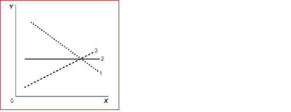 (Figure: Illustrating Slope) Look at the figure Illustrating Slope.In the graph, line 1 depicts X and
Y to be:
A.positively related.
B.nonlinearly related.
C.unrelated.
D.negatively related.
(Figure: Illustrating Slope) Look at the figure Illustrating Slope.In the graph, line 1 depicts X and
Y to be:
A.positively related.
B.nonlinearly related.
C.unrelated.
D.negatively related.
(Essay)
4.7/5 (32)
(Table: Price, Quantity Demanded, and Quantity Supplied) Look at the table Price, Quantity Demanded, and Quantity Supplied.The slope of the line representing the relation between price on the vertical axis and quantity supplied on the horizontal axis is:
A.equal to 1/2.
B.equal to 1.
C.equal to 2.
D.different at different points on the line.
(Essay)
4.9/5 (33)
Figure: Demand and Supply 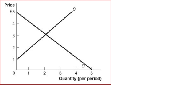 (Figure: Demand and Supply) Look at the figure Demand and Supply.The slope of the curve labeled S is:
(Multiple Choice)
5.0/5 (34)
The of a curve shows the point at which the curve intersects an axis.
(Multiple Choice)
4.7/5 (35)
Two points on a nonlinear curve have coordinates given by (5, 15) and (17, 13).The average slope of the curve between these points is:
A.-1/6.
B.-6.
C.1/4.
D.2.5.
(Essay)
4.8/5 (38)
Table: Wages and Hours Willing to Work
(Table: Wages and Hours Willing to Work) Look at the table Wages and Hours Willing to Work, which shows data on wage per hour and the number of hours someone is willing to work.Which variable would economists put on the vertical axis?
A.Either variable
B.the wage, because even though it is the independent variable, it is a price
C.hours willing to work, because it is the dependent variable
D.neither variable
(Essay)
4.9/5 (44)
A graph shows how the value of one or more variables have changed over some
period.
A.linear
B.time-series
C.nonlinear
D.periodic table
(Essay)
4.8/5 (38)
Taylor sees a bar graph showing the average weight of adult males over the past 200 years and concludes that men get more obese over time.Taylor's conclusion may be wrong, since she did not consider:
A.the features of construction.
B.omitted variables.
C.reverse causality.
D.tangent lines.
(Essay)
4.8/5 (44)
The scaling of the axes of a time-series graph:
A.is not a critical element in presenting the intended information.
B.may change the interpretation of the data presented.
C.generally places the time period on the vertical axis.
D.generally puts values of a variable, such as the unemployment rate, on the vertical axis.
(Essay)
4.9/5 (31)
The owner of the Dismal Philosopher, one of five bookstores on College Road, asks you to make a graph showing each bookstore's share of all book purchases on College Road.The best way to show this information is with:
A.a scatter diagram.
B.a pie chart.
C.a time-series graph.
D.an independent graph.
(Essay)
4.7/5 (28)
The fact that two variables always move together over time:
A.does not prove that one of the variables is dependent on the other.
B.proves that one of the variables is dependent on the other.
C.proves that changes in one variable cause changes in the other.
D.is often illustrated or depicted using either a pie chart or a bar chart.
(Essay)
4.7/5 (44)
The slope of a straight line is the ratio of the:
A.vertical change to the horizontal change.
B.horizontal change to the vertical
C.change.run over the rise.
D.vertical change to the horizontal change, and it must be positive.
(Essay)
4.9/5 (31)
If two variables are positively related:
A.as one goes up in value, the other must go up in value, too.
B.as one goes up in value, the other must go down in value.
C.there is always a trade-off between the two.
D.one variable is always the reciprocal of the other.
(Essay)
4.8/5 (29)
(Table: Price, Quantity Demanded, and Quantity Supplied) Look at the table Price, Quantity Demanded, and Quantity Supplied.The slope of the line representing the relationship between price on the vertical axis and quantity demanded on the horizontal axis is:
A.equal to 1/2.
B.equal to 1.
C.equal to 2.
D.different at different points on the line.
(Essay)
4.8/5 (29)
Professor Macro wants to use a numerical graph to show the percentage of government spending accounted for by its various components.Which of the following graphs is most suitable for this purpose?
A.bar graph
B.pie chart
C.time-series graph
D.scatter diagram
(Essay)
4.9/5 (34)
Filters
- Essay(0)
- Multiple Choice(0)
- Short Answer(0)
- True False(0)
- Matching(0)