Deck 2: Graphical and Tabular Descriptive Techniques
Full screen (f)
Question
Question
Question
Question
Question
Question
Question
Question
Question
Question
Question
Question
Question
Question
Question
Question
Question
Question
Question
Question
Question
Question
Question
Question
Question
According to the stem-and-leaf plot below, this data set is symmetric. 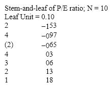
Question
Question
According to the stem-and-leaf plot below, this data set has a negative median. 
Question
Question
Question
Question
Question
Question
Question
Question
Question
According to the stem-and-leaf plot below, the median quiz score for this data set is 8. 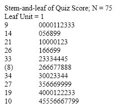
Question
Question
Question
Question
Question
Question
The graph below is an example of a histogram. 
Question
The line chart below shows tomato prices each month from January (month 1)to December last year ($ per pound). By looking at this chart you can see the lowest tomato prices occurred in July. 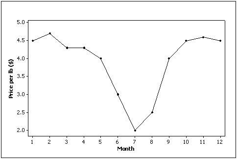
Question
Question
Data for calories and salt content (milligrams of sodium)in 17 brands of meat hot dogs are shown in the scatter diagram below. According to this diagram, it appears that hot dogs that are high in sodium are generally low in calories, and hot dogs with low sodium are generally high in calories. 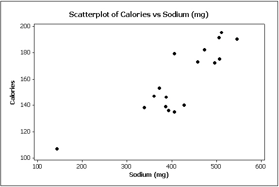
Question
Question
Question
Question
Question
Question
Question
Question
The scatter diagram below depicts data with a negative linear relationship. 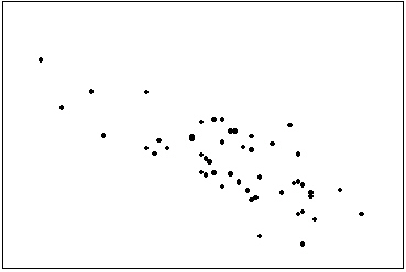
Question
Question
The graph below represents a line graph. 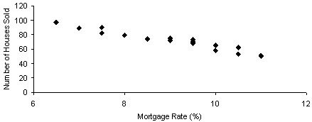
Question
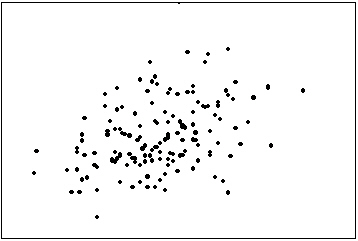
The first scatter diagram below shows a stronger linear relationship than the second scatter diagram. (Assume the scales on both scatter diagrams are the same.) 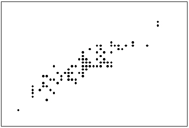
Question
Question
Question
Question
The line chart below shows cucumber prices fluctuated from $2.00 per pound to over $4.50 per pound during the year. 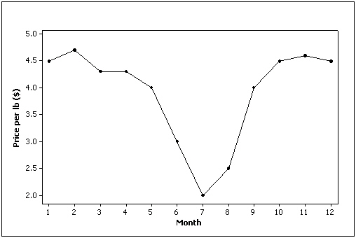
Question
Question
Question
Which of the following describes the shape of the histogram below? 
A)Positively skewed
B)Negatively skewed
C)Symmetric
D)None of these choices
A)Positively skewed
B)Negatively skewed
C)Symmetric
D)None of these choices
Question
Question
Compare the two histograms below. Which statement is true? 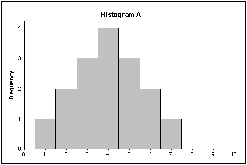

A)The center of histogram A is lower than the center of histogram B.
B)The center of histogram A is higher than the center of histogram B.
C)The center of histogram A is the same as the center of histogram B.
D)You cannot compare the centers of these two histograms without the original data.
A)The center of histogram A is lower than the center of histogram B.
B)The center of histogram A is higher than the center of histogram B.
C)The center of histogram A is the same as the center of histogram B.
D)You cannot compare the centers of these two histograms without the original data.
Question
Compare the two histograms below. Which statement is true? 
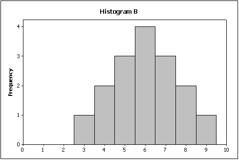
A)The spread of histogram A is smaller than the spread of histogram B.
B)The spread of histogram A is larger than the spread of histogram B.
C)The spread of histogram A is the same as the spread of histogram B.
D)You cannot compare the spreads of these two histograms without the original data.
A)The spread of histogram A is smaller than the spread of histogram B.
B)The spread of histogram A is larger than the spread of histogram B.
C)The spread of histogram A is the same as the spread of histogram B.
D)You cannot compare the spreads of these two histograms without the original data.
Question
A professor examines the relationship between minutes studying and exam score (out of 200 points)for a random sample of his students. The scatter diagram is shown below. It appears that study time has somewhat of a positive linear relationship with exam score. 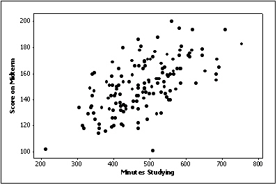
Question
Suppose you measure the number of minutes it takes an employee to complete a task, where the maximum allowed time is 5 minutes, and each time is rounded to the nearest minute. Data from 130 employees is summarized below. How long did it take most employees to complete the task? 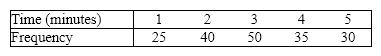
A)5 minutes
B)3 minutes
C)30 minutes
D)50 minutes
A)5 minutes
B)3 minutes
C)30 minutes
D)50 minutes
Question
Question
Question
Question
Question
Question
Question
Car buyers were asked to indicate the car dealer they believed offered the best overall service. The four choices were Convoy Motors (C), Mako Chrysler (M), Torrent Auto (T), and Unequaled Chevrolet (U). The following data were obtained: 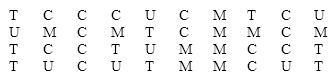 What percentage of car buyers identified Convoy Motors as having the best overall service?
A)1\4 = 0.25 or 25%
B)14\40 = 0.35 or 35%
C)14%
D)None of these choices.
What percentage of car buyers identified Convoy Motors as having the best overall service?A)1\4 = 0.25 or 25%
B)14\40 = 0.35 or 35%
C)14%
D)None of these choices.
Question
Question
Question
Question
Question

Unlock Deck
Sign up to unlock the cards in this deck!
Unlock Deck
Unlock Deck
1/199
Play
Full screen (f)
Deck 2: Graphical and Tabular Descriptive Techniques
1
One of the advantages of a pie chart is that it clearly shows that the total percentages of all the categories add to 100%.
True
2
With nominal data, there is one and only one way the possible values can be ordered.
False
3
A relative frequency distribution lists the categories and their counts.
False
4
Whether or not you are over the age of 21 is a nominal variable.
Unlock Deck
Unlock for access to all 199 flashcards in this deck.
Unlock Deck
k this deck
5
Your age group (1-9; 10-19; 20-29; 30-39; etc.)is an interval variable.
Unlock Deck
Unlock for access to all 199 flashcards in this deck.
Unlock Deck
k this deck
6
Your age is an interval variable.
Unlock Deck
Unlock for access to all 199 flashcards in this deck.
Unlock Deck
k this deck
7
Bar and pie charts are graphical techniques for nominal data. The former focus the attention on the frequency of the occurrences of each category, and the later emphasizes the proportion of occurrences of each category.
Unlock Deck
Unlock for access to all 199 flashcards in this deck.
Unlock Deck
k this deck
8
Interval data, such as heights, weights, and incomes, are also referred to as quantitative or numerical data.
Unlock Deck
Unlock for access to all 199 flashcards in this deck.
Unlock Deck
k this deck
9
Your final grade in a course (A, B, C, D, E)is a nominal variable.
Unlock Deck
Unlock for access to all 199 flashcards in this deck.
Unlock Deck
k this deck
10
A variable is some characteristic of a population or sample.
Unlock Deck
Unlock for access to all 199 flashcards in this deck.
Unlock Deck
k this deck
11
Interval data may be treated as ordinal or nominal.
Unlock Deck
Unlock for access to all 199 flashcards in this deck.
Unlock Deck
k this deck
12
Nominal data are also called qualitative or categorical data.
Unlock Deck
Unlock for access to all 199 flashcards in this deck.
Unlock Deck
k this deck
13
A bar chart is used to represent interval data.
Unlock Deck
Unlock for access to all 199 flashcards in this deck.
Unlock Deck
k this deck
14
The intervals (classes)in a histogram do not overlap.
Unlock Deck
Unlock for access to all 199 flashcards in this deck.
Unlock Deck
k this deck
15
From a pie chart you are able to find the frequency for each category.
Unlock Deck
Unlock for access to all 199 flashcards in this deck.
Unlock Deck
k this deck
16
You cannot calculate and interpret differences between numbers assigned to nominal data.
Unlock Deck
Unlock for access to all 199 flashcards in this deck.
Unlock Deck
k this deck
17
The values of quantitative data are categories.
Unlock Deck
Unlock for access to all 199 flashcards in this deck.
Unlock Deck
k this deck
18
A frequency distribution lists the categories and the proportion with which each occurs.
Unlock Deck
Unlock for access to all 199 flashcards in this deck.
Unlock Deck
k this deck
19
Your gender is a nominal variable.
Unlock Deck
Unlock for access to all 199 flashcards in this deck.
Unlock Deck
k this deck
20
All calculations are permitted on interval data.
Unlock Deck
Unlock for access to all 199 flashcards in this deck.
Unlock Deck
k this deck
21
A histogram represents interval data.
Unlock Deck
Unlock for access to all 199 flashcards in this deck.
Unlock Deck
k this deck
22
The intervals (classes)in a histogram are equally wide.
Unlock Deck
Unlock for access to all 199 flashcards in this deck.
Unlock Deck
k this deck
23
The sum of cumulative relative frequencies always equals 1.
Unlock Deck
Unlock for access to all 199 flashcards in this deck.
Unlock Deck
k this deck
24
The sum of relative frequencies in a distribution always equals 1.
Unlock Deck
Unlock for access to all 199 flashcards in this deck.
Unlock Deck
k this deck
25
According to the stem-and-leaf plot below, this data set is symmetric.
Unlock Deck
Unlock for access to all 199 flashcards in this deck.
Unlock Deck
k this deck
26
The advantage of a stem-and-leaf display over a histogram is that we can see the actual observations.
Unlock Deck
Unlock for access to all 199 flashcards in this deck.
Unlock Deck
k this deck
27
According to the stem-and-leaf plot below, this data set has a negative median.
Unlock Deck
Unlock for access to all 199 flashcards in this deck.
Unlock Deck
k this deck
28
A relative frequency distribution describes the proportion of data values that fall within each category.
Unlock Deck
Unlock for access to all 199 flashcards in this deck.
Unlock Deck
k this deck
29
The number of observations within each class may be found in a frequency distribution.
Unlock Deck
Unlock for access to all 199 flashcards in this deck.
Unlock Deck
k this deck
30
A histogram is said to be symmetric if, when we draw a vertical line down the center of the histogram the two sides are nearly identical.
Unlock Deck
Unlock for access to all 199 flashcards in this deck.
Unlock Deck
k this deck
31
The original observations cannot be determined once they are grouped into a frequency distribution.
Unlock Deck
Unlock for access to all 199 flashcards in this deck.
Unlock Deck
k this deck
32
The number of class intervals in a histogram depends on the number of observations in the data set.
Unlock Deck
Unlock for access to all 199 flashcards in this deck.
Unlock Deck
k this deck
33
When a distribution has more values to the right and tails to the left, we say it is skewed negatively.
Unlock Deck
Unlock for access to all 199 flashcards in this deck.
Unlock Deck
k this deck
34
A stem-and-leaf display represents nominal data.
Unlock Deck
Unlock for access to all 199 flashcards in this deck.
Unlock Deck
k this deck
35
When a distribution has more values to the left and tails off to the right, it is skewed negatively.
Unlock Deck
Unlock for access to all 199 flashcards in this deck.
Unlock Deck
k this deck
36
According to the stem-and-leaf plot below, the median quiz score for this data set is 8.
Unlock Deck
Unlock for access to all 199 flashcards in this deck.
Unlock Deck
k this deck
37
In a histogram, each observation is assigned to one or more classes.
Unlock Deck
Unlock for access to all 199 flashcards in this deck.
Unlock Deck
k this deck
38
A stem-and-leaf display reveals more information about the original data than does a histogram.
Unlock Deck
Unlock for access to all 199 flashcards in this deck.
Unlock Deck
k this deck
39
A cumulative relative frequency distribution lists the number of observations that lie below each of the class limits.
Unlock Deck
Unlock for access to all 199 flashcards in this deck.
Unlock Deck
k this deck
40
A skewed histogram is one with a long tail extending either to the right or left.
Unlock Deck
Unlock for access to all 199 flashcards in this deck.
Unlock Deck
k this deck
41
Correlation implies causation.
Unlock Deck
Unlock for access to all 199 flashcards in this deck.
Unlock Deck
k this deck
42
The graph below is an example of a histogram.
Unlock Deck
Unlock for access to all 199 flashcards in this deck.
Unlock Deck
k this deck
43
The line chart below shows tomato prices each month from January (month 1)to December last year ($ per pound). By looking at this chart you can see the lowest tomato prices occurred in July.
Unlock Deck
Unlock for access to all 199 flashcards in this deck.
Unlock Deck
k this deck
44
The two most important characteristics revealed by the scatter diagram are the strength and direction of the linear relationship.
Unlock Deck
Unlock for access to all 199 flashcards in this deck.
Unlock Deck
k this deck
45
Data for calories and salt content (milligrams of sodium)in 17 brands of meat hot dogs are shown in the scatter diagram below. According to this diagram, it appears that hot dogs that are high in sodium are generally low in calories, and hot dogs with low sodium are generally high in calories.
Unlock Deck
Unlock for access to all 199 flashcards in this deck.
Unlock Deck
k this deck
46
The graphical technique used to describe the relationship between two interval variables is the scatter diagram.
Unlock Deck
Unlock for access to all 199 flashcards in this deck.
Unlock Deck
k this deck
47
When two variables are linearly related, and tend to move in opposite directions, we describe the nature of their association as a negative linear relationship.
Unlock Deck
Unlock for access to all 199 flashcards in this deck.
Unlock Deck
k this deck
48
Experience shows that few students hand in their statistics exams early; most prefer to hand them in near the end of the test period. This means the time taken by students to write exams is positively skewed.
Unlock Deck
Unlock for access to all 199 flashcards in this deck.
Unlock Deck
k this deck
49
The sum of cumulative relative frequencies always equals 1.
Unlock Deck
Unlock for access to all 199 flashcards in this deck.
Unlock Deck
k this deck
50
A modal class is the class with the largest number of observations.
Unlock Deck
Unlock for access to all 199 flashcards in this deck.
Unlock Deck
k this deck
51
Time series data are often graphically depicted on a line chart, which is a plot of the variable of interest over time.
Unlock Deck
Unlock for access to all 199 flashcards in this deck.
Unlock Deck
k this deck
52
If we draw a straight line through the points in a scatter diagram and most of the points fall close to the line, there must be a positive relationship between the two variables.
Unlock Deck
Unlock for access to all 199 flashcards in this deck.
Unlock Deck
k this deck
53
The scatter diagram below depicts data with a negative linear relationship.
Unlock Deck
Unlock for access to all 199 flashcards in this deck.
Unlock Deck
k this deck
54
A line chart that is flat shows no fluctuation in the variable being presented.
Unlock Deck
Unlock for access to all 199 flashcards in this deck.
Unlock Deck
k this deck
55
The graph below represents a line graph.
Unlock Deck
Unlock for access to all 199 flashcards in this deck.
Unlock Deck
k this deck
56
The first scatter diagram below shows a stronger linear relationship than the second scatter diagram. (Assume the scales on both scatter diagrams are the same.)
Unlock Deck
Unlock for access to all 199 flashcards in this deck.
Unlock Deck
k this deck
57
A line chart is created by plotting the values of the variable on the vertical axis and the time periods on the horizontal axis.
Unlock Deck
Unlock for access to all 199 flashcards in this deck.
Unlock Deck
k this deck
58
If two variables have a strong linear relationship, that means one variable is causing the other variable to go up or down.
Unlock Deck
Unlock for access to all 199 flashcards in this deck.
Unlock Deck
k this deck
59
The two most important characteristics to examine in a scatter diagram are the number of possible categories for X and Y and the number of observations in each category.
Unlock Deck
Unlock for access to all 199 flashcards in this deck.
Unlock Deck
k this deck
60
The line chart below shows cucumber prices fluctuated from $2.00 per pound to over $4.50 per pound during the year.
Unlock Deck
Unlock for access to all 199 flashcards in this deck.
Unlock Deck
k this deck
61
For what type of data are frequencies the only calculations that can be done?
A)Interval data
B)Nominal data
C)Ordinal data
D)None of these choices.
A)Interval data
B)Nominal data
C)Ordinal data
D)None of these choices.
Unlock Deck
Unlock for access to all 199 flashcards in this deck.
Unlock Deck
k this deck
62
Which of the following statements about histograms is false?
A)The intervals of a histogram do not overlap.
B)Every observation is assigned to one and only one class in a histogram.
C)The intervals of a histogram are equally wide.
D)None of these choices.
A)The intervals of a histogram do not overlap.
B)Every observation is assigned to one and only one class in a histogram.
C)The intervals of a histogram are equally wide.
D)None of these choices.
Unlock Deck
Unlock for access to all 199 flashcards in this deck.
Unlock Deck
k this deck
63
Which of the following describes the shape of the histogram below?
A)Positively skewed
B)Negatively skewed
C)Symmetric
D)None of these choices
A)Positively skewed
B)Negatively skewed
C)Symmetric
D)None of these choices
Unlock Deck
Unlock for access to all 199 flashcards in this deck.
Unlock Deck
k this deck
64
Which of the following represents a graphical presentation of interval data?
A)A bar chart.
B)A histogram.
C)A pie chart.
D)All of these choices are true.
A)A bar chart.
B)A histogram.
C)A pie chart.
D)All of these choices are true.
Unlock Deck
Unlock for access to all 199 flashcards in this deck.
Unlock Deck
k this deck
65
Compare the two histograms below. Which statement is true?
A)The center of histogram A is lower than the center of histogram B.
B)The center of histogram A is higher than the center of histogram B.
C)The center of histogram A is the same as the center of histogram B.
D)You cannot compare the centers of these two histograms without the original data.
A)The center of histogram A is lower than the center of histogram B.
B)The center of histogram A is higher than the center of histogram B.
C)The center of histogram A is the same as the center of histogram B.
D)You cannot compare the centers of these two histograms without the original data.
Unlock Deck
Unlock for access to all 199 flashcards in this deck.
Unlock Deck
k this deck
66
Compare the two histograms below. Which statement is true?
A)The spread of histogram A is smaller than the spread of histogram B.
B)The spread of histogram A is larger than the spread of histogram B.
C)The spread of histogram A is the same as the spread of histogram B.
D)You cannot compare the spreads of these two histograms without the original data.
A)The spread of histogram A is smaller than the spread of histogram B.
B)The spread of histogram A is larger than the spread of histogram B.
C)The spread of histogram A is the same as the spread of histogram B.
D)You cannot compare the spreads of these two histograms without the original data.
Unlock Deck
Unlock for access to all 199 flashcards in this deck.
Unlock Deck
k this deck
67
A professor examines the relationship between minutes studying and exam score (out of 200 points)for a random sample of his students. The scatter diagram is shown below. It appears that study time has somewhat of a positive linear relationship with exam score.
Unlock Deck
Unlock for access to all 199 flashcards in this deck.
Unlock Deck
k this deck
68
Suppose you measure the number of minutes it takes an employee to complete a task, where the maximum allowed time is 5 minutes, and each time is rounded to the nearest minute. Data from 130 employees is summarized below. How long did it take most employees to complete the task?
A)5 minutes
B)3 minutes
C)30 minutes
D)50 minutes
A)5 minutes
B)3 minutes
C)30 minutes
D)50 minutes
Unlock Deck
Unlock for access to all 199 flashcards in this deck.
Unlock Deck
k this deck
69
Which of the following statements about histograms is false?
A)A histogram is a summary of interval data.
B)A histogram is made of a series of intervals, called classes.
C)The classes in a histogram cover the complete range of observations.
D)All of these choices are true.
A)A histogram is a summary of interval data.
B)A histogram is made of a series of intervals, called classes.
C)The classes in a histogram cover the complete range of observations.
D)All of these choices are true.
Unlock Deck
Unlock for access to all 199 flashcards in this deck.
Unlock Deck
k this deck
70
The relative frequency of a class in a histogram is computed by
A)dividing the frequency of the class by the number of classes.
B)dividing the frequency of the class by the class width.
C)dividing the frequency of the class by the total of all frequencies.
D)None of these choices.
A)dividing the frequency of the class by the number of classes.
B)dividing the frequency of the class by the class width.
C)dividing the frequency of the class by the total of all frequencies.
D)None of these choices.
Unlock Deck
Unlock for access to all 199 flashcards in this deck.
Unlock Deck
k this deck
71
Values must represent ordered rankings for what type of data?
A)Interval data
B)Nominal data
C)Ordinal data
D)None of these choices.
A)Interval data
B)Nominal data
C)Ordinal data
D)None of these choices.
Unlock Deck
Unlock for access to all 199 flashcards in this deck.
Unlock Deck
k this deck
72
The classification of student major (accounting, economics, management, marketing, other)is an example of a(n)
A)nominal random variable.
B)interval random variable.
C)continuous random variable.
D)parameter.
A)nominal random variable.
B)interval random variable.
C)continuous random variable.
D)parameter.
Unlock Deck
Unlock for access to all 199 flashcards in this deck.
Unlock Deck
k this deck
73
The classification of student class designation (freshman, sophomore, junior, senior)is an example of a(n)
A)nominal random variable.
B)interval random variable.
C)ordinal random variable.
D)a parameter.
A)nominal random variable.
B)interval random variable.
C)ordinal random variable.
D)a parameter.
Unlock Deck
Unlock for access to all 199 flashcards in this deck.
Unlock Deck
k this deck
74
Which of the following situations is best suited for a pie chart?
A)The number of dollars spent this year on each type of legal gambling.
B)The percentage of a charitable donation that goes to administrative costs vs. directly to the charity.
C)The number of students in your class who received an A, B, C, D, F on their exam.
D)All of these choices are true.
A)The number of dollars spent this year on each type of legal gambling.
B)The percentage of a charitable donation that goes to administrative costs vs. directly to the charity.
C)The number of students in your class who received an A, B, C, D, F on their exam.
D)All of these choices are true.
Unlock Deck
Unlock for access to all 199 flashcards in this deck.
Unlock Deck
k this deck
75
Car buyers were asked to indicate the car dealer they believed offered the best overall service. The four choices were Convoy Motors (C), Mako Chrysler (M), Torrent Auto (T), and Unequaled Chevrolet (U). The following data were obtained: What percentage of car buyers identified Convoy Motors as having the best overall service?
A)1\4 = 0.25 or 25%
B)14\40 = 0.35 or 35%
C)14%
D)None of these choices.
What percentage of car buyers identified Convoy Motors as having the best overall service?A)1\4 = 0.25 or 25%
B)14\40 = 0.35 or 35%
C)14%
D)None of these choices.
Unlock Deck
Unlock for access to all 199 flashcards in this deck.
Unlock Deck
k this deck
76
Which situation identifies when to use pie charts and\or bar charts?
A)You want to describe a single set of data.
B)Your data is nominal.
C)You want to show the number or the percentage of individuals in each category.
D)All of these choices are true.
A)You want to describe a single set of data.
B)Your data is nominal.
C)You want to show the number or the percentage of individuals in each category.
D)All of these choices are true.
Unlock Deck
Unlock for access to all 199 flashcards in this deck.
Unlock Deck
k this deck
77
Which of the following statements about pie charts is false?
A)A pie chart is a graphical representation of a relative frequency distribution.
B)You can always determine frequencies for each category by looking at a pie chart.
C)The total percentage of all the slices of a pie chart is 100%.
D)The area of a slice of a pie chart is the proportion of all the individuals that fall into that particular category.
Unlock Deck
Unlock for access to all 199 flashcards in this deck.
Unlock Deck
k this deck
78
All calculations are permitted on what type of data?
A)Interval data
B)Nominal data
C)Ordinal data
D)All of these choices are true.
A)Interval data
B)Nominal data
C)Ordinal data
D)All of these choices are true.
Unlock Deck
Unlock for access to all 199 flashcards in this deck.
Unlock Deck
k this deck
79
For which type of data are the values arbitrary numbers?
A)Interval data
B)Nominal data
C)Ordinal data
D)None of these choices.
A)Interval data
B)Nominal data
C)Ordinal data
D)None of these choices.
Unlock Deck
Unlock for access to all 199 flashcards in this deck.
Unlock Deck
k this deck
80
A researcher wishes to estimate the textbook costs of first-year students at Barry University. To do so, he recorded the textbook cost of 300 first-year students and found that their average textbook cost was $195 per semester. The variable of interest to the researcher is
A)textbook cost.
B)class rank.
C)number of students.
D)name of university.
A)textbook cost.
B)class rank.
C)number of students.
D)name of university.
Unlock Deck
Unlock for access to all 199 flashcards in this deck.
Unlock Deck
k this deck
Unlock Deck
Unlock for access to all 199 flashcards in this deck.


