Exam 2: Graphical and Tabular Descriptive Techniques
Exam 1: What Is Statistics41 Questions
Exam 2: Graphical and Tabular Descriptive Techniques199 Questions
Exam 3: Numerical Descriptive Techniques226 Questions
Exam 4: Data Collection and Sampling82 Questions
Exam 5: Probability212 Questions
Exam 6: Random Variables and Discrete Probability Distributions174 Questions
Exam 7: Continuous Probability Distributions167 Questions
Exam 8: Sampling Distributions133 Questions
Exam 9: Introduction to Estimation88 Questions
Exam 10: Introduction to Hypothesis Testing186 Questions
Exam 11: Inference About a Population76 Questions
Exam 12: Inference About Comparing Two Populat85 Questions
Exam 13: Inference About Comparing Two Populat85 Questions
Exam 14: Analysis of Variance127 Questions
Exam 15: Chi-Squared Tests118 Questions
Exam 16: Simple Linear Regression and Correlat238 Questions
Exam 17: Multiple Regression147 Questions
Exam 18: Review of Statistical Inference189 Questions
Select questions type
Business School Graduates A sample of business school graduates were asked what their major was. The results are shown in the following frequency distribution. 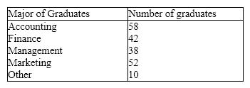 {Business School Graduates Narrative} How many graduates were surveyed?
Free
(Essay)
4.7/5  (34)
(34)
Correct Answer: Verified
200; you get this by totaling the counts for each major.
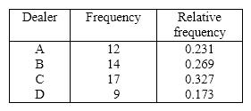
Forty truck buyers were asked to indicate the car dealer they believed offered the best overall service. The four choices were A, B, C, and D as shown below: 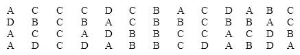 Construct a table showing the frequencies and relative frequencies for this data set. What proportion of car buyers rated dealer D as the best?
Free
(Essay)
4.9/5 (32)
Correct Answer:Verified
A bar chart is used to represent interval data.
Free
(True/False)
4.8/5 (34)
Correct Answer:Verified
False
Car Buyers Forty car buyers were asked to indicate which car dealer offered the best overall service. The four choices were Contour Motors (C), Modern Chrysler (M), Tonneau Auto (T), and Uncanny Chevrolet (U). The following data were obtained:  {Car Buyers Narrative} Construct a pie chart of this data. Which car dealer offered the best overall service?
(Essay)
4.7/5 (36)
If the data in a scatter diagram is scattered completely at random, what do you conclude?
(Multiple Choice)
4.9/5 (37)
Business School Graduates A sample of business school graduates were asked what their major was. The results are shown in the following frequency distribution.  {Business School Graduates Narrative} Draw a pie chart to summarize this data. Which major was the most popular?
(Essay)
4.8/5 (28)
Data for calories and salt content (milligrams of sodium)in 17 brands of meat hot dogs are shown in the scatter diagram below. According to this diagram, it appears that hot dogs that are high in sodium are generally low in calories, and hot dogs with low sodium are generally high in calories. 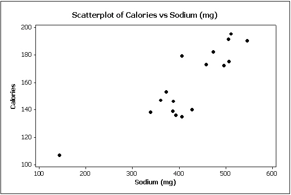
(True/False)
4.7/5 (37)
According to the stem-and-leaf plot below, this data set is symmetric. 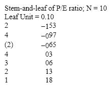
(True/False)
4.8/5 (34)
If we draw a straight line through the points in a scatter diagram and most of the points fall close to the line, there must be a positive relationship between the two variables.
(True/False)
4.7/5 (36)
Electronics Company At a meeting of regional offices managers of a national electronics company, a survey was taken to determine the number of employees the regional managers supervise in the operation of their departments. The results of the survey are shown below. 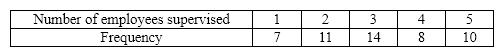 {Electronics Company Narrative} How many regional offices are represented in the survey results?
(Essay)
4.8/5 (36)
Bar and pie charts are graphical techniques for nominal data. The former focus the attention on the frequency of the occurrences of each category, and the later emphasizes the proportion of occurrences of each category.
(True/False)
4.9/5 (38)
A pie chart shows the ____________________ of individuals that fall into each category.
(Short Answer)
4.9/5 (38)
The classification of student major (accounting, economics, management, marketing, other)is an example of a(n)
(Multiple Choice)
4.9/5 (36)
A cumulative relative frequency distribution lists the number of observations that lie below each of the class limits.
(True/False)
4.9/5 (32)
The Dean of Students conducted a survey on campus. The gender of each student is an example of a(n)____________________ variable.
(Short Answer)
4.7/5 (41)
The advantage of a stem-and-leaf display over a histogram is that we can see the actual observations.
(True/False)
4.7/5 (34)
We determine the approximate width of the classes of a histogram by subtracting the smallest observation from the largest and dividing the answer by the number of ____________________.
(Short Answer)
4.9/5 (36)
The line chart below shows tomato prices each month from January (month 1)to December last year ($ per pound). By looking at this chart you can see the lowest tomato prices occurred in July. 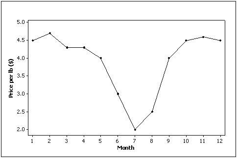
(True/False)
4.7/5 (37)
A line chart is created by plotting the values of the variable on the vertical axis and the time periods on the horizontal axis.
(True/False)
4.9/5 (42)
Insurance Company A representative from a local insurance agency selected a random sample of insured homeowners and recorded the number of claims made in the last three years, with the following results: 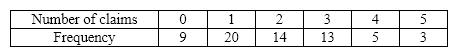 {Insurance Company Narrative} What proportion of homeowners had no claims in the last three years?
(Essay)
4.9/5 (37)
Filters
- Essay(0)
- Multiple Choice(0)
- Short Answer(0)
- True False(0)
- Matching(0)