Deck 2: Displaying Data
Full screen (f)
Question
Question
Consider an experiment in which rats are given three diets (reduced calorie, control, and increased calorie) and their masses at 6 weeks of age are measured. Which of the following is NOT an aspect of poor design in the figure shown?
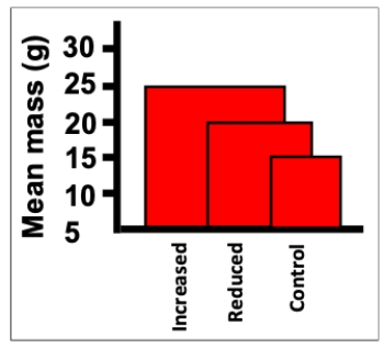
A) The two-dimensional nature of the bars subliminally exaggerates differences between the groups.
B) The axis should go to zero to allow true judgement of relative differences.
C) The data are shown in a manner that makes judging the values more difficult.
D) The unit for mass in the axis label is redundant and makes the label overly wordy.
Question
Consider an experiment in which rats are given three diets (reduced calorie, control, and increased calorie) and their masses at 6 weeks of age are measured. Which of the following is an aspect of poor design in the figure shown?
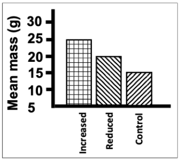
A) The different patterns for the groups provide no additional information because they are redundant with the labels.
B) The figure is black and white; color is always better when making figures and graphs.
C) The unit for mass in the axis label should be spelled out with words instead of abbreviated within the parentheses.
D) Since the minimum group mean is 20, dropping the axis all the way down to zero is too far and wastes space.
Question
Consider an experiment in which female and male rats are weighed and then their food consumption is measured. Which of the following is a flaw in the figure showing data from this experiment?
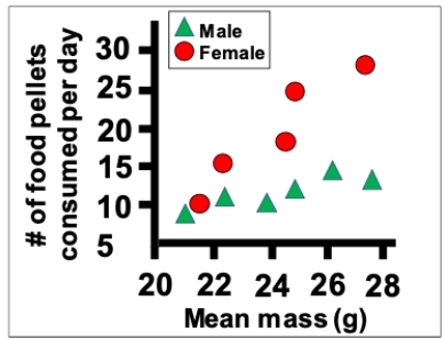
A) Data for an unequal number of subjects for each of the two sexes are displayed.
B) The pair of colors, red and green, is used.
C) The groups have both different colors and different shapes, which is redundant; only one aspect of the symbols should differ.
D) The wrong variables are plotted on the axes; they should be switched.
Question
Consider an experiment in which female and male rats are weighed and then their food consumption is measured. Which of the following is NOT a flaw in the figure showing data from this experiment?
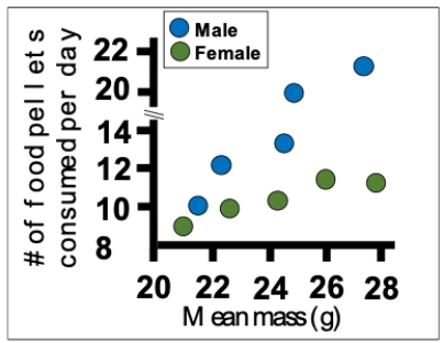
A) The fonts used for the two axes are different and both hard to read.
B) The symbols have identical shapes and colors with very similar shades.
C) The x-axis should extend all the way to zero to show magnitude.
D) The y-axis has a discontinuity, a sudden jump in magnitude.
A) The fonts used for the two axes are different and both hard to read.
B) The symbols have identical shapes and colors with very similar shades.
C) The x-axis should extend all the way to zero to show magnitude.
D) The y-axis has a discontinuity, a sudden jump in magnitude.
Question
Question
Question
Question
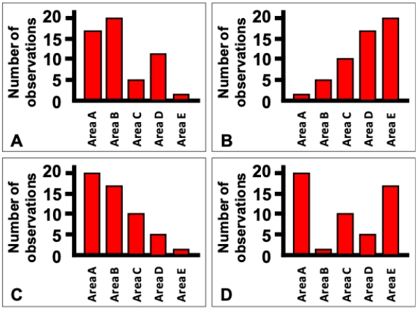
Which of the bar charts shown corresponds to the data table shown?
?
Frequency table showing the number of oak trees in each of 5 areas in a forest.
?
 ?
?
A) Chart A
B) Chart B
C) Chart C
D) Chart D
?
Frequency table showing the number of oak trees in each of 5 areas in a forest.
?
?A) Chart A
B) Chart B
C) Chart C
D) Chart D
Question
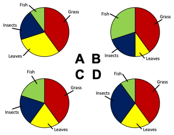
Consider an experiment in which an omnivorous species has its stomach contents analyzed. Which of the pie charts correctly depicts the following values for the diet of the omnivore:
Fish = 10%
Grass = 40%,
Insects = 20%
Leaves = 30%
A) Chart A
B) Chart B
C) Chart C
D) Chart D
Fish = 10%
Grass = 40%,
Insects = 20%
Leaves = 30%
A) Chart A
B) Chart B
C) Chart C
D) Chart D
Question
Consider an experiment in which an omnivorous species has its stomach contents analyzed. Which of the pie charts correctly depicts the following values for the diet of the omnivore: 20% grass, 40% leaves, 20% insects, 20% fish?

A) Chart A
B) Chart B
C) Chart C
D) Chart D
A) Chart A
B) Chart B
C) Chart C
D) Chart D
Question
Consider a lake survey in which the relative amounts of five different types of fish are identified. Which of the following data sets matches the pie chart shown?
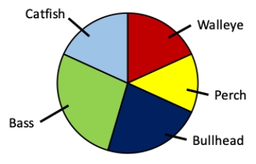
A) 25% bass, 20% bullhead, 25% catfish, 15% perch, 15% walleye
B) 35% bass, 15% bullhead, 15% catfish, 15% perch, 20% walleye
C) 20% bass, 15% bullhead, 25% catfish, 20% perch, 20% walleye
D) 30% bass, 20% bullhead, 15% catfish, 15% perch, 20% walleye
A) 25% bass, 20% bullhead, 25% catfish, 15% perch, 15% walleye
B) 35% bass, 15% bullhead, 15% catfish, 15% perch, 20% walleye
C) 20% bass, 15% bullhead, 25% catfish, 20% perch, 20% walleye
D) 30% bass, 20% bullhead, 15% catfish, 15% perch, 20% walleye
Question
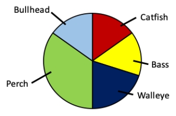
Consider a lake survey in which the relative amounts of five different types of fish are identified. Which of the following data sets matches the pie chart shown?

A) 15% bass, 15% bullhead, 15% catfish, 40% perch, 15% walleye
B) 15% bass, 15% bullhead, 15% catfish, 35% perch, 20% walleye
C) 20% bass, 15% bullhead, 20% catfish, 30% perch, 15% walleye
D) 20% bass, 15% bullhead, 15% catfish, 30% perch, 20% walleye
A) 15% bass, 15% bullhead, 15% catfish, 40% perch, 15% walleye
B) 15% bass, 15% bullhead, 15% catfish, 35% perch, 20% walleye
C) 20% bass, 15% bullhead, 20% catfish, 30% perch, 15% walleye
D) 20% bass, 15% bullhead, 15% catfish, 30% perch, 20% walleye
Question
Consider a lake survey in which the relative amounts of five different types of fish are identified. Which of the following is not an aspect of poor design in the pie chart shown?
A) The segments are not arranged alphabetically.
B) The segments are not arranged in order of magnitude.
C) The green and light blue would be hard to tell apart if printed in black and white.
D) The yellow and red segments would be hard for most color-blind people to tell apart.
A) The segments are not arranged alphabetically.
B) The segments are not arranged in order of magnitude.
C) The green and light blue would be hard to tell apart if printed in black and white.
D) The yellow and red segments would be hard for most color-blind people to tell apart.
Question
Consider the data table that indicates how many subjects in a skin cancer study had various numbers of moles on their backs. Which of the histograms correctly depicts the data?
?
Frequency table showing the number of moles on the backs of 55 subjects.
?
 ?
?
A) Chart A
B) Chart B
C) Chart C
D) Chart D
?
Frequency table showing the number of moles on the backs of 55 subjects.
?
?A) Chart A
B) Chart B
C) Chart C
D) Chart D
Question
Consider the data table that indicates how many subjects in a skin cancer study had various sizes of moles on their backs. Which of the histograms correctly depicts the data?
Frequency table showing the average size of moles on 70 subjects.
 ?
?
?
A) Chart A
B) Chart B
C) Chart C
D) Chart D
Frequency table showing the average size of moles on 70 subjects.
??
A) Chart A
B) Chart B
C) Chart C
D) Chart D
Question
Question
Question
Question
Question
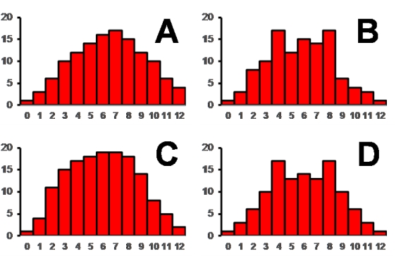
Consider the histogram of a data set shown. Which of the following values is the mode of the data set?
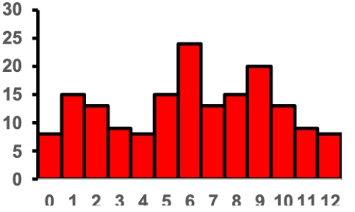
A) 6
B) 9
C) 25
D) 30
A) 6
B) 9
C) 25
D) 30
Question
Consider the histogram of a data set shown. Which of the following values is the mode of the data set?
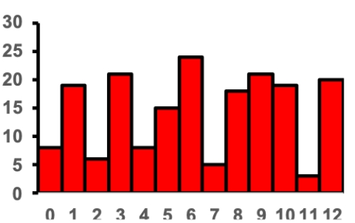
A) 6
B) 7
C) 12
D) 24
A) 6
B) 7
C) 12
D) 24
Question
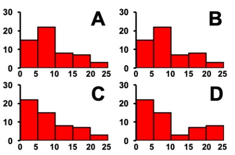
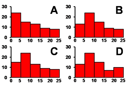
Consider the histograms of a data set shown. Which of the histograms depicts an asymmetric data set?
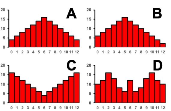
A) Chart A
B) Chart B
C) Chart C
D) Chart D
A) Chart A
B) Chart B
C) Chart C
D) Chart D
Question
Consider the histograms of a data set shown. Which of the histograms depicts a symmetric data set?
A) Chart A
B) Chart B
C) Chart C
D) Chart D
A) Chart A
B) Chart B
C) Chart C
D) Chart D
Question
Consider the histogram shown. What two words describe the skew?
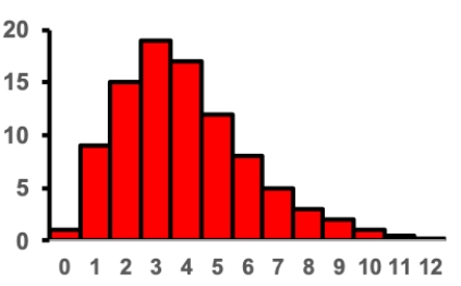
A) Left skewed, negative skew
B) Left skewed, positive skew
C) Right skewed, negative skew
D) Right skewed, positive skew
A) Left skewed, negative skew
B) Left skewed, positive skew
C) Right skewed, negative skew
D) Right skewed, positive skew
Question
Consider the histogram shown. What two words describe the skew?
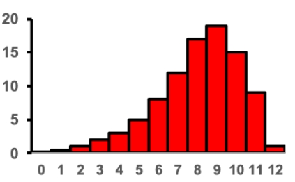
A) Left skewed, negative skew
B) Left skewed, positive skew
C) Right skewed, negative skew
D) Right skewed, positive skew
A) Left skewed, negative skew
B) Left skewed, positive skew
C) Right skewed, negative skew
D) Right skewed, positive skew
Question
Question
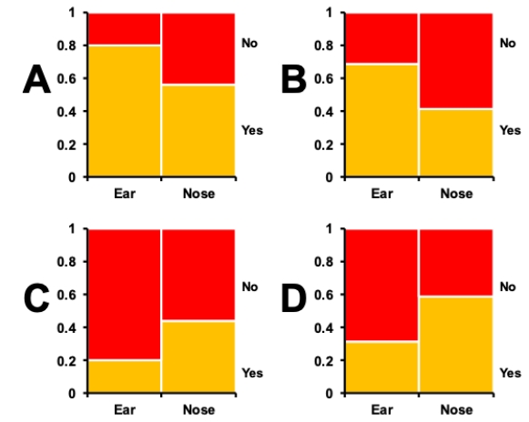
Consider a situation in which bacterial swabs were taken from the ears and noses of 50 study subjects, and the number of swabs that showed the presence of staphylococcus were measured. The table shows the results of the measurements. Which of the mosaic plots shown correctly depicts this data?
?
Contingency table showing presence of Staphylococcus in swabs from different body parts.
?
 ?
?
A) Plot A
B) Plot B
C) Plot C
D) Plot D
?
Contingency table showing presence of Staphylococcus in swabs from different body parts.
?
?A) Plot A
B) Plot B
C) Plot C
D) Plot D
Question
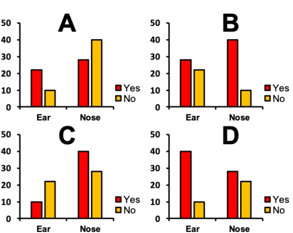
Consider a situation in which bacterial swabs were taken from the ears and noses of 50 study subjects, and the number of swabs that showed the presence of staphylococcus were measured. The table shows the results of the measurements. Which of the grouped bar graphs shown correctly depicts this data?
?
Contingency table showing presence of Staphylococcus in swabs from different body parts.
?
 ?
?
A) Plot A
B) Plot B
C) Plot C
D) Plot D
?
Contingency table showing presence of Staphylococcus in swabs from different body parts.
?
?A) Plot A
B) Plot B
C) Plot C
D) Plot D
Question
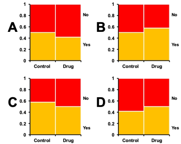
Consider a situation in which tumor-prone rats were given an experimental anti-cancer drug or a control. There were 50 rats in each treatment group, and after 6 weeks they were sacrificed and autopsies performed to determine the presence or absence of liver tumors. The table shows the results of the measurements. Which of the mosaic plots shown correctly depicts this data?
?
Contingency table showing presence of tumors in rats with different drug regimes.
?
 ?
?
A) Plot A
B) Plot B
C) Plot C
D) Plot D
?
Contingency table showing presence of tumors in rats with different drug regimes.
?
?A) Plot A
B) Plot B
C) Plot C
D) Plot D
Question
Consider a situation in which bacterial swabs were taken from the ears and noses of 50 study subjects, and the number of swabs that showed the presence of staphylococcus were measured. The table shows the results of the measurements. Which of the grouped bar graphs shown correctly depicts this data?
?
Contingency table showing presence of tumors in rats with different drug regimes.
?
 ?
?
A) Plot A
B) Plot B
C) Plot C
D) Plot D
?
Contingency table showing presence of tumors in rats with different drug regimes.
?
?A) Plot A
B) Plot B
C) Plot C
D) Plot D
Question
Question
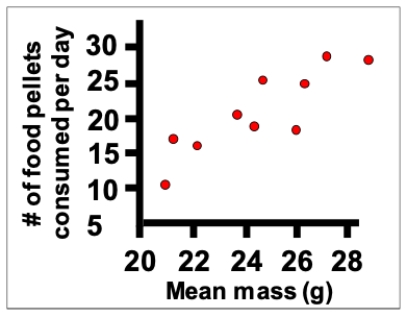
Consider an experiment in which rats are weighed and then their food consumption is measured. Which of the following terms is the best technical description of the data shown?
A) A casual relationship.
B) A causal relationship.
C) A positive relationship.
D) An upward relationship.
A) A casual relationship.
B) A causal relationship.
C) A positive relationship.
D) An upward relationship.
Question
Consider an experiment in which rats are weighed and then their food consumption is measured. Which of the following terms would be used for the data point indicated with the arrow?
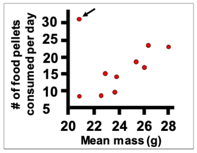
A) A deviation.
B) An exception.
C) An outlier.
D) A scattered point.
A) A deviation.
B) An exception.
C) An outlier.
D) A scattered point.
Question
Question
Question
Question
Question
Question
Question
Question
Question
Question
Question
Question
Question
Question
Question
Question
Question
Question
Question
Question
Question

Unlock Deck
Sign up to unlock the cards in this deck!
Unlock Deck
Unlock Deck
1/55
Play
Full screen (f)
Deck 2: Displaying Data
1
Effective graphs are designed to accomplish three goals. Which of the following is NOT one of these goals?
A) Communicating results to a wider audience.
B) Comparing measurements between groups.
C) Proving a hypothesis is correct or incorrect.
D) Uncovering relationships between variables.
A) Communicating results to a wider audience.
B) Comparing measurements between groups.
C) Proving a hypothesis is correct or incorrect.
D) Uncovering relationships between variables.
C
2
Consider an experiment in which rats are given three diets (reduced calorie, control, and increased calorie) and their masses at 6 weeks of age are measured. Which of the following is NOT an aspect of poor design in the figure shown?
A) The two-dimensional nature of the bars subliminally exaggerates differences between the groups.
B) The axis should go to zero to allow true judgement of relative differences.
C) The data are shown in a manner that makes judging the values more difficult.
D) The unit for mass in the axis label is redundant and makes the label overly wordy.
D
3
Consider an experiment in which rats are given three diets (reduced calorie, control, and increased calorie) and their masses at 6 weeks of age are measured. Which of the following is an aspect of poor design in the figure shown?
A) The different patterns for the groups provide no additional information because they are redundant with the labels.
B) The figure is black and white; color is always better when making figures and graphs.
C) The unit for mass in the axis label should be spelled out with words instead of abbreviated within the parentheses.
D) Since the minimum group mean is 20, dropping the axis all the way down to zero is too far and wastes space.
C
4
Consider an experiment in which female and male rats are weighed and then their food consumption is measured. Which of the following is a flaw in the figure showing data from this experiment?
A) Data for an unequal number of subjects for each of the two sexes are displayed.
B) The pair of colors, red and green, is used.
C) The groups have both different colors and different shapes, which is redundant; only one aspect of the symbols should differ.
D) The wrong variables are plotted on the axes; they should be switched.
Unlock Deck
Unlock for access to all 55 flashcards in this deck.
Unlock Deck
k this deck
5
Consider an experiment in which female and male rats are weighed and then their food consumption is measured. Which of the following is NOT a flaw in the figure showing data from this experiment?
A) The fonts used for the two axes are different and both hard to read.
B) The symbols have identical shapes and colors with very similar shades.
C) The x-axis should extend all the way to zero to show magnitude.
D) The y-axis has a discontinuity, a sudden jump in magnitude.
A) The fonts used for the two axes are different and both hard to read.
B) The symbols have identical shapes and colors with very similar shades.
C) The x-axis should extend all the way to zero to show magnitude.
D) The y-axis has a discontinuity, a sudden jump in magnitude.
Unlock Deck
Unlock for access to all 55 flashcards in this deck.
Unlock Deck
k this deck
6
The type of figure that uses rectangles, the height of which indicates magnitude, is called which of the following?
A) Bar graph
B) Box plot
C) Pie chart
D) Rectangle plot
A) Bar graph
B) Box plot
C) Pie chart
D) Rectangle plot
Unlock Deck
Unlock for access to all 55 flashcards in this deck.
Unlock Deck
k this deck
7
Which of the following is NOT true of relative frequencies for a complete data set?
A) All the relative frequency values are less than or equal to one.
B) All the relative frequency values sum to one.
C) Each relative frequency is less than or equal to the corresponding absolute frequency.
D) No two relative frequency values can be the same.
A) All the relative frequency values are less than or equal to one.
B) All the relative frequency values sum to one.
C) Each relative frequency is less than or equal to the corresponding absolute frequency.
D) No two relative frequency values can be the same.
Unlock Deck
Unlock for access to all 55 flashcards in this deck.
Unlock Deck
k this deck
8
Which of the following would greatly improve the utility of the data table shown?
?
Frequency table showing the number of fish caught by a fishing boat during a four hour fishing voyage.
?
A) Instead of a row for each fish species, there should be a column for each species, with the number listed underneath.
B) The rows should be sorted alphabetically based on the fish species name.
C) The rows should be sorted numerically based on the number of fish caught.
D) The scientific names of the fish should be provided on each row.
?
Frequency table showing the number of fish caught by a fishing boat during a four hour fishing voyage.
?
A) Instead of a row for each fish species, there should be a column for each species, with the number listed underneath.
B) The rows should be sorted alphabetically based on the fish species name.
C) The rows should be sorted numerically based on the number of fish caught.
D) The scientific names of the fish should be provided on each row.
Unlock Deck
Unlock for access to all 55 flashcards in this deck.
Unlock Deck
k this deck
9
Which of the bar charts shown corresponds to the data table shown?
?
Frequency table showing the number of oak trees in each of 5 areas in a forest.
?
?
A) Chart A
B) Chart B
C) Chart C
D) Chart D
?
Frequency table showing the number of oak trees in each of 5 areas in a forest.
?
?A) Chart A
B) Chart B
C) Chart C
D) Chart D
Unlock Deck
Unlock for access to all 55 flashcards in this deck.
Unlock Deck
k this deck
10
Consider an experiment in which an omnivorous species has its stomach contents analyzed. Which of the pie charts correctly depicts the following values for the diet of the omnivore:
Fish = 10%
Grass = 40%,
Insects = 20%
Leaves = 30%
A) Chart A
B) Chart B
C) Chart C
D) Chart D
Fish = 10%
Grass = 40%,
Insects = 20%
Leaves = 30%
A) Chart A
B) Chart B
C) Chart C
D) Chart D
Unlock Deck
Unlock for access to all 55 flashcards in this deck.
Unlock Deck
k this deck
11
Consider an experiment in which an omnivorous species has its stomach contents analyzed. Which of the pie charts correctly depicts the following values for the diet of the omnivore: 20% grass, 40% leaves, 20% insects, 20% fish?
A) Chart A
B) Chart B
C) Chart C
D) Chart D
A) Chart A
B) Chart B
C) Chart C
D) Chart D
Unlock Deck
Unlock for access to all 55 flashcards in this deck.
Unlock Deck
k this deck
12
Consider a lake survey in which the relative amounts of five different types of fish are identified. Which of the following data sets matches the pie chart shown?
A) 25% bass, 20% bullhead, 25% catfish, 15% perch, 15% walleye
B) 35% bass, 15% bullhead, 15% catfish, 15% perch, 20% walleye
C) 20% bass, 15% bullhead, 25% catfish, 20% perch, 20% walleye
D) 30% bass, 20% bullhead, 15% catfish, 15% perch, 20% walleye
A) 25% bass, 20% bullhead, 25% catfish, 15% perch, 15% walleye
B) 35% bass, 15% bullhead, 15% catfish, 15% perch, 20% walleye
C) 20% bass, 15% bullhead, 25% catfish, 20% perch, 20% walleye
D) 30% bass, 20% bullhead, 15% catfish, 15% perch, 20% walleye
Unlock Deck
Unlock for access to all 55 flashcards in this deck.
Unlock Deck
k this deck
13
Consider a lake survey in which the relative amounts of five different types of fish are identified. Which of the following data sets matches the pie chart shown?
A) 15% bass, 15% bullhead, 15% catfish, 40% perch, 15% walleye
B) 15% bass, 15% bullhead, 15% catfish, 35% perch, 20% walleye
C) 20% bass, 15% bullhead, 20% catfish, 30% perch, 15% walleye
D) 20% bass, 15% bullhead, 15% catfish, 30% perch, 20% walleye
A) 15% bass, 15% bullhead, 15% catfish, 40% perch, 15% walleye
B) 15% bass, 15% bullhead, 15% catfish, 35% perch, 20% walleye
C) 20% bass, 15% bullhead, 20% catfish, 30% perch, 15% walleye
D) 20% bass, 15% bullhead, 15% catfish, 30% perch, 20% walleye
Unlock Deck
Unlock for access to all 55 flashcards in this deck.
Unlock Deck
k this deck
14
Consider a lake survey in which the relative amounts of five different types of fish are identified. Which of the following is not an aspect of poor design in the pie chart shown?
A) The segments are not arranged alphabetically.
B) The segments are not arranged in order of magnitude.
C) The green and light blue would be hard to tell apart if printed in black and white.
D) The yellow and red segments would be hard for most color-blind people to tell apart.
A) The segments are not arranged alphabetically.
B) The segments are not arranged in order of magnitude.
C) The green and light blue would be hard to tell apart if printed in black and white.
D) The yellow and red segments would be hard for most color-blind people to tell apart.
Unlock Deck
Unlock for access to all 55 flashcards in this deck.
Unlock Deck
k this deck
15
Consider the data table that indicates how many subjects in a skin cancer study had various numbers of moles on their backs. Which of the histograms correctly depicts the data?
?
Frequency table showing the number of moles on the backs of 55 subjects.
?
?
A) Chart A
B) Chart B
C) Chart C
D) Chart D
?
Frequency table showing the number of moles on the backs of 55 subjects.
?
?A) Chart A
B) Chart B
C) Chart C
D) Chart D
Unlock Deck
Unlock for access to all 55 flashcards in this deck.
Unlock Deck
k this deck
16
Consider the data table that indicates how many subjects in a skin cancer study had various sizes of moles on their backs. Which of the histograms correctly depicts the data?
Frequency table showing the average size of moles on 70 subjects.
?
?
A) Chart A
B) Chart B
C) Chart C
D) Chart D
Frequency table showing the average size of moles on 70 subjects.
??
A) Chart A
B) Chart B
C) Chart C
D) Chart D
Unlock Deck
Unlock for access to all 55 flashcards in this deck.
Unlock Deck
k this deck
17
When designing a bar graph, which of the following is NOT something that should generally be done?
A) Bar heights should be proportional to the number of observations.
B) Bars should stand apart with small gaps between them.
C) Nominal categories should be ordered by frequency, from largest to smallest.
D) Ordinal categories should be ordered by frequency, from largest to smallest.
A) Bar heights should be proportional to the number of observations.
B) Bars should stand apart with small gaps between them.
C) Nominal categories should be ordered by frequency, from largest to smallest.
D) Ordinal categories should be ordered by frequency, from largest to smallest.
Unlock Deck
Unlock for access to all 55 flashcards in this deck.
Unlock Deck
k this deck
18
Which of the following is generally true for pie charts?
A) Frequencies are easy to compare across different pie charts.
B) Frequencies are hard to compare visually when there are many categories.
C) Pie charts are better for showing absolute frequencies than relative frequencies.
D) Pie charts are better for showing relative frequencies than absolute frequencies.
Unlock Deck
Unlock for access to all 55 flashcards in this deck.
Unlock Deck
k this deck
19
If you saw a graph with rectangles standing on a horizontal axis, what is the best immediate visual clue to determine whether it is likely to be a well-designed bar chart or a histogram?
A) If it is in color or shades of gray.
B) If the bars are solid or filled with patterns.
C) Whether the bars touch or have gaps between them.
D) Whether the y-axis goes to zero or some other number.
A) If it is in color or shades of gray.
B) If the bars are solid or filled with patterns.
C) Whether the bars touch or have gaps between them.
D) Whether the y-axis goes to zero or some other number.
Unlock Deck
Unlock for access to all 55 flashcards in this deck.
Unlock Deck
k this deck
20
If you saw a graph with rectangles standing on a horizontal axis, what is the best immediate visual clue to determine whether it is likely to be a well-designed bar chart or a histogram?
A) If the x-axis has numbers or labels.
B) If the y-axis goes to zero or some other number.
C) Whether it is black and white or in color.
D) Whether the bars are solid or filled with patterns.
A) If the x-axis has numbers or labels.
B) If the y-axis goes to zero or some other number.
C) Whether it is black and white or in color.
D) Whether the bars are solid or filled with patterns.
Unlock Deck
Unlock for access to all 55 flashcards in this deck.
Unlock Deck
k this deck
21
Consider the histogram of a data set shown. Which of the following values is the mode of the data set?
A) 6
B) 9
C) 25
D) 30
A) 6
B) 9
C) 25
D) 30
Unlock Deck
Unlock for access to all 55 flashcards in this deck.
Unlock Deck
k this deck
22
Consider the histogram of a data set shown. Which of the following values is the mode of the data set?
A) 6
B) 7
C) 12
D) 24
A) 6
B) 7
C) 12
D) 24
Unlock Deck
Unlock for access to all 55 flashcards in this deck.
Unlock Deck
k this deck
23
Consider the histograms of a data set shown. Which of the histograms depicts an asymmetric data set?
A) Chart A
B) Chart B
C) Chart C
D) Chart D
A) Chart A
B) Chart B
C) Chart C
D) Chart D
Unlock Deck
Unlock for access to all 55 flashcards in this deck.
Unlock Deck
k this deck
24
Consider the histograms of a data set shown. Which of the histograms depicts a symmetric data set?
A) Chart A
B) Chart B
C) Chart C
D) Chart D
A) Chart A
B) Chart B
C) Chart C
D) Chart D
Unlock Deck
Unlock for access to all 55 flashcards in this deck.
Unlock Deck
k this deck
25
Consider the histogram shown. What two words describe the skew?
A) Left skewed, negative skew
B) Left skewed, positive skew
C) Right skewed, negative skew
D) Right skewed, positive skew
A) Left skewed, negative skew
B) Left skewed, positive skew
C) Right skewed, negative skew
D) Right skewed, positive skew
Unlock Deck
Unlock for access to all 55 flashcards in this deck.
Unlock Deck
k this deck
26
Consider the histogram shown. What two words describe the skew?
A) Left skewed, negative skew
B) Left skewed, positive skew
C) Right skewed, negative skew
D) Right skewed, positive skew
A) Left skewed, negative skew
B) Left skewed, positive skew
C) Right skewed, negative skew
D) Right skewed, positive skew
Unlock Deck
Unlock for access to all 55 flashcards in this deck.
Unlock Deck
k this deck
27
What of the following is the best approach to deciding on the number of bins for a histogram?
A) The number of bins should be approximately 20% of the number of data values.
B) There is a formula, number of bins = 1 + ln(n)/ln(2), that should always be used to set the number of bins.
C) There is no strict rule; the number of bins should be chosen to best show patterns.
D) There should be no less than 5 bins and no more than 20.
Unlock Deck
Unlock for access to all 55 flashcards in this deck.
Unlock Deck
k this deck
28
Consider a situation in which bacterial swabs were taken from the ears and noses of 50 study subjects, and the number of swabs that showed the presence of staphylococcus were measured. The table shows the results of the measurements. Which of the mosaic plots shown correctly depicts this data?
?
Contingency table showing presence of Staphylococcus in swabs from different body parts.
?
?
A) Plot A
B) Plot B
C) Plot C
D) Plot D
?
Contingency table showing presence of Staphylococcus in swabs from different body parts.
?
?A) Plot A
B) Plot B
C) Plot C
D) Plot D
Unlock Deck
Unlock for access to all 55 flashcards in this deck.
Unlock Deck
k this deck
29
Consider a situation in which bacterial swabs were taken from the ears and noses of 50 study subjects, and the number of swabs that showed the presence of staphylococcus were measured. The table shows the results of the measurements. Which of the grouped bar graphs shown correctly depicts this data?
?
Contingency table showing presence of Staphylococcus in swabs from different body parts.
?
?
A) Plot A
B) Plot B
C) Plot C
D) Plot D
?
Contingency table showing presence of Staphylococcus in swabs from different body parts.
?
?A) Plot A
B) Plot B
C) Plot C
D) Plot D
Unlock Deck
Unlock for access to all 55 flashcards in this deck.
Unlock Deck
k this deck
30
Consider a situation in which tumor-prone rats were given an experimental anti-cancer drug or a control. There were 50 rats in each treatment group, and after 6 weeks they were sacrificed and autopsies performed to determine the presence or absence of liver tumors. The table shows the results of the measurements. Which of the mosaic plots shown correctly depicts this data?
?
Contingency table showing presence of tumors in rats with different drug regimes.
?
?
A) Plot A
B) Plot B
C) Plot C
D) Plot D
?
Contingency table showing presence of tumors in rats with different drug regimes.
?
?A) Plot A
B) Plot B
C) Plot C
D) Plot D
Unlock Deck
Unlock for access to all 55 flashcards in this deck.
Unlock Deck
k this deck
31
Consider a situation in which bacterial swabs were taken from the ears and noses of 50 study subjects, and the number of swabs that showed the presence of staphylococcus were measured. The table shows the results of the measurements. Which of the grouped bar graphs shown correctly depicts this data?
?
Contingency table showing presence of tumors in rats with different drug regimes.
?
?
A) Plot A
B) Plot B
C) Plot C
D) Plot D
?
Contingency table showing presence of tumors in rats with different drug regimes.
?
?A) Plot A
B) Plot B
C) Plot C
D) Plot D
Unlock Deck
Unlock for access to all 55 flashcards in this deck.
Unlock Deck
k this deck
32
Mosaic plots and grouped bar graphs display the same basic data, but mosaic plots only show the frequencies, not the raw values. While this may seem to be a weakness, in which way are mosaic plots potentially better than grouped bar graphs?
A) They are more widely used and therefore better understood by readers.
B) They are not as prone as grouped bars graphs to rounding error, which causes inaccuracy.
C) They are often better at indicating associations between treatment and response variables.
D) They take up less space on the page.
A) They are more widely used and therefore better understood by readers.
B) They are not as prone as grouped bars graphs to rounding error, which causes inaccuracy.
C) They are often better at indicating associations between treatment and response variables.
D) They take up less space on the page.
Unlock Deck
Unlock for access to all 55 flashcards in this deck.
Unlock Deck
k this deck
33
Consider an experiment in which rats are weighed and then their food consumption is measured. Which of the following terms is the best technical description of the data shown?
A) A casual relationship.
B) A causal relationship.
C) A positive relationship.
D) An upward relationship.
A) A casual relationship.
B) A causal relationship.
C) A positive relationship.
D) An upward relationship.
Unlock Deck
Unlock for access to all 55 flashcards in this deck.
Unlock Deck
k this deck
34
Consider an experiment in which rats are weighed and then their food consumption is measured. Which of the following terms would be used for the data point indicated with the arrow?
A) A deviation.
B) An exception.
C) An outlier.
D) A scattered point.
A) A deviation.
B) An exception.
C) An outlier.
D) A scattered point.
Unlock Deck
Unlock for access to all 55 flashcards in this deck.
Unlock Deck
k this deck
35
Which of the following is a good thing to do when designing a data table?
A) Arrange rows according to the numerical value of the most interesting variable.
B) Arrange rows alphabetically.
C) Arrange rows and columns so that values in the same row are as similar as possible.
D) Arrange rows from smallest sample size to largest sample size.
A) Arrange rows according to the numerical value of the most interesting variable.
B) Arrange rows alphabetically.
C) Arrange rows and columns so that values in the same row are as similar as possible.
D) Arrange rows from smallest sample size to largest sample size.
Unlock Deck
Unlock for access to all 55 flashcards in this deck.
Unlock Deck
k this deck
36
Which of the following is NOT a good thing to do when designing a data table?
A) Arrange quantitative categories by order of value.
B) Arrange unordered categorical variables in alphabetical order.
C) Arrange unordered categorical variables in order of importance.
D) Arrange unordered categorical variables in their natural order, if they have one.
A) Arrange quantitative categories by order of value.
B) Arrange unordered categorical variables in alphabetical order.
C) Arrange unordered categorical variables in order of importance.
D) Arrange unordered categorical variables in their natural order, if they have one.
Unlock Deck
Unlock for access to all 55 flashcards in this deck.
Unlock Deck
k this deck
37
One of the graphical methods in particular was described as being particularly suited to looking at data values over time-which one?
A) A grouped bar graph
B) A line graph
C) A map
D) A mosaic plot
A) A grouped bar graph
B) A line graph
C) A map
D) A mosaic plot
Unlock Deck
Unlock for access to all 55 flashcards in this deck.
Unlock Deck
k this deck
38
Preparing figures typically follows data analysis.
Unlock Deck
Unlock for access to all 55 flashcards in this deck.
Unlock Deck
k this deck
39
Three-dimensional figures are often the best way to represent data
Unlock Deck
Unlock for access to all 55 flashcards in this deck.
Unlock Deck
k this deck
40
Bar graphs, histograms, and scatter plots should always show the y-axis all the way down to zero.
Unlock Deck
Unlock for access to all 55 flashcards in this deck.
Unlock Deck
k this deck
41
Bar graphs are typically superior to pie charts for representing category frequencies.
Unlock Deck
Unlock for access to all 55 flashcards in this deck.
Unlock Deck
k this deck
42
There is no strict rule for choosing the number of bins in a histogram.
Unlock Deck
Unlock for access to all 55 flashcards in this deck.
Unlock Deck
k this deck
43
Grouped bar graphs and mosaic plots are typically used for the same purpose.
Unlock Deck
Unlock for access to all 55 flashcards in this deck.
Unlock Deck
k this deck
44
Strip plots and violin plots are typically used for the same purpose.
Unlock Deck
Unlock for access to all 55 flashcards in this deck.
Unlock Deck
k this deck
45
The primary purpose of scatter plots is to highlight differences between groups.
Unlock Deck
Unlock for access to all 55 flashcards in this deck.
Unlock Deck
k this deck
46
Multiple histograms and grouped bar graphs are typically used for the same purpose.
Unlock Deck
Unlock for access to all 55 flashcards in this deck.
Unlock Deck
k this deck
47
When designing a table of data values, the rows should always be arranged such that the category with the largest number of values is at the top with the values descending until the last row has the smallest number of values.
Unlock Deck
Unlock for access to all 55 flashcards in this deck.
Unlock Deck
k this deck
48
When looking at a color map that uses colors to represent values, blue signifies larger values and red signifies smaller values.
Unlock Deck
Unlock for access to all 55 flashcards in this deck.
Unlock Deck
k this deck
49
Essentially, all professional statistics software programs can read data files saved as .csv or text files, but not all will read Excel formats.
Unlock Deck
Unlock for access to all 55 flashcards in this deck.
Unlock Deck
k this deck
50
Distinguish between absolute and relative frequencies with regard to a data set.
Unlock Deck
Unlock for access to all 55 flashcards in this deck.
Unlock Deck
k this deck
51
Draw a graph showing hypothetical data in which two aspects of its design are misleading or bad. Briefly describe each of the two flaws you included and explain how they could be improved.
Unlock Deck
Unlock for access to all 55 flashcards in this deck.
Unlock Deck
k this deck
52
Sketch out a histogram (with 5 bins of equal size as appropriate) showing the distribution of the following values: 2, 3, 3, 4, 5, 7, 8, 8, 11, 11, 12, 13, 15, 15, 17, 18, 18, 23, 24, 32, 33, 34, 35, 38, 41, 42, 43, 48
Unlock Deck
Unlock for access to all 55 flashcards in this deck.
Unlock Deck
k this deck
53
Imagine you have length and weight data for two sets of mice: wildtype mice and ones with a genetic mutation for bone growths. Describe a scientific question using these mice that would be best analyzed with a scatter plot and a different question that would be best approached using a violin plot.
Unlock Deck
Unlock for access to all 55 flashcards in this deck.
Unlock Deck
k this deck
54
Write out a procedure or recipe for how to best work with a set of values you have obtained in order to make a good set of data files. Be clear about what your end result should be in terms of files.
Unlock Deck
Unlock for access to all 55 flashcards in this deck.
Unlock Deck
k this deck
55
Multiple histograms and group bar graphs both use multiple sets of bars to display data and facilitate certain analyses. Contrast these two graphical methods-what is the main difference in the goal of these figures?
Unlock Deck
Unlock for access to all 55 flashcards in this deck.
Unlock Deck
k this deck
Unlock Deck
Unlock for access to all 55 flashcards in this deck.


