Exam 2: Displaying Data
Exam 1: Statistics and Samples36 Questions
Exam 2: Displaying Data55 Questions
Exam 3: Describing Data49 Questions
Exam 4: Estimating With Uncertainty47 Questions
Exam 5: Probability50 Questions
Exam 6: Hypothesis Testing40 Questions
Exam 7: Analyzing Proportions54 Questions
Exam 8: Fitting Probability Models to Frequency Data53 Questions
Exam 9: Contingency Analysis: Associations Between56 Questions
Exam 10: The Normal Distribution51 Questions
Exam 11: Inference for a Normal Population46 Questions
Exam 12: Comparing Two Means53 Questions
Exam 13: Handling Violations of Assumptions38 Questions
Exam 14: Designing Experiments56 Questions
Exam 15: Comparing Means of More Than Two Groups54 Questions
Exam 16: Correlation Between Numerical Variables49 Questions
Exam 17: Regression54 Questions
Exam 18: Multiple Explanatory Variables47 Questions
Exam 19: Computer-Intensive Methods25 Questions
Exam 20: Likelihood33 Questions
Exam 21: Meta-Analysis: Combining Information From38 Questions
Select questions type
The type of figure that uses rectangles, the height of which indicates magnitude, is called which of the following?
Free
(Multiple Choice)
4.8/5  (34)
(34)
Correct Answer: Verified
A
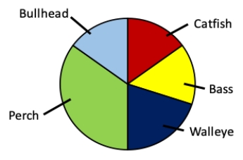
Consider a lake survey in which the relative amounts of five different types of fish are identified. Which of the following is not an aspect of poor design in the pie chart shown?
Free
(Multiple Choice)
4.9/5 (44)
Correct Answer:Verified
D
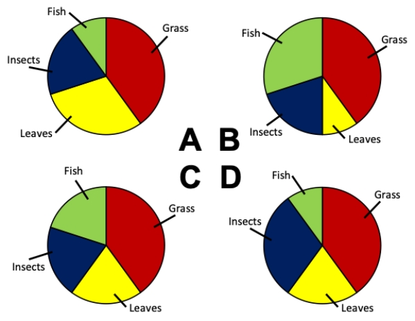
Consider an experiment in which an omnivorous species has its stomach contents analyzed. Which of the pie charts correctly depicts the following values for the diet of the omnivore: 20% grass, 40% leaves, 20% insects, 20% fish?
Free
(Multiple Choice)
4.8/5 (38)
Correct Answer:Verified
C
Three-dimensional figures are often the best way to represent data
(True/False)
4.8/5 (29)
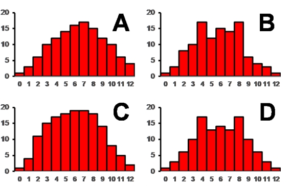
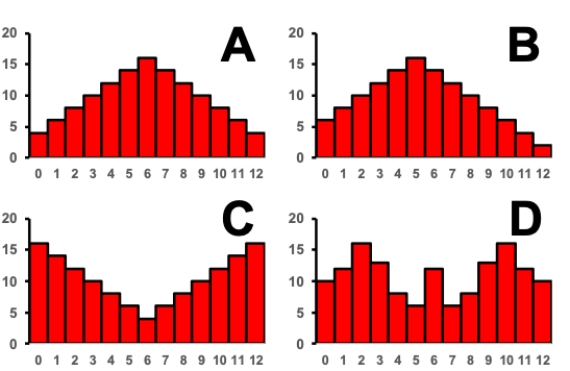
Consider the histograms of a data set shown. Which of the histograms depicts a symmetric data set?
(Multiple Choice)
4.9/5 (36)
Which of the following is NOT true of relative frequencies for a complete data set?
(Multiple Choice)
4.7/5 (35)
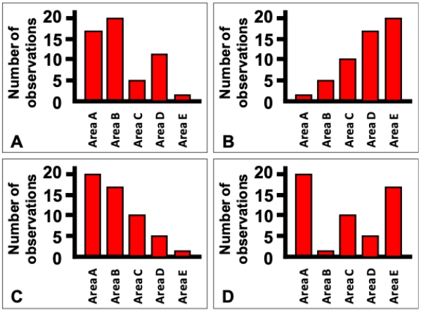
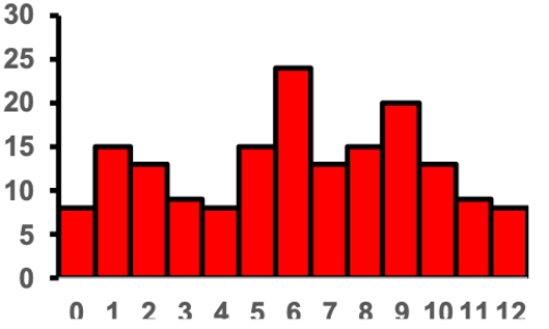
Which of the bar charts shown corresponds to the data table shown?
?
Frequency table showing the number of oak trees in each of 5 areas in a forest.
Species of fish Frequency (number caught) Area A 20 Area B 17 Area C 10 Area D 5 Area E 1 ?
 ?
?
(Multiple Choice)
4.7/5 (28)
Draw a graph showing hypothetical data in which two aspects of its design are misleading or bad. Briefly describe each of the two flaws you included and explain how they could be improved.
(Essay)
4.8/5 (38)
Sketch out a histogram (with 5 bins of equal size as appropriate) showing the distribution of the following values: 2, 3, 3, 4, 5, 7, 8, 8, 11, 11, 12, 13, 15, 15, 17, 18, 18, 23, 24, 32, 33, 34, 35, 38, 41, 42, 43, 48
(Short Answer)
4.8/5 (31)
Consider the histogram of a data set shown. Which of the following values is the mode of the data set?
(Multiple Choice)
4.8/5 (29)
Consider a situation in which bacterial swabs were taken from the ears and noses of 50 study subjects, and the number of swabs that showed the presence of staphylococcus were measured. The table shows the results of the measurements. Which of the grouped bar graphs shown correctly depicts this data?
?
Contingency table showing presence of tumors in rats with different drug regimes.
Present? Control Drug Yes 29 25 No 21 25 ?
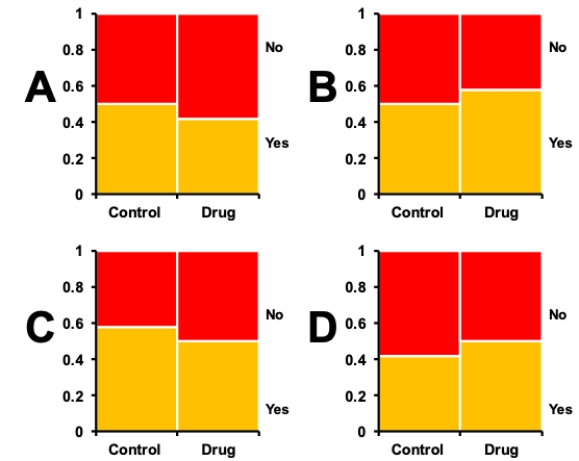 ?
?
(Multiple Choice)
4.9/5 (35)
One of the graphical methods in particular was described as being particularly suited to looking at data values over time-which one?
(Multiple Choice)
4.9/5 (36)
Write out a procedure or recipe for how to best work with a set of values you have obtained in order to make a good set of data files. Be clear about what your end result should be in terms of files.
(Essay)
4.8/5 (37)
Mosaic plots and grouped bar graphs display the same basic data, but mosaic plots only show the frequencies, not the raw values. While this may seem to be a weakness, in which way are mosaic plots potentially better than grouped bar graphs?
(Multiple Choice)
4.8/5 (32)
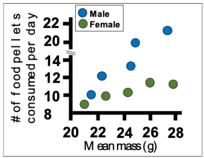
Consider an experiment in which female and male rats are weighed and then their food consumption is measured. Which of the following is NOT a flaw in the figure showing data from this experiment?
(Multiple Choice)
4.8/5 (30)
Multiple histograms and grouped bar graphs are typically used for the same purpose.
(True/False)
4.8/5 (40)
Grouped bar graphs and mosaic plots are typically used for the same purpose.
(True/False)
4.9/5 (37)
If you saw a graph with rectangles standing on a horizontal axis, what is the best immediate visual clue to determine whether it is likely to be a well-designed bar chart or a histogram?
(Multiple Choice)
4.8/5 (33)
Consider the histograms of a data set shown. Which of the histograms depicts an asymmetric data set?
(Multiple Choice)
4.7/5 (32)
Filters
- Essay(0)
- Multiple Choice(0)
- Short Answer(0)
- True False(0)
- Matching(0)