Deck 8: Regression Wisdom
Full screen (f)
Question
The scatterplot below displays the yearly production in millions of pounds of flue-cured tobacco in the U.S.For what range of years is a linear model appropriate? 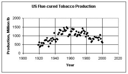
A)A linear model should be used for each pair of adjacent data points.
B)A single linear model is appropriate for the entire data set.
C)One linear model for 1919 through about 1960 and another linear model for about 1960 through 2000.
D)A linear model should not be used for any part of the data.
E)None of these
Question
Which of the labeled points below are outliers? 
A)Point D
B)Points A and B
C)Points B and D
D)Points A,B,and D
E)Points A,B,C,and D
A)Point D
B)Points A and B
C)Points B and D
D)Points A,B,and D
E)Points A,B,C,and D
Question
Which of the labeled points below are outliers? 
A)Points A,B,C,and D
B)Point A
C)Points A,C,and D
D)Points A and C
E)Points C and D
A)Points A,B,C,and D
B)Point A
C)Points A,C,and D
D)Points A and C
E)Points C and D
Question
The scatterplot below displays the total home attendance (in millions)for major league baseball's National League for the years 1960 through 2002.This total home attendance is the grand total of all attendees at all National League games during the season.For what range of years is a linear model appropriate? 
A)A linear model should not be used for any part of the data set.
B)A single linear model is appropriate for the entire data set.
C)One linear model for 1960 through 1995 and another linear model for 1995 through 2002.
D)A linear model should be used for each pair of adjacent data points.
E)None of these
Question
The figure below shows the association between female life expectancy and the average number of children women give birth to for several different countries.Also shown is the equation and correlation from a regression analysis.What is the correct conclusion to draw from the figure? 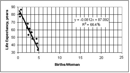
A)While there appears to be a very strong association,there is probably not a cause-and-effect relationship between female life expectancy and the average number of children women give birth to .Access to basic health care is probably a lurking variable that drives both female life expectancy and the average number of children women give birth to.
B)Those countries with low life expectancies clearly have no regard for children or expectant mothers.
C)Countries that have low life expectancies and high average number of children women give birth to seem to have less regard for the sanctity of human life.
D)The association must be coincidental.I would expect the association to have a positive slope,not the negative one illustrated above.
E)High average number of children women give birth to is causing reduced life expectancy,probably because of the increased fatigue and emotional stress exerted on mothers.
Question
The scatterplot below displays world population (in millions)for the years 0 - 1800.Where the population is an estimate,the lower estimate is given.For what range of years is a linear model appropriate? 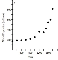
A)One linear model is appropriate for the years 0 through 1000 and another linear model for the years 1400 through 1800.
B)A single linear model is appropriate for the entire data set.
C)One linear model is appropriate for the years 0 through 600 and another linear model for the years 600 through 1800.
D)A linear model should be used for each pair of adjacent data points.
E)A linear model should not be used for any part of the data.
Question
Which of the labeled points below will exert the largest leverage on a linear model of the data? 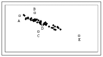
A)Point B
B)Point A
C)Point D
D)Point C
E)Point E
A)Point B
B)Point A
C)Point D
D)Point C
E)Point E
Question
The figure below examines the association between life expectancy and computer ownership for several countries.Also shown are the equation and R2 value from a linear regression analysis.What is the best conclusion to draw from the figure? 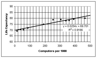
A)Exposure to the radiation from computer monitors is causing a clear decline in life expectancy.
B)Persons who live longer buy more computers over the course of their longer lifetimes.
C)Although the association is strong,computer ownership probably does not promote longevity.Instead,national per capita wealth is probably a lurking variable that drives both life expectancy and computer ownership.
D)Computer ownership promotes health and long life,probably due to the greater access that computer owners have to health information on the world-wide web.
E)Clearly,there must be some as-yet unknown health benefit associated with using computers.
Question
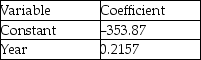
The table below displays the latitude (degrees north)and average daily minimum temperature in January (in degrees Fahrenheit)for some cities located in the northern hemisphere. 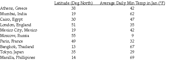
The scatter plot and regression equation are shown below: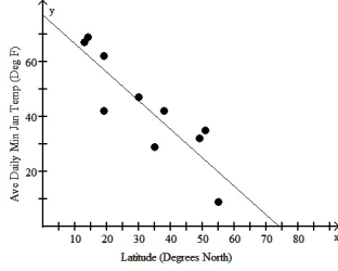
The regression analysis of this data yields the following values:
R2 = 0.7660
Use this model to predict the average daily minimum temperature in January for Panama City whose latitude is 9 degrees north.
A)9.3° F
B)67.6° F
C)86.3° F
D)61.5° F
E)54.0° F
Question
The scatterplot below displays the average longevity (in years)plotted against gestation (in days)for a number of different mammals.For what range of gestation lengths is a linear model appropriate? 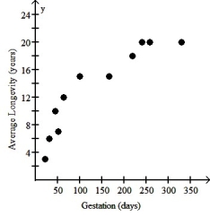
A)A linear model should not be used for any part of the data.
B)One linear model for 0 through 200 days and another linear model for 200 through 350 days.
C)A single linear model is appropriate for the entire data set.
D)One linear model for 0 through 100 days and another linear model for 150 through 350 days.
E)A linear model should be used for each pair of adjacent data points.
Question
Which of the labeled points below will exert the largest leverage on a linear model of the data? 
A)Point E
B)Point C
C)Point A
D)Point B
E)Point D
A)Point E
B)Point C
C)Point A
D)Point B
E)Point D
Question
Over a period of years,a certain town observed the association between the number of people attending churches and the number of people in the city jail.The results are shown on the figure below.Also shown are the equation and R2 value from a linear regression analysis.What is the best conclusion to draw from the figure? 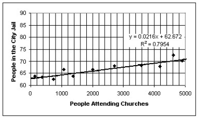
A)Although the association is negatively strong,going to church does not cause people to go to jail.Instead,size of the population in the town is probably a lurking variable that drives both the number of people in jail and the number of people attending church to increase together.
B)More detainees should go to church to improve their behavior.
C)Although the association is positively strong,going to church does not cause people to go to jail.Instead,size of the population of the town is probably a lurking variable that drives both the number of people in jail and the number of people attending church to increase together.
D)More people go to church not to go to jail.
E)Clearly,there must be some as-yet unknown problems associated with going to church.
Question
The figure below shows the recent trend in first-birth rate for women in the U.S.A.between the ages of 18 and 19.(The first-birth rate is the number of 18 to 19 year-olds per 1000 who give birth to their first child). 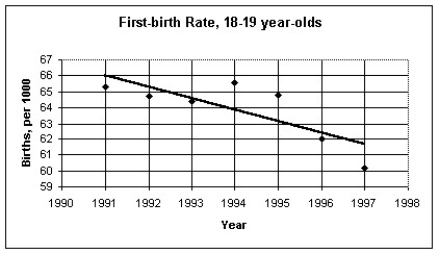
The regression analysis of this data yields the following values:
R2 = 0.6174
Use this model to predict the first-birth rate for 18 to 19 year-olds in 2006.
A)58 per 1000
B)55 per 1000
C)51 per 1000
D)61 per 1000
E)53 per 1000
The regression analysis of this data yields the following values:
R2 = 0.6174
Use this model to predict the first-birth rate for 18 to 19 year-olds in 2006.
A)58 per 1000
B)55 per 1000
C)51 per 1000
D)61 per 1000
E)53 per 1000
Question
The table below shows the gestation (in days)and average longevity (in years)for a number of different mammals: 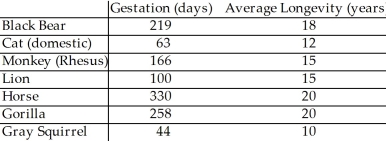
The scatter plot and regression equation are shown below: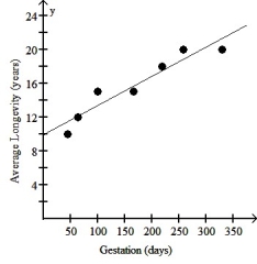
The regression analysis of this data yields the following values:
R2 = 0.9048
Use this model to predict the average longevity of an African elephant whose gestation is 660 days.
A)32.7 years
B)38.7 years
C)41.9 years
D)22.8 years
E)51.2 years
Question
The scatterplot below shows the percentage of the US population that is foreign born for the years 1910 - 1990.For what range of years is a linear model appropriate? 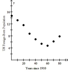
A)One linear model is appropriate for the years 1910 through 1950 and another linear model for the years 1950 through 1990.
B)A linear model should be used for each pair of adjacent data points.
C)One linear model is appropriate for the years 1910 through 1970 and another linear model for the years 1970 through 1990.
D)A linear model should not be used for any part of the data.
E)A single linear model is appropriate for the entire data set.
Question
Which of the labeled points below are influential points? 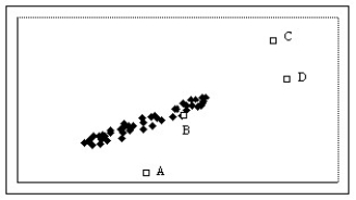
A)Points A,C,and D
B)Points A,B,C,and D
C)Points A and D
D)Point C
E)Points A and C
A)Points A,C,and D
B)Points A,B,C,and D
C)Points A and D
D)Point C
E)Points A and C
Question
Which of the labeled points below are influential points? 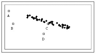
A)Points B and D
B)Point C
C)Points A,B,and D
D)Point B
E)Points A,B,C,and D
A)Points B and D
B)Point C
C)Points A,B,and D
D)Point B
E)Points A,B,C,and D
Question
The figure below shows the association between life expectancy and infant mortality for several different countries.Also shown is the equation and correlation from a regression analysis.What is the correct conclusion to draw from the figure? 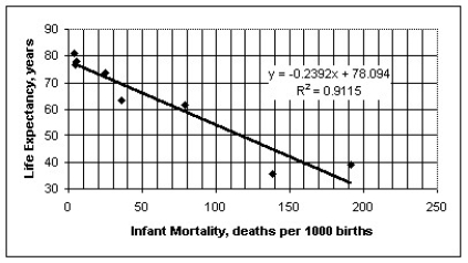
A)Countries that have low life expectancies and high infant mortality rates seem to have less regard for the sanctity of human life.
B)While there appears to be a very strong association,there is probably not a cause-and-effect relationship between infant mortality and life expectancy.Access to basic health care is probably a lurking variable that drives both life expectancy and infant mortality.
C)Those countries with low life expectancies clearly have no regard for children or expectant mothers.
D)The association must be coincidental.I would expect the association to have a positive slope,not the negative one illustrated above.
E)High infant mortality is causing reduced life expectancy,probably because of the increased emotional stress exerted on parents who have lost a child at birth.
Question
The table below shows the age and annual income of 12 randomly selected college graduates all living in the same city. 
The scatter plot and regression equation are shown below: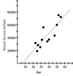
The regression analysis of this data yields the following values:
R2 = 0.7182
Use this model to predict the annual income of a 56 year old college graduate living in this city.
A)$77,333
B)$61,367
C)$85,780
D)$70,230
E)$68,886
The scatter plot and regression equation are shown below:
The regression analysis of this data yields the following values:
R2 = 0.7182
Use this model to predict the annual income of a 56 year old college graduate living in this city.
A)$77,333
B)$61,367
C)$85,780
D)$70,230
E)$68,886
Question
The figure below shows the life expectancy for persons living in the U.S.A. 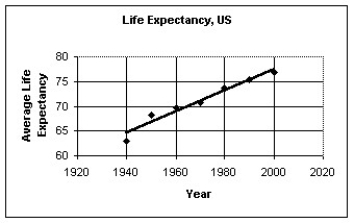
The regression analysis of the data yields the following values:
R2 = 0.9539
Use the regression model to predict the life expectancy in 2015.
A)81 years
B)79 years
C)84 years
D)83 years
E)80 years
The regression analysis of the data yields the following values:
R2 = 0.9539
Use the regression model to predict the life expectancy in 2015.
A)81 years
B)79 years
C)84 years
D)83 years
E)80 years
Question
Question
Question
Question
Which of the following scatterplots of residuals suggests that a linear model may not be applicable?
I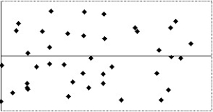
II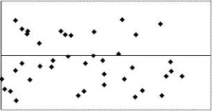
III
IV
A)I
B)III
C)IV
D)II
E)None of the above
I
II
III
IV
A)I
B)III
C)IV
D)II
E)None of the above
Question
Which of the following scatterplots of residuals suggests that a linear model may not be applicable?
I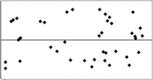
II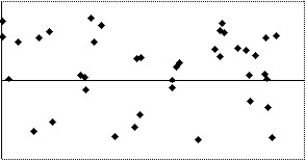
III
IV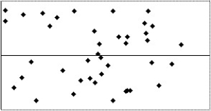
A)IV
B)I
C)III
D)II
E)None of the above
I
II
III
IV
A)IV
B)I
C)III
D)II
E)None of the above
Question
,The total home-game attendance for major-league baseball is the sum of all attendees for all stadiums during the entire season.The home attendance (in millions)for a number of years is shown in the table below.
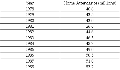
a)Make a scatterplot showing the trend in home attendance.Describe what you see.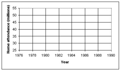
b)Determine the correlation,and comment on its significance.
c)Find the equation of the line of regression.Interpret the slope of the equation.
d)Use your model to predict the home attendance for 1998.How much confidence do you have in this prediction? Explain.
e)Use the internet or other resource to find reasons for any outliers you observe in the scatterplot.
Question
Question
A college admissions officer in the U.S.A. ,defending the college's use of SAT scores in the admissions process,produced the graph below.It represents the mean GPAs for last year's freshmen,grouped by SAT scores.It shows that increased SAT score is associated with increased GPA.What concerns you about the graph,the statistical methodology,or the conclusion reached? 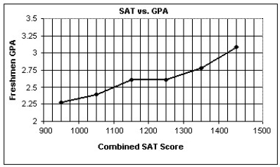
A)The statistical methodology is a concern,because SAT is not an adequate predictor of GPA on average.
B)The conclusion reached is a concern,because it should be increased GPA is associated with increased SAT score.
C)The conclusion reached is a concern,because there are no relationships between SAT scores and GPA.
D)The statistical methodology is a concern,because there may be lurking variables.
E)The statistical methodology is a concern,because the GPA data is based on mean GPAs,not individual data.We also don't know the number of students in each SAT category.
Question
Which of the following scatterplots of residuals suggests that a linear model may not be applicable?
I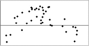
II
III
IV
A)I
B)II,III
C)IV
D)I,IV
E)None of the above
I
II
III
IV
A)I
B)II,III
C)IV
D)I,IV
E)None of the above
Question
Question
The data in the table below can be used to explore the association between the rate of television ownership and per capita gross domestic product for several countries.
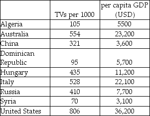
a)Make a scatterplot showing the trend in television ownership versus per capita GDP.Describe what you see.
b)Determine the correlation and comment on its significance.
c)Find the equation of the line of regression.Interpret the slope of the equation.
d)Use your model to predict the rate of TV ownership for India,which has a per capita GDP of $2,200.How much confidence do you have in this prediction? Explain.
e)Discuss the impact that the U.S.A.data exerts on the model.
Question
Which of the following scatterplots of residuals suggests that a linear model may not be applicable?
I
II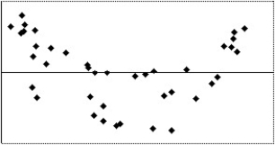
III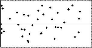
IV
A)I
B)II
C)III
D)IV
E)None of the above
I
II
III
IV
A)I
B)II
C)III
D)IV
E)None of the above

Unlock Deck
Sign up to unlock the cards in this deck!
Unlock Deck
Unlock Deck
1/32
Play
Full screen (f)
Deck 8: Regression Wisdom
1
The scatterplot below displays the yearly production in millions of pounds of flue-cured tobacco in the U.S.For what range of years is a linear model appropriate?
A)A linear model should be used for each pair of adjacent data points.
B)A single linear model is appropriate for the entire data set.
C)One linear model for 1919 through about 1960 and another linear model for about 1960 through 2000.
D)A linear model should not be used for any part of the data.
E)None of these
One linear model for 1919 through about 1960 and another linear model for about 1960 through 2000.
2
Which of the labeled points below are outliers?
A)Point D
B)Points A and B
C)Points B and D
D)Points A,B,and D
E)Points A,B,C,and D
A)Point D
B)Points A and B
C)Points B and D
D)Points A,B,and D
E)Points A,B,C,and D
Points A,B,and D
3
Which of the labeled points below are outliers?
A)Points A,B,C,and D
B)Point A
C)Points A,C,and D
D)Points A and C
E)Points C and D
A)Points A,B,C,and D
B)Point A
C)Points A,C,and D
D)Points A and C
E)Points C and D
Points A,C,and D
4
The scatterplot below displays the total home attendance (in millions)for major league baseball's National League for the years 1960 through 2002.This total home attendance is the grand total of all attendees at all National League games during the season.For what range of years is a linear model appropriate?
A)A linear model should not be used for any part of the data set.
B)A single linear model is appropriate for the entire data set.
C)One linear model for 1960 through 1995 and another linear model for 1995 through 2002.
D)A linear model should be used for each pair of adjacent data points.
E)None of these
Unlock Deck
Unlock for access to all 32 flashcards in this deck.
Unlock Deck
k this deck
5
The figure below shows the association between female life expectancy and the average number of children women give birth to for several different countries.Also shown is the equation and correlation from a regression analysis.What is the correct conclusion to draw from the figure?
A)While there appears to be a very strong association,there is probably not a cause-and-effect relationship between female life expectancy and the average number of children women give birth to .Access to basic health care is probably a lurking variable that drives both female life expectancy and the average number of children women give birth to.
B)Those countries with low life expectancies clearly have no regard for children or expectant mothers.
C)Countries that have low life expectancies and high average number of children women give birth to seem to have less regard for the sanctity of human life.
D)The association must be coincidental.I would expect the association to have a positive slope,not the negative one illustrated above.
E)High average number of children women give birth to is causing reduced life expectancy,probably because of the increased fatigue and emotional stress exerted on mothers.
Unlock Deck
Unlock for access to all 32 flashcards in this deck.
Unlock Deck
k this deck
6
The scatterplot below displays world population (in millions)for the years 0 - 1800.Where the population is an estimate,the lower estimate is given.For what range of years is a linear model appropriate?
A)One linear model is appropriate for the years 0 through 1000 and another linear model for the years 1400 through 1800.
B)A single linear model is appropriate for the entire data set.
C)One linear model is appropriate for the years 0 through 600 and another linear model for the years 600 through 1800.
D)A linear model should be used for each pair of adjacent data points.
E)A linear model should not be used for any part of the data.
Unlock Deck
Unlock for access to all 32 flashcards in this deck.
Unlock Deck
k this deck
7
Which of the labeled points below will exert the largest leverage on a linear model of the data?
A)Point B
B)Point A
C)Point D
D)Point C
E)Point E
A)Point B
B)Point A
C)Point D
D)Point C
E)Point E
Unlock Deck
Unlock for access to all 32 flashcards in this deck.
Unlock Deck
k this deck
8
The figure below examines the association between life expectancy and computer ownership for several countries.Also shown are the equation and R2 value from a linear regression analysis.What is the best conclusion to draw from the figure?
A)Exposure to the radiation from computer monitors is causing a clear decline in life expectancy.
B)Persons who live longer buy more computers over the course of their longer lifetimes.
C)Although the association is strong,computer ownership probably does not promote longevity.Instead,national per capita wealth is probably a lurking variable that drives both life expectancy and computer ownership.
D)Computer ownership promotes health and long life,probably due to the greater access that computer owners have to health information on the world-wide web.
E)Clearly,there must be some as-yet unknown health benefit associated with using computers.
Unlock Deck
Unlock for access to all 32 flashcards in this deck.
Unlock Deck
k this deck
9
The table below displays the latitude (degrees north)and average daily minimum temperature in January (in degrees Fahrenheit)for some cities located in the northern hemisphere.
The scatter plot and regression equation are shown below:
The regression analysis of this data yields the following values:
R2 = 0.7660
Use this model to predict the average daily minimum temperature in January for Panama City whose latitude is 9 degrees north.
A)9.3° F
B)67.6° F
C)86.3° F
D)61.5° F
E)54.0° F
Unlock Deck
Unlock for access to all 32 flashcards in this deck.
Unlock Deck
k this deck
10
The scatterplot below displays the average longevity (in years)plotted against gestation (in days)for a number of different mammals.For what range of gestation lengths is a linear model appropriate?
A)A linear model should not be used for any part of the data.
B)One linear model for 0 through 200 days and another linear model for 200 through 350 days.
C)A single linear model is appropriate for the entire data set.
D)One linear model for 0 through 100 days and another linear model for 150 through 350 days.
E)A linear model should be used for each pair of adjacent data points.
Unlock Deck
Unlock for access to all 32 flashcards in this deck.
Unlock Deck
k this deck
11
Which of the labeled points below will exert the largest leverage on a linear model of the data?
A)Point E
B)Point C
C)Point A
D)Point B
E)Point D
A)Point E
B)Point C
C)Point A
D)Point B
E)Point D
Unlock Deck
Unlock for access to all 32 flashcards in this deck.
Unlock Deck
k this deck
12
Over a period of years,a certain town observed the association between the number of people attending churches and the number of people in the city jail.The results are shown on the figure below.Also shown are the equation and R2 value from a linear regression analysis.What is the best conclusion to draw from the figure?
A)Although the association is negatively strong,going to church does not cause people to go to jail.Instead,size of the population in the town is probably a lurking variable that drives both the number of people in jail and the number of people attending church to increase together.
B)More detainees should go to church to improve their behavior.
C)Although the association is positively strong,going to church does not cause people to go to jail.Instead,size of the population of the town is probably a lurking variable that drives both the number of people in jail and the number of people attending church to increase together.
D)More people go to church not to go to jail.
E)Clearly,there must be some as-yet unknown problems associated with going to church.
Unlock Deck
Unlock for access to all 32 flashcards in this deck.
Unlock Deck
k this deck
13
The figure below shows the recent trend in first-birth rate for women in the U.S.A.between the ages of 18 and 19.(The first-birth rate is the number of 18 to 19 year-olds per 1000 who give birth to their first child).
The regression analysis of this data yields the following values:
R2 = 0.6174
Use this model to predict the first-birth rate for 18 to 19 year-olds in 2006.
A)58 per 1000
B)55 per 1000
C)51 per 1000
D)61 per 1000
E)53 per 1000
The regression analysis of this data yields the following values:
R2 = 0.6174
Use this model to predict the first-birth rate for 18 to 19 year-olds in 2006.
A)58 per 1000
B)55 per 1000
C)51 per 1000
D)61 per 1000
E)53 per 1000
Unlock Deck
Unlock for access to all 32 flashcards in this deck.
Unlock Deck
k this deck
14
The table below shows the gestation (in days)and average longevity (in years)for a number of different mammals:
The scatter plot and regression equation are shown below:
The regression analysis of this data yields the following values:
R2 = 0.9048
Use this model to predict the average longevity of an African elephant whose gestation is 660 days.
A)32.7 years
B)38.7 years
C)41.9 years
D)22.8 years
E)51.2 years
Unlock Deck
Unlock for access to all 32 flashcards in this deck.
Unlock Deck
k this deck
15
The scatterplot below shows the percentage of the US population that is foreign born for the years 1910 - 1990.For what range of years is a linear model appropriate?
A)One linear model is appropriate for the years 1910 through 1950 and another linear model for the years 1950 through 1990.
B)A linear model should be used for each pair of adjacent data points.
C)One linear model is appropriate for the years 1910 through 1970 and another linear model for the years 1970 through 1990.
D)A linear model should not be used for any part of the data.
E)A single linear model is appropriate for the entire data set.
Unlock Deck
Unlock for access to all 32 flashcards in this deck.
Unlock Deck
k this deck
16
Which of the labeled points below are influential points?
A)Points A,C,and D
B)Points A,B,C,and D
C)Points A and D
D)Point C
E)Points A and C
A)Points A,C,and D
B)Points A,B,C,and D
C)Points A and D
D)Point C
E)Points A and C
Unlock Deck
Unlock for access to all 32 flashcards in this deck.
Unlock Deck
k this deck
17
Which of the labeled points below are influential points?
A)Points B and D
B)Point C
C)Points A,B,and D
D)Point B
E)Points A,B,C,and D
A)Points B and D
B)Point C
C)Points A,B,and D
D)Point B
E)Points A,B,C,and D
Unlock Deck
Unlock for access to all 32 flashcards in this deck.
Unlock Deck
k this deck
18
The figure below shows the association between life expectancy and infant mortality for several different countries.Also shown is the equation and correlation from a regression analysis.What is the correct conclusion to draw from the figure?
A)Countries that have low life expectancies and high infant mortality rates seem to have less regard for the sanctity of human life.
B)While there appears to be a very strong association,there is probably not a cause-and-effect relationship between infant mortality and life expectancy.Access to basic health care is probably a lurking variable that drives both life expectancy and infant mortality.
C)Those countries with low life expectancies clearly have no regard for children or expectant mothers.
D)The association must be coincidental.I would expect the association to have a positive slope,not the negative one illustrated above.
E)High infant mortality is causing reduced life expectancy,probably because of the increased emotional stress exerted on parents who have lost a child at birth.
Unlock Deck
Unlock for access to all 32 flashcards in this deck.
Unlock Deck
k this deck
19
The table below shows the age and annual income of 12 randomly selected college graduates all living in the same city.
The scatter plot and regression equation are shown below:
The regression analysis of this data yields the following values:
R2 = 0.7182
Use this model to predict the annual income of a 56 year old college graduate living in this city.
A)$77,333
B)$61,367
C)$85,780
D)$70,230
E)$68,886
The scatter plot and regression equation are shown below:
The regression analysis of this data yields the following values:
R2 = 0.7182
Use this model to predict the annual income of a 56 year old college graduate living in this city.
A)$77,333
B)$61,367
C)$85,780
D)$70,230
E)$68,886
Unlock Deck
Unlock for access to all 32 flashcards in this deck.
Unlock Deck
k this deck
20
The figure below shows the life expectancy for persons living in the U.S.A.
The regression analysis of the data yields the following values:
R2 = 0.9539
Use the regression model to predict the life expectancy in 2015.
A)81 years
B)79 years
C)84 years
D)83 years
E)80 years
The regression analysis of the data yields the following values:
R2 = 0.9539
Use the regression model to predict the life expectancy in 2015.
A)81 years
B)79 years
C)84 years
D)83 years
E)80 years
Unlock Deck
Unlock for access to all 32 flashcards in this deck.
Unlock Deck
k this deck
21
A university studied students' grades and established a strong positive association between the high school average of incoming students and their university GPA.Describe three different possible cause-and-effect relationships that might be present.
A)Perhaps higher high school averages cause higher university GPAs,or both could be caused by a lurking variable such as the students' IQ.
B)There is only one cause-and-effect relationship: higher university GPAs cause higher high school averages.
C)There is only one cause-and-effect relationship: higher high school averages cause higher university GPAs.
D)There are only two cause-and-effect relationships: higher high school averages cause higher university GPAs,or higher university GPAs cause higher high school averages.
E)Perhaps higher high school averages cause higher university GPAs,higher university GPAs cause higher high school averages,or both could be caused by a lurking variable such as the students' high school.
Unlock Deck
Unlock for access to all 32 flashcards in this deck.
Unlock Deck
k this deck
22
A reporter studied the causes of a fire to a house,and established a strong positive association between the damages (in dollars)and the number of firefighters at the scene.Describe three different possible cause-and-effect relationships that might be present.
A)Perhaps the damages cause more firefighters at the scene,firefighters cause more damages at the scene ,or both could be caused by a lurking variable such as the type of the building.
B)There is only one cause-and-effect relationship: firefighters cause more damages at the scene.
C)There are only two cause-and-effect relationships: damages cause more firefighters at the scene,or firefighters cause more damages at the scene.
D)There is only one cause-and-effect relationship: the damages cause more firefighters at the scene.
E)Perhaps the damages cause more firefighters at the scene,firefighters cause more damages at the scene ,or both could be caused by a lurking variable such as the size of the blaze.
Unlock Deck
Unlock for access to all 32 flashcards in this deck.
Unlock Deck
k this deck
23
An economist noticed that nations with more TV sets have higher life expectancy.He established a strong positive association between length of life and number of TV sets.Describe three different possible cause-and-effect relationships that might be present.
A)Perhaps more TV sets cause higher life expectancy,higher life expectancy cause more TV sets,or both could be caused by a lurking variable such as the wealth of the nation.
B)There is only one cause-and-effect relationship: more TV sets cause higher life expectancy.
C)Perhaps more TV sets cause higher life expectancy,higher life expectancy cause more TV sets,or both could be caused by a lurking variable such as the TV sets brand.
D)There is only one cause-and-effect relationship: higher life expectancy cause more TV sets.
E)There are only two cause-and-effect relationships: more TV sets cause higher life expectancy,or higher life expectancy cause more TV sets.
Unlock Deck
Unlock for access to all 32 flashcards in this deck.
Unlock Deck
k this deck
24
Which of the following scatterplots of residuals suggests that a linear model may not be applicable?
I
II
III
IV
A)I
B)III
C)IV
D)II
E)None of the above
I
II
III
IV
A)I
B)III
C)IV
D)II
E)None of the above
Unlock Deck
Unlock for access to all 32 flashcards in this deck.
Unlock Deck
k this deck
25
Which of the following scatterplots of residuals suggests that a linear model may not be applicable?
I
II
III
IV
A)IV
B)I
C)III
D)II
E)None of the above
I
II
III
IV
A)IV
B)I
C)III
D)II
E)None of the above
Unlock Deck
Unlock for access to all 32 flashcards in this deck.
Unlock Deck
k this deck
26
,The total home-game attendance for major-league baseball is the sum of all attendees for all stadiums during the entire season.The home attendance (in millions)for a number of years is shown in the table below.
a)Make a scatterplot showing the trend in home attendance.Describe what you see.
b)Determine the correlation,and comment on its significance.
c)Find the equation of the line of regression.Interpret the slope of the equation.
d)Use your model to predict the home attendance for 1998.How much confidence do you have in this prediction? Explain.
e)Use the internet or other resource to find reasons for any outliers you observe in the scatterplot.
Unlock Deck
Unlock for access to all 32 flashcards in this deck.
Unlock Deck
k this deck
27
A study of consumer behavior finds a strong positive association between sales of ice cream and sales of soda.Describe three different possible cause-and-effect relationships that might be present.
A)Perhaps sales of ice cream cause higher sales of soda,sales of soda cause higher sales of ice cream,or both could be caused by a lurking variable such as the outdoor temperature.
B)There is only one cause-and-effect relationship: sales of soda cause higher sales of ice cream.
C)There are no possible cause-and-effect relationship ,because there should be an arithmetic mistake.
D)There is only one cause-and-effect relationship: sales of ice cream cause higher sales of soda.
E)There are only two cause-and-effect relationships: sales of ice cream cause higher sales of soda,or sales of soda cause higher sales of ice cream.
Unlock Deck
Unlock for access to all 32 flashcards in this deck.
Unlock Deck
k this deck
28
A college admissions officer in the U.S.A. ,defending the college's use of SAT scores in the admissions process,produced the graph below.It represents the mean GPAs for last year's freshmen,grouped by SAT scores.It shows that increased SAT score is associated with increased GPA.What concerns you about the graph,the statistical methodology,or the conclusion reached?
A)The statistical methodology is a concern,because SAT is not an adequate predictor of GPA on average.
B)The conclusion reached is a concern,because it should be increased GPA is associated with increased SAT score.
C)The conclusion reached is a concern,because there are no relationships between SAT scores and GPA.
D)The statistical methodology is a concern,because there may be lurking variables.
E)The statistical methodology is a concern,because the GPA data is based on mean GPAs,not individual data.We also don't know the number of students in each SAT category.
Unlock Deck
Unlock for access to all 32 flashcards in this deck.
Unlock Deck
k this deck
29
Which of the following scatterplots of residuals suggests that a linear model may not be applicable?
I
II
III
IV
A)I
B)II,III
C)IV
D)I,IV
E)None of the above
I
II
III
IV
A)I
B)II,III
C)IV
D)I,IV
E)None of the above
Unlock Deck
Unlock for access to all 32 flashcards in this deck.
Unlock Deck
k this deck
30
A study finds a strong positive association between sizes of children feet and results in spelling tests.Describe three different possible cause-and-effect relationships that might be present.
A)There are only two cause-and-effect relationships: older children cause better spelling tests,spelling tests cause older children.
B)There are only one cause-and-effect relationship: feet sizes cause better spelling tests,because children with larger feet do better on spelling tests than children with smaller feet,on average.
C)Perhaps foot size causes better performance on spelling tests,spelling tests causes children to become older,or both could be caused by a lurking variable such as the school.
D)Perhaps foot size causes better performance on spelling tests,good performance on spelling tests cause bigger foot sizes,or both could be caused by a lurking variable such as the age.
E)There are no possible cause-and-effect relationships.
Unlock Deck
Unlock for access to all 32 flashcards in this deck.
Unlock Deck
k this deck
31
The data in the table below can be used to explore the association between the rate of television ownership and per capita gross domestic product for several countries.
a)Make a scatterplot showing the trend in television ownership versus per capita GDP.Describe what you see.
b)Determine the correlation and comment on its significance.
c)Find the equation of the line of regression.Interpret the slope of the equation.
d)Use your model to predict the rate of TV ownership for India,which has a per capita GDP of $2,200.How much confidence do you have in this prediction? Explain.
e)Discuss the impact that the U.S.A.data exerts on the model.
Unlock Deck
Unlock for access to all 32 flashcards in this deck.
Unlock Deck
k this deck
32
Which of the following scatterplots of residuals suggests that a linear model may not be applicable?
I
II
III
IV
A)I
B)II
C)III
D)IV
E)None of the above
I
II
III
IV
A)I
B)II
C)III
D)IV
E)None of the above
Unlock Deck
Unlock for access to all 32 flashcards in this deck.
Unlock Deck
k this deck
Unlock Deck
Unlock for access to all 32 flashcards in this deck.


