Exam 8: Regression Wisdom
Exam 1: Data30 Questions
Exam 2: Displaying and Describing Categorical Data65 Questions
Exam 3: Displaying and Summarizing Quantitative Data93 Questions
Exam 4: Understanding and Comparing Distributions102 Questions
Exam 5: The Standard Deviation As a Ruler and the Normal Model131 Questions
Exam 6: Scatterplots, association, and Correlation74 Questions
Exam 7: Linear Regression57 Questions
Exam 8: Regression Wisdom32 Questions
Exam 9: Re-Expressing Data: Get It Straight51 Questions
Exam 10: Understanding Randomness26 Questions
Exam 11: Sample Surveys50 Questions
Exam 12: Experiments and Observational Surveys87 Questions
Exam 13: From Randomness to Probability64 Questions
Exam 14: Probability Rules90 Questions
Exam 15: Random Variables112 Questions
Exam 16: Probability Models114 Questions
Exam 17: Sampling Distribution Models45 Questions
Exam 18: Confidence Intervals for Proportions56 Questions
Exam 19: Testing Hypotheses About Proportions50 Questions
Exam 20: More About Tests69 Questions
Exam 21: Comparing Two Proportions52 Questions
Exam 22: Inferences About Means106 Questions
Exam 23: Comparing Means43 Questions
Exam 24: Paired Samples and Blocks33 Questions
Exam 25: Comparing Counts78 Questions
Exam 26: Inferences for Regression51 Questions
Exam 27: Analysis of Variance39 Questions
Exam 28: Multifactor Analysis of Variance22 Questions
Exam 29: Multiple Regression22 Questions
Exam 30: Multiple Regression Wisdom21 Questions
Exam 31: Rank-Based Nonparametric Tests29 Questions
Exam 32: The Bootstrap31 Questions
Select questions type
An economist noticed that nations with more TV sets have higher life expectancy.He established a strong positive association between length of life and number of TV sets.Describe three different possible cause-and-effect relationships that might be present.
Free
(Multiple Choice)
4.8/5  (35)
(35)
Correct Answer: Verified
A
Which of the following scatterplots of residuals suggests that a linear model may not be applicable?
I 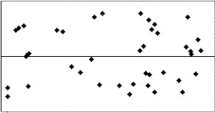 II
II 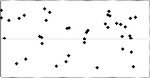 III
III  IV
IV 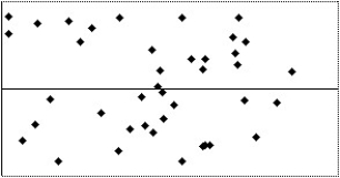
Free
(Multiple Choice)
4.8/5 (42)
Correct Answer:Verified
E
A college admissions officer in the U.S.A. ,defending the college's use of SAT scores in the admissions process,produced the graph below.It represents the mean GPAs for last year's freshmen,grouped by SAT scores.It shows that increased SAT score is associated with increased GPA.What concerns you about the graph,the statistical methodology,or the conclusion reached? 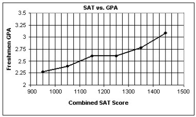
Free
(Multiple Choice)
4.8/5 (43)
Correct Answer:Verified
E
Which of the following scatterplots of residuals suggests that a linear model may not be applicable?
I 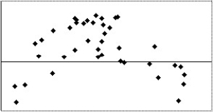 II
II 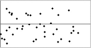 III
III 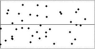 IV
IV 
(Multiple Choice)
4.9/5 (28)
The table below shows the gestation (in days)and average longevity (in years)for a number of different mammals: 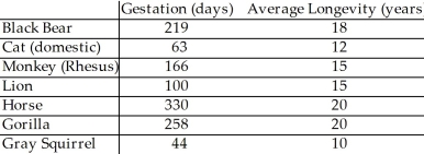 The scatter plot and regression equation are shown below:
 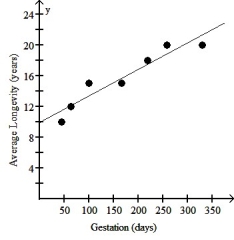 The regression analysis of this data yields the following values:
  R2 = 0.9048
Use this model to predict the average longevity of an African elephant whose gestation is 660 days.
R2 = 0.9048
Use this model to predict the average longevity of an African elephant whose gestation is 660 days.
(Multiple Choice)
4.8/5 (30)
A study finds a strong positive association between sizes of children feet and results in spelling tests.Describe three different possible cause-and-effect relationships that might be present.
(Multiple Choice)
4.9/5 (37)
The data in the table below can be used to explore the association between the rate of television ownership and per capita gross domestic product for several countries.
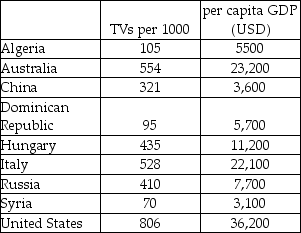 a)Make a scatterplot showing the trend in television ownership versus per capita GDP.Describe what you see.
 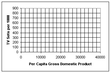 b)Determine the correlation and comment on its significance.
c)Find the equation of the line of regression.Interpret the slope of the equation.
d)Use your model to predict the rate of TV ownership for India,which has a per capita GDP of $2,200.How much confidence do you have in this prediction? Explain.
e)Discuss the impact that the U.S.A.data exerts on the model.
b)Determine the correlation and comment on its significance.
c)Find the equation of the line of regression.Interpret the slope of the equation.
d)Use your model to predict the rate of TV ownership for India,which has a per capita GDP of $2,200.How much confidence do you have in this prediction? Explain.
e)Discuss the impact that the U.S.A.data exerts on the model.
(Essay)
4.9/5 (45)
Which of the following scatterplots of residuals suggests that a linear model may not be applicable?
I  II
II 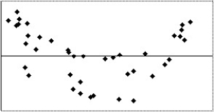 III
III 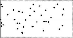 IV
IV 
(Multiple Choice)
5.0/5 (34)
Over a period of years,a certain town observed the association between the number of people attending churches and the number of people in the city jail.The results are shown on the figure below.Also shown are the equation and R2 value from a linear regression analysis.What is the best conclusion to draw from the figure? 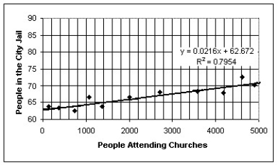
(Multiple Choice)
4.8/5 (40)
The scatterplot below shows the percentage of the US population that is foreign born for the years 1910 - 1990.For what range of years is a linear model appropriate? 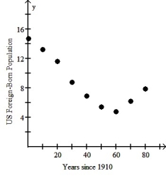
(Multiple Choice)
4.8/5 (25)
A study of consumer behavior finds a strong positive association between sales of ice cream and sales of soda.Describe three different possible cause-and-effect relationships that might be present.
(Multiple Choice)
4.8/5 (40)
The table below shows the age and annual income of 12 randomly selected college graduates all living in the same city.  The scatter plot and regression equation are shown below:
 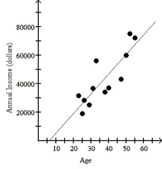 The regression analysis of this data yields the following values:
  R2 = 0.7182
Use this model to predict the annual income of a 56 year old college graduate living in this city.
R2 = 0.7182
Use this model to predict the annual income of a 56 year old college graduate living in this city.
(Multiple Choice)
4.8/5 (43)
The figure below examines the association between life expectancy and computer ownership for several countries.Also shown are the equation and R2 value from a linear regression analysis.What is the best conclusion to draw from the figure? 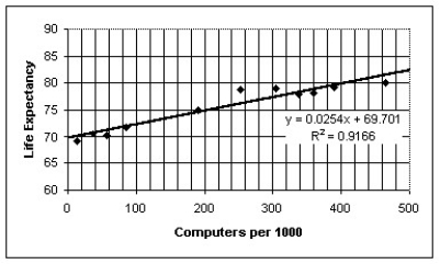
(Multiple Choice)
4.9/5 (37)
The figure below shows the association between life expectancy and infant mortality for several different countries.Also shown is the equation and correlation from a regression analysis.What is the correct conclusion to draw from the figure? 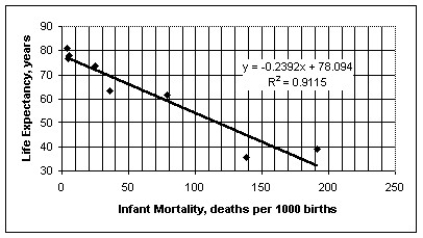
(Multiple Choice)
4.8/5 (27)
A reporter studied the causes of a fire to a house,and established a strong positive association between the damages (in dollars)and the number of firefighters at the scene.Describe three different possible cause-and-effect relationships that might be present.
(Multiple Choice)
4.9/5 (43)
The scatterplot below displays the average longevity (in years)plotted against gestation (in days)for a number of different mammals.For what range of gestation lengths is a linear model appropriate? 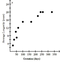
(Multiple Choice)
4.8/5 (37)
The scatterplot below displays the yearly production in millions of pounds of flue-cured tobacco in the U.S.For what range of years is a linear model appropriate? 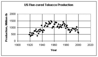
(Multiple Choice)
4.9/5 (29)
The figure below shows the association between female life expectancy and the average number of children women give birth to for several different countries.Also shown is the equation and correlation from a regression analysis.What is the correct conclusion to draw from the figure? 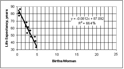
(Multiple Choice)
4.7/5 (31)
Filters
- Essay(0)
- Multiple Choice(0)
- Short Answer(0)
- True False(0)
- Matching(0)