Deck 4: Understanding and Comparing Distributions
Full screen (f)
Question
Question
Question
Match each class with the corresponding boxplot below. 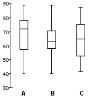
A)Class 1 is B Class 2 is C
Class 3 is A
B)Class 1 is B Class 2 is A
Class 3 is C
C)Class 1 is A Class 2 is B
Class 3 is C
D)Class 1 is C Class 2 is A
Class 3 is B
E)Class 1 is C Class 2 is B
Class 3 is A
A)Class 1 is B Class 2 is C
Class 3 is A
B)Class 1 is B Class 2 is A
Class 3 is C
C)Class 1 is A Class 2 is B
Class 3 is C
D)Class 1 is C Class 2 is A
Class 3 is B
E)Class 1 is C Class 2 is B
Class 3 is A
Question
Question
Question
Here are boxplots of the points scored during the first 10 games of the basketball season for both Caroline and Alexandra.The coach can take only one player to the state championship.Which one should she take knowing that she would like a safe player? 
A)Alexandra,because she is the more consistent player.
B)Both of them,because both girls have a median score of about 18 points per game.
C)Caroline,because she is the more consistent player.
D)Caroline,because the IQR is the largest.
E)Alexandra,because the IQR is the largest.
A)Alexandra,because she is the more consistent player.
B)Both of them,because both girls have a median score of about 18 points per game.
C)Caroline,because she is the more consistent player.
D)Caroline,because the IQR is the largest.
E)Alexandra,because the IQR is the largest.
Question
Question
Here are boxplots of the points scored during the first 10 games of the basketball season for both Caroline and Alexandra.Summarize the similarities and differences in their performance so far. 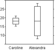
A)Both girls have a median score of about 18 points per game.Alexandra is much more consistent,because her IQR is about 15 points,while Caroline's is over 3.
B)The girls have a different average score per game,but the same median score of about 18 points per game.Their IQR are different,but this does not give anymore information on the girls' performance.
C)Both girls have a median score of about 18 points per game.Caroline is much more consistent,because her IQR is about 6 points,while Alexandra's is over 20.
D)The girls have a different average score per game.Caroline is much more consistent,because her IQR is about 4 points,while Alexandra's is over 15.
E)Both girls have a median score of about 18 points per game.Caroline is much more consistent,because her IQR is about 4 points,while Alexandra's is over 15.
Question
Describe what these boxplots tell you about the relationship between the provinces and salary,based on the same occupation. 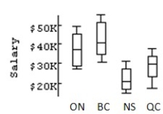
A)ON and BC have very comparable salaries.The average salaries for these provinces are just above $40K,and their spreads are very close.NS is very comparable to ON and BC.The upper 50% of salaries for NS corresponds to the lower 50% of QC salaries.
B)ON and BC have very comparable salaries.The average salaries for these provinces are just below $40K,but their spreads are different.NS is not very comparable to either ON and BC.The upper 50% of salaries for NS corresponds to the lower 50% of QC salaries.
C)ON and BC don't have very comparable salaries.The average salaries for these provinces are just below $40K,and their spreads are different.NS is not very comparable to either ON and BC.The upper 50% of salaries for QC corresponds to the lower 50% of NS salaries.
D)ON and BC have very comparable salaries.The average salaries for these provinces are just below $40K,and their spreads are very close.NS's average is the highest.The upper 50% of salaries for NS corresponds to the lower 50% of QC salaries.
E)ON and BC have very comparable salaries.The average salaries for these provinces are just below $40K,and their spreads are very close.NS is not very comparable to either ON or BC.The upper 50% of salaries for NS corresponds to the lower 50% of QC salaries.
Question
The histograms display the body fat percentages of 42 female students and 48 male students taking a college health course. 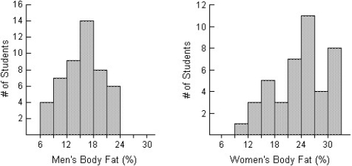 Compare the distributions (shape,centre,spread,unusual features).
A)The distribution of body fat percentages for men is unimodal and symmetric,with a centre at around 15%.Body fat percentages vary from approximately 6% to 24%.The distribution of body fat percentages for women is unimodal and slightly skewed to the left,with a typical value of 24%.The women's body fat percentages vary from approximately 9% to 33%.In general,the body fat percentages of men are higher than the body fat percentages of women.Additionally,the body fat percentages of men appear more consistent then the body fat percentages for women.
B)The distribution of body fat percentages for men is unimodal and symmetric,with a centre at around 15%.Body fat percentages vary from approximately 6% to 24%.The distribution of body fat percentages for women is unimodal and slightly skewed to the left,with a typical value of 24%.The women's body fat percentages vary from approximately 9% to 33%.In general,the body fat percentages of men are lower than the body fat percentages of women.Additionally,the body fat percentages of women appear more consistent then the body fat percentages for men.
C)The distribution of body fat percentages for men is unimodal and symmetric,with a centre at around 15%.Body fat percentages vary from approximately 6% to 24%.The distribution of body fat percentages for women is unimodal and slightly skewed to the left,with a typical value of 24%.The women's body fat percentages vary from approximately 9% to 33%.In general,the body fat percentages of men are lower than the body fat percentages of women.Additionally,the body fat percentages of men appear more consistent then the body fat percentages for women.
D)The distribution of body fat percentages for men is unimodal and symmetric,with a centre at around 24%.Body fat percentages vary from approximately 6% to 30%.The distribution of body fat percentages for women is unimodal and slightly skewed to the left,with a typical value of 24%.The women's body fat percentages vary from approximately 6% to 30%.In general,the body fat percentages of men and women are the same; however,the body fat percentages of men appear more consistent then the body fat percentages for women.
E)The distribution of body fat percentages for men is unimodal and symmetric,with a centre at around 15%.Body fat percentages vary from approximately 6% to 24%.The distribution of body fat percentages for women is unimodal and slightly skewed to the right,with a typical value of 24%.The women's body fat percentages vary from approximately 9% to 33%.In general,the body fat percentages of men are lower than the body fat percentages of women.Additionally,the body fat percentages of men appear more consistent then the body fat percentages for women.
Compare the distributions (shape,centre,spread,unusual features).A)The distribution of body fat percentages for men is unimodal and symmetric,with a centre at around 15%.Body fat percentages vary from approximately 6% to 24%.The distribution of body fat percentages for women is unimodal and slightly skewed to the left,with a typical value of 24%.The women's body fat percentages vary from approximately 9% to 33%.In general,the body fat percentages of men are higher than the body fat percentages of women.Additionally,the body fat percentages of men appear more consistent then the body fat percentages for women.
B)The distribution of body fat percentages for men is unimodal and symmetric,with a centre at around 15%.Body fat percentages vary from approximately 6% to 24%.The distribution of body fat percentages for women is unimodal and slightly skewed to the left,with a typical value of 24%.The women's body fat percentages vary from approximately 9% to 33%.In general,the body fat percentages of men are lower than the body fat percentages of women.Additionally,the body fat percentages of women appear more consistent then the body fat percentages for men.
C)The distribution of body fat percentages for men is unimodal and symmetric,with a centre at around 15%.Body fat percentages vary from approximately 6% to 24%.The distribution of body fat percentages for women is unimodal and slightly skewed to the left,with a typical value of 24%.The women's body fat percentages vary from approximately 9% to 33%.In general,the body fat percentages of men are lower than the body fat percentages of women.Additionally,the body fat percentages of men appear more consistent then the body fat percentages for women.
D)The distribution of body fat percentages for men is unimodal and symmetric,with a centre at around 24%.Body fat percentages vary from approximately 6% to 30%.The distribution of body fat percentages for women is unimodal and slightly skewed to the left,with a typical value of 24%.The women's body fat percentages vary from approximately 6% to 30%.In general,the body fat percentages of men and women are the same; however,the body fat percentages of men appear more consistent then the body fat percentages for women.
E)The distribution of body fat percentages for men is unimodal and symmetric,with a centre at around 15%.Body fat percentages vary from approximately 6% to 24%.The distribution of body fat percentages for women is unimodal and slightly skewed to the right,with a typical value of 24%.The women's body fat percentages vary from approximately 9% to 33%.In general,the body fat percentages of men are lower than the body fat percentages of women.Additionally,the body fat percentages of men appear more consistent then the body fat percentages for women.
Question
Question
Do men and women run a 5-kilometre race at the same pace? Here are boxplots of the time (in minutes)for a race recently run in Victoria,B.C.Write a brief report discussing what these data show. 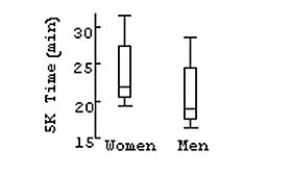
A)Women appear to run about 3 minutes faster than men,but the two distributions are very similar in shape and spread.
B)Men appear to run about 3 minutes faster than women,but the two distributions are very similar in shape and spread.
C)Women appear to run about 3 minutes faster than men,and the two distributions have different IQR.
D)Men appear to run about 3 minutes faster than women,and the two distributions have different IQR.
E)Men appear to run about 10 minutes faster than women,but the two distributions are very similar in shape and spread.
Question
The histograms show the cost of living,in dollars,for 32 Canadian cities.The histogram on the left shows the cost of living for the 32 cities using bins $10 wide,and the histogram on the right displays the same data using bins that are $6 wide. 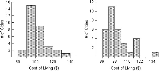 Compare the distributions (shape,centre,spread,unusual features).
A)The distribution in the left histogram of the cost of living in the 32 Canadian cities is unimodal and skewed to the right.The distribution is centred around $100,and spread out,with values ranging from $80 to $140.The distribution in the right histogram appears bimodal,with many cities costing just under $104 and another smaller cluster around $119.There also appears to be an outlier in the right histogram at $134 that was not apparent in the histogram on the left.
B)The distribution in the left histogram of the cost of living in the 32 Canadian cities is unimodal and skewed to the right.The distribution is centred around $100,and spread out,with values ranging from $80 to $140.The distribution in the right histogram is unimodal and symmetric.The distribution is centred around $104,and spread out,with values ranging from $86 to $140.There also appears to be an outlier in the right histogram at $134 that was not apparent in the histogram on the left.
C)The distribution in the left histogram of the cost of living in the 32 Canadian cities is unimodal and skewed to the left.The distribution is centred around $100,and spread out,with values ranging from $80 to $140.The distribution in the right histogram appears bimodal,with many cities costing just under $104 and another smaller cluster around $119.There also appears to be an outlier in the right histogram at $134 that was not apparent in the histogram on the left.
D)The distribution in the left histogram of the cost of living in the 32 Canadian cities is unimodal and skewed to the right.The distribution is centred around $100,and spread out,with values ranging from $80 to $140.The distribution in the right histogram is also unimodal and skewed to the right.The distribution is centred around $104,and spread out,with values ranging from $86 to $140.There also appears to be an outlier in the right histogram at $134 that was not apparent in the histogram on the left.
E)The distribution in the left histogram of the cost of living in the 32 Canadian cities is unimodal and skewed to the right.The distribution is centred around $100,and spread out,with values ranging from $80 to $140.The distribution in the right histogram appears bimodal,with many cities costing just under $104 and another smaller cluster around $119.
Compare the distributions (shape,centre,spread,unusual features).A)The distribution in the left histogram of the cost of living in the 32 Canadian cities is unimodal and skewed to the right.The distribution is centred around $100,and spread out,with values ranging from $80 to $140.The distribution in the right histogram appears bimodal,with many cities costing just under $104 and another smaller cluster around $119.There also appears to be an outlier in the right histogram at $134 that was not apparent in the histogram on the left.
B)The distribution in the left histogram of the cost of living in the 32 Canadian cities is unimodal and skewed to the right.The distribution is centred around $100,and spread out,with values ranging from $80 to $140.The distribution in the right histogram is unimodal and symmetric.The distribution is centred around $104,and spread out,with values ranging from $86 to $140.There also appears to be an outlier in the right histogram at $134 that was not apparent in the histogram on the left.
C)The distribution in the left histogram of the cost of living in the 32 Canadian cities is unimodal and skewed to the left.The distribution is centred around $100,and spread out,with values ranging from $80 to $140.The distribution in the right histogram appears bimodal,with many cities costing just under $104 and another smaller cluster around $119.There also appears to be an outlier in the right histogram at $134 that was not apparent in the histogram on the left.
D)The distribution in the left histogram of the cost of living in the 32 Canadian cities is unimodal and skewed to the right.The distribution is centred around $100,and spread out,with values ranging from $80 to $140.The distribution in the right histogram is also unimodal and skewed to the right.The distribution is centred around $104,and spread out,with values ranging from $86 to $140.There also appears to be an outlier in the right histogram at $134 that was not apparent in the histogram on the left.
E)The distribution in the left histogram of the cost of living in the 32 Canadian cities is unimodal and skewed to the right.The distribution is centred around $100,and spread out,with values ranging from $80 to $140.The distribution in the right histogram appears bimodal,with many cities costing just under $104 and another smaller cluster around $119.
Question
The centre for health in a certain country compiles data on the length of stay by patients in short-term hospitals and publishes its statistical findings annually.Data from a sample of 67 male patients and 63 female patients on length of stay (in days)are displayed in the histograms below. 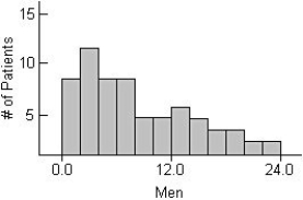
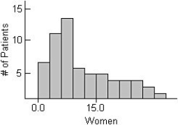
i)What would you suggest be changed about these histograms to make them easier to compare?
ii)Describe these distributions by writing a few sentences comparing the duration of hospitalization for men and women.
iii)Can you suggest a reason for the peak in women's length of stay?
A)i)They should be put on the same scale,from 0 to 40 days.
ii)Men have a mode near 1 day,then tapering off from there.Women have a mode near 6 days with a sharp drop afterward.
iii)A possible reason is childbirth.
B)i)They should be put on the same scale,from 0 to 33 days.
ii)Men have a mode near 3 days,then tapering off from there.Women have a mode near 8 days with a sharp drop afterward.
iii)A possible reason is childbirth.
C)i)They should be put on the same scale,from 0 to 25 days.
ii)Men have a mode near 2 days,then tapering off from there.Women have a mode near 4 days with a sharp drop afterward.
iii)A possible reason is childbirth.
D)i)They should be put on the same scale,from 0 to 15 days.
ii)Men have a mode near 3 days,then tapering off from there.Women have a mode near 10 days with a sharp drop afterward.
iii)A possible reason is childbirth.
E)i)They should be put on the same scale,from 0 to 18 days.
ii)Men have a mode near 7 days,then tapering off from there.Women have a mode near 1 day with a sharp drop afterward.
iii)A possible reason is childbirth.
Question
Question
Question
Question
Here are 3 boxplots of weekly gas prices at a service station in the U.S.A.(price in $ per gallon).Compare the distribution of prices over the three years. 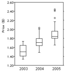
A)Gas price have been increasing on average over the 3-year period,but the spread has been decreasing.The distribution has been skewed to the left,and there were 3 high outliers in 2005.
B)Gas price have been increasing on average over the 3-year period,and the spread has been increasing as well.The distribution has been skewed to the right,and there were 3 high outliers in 2005.
C)Gas price have been decreasing on average over the 3-year period,and the spread has been decreasing.The distribution has been skewed to the left,and there were 3 high outliers in 2005.
D)Gas price have been decreasing on average over the 3-year period,but the spread has been increasing.The distribution has been skewed to the right,and there were 3 high outliers in 2005.
E)Gas price have been increasing on average over the 3-year period,and the spread has been increasing as well.The distribution has been skewed to the left,and there were 3 high outliers in 2005.
Question
Question
Question
Here are the summary statistics for mathematics scores for one high school graduating class,and the parallel boxplots comparing the scores of male and female students.Write a brief report on these results.Be sure to discuss shape,centre,and spread of the scores.
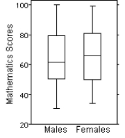
A)Median score by females at 66 points is 3 points higher than that by males,and female mean is higher by 5.The middle 50% for both group is close with a IQR at 26 for the males and 30 for the females.The males have a larger range from 30 to 100.The distribution is right-skewed for the females and symmetric for the males.
B)Median score by females at 66 points is 3 points higher than that by males,and female mean is higher by 5.The middle 50% for both group is close with a IQR at 26 for the males and 30 for the females.The males have a larger range from 30 to 100.Both distributions are right-skewed.
C)Median score by females at 66 points is 3 points higher than that by males,and female mean is higher by 5.The middle 50% for both group is close with a IQR at 26 for the males and 30 for the females.The males have a larger range from 30 to 100.The distribution is right-skewed for the males and symmetric for the females.
D)Median score by females at 66 points is 3 points higher than that by males,and male mean is higher by 5.The middle 50% for both group is close with a IQR at 30 for the males and 26 for the females.The males have a larger range from 30 to 100.The distribution is right-skewed for the males and symmetric for the females.
E)Median score by females at 66 points is 3 points higher than that by males,and female mean is higher by 5.The middle 50% for both group is close with a IQR at 26 for the males and 30 for the females.The males have a smaller range from 30 to 100.Both distributions are left-skewed.
Question
The following stem-and-leaf display shows the number of homeless cats and dogs that had to be euthanized each year in a large city for the period 1985-2004.Use both the stemplot and timeplot to describe the distribution. Euthanized Animal Totals 90
89
88
87
86
85
84
83
82
81 \ Key:
cats and dogs euthanized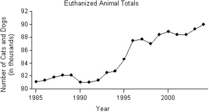
A)The distribution of the number of cats and dogs that were euthanized is skewed to the right,and has several modes,with gaps in between.One mode is clustered between 87,000 and 90,000 euthanized,a second mode at 84,000,and a third mode with a cluster between 81,000 and 82,000.The timeplot shows that the number of animals euthanized has increased over the period 1985-2004,with a significant increase between 1994 and 1996.
B)The distribution of the number of cats and dogs that were euthanized is bimodal.The upper cluster is between 87,000 and 90,000 euthanized,with a centre at around 88,400.The lower cluster is between 81,000 and 82,000 euthanized,with a centre at around 81,000.The timeplot shows that the number of animals euthanized has decreased over the period 1985-2004,with a significant decrease between 1994 and 1996.
C)The distribution of the number of cats and dogs that were euthanized is bimodal.The upper cluster is between 87,000 and 90,000 euthanized,with a centre at around 88,400.The lower cluster is between 81,000 and 82,000 euthanized,with a centre at around 81,000.The timeplot shows that the number of animals euthanized has increased over the period 1985-2004,with a significant increase between 1994 and 1996.
D)The distribution of the number of cats and dogs that were euthanized is bimodal.The upper cluster is between 89,000 and 90,000 euthanized,with a centre at around 88,400.The lower cluster is between 81,000 and 82,000 euthanized,with a centre at around 81,000.The timeplot shows that the number of animals euthanized has increased over the period 1985-2004,with a significant increase between 1994 and 1996.
E)The distribution of the number of cats and dogs that were euthanized is skewed to the left,and has several modes,with gaps in between.One mode is clustered between 87,000 and 90,000 euthanized,a second mode at 84,000,and a third mode with a cluster between 81,000 and 82,000.The timeplot shows that the number of animals euthanized has increased over the period 1985-2004,with a significant increase between 1994 and 1996.
Question
Question
The boxplots display case prices (in dollars)of white wines produced by three vineyards in south-western Ontario.Which vineyard produces the cheapest wine? 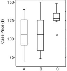
A)Vineyard C,because it has the smallest range.
B)Vineyard B,because it does not have any outliers.
C)Vineyard C,because it has the smallest IQR.
D)Vineyard B,because it has the highest case price at about $150.
E)Vineyard A,because it has the smallest case price at about $60.
A)Vineyard C,because it has the smallest range.
B)Vineyard B,because it does not have any outliers.
C)Vineyard C,because it has the smallest IQR.
D)Vineyard B,because it has the highest case price at about $150.
E)Vineyard A,because it has the smallest case price at about $60.
Question
Question
Question
Use the high closing values of Naristar Inc.stock from the years 2003-2014 to construct a timeplot. 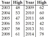
Question
Question
Question
The boxplots display case prices (in dollars)of white wines produced by three vineyards in south-western Ontario.Which vineyard produces the most expensive wine? 
A)Vineyard B,because it has the highest case price at about $150.
B)Vineyard A,because it has one outlier at about $145.
C)Vineyard C,because it has the smallest IQR.
D)Vineyard A,because it has the smallest case price at about $60.
E)Vineyard B,because it has the highest case price at about $120.
A)Vineyard B,because it has the highest case price at about $150.
B)Vineyard A,because it has one outlier at about $145.
C)Vineyard C,because it has the smallest IQR.
D)Vineyard A,because it has the smallest case price at about $60.
E)Vineyard B,because it has the highest case price at about $120.
Question
Question
A business owner recorded her annual profits for the first 12 years since opening her business in 1993.The stem-and-leaf display below shows the annual profits in thousands of dollars.Use both the stemplot and timeplot to describe the distribution. Annual Profit Totals 8
7
6
5
4
3
2
1 Key:
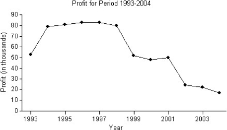
A)The distribution of the business owner's profits is skewed to the left,and is unimodal,with gaps in between.The centre is at around $50,000.The timeplot shows that the profits grew from 1993 to 1994,and were relatively steady from 1994 to 1998.After 1998,the profits declined significantly compared with those between 1993 and 1998.
B)The distribution of the business owner's profits is skewed to the left,and is multimodal,with gaps in between.One mode is at around $80,000,another at around $50,000,and a third mode at around $20,000.The timeplot shows that the profits grew from 1993 to 1994,and were relatively steady from 1994 to 2001.After 2001,the profits declined significantly compared with those between 1994 and 2001.
C)The distribution of the business owner's profits is skewed to the right,and is multimodal,with gaps in between.One mode is at around $80,000,another at around $50,000,and a third mode at around $20,000.The timeplot shows that the profits grew from 1993 to 1994,and were relatively steady from 1994 to 1998.After 1998,the profits declined significantly compared with those between 1993 and 1998.
D)The distribution of the business owner's profits is skewed to the left,and is multimodal,with gaps in between.One mode is at around $80,000,another at around $50,000,and a third mode at around $20,000.The timeplot shows that the profits grew from 1993 to 1994,and were relatively steady from 1994 to 1998.After 1998,the profits declined significantly compared with those between 1993 and 1998.
E)The distribution of the business owner's profits is skewed to the left,and is unimodal,with gaps in between.The centre is at around $50,000.The timeplot shows that the profits grew from 1993 to 1994,and were relatively steady from 1994 to 2001.After 2001,the profits declined significantly compared with those between 1994 and 2001.
7
6
5
4
3
2
1 Key:
A)The distribution of the business owner's profits is skewed to the left,and is unimodal,with gaps in between.The centre is at around $50,000.The timeplot shows that the profits grew from 1993 to 1994,and were relatively steady from 1994 to 1998.After 1998,the profits declined significantly compared with those between 1993 and 1998.
B)The distribution of the business owner's profits is skewed to the left,and is multimodal,with gaps in between.One mode is at around $80,000,another at around $50,000,and a third mode at around $20,000.The timeplot shows that the profits grew from 1993 to 1994,and were relatively steady from 1994 to 2001.After 2001,the profits declined significantly compared with those between 1994 and 2001.
C)The distribution of the business owner's profits is skewed to the right,and is multimodal,with gaps in between.One mode is at around $80,000,another at around $50,000,and a third mode at around $20,000.The timeplot shows that the profits grew from 1993 to 1994,and were relatively steady from 1994 to 1998.After 1998,the profits declined significantly compared with those between 1993 and 1998.
D)The distribution of the business owner's profits is skewed to the left,and is multimodal,with gaps in between.One mode is at around $80,000,another at around $50,000,and a third mode at around $20,000.The timeplot shows that the profits grew from 1993 to 1994,and were relatively steady from 1994 to 1998.After 1998,the profits declined significantly compared with those between 1993 and 1998.
E)The distribution of the business owner's profits is skewed to the left,and is unimodal,with gaps in between.The centre is at around $50,000.The timeplot shows that the profits grew from 1993 to 1994,and were relatively steady from 1994 to 2001.After 2001,the profits declined significantly compared with those between 1994 and 2001.
Question
Question
Use the high closing values of Naristar Inc.stock from the years 2003-2014 to construct a timeplot. 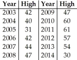
Question
Question
Question
The boxplots display case prices (in dollars)of white wines produced by three vineyards in south-western Ontario.Describe these wine prices. 
A)Vineyards A and B have about the same average price; the boxplots show similar medians and similar IQRs.Vineyard C has higher prices except for one low outlier,and a more consistent pricing as shown by the smaller IQR.The three distributions are roughly symmetric.
B)Vineyards A and B have different average price,but a similar spread.Vineyard C has lower prices except for one low outlier,and a more consistent pricing as shown by the smaller IQR.
C)Vineyards A and B have about the same average price; the boxplots show similar medians and similar IQRs.Vineyard C has consistently higher prices except for one low outlier,and a more consistent pricing as shown by the larger IQR.
D)Vineyards A and B have about the same average price; the boxplots show similar medians and similar IQRs.Vineyard C has higher prices except for one low outlier,and a less consistent pricing as shown by the larger IQR.
E)Vineyards A and B have about the same average price; the boxplots show similar medians and similar IQRs.Vineyard C has higher prices except for one low outlier,and a more consistent pricing as shown by the smaller IQR.
Question
Question
Use the Olympic gold medal performances in the men's high jump from the years 1960-2012 to construct a timeplot. 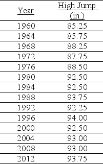
Question
The boxplots display case prices (in dollars)of white wines produced by three vineyards in south-western Ontario.In which vineyard are the wines generally more expensive? 
A)Vineyards A and B,because they have a similar average price,and roughly the same spread.
B)Vineyard C,because it has the highest average price and the smallest spread.
C)Vineyard C,because it has the smallest range.
D)Vineyard B,because it has the highest case price at about $150.
E)Vineyard A,because it has one outlier at about $145.
Question
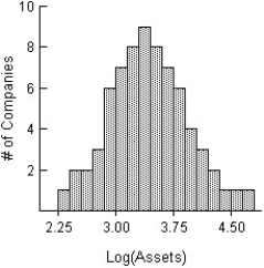
Here is a histogram of the assets (in millions of dollars)of 71 companies.What aspect of this distribution makes it difficult to summarize,or to discuss,the centre and spread? What could be done with these data to make it easier to discuss the distribution? 
A)The distribution of assets of the 71 companies is heavily skewed to the right.The vast majority of the companies have assets represented in the first bar of the histogram,0 to 4000 dollars.This makes the discussion of the distribution meaningless.Re-expressing these data using logs or square roots might make the distribution nearly symmetric,and a meaningful discussion of centre and spread might be possible.
B)The distribution of assets of the 71 companies is heavily skewed to the left.The vast majority of the companies have assets represented in the first bar of the histogram,0 to 4 billion dollars.This makes the discussion of the distribution meaningless.Re-expressing these data using logs or square roots might make the distribution nearly symmetric,and a meaningful discussion of centre and spread might be possible.
C)The distribution of assets of the 71 companies is heavily skewed to the right.The vast majority of the companies have assets represented in the first bar of the histogram,0 to 4 billion dollars.This makes the discussion of the distribution meaningless.Re-expressing these data using logs or squares might make the distribution nearly symmetric,and a meaningful discussion of centre and spread might be possible.
D)The distribution of assets of the 71 companies is heavily skewed to the right.The vast majority of the companies have assets represented in the first bar of the histogram,0 to 4000 dollars.This makes the discussion of the distribution meaningless.Re-expressing these data using logs or squares might make the distribution nearly symmetric,and a meaningful discussion of centre and spread might be possible.
E)The distribution of assets of the 71 companies is heavily skewed to the right.The vast majority of the companies have assets represented in the first bar of the histogram,0 to 4 billion dollars.This makes the discussion of the distribution meaningless.Re-expressing these data using logs or square roots might make the distribution nearly symmetric,and a meaningful discussion of centre and spread might be possible.
Question
Here is a histogram of the assets (in millions of dollars)of 71 companies. 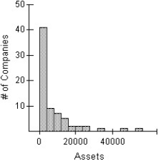 Which of the following is an appropriate re-expression of these data? (More than one may be appropriate.)
I
II

III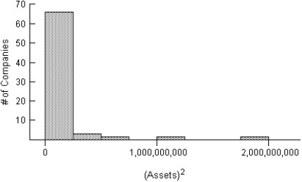
A)II
B)I,II
C)II,III
D)I
E)None of these are appropriate re-expression displays.
Which of the following is an appropriate re-expression of these data? (More than one may be appropriate.) I
II
III
A)II
B)I,II
C)II,III
D)I
E)None of these are appropriate re-expression displays.
Question
Here is a histogram of the assets (in millions of dollars)of 71 companies.The square root re-expression of assets is also given.In the square root re-expression,what does the value 45 actually indicate about the company's assets? 

A)The company's assets are $45,000,000.
B)The company's assets are $4,500,000.
C)The company's assets are $2025.
D)The company's assets are $2,025,000.
E)The company's assets are $2,025,000,000.
A)The company's assets are $45,000,000.
B)The company's assets are $4,500,000.
C)The company's assets are $2025.
D)The company's assets are $2,025,000.
E)The company's assets are $2,025,000,000.
Question
Here is a histogram of the assets (in millions of dollars)of 71 companies.  Which of the following is the most appropriate re-expression of these data? Explain.
I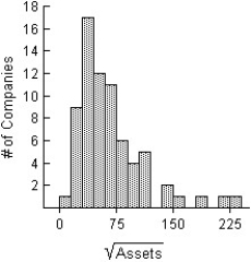
II
III
A)II,because the distribution is nearly symmetric.
B)III,because the distribution more closely resembles the original histogram.
C)I,because the distribution has a greater spread.
D)I,because the distribution is nearly symmetric.
E)I and II are equally appropriate,because re-expression using logs or square roots yields the same results.
Which of the following is the most appropriate re-expression of these data? Explain.I
II
III
A)II,because the distribution is nearly symmetric.
B)III,because the distribution more closely resembles the original histogram.
C)I,because the distribution has a greater spread.
D)I,because the distribution is nearly symmetric.
E)I and II are equally appropriate,because re-expression using logs or square roots yields the same results.
Question
In a child psychology course,children took part in an experiment to determine how,while putting together a 10-piece puzzle,being able to view the completed picture affected the time required for the child to complete the puzzle.One group (NV)was not allowed to look at the picture on the cover of the puzzle box.A second group (VP)was allowed to view the picture on the cover of the box.Below are the boxplots of the original completion times and the boxplots of the log of the completion times. 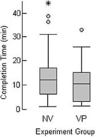
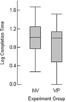 Is it better to analyze the original completion times or the log of the completion times? Explain.
Is it better to analyze the original completion times or the log of the completion times? Explain. Question
Here is a histogram of the assets (in millions of dollars)of 71 companies.The logarithm re-expression of assets is also given.In the logarithm re-expression,what does the value 2.25 actually indicate about the company's assets? 
A)The company's assets are approximately $180.
B)The company's assets are approximately $3300.
C)The company's assets are approximately $180,000,000.
D)The company's assets are approximately $330,000.
E)The company's assets are approximately $180,000.
A)The company's assets are approximately $180.
B)The company's assets are approximately $3300.
C)The company's assets are approximately $180,000,000.
D)The company's assets are approximately $330,000.
E)The company's assets are approximately $180,000.

Unlock Deck
Sign up to unlock the cards in this deck!
Unlock Deck
Unlock Deck
1/46
Play
Full screen (f)
Deck 4: Understanding and Comparing Distributions
1
Which class had the highest median score?
A)Class 2
B)Class 1 and class 3
C)Class 3
D)Class 1
E)None,because the classes had the same median.
A)Class 2
B)Class 1 and class 3
C)Class 3
D)Class 1
E)None,because the classes had the same median.
Class 2
2
The back-to-back stem-and-leaf display compares the percent growth in sales for a retail chain's stores located in two regions of Canada.The lower stem contains leaves with the digits 0-4 and the upper stem contains leaves with digits 5-9. Key: 3 = 35% sales growth
A)The distribution of sales growth in Region 1 stores is unimodal,symmetric and tightly clustered around 35% growth.The distribution of sales growth in Region 2 stores is much more spread out,with most stores having sales growth between 5% and 35%.A typical Region 2 store had about 15% growth.There were two outliers,one store with 58% growth and another with 65% growth.Generally,the sales growth rates in the Region 2 stores were higher and more variable than the rates in the Region 1 stores.
B)The distribution of sales growth in the Region 1 stores is unimodal,symmetric and tightly clustered around 35% growth.The distribution of sales growth in Region 2 stores is much more spread out,with most stores having sales growth between 5% and 35%.A typical Region 2 store had about 15% growth.There were two outliers,one store with 58% growth and another with 65% growth.Generally,the sales growth rates in the Region 1 stores were higher and less variable than the rates in the Region 2 stores.
C)The distribution of sales growth in Region 1 stores is unimodal,symmetric and tightly clustered around 35% growth.The distribution of sales growth in Region 2 stores is much more spread out,with most stores having sales growth between 5% and 35%.A typical Region 2 store had about 15% growth.There were two outliers,one store with 58% growth and another with 65% growth.Generally,the sales growth rates in the Region 1 stores were higher and more variable than the rates in the Region 2 stores.
D)The distribution of sales growth in Region 1 stores is unimodal,symmetric and tightly clustered around 45% growth.The distribution of sales growth in Region 2 stores is much more spread out,with most stores having sales growth between 5% and 35%.A typical Region 2 store had about 25% growth.There were two outliers,one store with 58% growth and another with 65% growth.Generally,the sales growth rates in the Region 2 stores were higher and more variable than the rates in the Region 1 stores.
E)The distribution of sales growth in Region 1 stores is unimodal,symmetric and tightly clustered around 45% growth.The distribution of sales growth in Region 2 stores is much more spread out,with most stores having sales growth between 5% and 35%.A typical Region 2 store had about 25% growth.There were two outliers,one store with 58% growth and another with 65% growth.Generally,the sales growth rates in the Region 1 stores were higher and less variable than the rates in the Region 2 stores.
The distribution of sales growth in the Region 1 stores is unimodal,symmetric and tightly clustered around 35% growth.The distribution of sales growth in Region 2 stores is much more spread out,with most stores having sales growth between 5% and 35%.A typical Region 2 store had about 15% growth.There were two outliers,one store with 58% growth and another with 65% growth.Generally,the sales growth rates in the Region 1 stores were higher and less variable than the rates in the Region 2 stores.
3
Match each class with the corresponding boxplot below.
A)Class 1 is B Class 2 is C
Class 3 is A
B)Class 1 is B Class 2 is A
Class 3 is C
C)Class 1 is A Class 2 is B
Class 3 is C
D)Class 1 is C Class 2 is A
Class 3 is B
E)Class 1 is C Class 2 is B
Class 3 is A
A)Class 1 is B Class 2 is C
Class 3 is A
B)Class 1 is B Class 2 is A
Class 3 is C
C)Class 1 is A Class 2 is B
Class 3 is C
D)Class 1 is C Class 2 is A
Class 3 is B
E)Class 1 is C Class 2 is B
Class 3 is A
Class 1 is C Class 2 is A
Class 3 is B
Class 3 is B
4
For class 2,compare the mean and the median.
A)Mean is equal to median.
B)Median is lower than mean.
C)Median is higher than mean.
D)Mean is higher than median.
E)No comparison possible
A)Mean is equal to median.
B)Median is lower than mean.
C)Median is higher than mean.
D)Mean is higher than median.
E)No comparison possible
Unlock Deck
Unlock for access to all 46 flashcards in this deck.
Unlock Deck
k this deck
5
For which class are the mean and median most different?
A)Class 2,because the shape is symmetric.
B)Class 2,because the shape is skewed to the right.
C)Class 1,because the shape is skewed to the left.
D)Class 3,because the shape is symmetric.
E)Class 2,because the shape is skewed to the left.
A)Class 2,because the shape is symmetric.
B)Class 2,because the shape is skewed to the right.
C)Class 1,because the shape is skewed to the left.
D)Class 3,because the shape is symmetric.
E)Class 2,because the shape is skewed to the left.
Unlock Deck
Unlock for access to all 46 flashcards in this deck.
Unlock Deck
k this deck
6
Here are boxplots of the points scored during the first 10 games of the basketball season for both Caroline and Alexandra.The coach can take only one player to the state championship.Which one should she take knowing that she would like a safe player?
A)Alexandra,because she is the more consistent player.
B)Both of them,because both girls have a median score of about 18 points per game.
C)Caroline,because she is the more consistent player.
D)Caroline,because the IQR is the largest.
E)Alexandra,because the IQR is the largest.
A)Alexandra,because she is the more consistent player.
B)Both of them,because both girls have a median score of about 18 points per game.
C)Caroline,because she is the more consistent player.
D)Caroline,because the IQR is the largest.
E)Alexandra,because the IQR is the largest.
Unlock Deck
Unlock for access to all 46 flashcards in this deck.
Unlock Deck
k this deck
7
Which class had the largest standard deviation?
A)Class 3,because the shape has the highest number of students.
B)Class 1 or 2,but you can't tell for sure which one.
C)Class 3,because the shape is symmetric.
D)Class 1,because the shape is not perfectly symmetric.
E)None,because the classes had the same standard deviation.
A)Class 3,because the shape has the highest number of students.
B)Class 1 or 2,but you can't tell for sure which one.
C)Class 3,because the shape is symmetric.
D)Class 1,because the shape is not perfectly symmetric.
E)None,because the classes had the same standard deviation.
Unlock Deck
Unlock for access to all 46 flashcards in this deck.
Unlock Deck
k this deck
8
Here are boxplots of the points scored during the first 10 games of the basketball season for both Caroline and Alexandra.Summarize the similarities and differences in their performance so far.
A)Both girls have a median score of about 18 points per game.Alexandra is much more consistent,because her IQR is about 15 points,while Caroline's is over 3.
B)The girls have a different average score per game,but the same median score of about 18 points per game.Their IQR are different,but this does not give anymore information on the girls' performance.
C)Both girls have a median score of about 18 points per game.Caroline is much more consistent,because her IQR is about 6 points,while Alexandra's is over 20.
D)The girls have a different average score per game.Caroline is much more consistent,because her IQR is about 4 points,while Alexandra's is over 15.
E)Both girls have a median score of about 18 points per game.Caroline is much more consistent,because her IQR is about 4 points,while Alexandra's is over 15.
Unlock Deck
Unlock for access to all 46 flashcards in this deck.
Unlock Deck
k this deck
9
Describe what these boxplots tell you about the relationship between the provinces and salary,based on the same occupation.
A)ON and BC have very comparable salaries.The average salaries for these provinces are just above $40K,and their spreads are very close.NS is very comparable to ON and BC.The upper 50% of salaries for NS corresponds to the lower 50% of QC salaries.
B)ON and BC have very comparable salaries.The average salaries for these provinces are just below $40K,but their spreads are different.NS is not very comparable to either ON and BC.The upper 50% of salaries for NS corresponds to the lower 50% of QC salaries.
C)ON and BC don't have very comparable salaries.The average salaries for these provinces are just below $40K,and their spreads are different.NS is not very comparable to either ON and BC.The upper 50% of salaries for QC corresponds to the lower 50% of NS salaries.
D)ON and BC have very comparable salaries.The average salaries for these provinces are just below $40K,and their spreads are very close.NS's average is the highest.The upper 50% of salaries for NS corresponds to the lower 50% of QC salaries.
E)ON and BC have very comparable salaries.The average salaries for these provinces are just below $40K,and their spreads are very close.NS is not very comparable to either ON or BC.The upper 50% of salaries for NS corresponds to the lower 50% of QC salaries.
Unlock Deck
Unlock for access to all 46 flashcards in this deck.
Unlock Deck
k this deck
10
The histograms display the body fat percentages of 42 female students and 48 male students taking a college health course. Compare the distributions (shape,centre,spread,unusual features).
A)The distribution of body fat percentages for men is unimodal and symmetric,with a centre at around 15%.Body fat percentages vary from approximately 6% to 24%.The distribution of body fat percentages for women is unimodal and slightly skewed to the left,with a typical value of 24%.The women's body fat percentages vary from approximately 9% to 33%.In general,the body fat percentages of men are higher than the body fat percentages of women.Additionally,the body fat percentages of men appear more consistent then the body fat percentages for women.
B)The distribution of body fat percentages for men is unimodal and symmetric,with a centre at around 15%.Body fat percentages vary from approximately 6% to 24%.The distribution of body fat percentages for women is unimodal and slightly skewed to the left,with a typical value of 24%.The women's body fat percentages vary from approximately 9% to 33%.In general,the body fat percentages of men are lower than the body fat percentages of women.Additionally,the body fat percentages of women appear more consistent then the body fat percentages for men.
C)The distribution of body fat percentages for men is unimodal and symmetric,with a centre at around 15%.Body fat percentages vary from approximately 6% to 24%.The distribution of body fat percentages for women is unimodal and slightly skewed to the left,with a typical value of 24%.The women's body fat percentages vary from approximately 9% to 33%.In general,the body fat percentages of men are lower than the body fat percentages of women.Additionally,the body fat percentages of men appear more consistent then the body fat percentages for women.
D)The distribution of body fat percentages for men is unimodal and symmetric,with a centre at around 24%.Body fat percentages vary from approximately 6% to 30%.The distribution of body fat percentages for women is unimodal and slightly skewed to the left,with a typical value of 24%.The women's body fat percentages vary from approximately 6% to 30%.In general,the body fat percentages of men and women are the same; however,the body fat percentages of men appear more consistent then the body fat percentages for women.
E)The distribution of body fat percentages for men is unimodal and symmetric,with a centre at around 15%.Body fat percentages vary from approximately 6% to 24%.The distribution of body fat percentages for women is unimodal and slightly skewed to the right,with a typical value of 24%.The women's body fat percentages vary from approximately 9% to 33%.In general,the body fat percentages of men are lower than the body fat percentages of women.Additionally,the body fat percentages of men appear more consistent then the body fat percentages for women.
Compare the distributions (shape,centre,spread,unusual features).A)The distribution of body fat percentages for men is unimodal and symmetric,with a centre at around 15%.Body fat percentages vary from approximately 6% to 24%.The distribution of body fat percentages for women is unimodal and slightly skewed to the left,with a typical value of 24%.The women's body fat percentages vary from approximately 9% to 33%.In general,the body fat percentages of men are higher than the body fat percentages of women.Additionally,the body fat percentages of men appear more consistent then the body fat percentages for women.
B)The distribution of body fat percentages for men is unimodal and symmetric,with a centre at around 15%.Body fat percentages vary from approximately 6% to 24%.The distribution of body fat percentages for women is unimodal and slightly skewed to the left,with a typical value of 24%.The women's body fat percentages vary from approximately 9% to 33%.In general,the body fat percentages of men are lower than the body fat percentages of women.Additionally,the body fat percentages of women appear more consistent then the body fat percentages for men.
C)The distribution of body fat percentages for men is unimodal and symmetric,with a centre at around 15%.Body fat percentages vary from approximately 6% to 24%.The distribution of body fat percentages for women is unimodal and slightly skewed to the left,with a typical value of 24%.The women's body fat percentages vary from approximately 9% to 33%.In general,the body fat percentages of men are lower than the body fat percentages of women.Additionally,the body fat percentages of men appear more consistent then the body fat percentages for women.
D)The distribution of body fat percentages for men is unimodal and symmetric,with a centre at around 24%.Body fat percentages vary from approximately 6% to 30%.The distribution of body fat percentages for women is unimodal and slightly skewed to the left,with a typical value of 24%.The women's body fat percentages vary from approximately 6% to 30%.In general,the body fat percentages of men and women are the same; however,the body fat percentages of men appear more consistent then the body fat percentages for women.
E)The distribution of body fat percentages for men is unimodal and symmetric,with a centre at around 15%.Body fat percentages vary from approximately 6% to 24%.The distribution of body fat percentages for women is unimodal and slightly skewed to the right,with a typical value of 24%.The women's body fat percentages vary from approximately 9% to 33%.In general,the body fat percentages of men are lower than the body fat percentages of women.Additionally,the body fat percentages of men appear more consistent then the body fat percentages for women.
Unlock Deck
Unlock for access to all 46 flashcards in this deck.
Unlock Deck
k this deck
11
Which class do you think performed better on the test?
A)Class 2,because it has the highest median and 50% of class 2 scored at or above the medians of 1 and 3.
B)Class 3,because 74% of class 3 scored at or above the medians of 1 and 2.
C)Class 1,because it has the smallest median and 70% of class 1 scored at or above the medians of 2 and 3.
D)Class 2,because it has the highest median and 70% of class 2 scored at or above the medians of 1 and 3.
E)Class 2,because it has different mean and median and 70% of class 2 scored at or above the medians of 1 and 3.
Unlock Deck
Unlock for access to all 46 flashcards in this deck.
Unlock Deck
k this deck
12
Do men and women run a 5-kilometre race at the same pace? Here are boxplots of the time (in minutes)for a race recently run in Victoria,B.C.Write a brief report discussing what these data show.
A)Women appear to run about 3 minutes faster than men,but the two distributions are very similar in shape and spread.
B)Men appear to run about 3 minutes faster than women,but the two distributions are very similar in shape and spread.
C)Women appear to run about 3 minutes faster than men,and the two distributions have different IQR.
D)Men appear to run about 3 minutes faster than women,and the two distributions have different IQR.
E)Men appear to run about 10 minutes faster than women,but the two distributions are very similar in shape and spread.
Unlock Deck
Unlock for access to all 46 flashcards in this deck.
Unlock Deck
k this deck
13
The histograms show the cost of living,in dollars,for 32 Canadian cities.The histogram on the left shows the cost of living for the 32 cities using bins $10 wide,and the histogram on the right displays the same data using bins that are $6 wide. Compare the distributions (shape,centre,spread,unusual features).
A)The distribution in the left histogram of the cost of living in the 32 Canadian cities is unimodal and skewed to the right.The distribution is centred around $100,and spread out,with values ranging from $80 to $140.The distribution in the right histogram appears bimodal,with many cities costing just under $104 and another smaller cluster around $119.There also appears to be an outlier in the right histogram at $134 that was not apparent in the histogram on the left.
B)The distribution in the left histogram of the cost of living in the 32 Canadian cities is unimodal and skewed to the right.The distribution is centred around $100,and spread out,with values ranging from $80 to $140.The distribution in the right histogram is unimodal and symmetric.The distribution is centred around $104,and spread out,with values ranging from $86 to $140.There also appears to be an outlier in the right histogram at $134 that was not apparent in the histogram on the left.
C)The distribution in the left histogram of the cost of living in the 32 Canadian cities is unimodal and skewed to the left.The distribution is centred around $100,and spread out,with values ranging from $80 to $140.The distribution in the right histogram appears bimodal,with many cities costing just under $104 and another smaller cluster around $119.There also appears to be an outlier in the right histogram at $134 that was not apparent in the histogram on the left.
D)The distribution in the left histogram of the cost of living in the 32 Canadian cities is unimodal and skewed to the right.The distribution is centred around $100,and spread out,with values ranging from $80 to $140.The distribution in the right histogram is also unimodal and skewed to the right.The distribution is centred around $104,and spread out,with values ranging from $86 to $140.There also appears to be an outlier in the right histogram at $134 that was not apparent in the histogram on the left.
E)The distribution in the left histogram of the cost of living in the 32 Canadian cities is unimodal and skewed to the right.The distribution is centred around $100,and spread out,with values ranging from $80 to $140.The distribution in the right histogram appears bimodal,with many cities costing just under $104 and another smaller cluster around $119.
Compare the distributions (shape,centre,spread,unusual features).A)The distribution in the left histogram of the cost of living in the 32 Canadian cities is unimodal and skewed to the right.The distribution is centred around $100,and spread out,with values ranging from $80 to $140.The distribution in the right histogram appears bimodal,with many cities costing just under $104 and another smaller cluster around $119.There also appears to be an outlier in the right histogram at $134 that was not apparent in the histogram on the left.
B)The distribution in the left histogram of the cost of living in the 32 Canadian cities is unimodal and skewed to the right.The distribution is centred around $100,and spread out,with values ranging from $80 to $140.The distribution in the right histogram is unimodal and symmetric.The distribution is centred around $104,and spread out,with values ranging from $86 to $140.There also appears to be an outlier in the right histogram at $134 that was not apparent in the histogram on the left.
C)The distribution in the left histogram of the cost of living in the 32 Canadian cities is unimodal and skewed to the left.The distribution is centred around $100,and spread out,with values ranging from $80 to $140.The distribution in the right histogram appears bimodal,with many cities costing just under $104 and another smaller cluster around $119.There also appears to be an outlier in the right histogram at $134 that was not apparent in the histogram on the left.
D)The distribution in the left histogram of the cost of living in the 32 Canadian cities is unimodal and skewed to the right.The distribution is centred around $100,and spread out,with values ranging from $80 to $140.The distribution in the right histogram is also unimodal and skewed to the right.The distribution is centred around $104,and spread out,with values ranging from $86 to $140.There also appears to be an outlier in the right histogram at $134 that was not apparent in the histogram on the left.
E)The distribution in the left histogram of the cost of living in the 32 Canadian cities is unimodal and skewed to the right.The distribution is centred around $100,and spread out,with values ranging from $80 to $140.The distribution in the right histogram appears bimodal,with many cities costing just under $104 and another smaller cluster around $119.
Unlock Deck
Unlock for access to all 46 flashcards in this deck.
Unlock Deck
k this deck
14
The centre for health in a certain country compiles data on the length of stay by patients in short-term hospitals and publishes its statistical findings annually.Data from a sample of 67 male patients and 63 female patients on length of stay (in days)are displayed in the histograms below.
i)What would you suggest be changed about these histograms to make them easier to compare?
ii)Describe these distributions by writing a few sentences comparing the duration of hospitalization for men and women.
iii)Can you suggest a reason for the peak in women's length of stay?
A)i)They should be put on the same scale,from 0 to 40 days.
ii)Men have a mode near 1 day,then tapering off from there.Women have a mode near 6 days with a sharp drop afterward.
iii)A possible reason is childbirth.
B)i)They should be put on the same scale,from 0 to 33 days.
ii)Men have a mode near 3 days,then tapering off from there.Women have a mode near 8 days with a sharp drop afterward.
iii)A possible reason is childbirth.
C)i)They should be put on the same scale,from 0 to 25 days.
ii)Men have a mode near 2 days,then tapering off from there.Women have a mode near 4 days with a sharp drop afterward.
iii)A possible reason is childbirth.
D)i)They should be put on the same scale,from 0 to 15 days.
ii)Men have a mode near 3 days,then tapering off from there.Women have a mode near 10 days with a sharp drop afterward.
iii)A possible reason is childbirth.
E)i)They should be put on the same scale,from 0 to 18 days.
ii)Men have a mode near 7 days,then tapering off from there.Women have a mode near 1 day with a sharp drop afterward.
iii)A possible reason is childbirth.
Unlock Deck
Unlock for access to all 46 flashcards in this deck.
Unlock Deck
k this deck
15
How would you describe the shape of each distribution?
A)Class 1: left-skewed,spread out ranging from about 40 to 90 Class 2: left-skewed,spread out ranging from about 40 to 90
Class 3: symmetric,spread out ranging from about 40 to 90
B)Class 1: fairly symmetric,spread out ranging from about 40 to 90 Class 2: left-skewed,spread out ranging from about 40 to 90
Class 3: asymmetric,spread out ranging from about 40 to 90
C)Class 1: left-skewed,spread out ranging from about 40 to 90 Class 2: right-skewed,spread out ranging from about 40 to 90
Class 3: symmetric,spread out ranging from about 40 to 90
D)Class 1: fairly symmetric,spread out ranging from about 40 to 90 Class 2: left-skewed,spread out ranging from about 40 to 90
Class 3: symmetric,spread out ranging from about 40 to 90
E)Class 1: fairly symmetric,spread out ranging from about 40 to 90 Class 2: right-skewed,spread out ranging from about 40 to 90
Class 3: symmetric,spread out ranging from about 40 to 90
Unlock Deck
Unlock for access to all 46 flashcards in this deck.
Unlock Deck
k this deck
16
Which class had the smallest standard deviation?
A)Class 3,because the shape is symmetric and unimodal.
B)Class 1,because the shape is fairly symmetric and uniform.
C)Class 3,because the shape has the highest number of students.
D)Class 2,because the shape is skewed.
E)None,because the classes had the same standard deviation.
A)Class 3,because the shape is symmetric and unimodal.
B)Class 1,because the shape is fairly symmetric and uniform.
C)Class 3,because the shape has the highest number of students.
D)Class 2,because the shape is skewed.
E)None,because the classes had the same standard deviation.
Unlock Deck
Unlock for access to all 46 flashcards in this deck.
Unlock Deck
k this deck
17
The back-to-back stem-and-leaf display compares the annual precipitation,in millimetres,of two towns over a period of 14 years.The lower stem contains leaves with the digits 0-4 and the upper stem contains leaves with digits 5-9. Key: 20 = 20.7 millimetres
A)The distribution of annual precipitation in Town 1 is bimodal,with one cluster centred around the mid and another cluster in the high 18s.There are two high outliers of 23.1 and 24.3 mm for Town 1.In Town 2,the distribution of annual precipitation is unimodal and skewed right,clustered predominantly between 20.5 and 22.4.There is a low outlier of 18.2 mm for Town 2.The annual precipitation is generally higher and more sporadic in Town 1.
B)The distribution of annual precipitation in Town 1 is bimodal,with one cluster centred around the mid and another cluster in the high 18s.There are two high outliers of 23.1 and 24.3 mm for Town 1.In Town 2,the distribution of annual precipitation is unimodal and skewed right,clustered predominantly between 20.5 and 22.4.There is a low outlier of 18.2 mm for Town 2.The annual precipitation is more consistent in Town 2; but overall,both cities have the same average annual precipitation.
C)The distribution of annual precipitation in Town 1 is bimodal,with one cluster centred around the mid and another cluster in the high 18s.There are two high outliers of 23.1 and 24.3 mm for Town 1.In Town 2,the distribution of annual precipitation is unimodal and skewed left,clustered predominantly between 20.5 and 22.4.There is a low outlier of 18.2 mm for Town 2.The annual precipitation is generally higher and more consistent in Town 2.
D)The distribution of annual precipitation in Town 1 is bimodal,with one cluster centred around the mid and another cluster in the high 18s.In Town 2,the distribution of annual precipitation is unimodal and skewed right,clustered predominantly between 20.5 and 22.4.The annual precipitation is generally higher and more consistent in Town 2.
E)The distribution of annual precipitation in Town 1 is bimodal,with one cluster centred around the mid and another cluster in the high 18s.There are two high outliers of 23.1 and 24.3 mm for Town 1.In Town 2,the distribution of annual precipitation is unimodal and skewed right,clustered predominantly between 20.5 and 22.4.There is a low outlier of 18.2 mm for Town 2.The annual precipitation is generally higher and more consistent in Town 2.
Unlock Deck
Unlock for access to all 46 flashcards in this deck.
Unlock Deck
k this deck
18
Here are 3 boxplots of weekly gas prices at a service station in the U.S.A.(price in $ per gallon).Compare the distribution of prices over the three years.
A)Gas price have been increasing on average over the 3-year period,but the spread has been decreasing.The distribution has been skewed to the left,and there were 3 high outliers in 2005.
B)Gas price have been increasing on average over the 3-year period,and the spread has been increasing as well.The distribution has been skewed to the right,and there were 3 high outliers in 2005.
C)Gas price have been decreasing on average over the 3-year period,and the spread has been decreasing.The distribution has been skewed to the left,and there were 3 high outliers in 2005.
D)Gas price have been decreasing on average over the 3-year period,but the spread has been increasing.The distribution has been skewed to the right,and there were 3 high outliers in 2005.
E)Gas price have been increasing on average over the 3-year period,and the spread has been increasing as well.The distribution has been skewed to the left,and there were 3 high outliers in 2005.
Unlock Deck
Unlock for access to all 46 flashcards in this deck.
Unlock Deck
k this deck
19
Which class had the smallest IQR?
A)Class 1,because the shape is fairly symmetric and uniform.
B)Class 3,because the shape has the highest number of students.
C)Class 2,because the shape is skewed.
D)Class 3,because the shape is symmetric and unimodal.
E)None,because all the classes had the same IQR.
A)Class 1,because the shape is fairly symmetric and uniform.
B)Class 3,because the shape has the highest number of students.
C)Class 2,because the shape is skewed.
D)Class 3,because the shape is symmetric and unimodal.
E)None,because all the classes had the same IQR.
Unlock Deck
Unlock for access to all 46 flashcards in this deck.
Unlock Deck
k this deck
20
Which class had the highest mean score?
A)Class 3
B)Class 2
C)Class 1
D)Class 1 and class 3
E)None,because the classes had the same mean.
A)Class 3
B)Class 2
C)Class 1
D)Class 1 and class 3
E)None,because the classes had the same mean.
Unlock Deck
Unlock for access to all 46 flashcards in this deck.
Unlock Deck
k this deck
21
Here are the summary statistics for mathematics scores for one high school graduating class,and the parallel boxplots comparing the scores of male and female students.Write a brief report on these results.Be sure to discuss shape,centre,and spread of the scores.
A)Median score by females at 66 points is 3 points higher than that by males,and female mean is higher by 5.The middle 50% for both group is close with a IQR at 26 for the males and 30 for the females.The males have a larger range from 30 to 100.The distribution is right-skewed for the females and symmetric for the males.
B)Median score by females at 66 points is 3 points higher than that by males,and female mean is higher by 5.The middle 50% for both group is close with a IQR at 26 for the males and 30 for the females.The males have a larger range from 30 to 100.Both distributions are right-skewed.
C)Median score by females at 66 points is 3 points higher than that by males,and female mean is higher by 5.The middle 50% for both group is close with a IQR at 26 for the males and 30 for the females.The males have a larger range from 30 to 100.The distribution is right-skewed for the males and symmetric for the females.
D)Median score by females at 66 points is 3 points higher than that by males,and male mean is higher by 5.The middle 50% for both group is close with a IQR at 30 for the males and 26 for the females.The males have a larger range from 30 to 100.The distribution is right-skewed for the males and symmetric for the females.
E)Median score by females at 66 points is 3 points higher than that by males,and female mean is higher by 5.The middle 50% for both group is close with a IQR at 26 for the males and 30 for the females.The males have a smaller range from 30 to 100.Both distributions are left-skewed.
Unlock Deck
Unlock for access to all 46 flashcards in this deck.
Unlock Deck
k this deck
22
The following stem-and-leaf display shows the number of homeless cats and dogs that had to be euthanized each year in a large city for the period 1985-2004.Use both the stemplot and timeplot to describe the distribution. Euthanized Animal Totals 90
89
88
87
86
85
84
83
82
81 \ Key:
cats and dogs euthanized
A)The distribution of the number of cats and dogs that were euthanized is skewed to the right,and has several modes,with gaps in between.One mode is clustered between 87,000 and 90,000 euthanized,a second mode at 84,000,and a third mode with a cluster between 81,000 and 82,000.The timeplot shows that the number of animals euthanized has increased over the period 1985-2004,with a significant increase between 1994 and 1996.
B)The distribution of the number of cats and dogs that were euthanized is bimodal.The upper cluster is between 87,000 and 90,000 euthanized,with a centre at around 88,400.The lower cluster is between 81,000 and 82,000 euthanized,with a centre at around 81,000.The timeplot shows that the number of animals euthanized has decreased over the period 1985-2004,with a significant decrease between 1994 and 1996.
C)The distribution of the number of cats and dogs that were euthanized is bimodal.The upper cluster is between 87,000 and 90,000 euthanized,with a centre at around 88,400.The lower cluster is between 81,000 and 82,000 euthanized,with a centre at around 81,000.The timeplot shows that the number of animals euthanized has increased over the period 1985-2004,with a significant increase between 1994 and 1996.
D)The distribution of the number of cats and dogs that were euthanized is bimodal.The upper cluster is between 89,000 and 90,000 euthanized,with a centre at around 88,400.The lower cluster is between 81,000 and 82,000 euthanized,with a centre at around 81,000.The timeplot shows that the number of animals euthanized has increased over the period 1985-2004,with a significant increase between 1994 and 1996.
E)The distribution of the number of cats and dogs that were euthanized is skewed to the left,and has several modes,with gaps in between.One mode is clustered between 87,000 and 90,000 euthanized,a second mode at 84,000,and a third mode with a cluster between 81,000 and 82,000.The timeplot shows that the number of animals euthanized has increased over the period 1985-2004,with a significant increase between 1994 and 1996.
89
88
87
86
85
84
83
82
81 \ Key:
cats and dogs euthanized
A)The distribution of the number of cats and dogs that were euthanized is skewed to the right,and has several modes,with gaps in between.One mode is clustered between 87,000 and 90,000 euthanized,a second mode at 84,000,and a third mode with a cluster between 81,000 and 82,000.The timeplot shows that the number of animals euthanized has increased over the period 1985-2004,with a significant increase between 1994 and 1996.
B)The distribution of the number of cats and dogs that were euthanized is bimodal.The upper cluster is between 87,000 and 90,000 euthanized,with a centre at around 88,400.The lower cluster is between 81,000 and 82,000 euthanized,with a centre at around 81,000.The timeplot shows that the number of animals euthanized has decreased over the period 1985-2004,with a significant decrease between 1994 and 1996.
C)The distribution of the number of cats and dogs that were euthanized is bimodal.The upper cluster is between 87,000 and 90,000 euthanized,with a centre at around 88,400.The lower cluster is between 81,000 and 82,000 euthanized,with a centre at around 81,000.The timeplot shows that the number of animals euthanized has increased over the period 1985-2004,with a significant increase between 1994 and 1996.
D)The distribution of the number of cats and dogs that were euthanized is bimodal.The upper cluster is between 89,000 and 90,000 euthanized,with a centre at around 88,400.The lower cluster is between 81,000 and 82,000 euthanized,with a centre at around 81,000.The timeplot shows that the number of animals euthanized has increased over the period 1985-2004,with a significant increase between 1994 and 1996.
E)The distribution of the number of cats and dogs that were euthanized is skewed to the left,and has several modes,with gaps in between.One mode is clustered between 87,000 and 90,000 euthanized,a second mode at 84,000,and a third mode with a cluster between 81,000 and 82,000.The timeplot shows that the number of animals euthanized has increased over the period 1985-2004,with a significant increase between 1994 and 1996.
Unlock Deck
Unlock for access to all 46 flashcards in this deck.
Unlock Deck
k this deck
23
The times,in minutes,it took for 21 students to finish writing a statistics test are given below. 32.4 30.5 34.6 64.9 22.1 31.8 16.6
27.7 36.2 60.6 24.3 47.2 45.6 9.2
27.1 18.9 14.2 31.4 24.2 12.5 35.4
A)9.2,60.6,64.9
B)60.6,64.9
C)64.9
D)24.3
E)None
27.7 36.2 60.6 24.3 47.2 45.6 9.2
27.1 18.9 14.2 31.4 24.2 12.5 35.4
A)9.2,60.6,64.9
B)60.6,64.9
C)64.9
D)24.3
E)None
Unlock Deck
Unlock for access to all 46 flashcards in this deck.
Unlock Deck
k this deck
24
The boxplots display case prices (in dollars)of white wines produced by three vineyards in south-western Ontario.Which vineyard produces the cheapest wine?
A)Vineyard C,because it has the smallest range.
B)Vineyard B,because it does not have any outliers.
C)Vineyard C,because it has the smallest IQR.
D)Vineyard B,because it has the highest case price at about $150.
E)Vineyard A,because it has the smallest case price at about $60.
A)Vineyard C,because it has the smallest range.
B)Vineyard B,because it does not have any outliers.
C)Vineyard C,because it has the smallest IQR.
D)Vineyard B,because it has the highest case price at about $150.
E)Vineyard A,because it has the smallest case price at about $60.
Unlock Deck
Unlock for access to all 46 flashcards in this deck.
Unlock Deck
k this deck
25
The reaction time of 20 drivers at a stop light was measured,in seconds,as the time between the traffic light turning green and the time it took them to press the gas pedal.
A)0.4,7.0
B)0.4
C)4.2,7.0
D)7.0
E)None
A)0.4,7.0
B)0.4
C)4.2,7.0
D)7.0
E)None
Unlock Deck
Unlock for access to all 46 flashcards in this deck.
Unlock Deck
k this deck
26
The weekly salaries (in dollars)of 24 randomly selected employees of a company are shown below. 310 320 450 460 470 500 520 540
580 600 650 700 710 840 870 900
1000 1200 1250 1300 1400 1720 2500 3700
A)3700
B)2500
C)310,2500,3700
D)2500,3700
E)None
580 600 650 700 710 840 870 900
1000 1200 1250 1300 1400 1720 2500 3700
A)3700
B)2500
C)310,2500,3700
D)2500,3700
E)None
Unlock Deck
Unlock for access to all 46 flashcards in this deck.
Unlock Deck
k this deck
27
Use the high closing values of Naristar Inc.stock from the years 2003-2014 to construct a timeplot.
Unlock Deck
Unlock for access to all 46 flashcards in this deck.
Unlock Deck
k this deck
28
Here are the heights,in centimetres,of 32 Grade 3 students. 100 100 105 105 106 106 107 107
108 110 110 112 112 112 114 114
114 115 116 117 118 118 118 118
118 119 120 121 122 125 128 142
A)142
B)100
C)128,142
D)100,142
E)None
108 110 110 112 112 112 114 114
114 115 116 117 118 118 118 118
118 119 120 121 122 125 128 142
A)142
B)100
C)128,142
D)100,142
E)None
Unlock Deck
Unlock for access to all 46 flashcards in this deck.
Unlock Deck
k this deck
29
The ages of the 21 members of a track and field team are listed below. 15 18 18 19 22 23 24
24 24 25 25 26 26 27
28 28 30 32 33 40 42
A)42
B)25
C)15,42
D)40,42
E)None
24 24 25 25 26 26 27
28 28 30 32 33 40 42
A)42
B)25
C)15,42
D)40,42
E)None
Unlock Deck
Unlock for access to all 46 flashcards in this deck.
Unlock Deck
k this deck
30
The boxplots display case prices (in dollars)of white wines produced by three vineyards in south-western Ontario.Which vineyard produces the most expensive wine?
A)Vineyard B,because it has the highest case price at about $150.
B)Vineyard A,because it has one outlier at about $145.
C)Vineyard C,because it has the smallest IQR.
D)Vineyard A,because it has the smallest case price at about $60.
E)Vineyard B,because it has the highest case price at about $120.
A)Vineyard B,because it has the highest case price at about $150.
B)Vineyard A,because it has one outlier at about $145.
C)Vineyard C,because it has the smallest IQR.
D)Vineyard A,because it has the smallest case price at about $60.
E)Vineyard B,because it has the highest case price at about $120.
Unlock Deck
Unlock for access to all 46 flashcards in this deck.
Unlock Deck
k this deck
31
The Ontario Ministry of Education collects data on the number of years of teaching experience of high school teachers.A sample taken this year of 19 high school teachers yielded the following data on number of years of teaching experience. 16 28 1 33 15
6 18 7 20 14
17 19 16 10 21
29 14 39 18
A)33,39
B)1
C)1,33,39
D)1,39
E)None
6 18 7 20 14
17 19 16 10 21
29 14 39 18
A)33,39
B)1
C)1,33,39
D)1,39
E)None
Unlock Deck
Unlock for access to all 46 flashcards in this deck.
Unlock Deck
k this deck
32
A business owner recorded her annual profits for the first 12 years since opening her business in 1993.The stem-and-leaf display below shows the annual profits in thousands of dollars.Use both the stemplot and timeplot to describe the distribution. Annual Profit Totals 8
7
6
5
4
3
2
1 Key:
A)The distribution of the business owner's profits is skewed to the left,and is unimodal,with gaps in between.The centre is at around $50,000.The timeplot shows that the profits grew from 1993 to 1994,and were relatively steady from 1994 to 1998.After 1998,the profits declined significantly compared with those between 1993 and 1998.
B)The distribution of the business owner's profits is skewed to the left,and is multimodal,with gaps in between.One mode is at around $80,000,another at around $50,000,and a third mode at around $20,000.The timeplot shows that the profits grew from 1993 to 1994,and were relatively steady from 1994 to 2001.After 2001,the profits declined significantly compared with those between 1994 and 2001.
C)The distribution of the business owner's profits is skewed to the right,and is multimodal,with gaps in between.One mode is at around $80,000,another at around $50,000,and a third mode at around $20,000.The timeplot shows that the profits grew from 1993 to 1994,and were relatively steady from 1994 to 1998.After 1998,the profits declined significantly compared with those between 1993 and 1998.
D)The distribution of the business owner's profits is skewed to the left,and is multimodal,with gaps in between.One mode is at around $80,000,another at around $50,000,and a third mode at around $20,000.The timeplot shows that the profits grew from 1993 to 1994,and were relatively steady from 1994 to 1998.After 1998,the profits declined significantly compared with those between 1993 and 1998.
E)The distribution of the business owner's profits is skewed to the left,and is unimodal,with gaps in between.The centre is at around $50,000.The timeplot shows that the profits grew from 1993 to 1994,and were relatively steady from 1994 to 2001.After 2001,the profits declined significantly compared with those between 1994 and 2001.
Unlock Deck
Unlock for access to all 46 flashcards in this deck.
Unlock Deck
k this deck
33
The weekly salaries (in dollars)of sixteen government workers are listed below. 690 578 813 630
728 546 469 614
502 677 685 350
530 787 477 1086
A)350,986
B)614
C)350
D)1086
E)None
728 546 469 614
502 677 685 350
530 787 477 1086
A)350,986
B)614
C)350
D)1086
E)None
Unlock Deck
Unlock for access to all 46 flashcards in this deck.
Unlock Deck
k this deck
34
Use the high closing values of Naristar Inc.stock from the years 2003-2014 to construct a timeplot.
Unlock Deck
Unlock for access to all 46 flashcards in this deck.
Unlock Deck
k this deck
35
The test scores of 15 students are listed below. 33 60 50 65 66
68 70 73 74 77
78 82 87 90 99
A)33
B)33,60
C)99
D)33,99
E)None
68 70 73 74 77
78 82 87 90 99
A)33
B)33,60
C)99
D)33,99
E)None
Unlock Deck
Unlock for access to all 46 flashcards in this deck.
Unlock Deck
k this deck
36
Here are the test scores of 32 students: 35 37 41 44 46 48 53 55
56 57 59 63 65 66 68 69
70 71 74 74 75 77 78 79
80 82 83 86 89 92 95 99
A)35
B)35,99
C)99
D)35,95,99
E)None
56 57 59 63 65 66 68 69
70 71 74 74 75 77 78 79
80 82 83 86 89 92 95 99
A)35
B)35,99
C)99
D)35,95,99
E)None
Unlock Deck
Unlock for access to all 46 flashcards in this deck.
Unlock Deck
k this deck
37
The boxplots display case prices (in dollars)of white wines produced by three vineyards in south-western Ontario.Describe these wine prices.
A)Vineyards A and B have about the same average price; the boxplots show similar medians and similar IQRs.Vineyard C has higher prices except for one low outlier,and a more consistent pricing as shown by the smaller IQR.The three distributions are roughly symmetric.
B)Vineyards A and B have different average price,but a similar spread.Vineyard C has lower prices except for one low outlier,and a more consistent pricing as shown by the smaller IQR.
C)Vineyards A and B have about the same average price; the boxplots show similar medians and similar IQRs.Vineyard C has consistently higher prices except for one low outlier,and a more consistent pricing as shown by the larger IQR.
D)Vineyards A and B have about the same average price; the boxplots show similar medians and similar IQRs.Vineyard C has higher prices except for one low outlier,and a less consistent pricing as shown by the larger IQR.
E)Vineyards A and B have about the same average price; the boxplots show similar medians and similar IQRs.Vineyard C has higher prices except for one low outlier,and a more consistent pricing as shown by the smaller IQR.
Unlock Deck
Unlock for access to all 46 flashcards in this deck.
Unlock Deck
k this deck
38
The weights (in kilograms)of 27 dogs are listed below.
A)1.2,4.2
B)3.6,4.2
C)1.2,2.0
D)1.2,3.6,4.2
E)None
A)1.2,4.2
B)3.6,4.2
C)1.2,2.0
D)1.2,3.6,4.2
E)None
Unlock Deck
Unlock for access to all 46 flashcards in this deck.
Unlock Deck
k this deck
39
Use the Olympic gold medal performances in the men's high jump from the years 1960-2012 to construct a timeplot.
Unlock Deck
Unlock for access to all 46 flashcards in this deck.
Unlock Deck
k this deck
40
The boxplots display case prices (in dollars)of white wines produced by three vineyards in south-western Ontario.In which vineyard are the wines generally more expensive?
A)Vineyards A and B,because they have a similar average price,and roughly the same spread.
B)Vineyard C,because it has the highest average price and the smallest spread.
C)Vineyard C,because it has the smallest range.
D)Vineyard B,because it has the highest case price at about $150.
E)Vineyard A,because it has one outlier at about $145.
Unlock Deck
Unlock for access to all 46 flashcards in this deck.
Unlock Deck
k this deck
41
Here is a histogram of the assets (in millions of dollars)of 71 companies.What aspect of this distribution makes it difficult to summarize,or to discuss,the centre and spread? What could be done with these data to make it easier to discuss the distribution?
A)The distribution of assets of the 71 companies is heavily skewed to the right.The vast majority of the companies have assets represented in the first bar of the histogram,0 to 4000 dollars.This makes the discussion of the distribution meaningless.Re-expressing these data using logs or square roots might make the distribution nearly symmetric,and a meaningful discussion of centre and spread might be possible.
B)The distribution of assets of the 71 companies is heavily skewed to the left.The vast majority of the companies have assets represented in the first bar of the histogram,0 to 4 billion dollars.This makes the discussion of the distribution meaningless.Re-expressing these data using logs or square roots might make the distribution nearly symmetric,and a meaningful discussion of centre and spread might be possible.
C)The distribution of assets of the 71 companies is heavily skewed to the right.The vast majority of the companies have assets represented in the first bar of the histogram,0 to 4 billion dollars.This makes the discussion of the distribution meaningless.Re-expressing these data using logs or squares might make the distribution nearly symmetric,and a meaningful discussion of centre and spread might be possible.
D)The distribution of assets of the 71 companies is heavily skewed to the right.The vast majority of the companies have assets represented in the first bar of the histogram,0 to 4000 dollars.This makes the discussion of the distribution meaningless.Re-expressing these data using logs or squares might make the distribution nearly symmetric,and a meaningful discussion of centre and spread might be possible.
E)The distribution of assets of the 71 companies is heavily skewed to the right.The vast majority of the companies have assets represented in the first bar of the histogram,0 to 4 billion dollars.This makes the discussion of the distribution meaningless.Re-expressing these data using logs or square roots might make the distribution nearly symmetric,and a meaningful discussion of centre and spread might be possible.
Unlock Deck
Unlock for access to all 46 flashcards in this deck.
Unlock Deck
k this deck
42
Here is a histogram of the assets (in millions of dollars)of 71 companies. Which of the following is an appropriate re-expression of these data? (More than one may be appropriate.)
I
II
III
A)II
B)I,II
C)II,III
D)I
E)None of these are appropriate re-expression displays.
Which of the following is an appropriate re-expression of these data? (More than one may be appropriate.) I
II
III
A)II
B)I,II
C)II,III
D)I
E)None of these are appropriate re-expression displays.
Unlock Deck
Unlock for access to all 46 flashcards in this deck.
Unlock Deck
k this deck
43
Here is a histogram of the assets (in millions of dollars)of 71 companies.The square root re-expression of assets is also given.In the square root re-expression,what does the value 45 actually indicate about the company's assets?
A)The company's assets are $45,000,000.
B)The company's assets are $4,500,000.
C)The company's assets are $2025.
D)The company's assets are $2,025,000.
E)The company's assets are $2,025,000,000.
A)The company's assets are $45,000,000.
B)The company's assets are $4,500,000.
C)The company's assets are $2025.
D)The company's assets are $2,025,000.
E)The company's assets are $2,025,000,000.
Unlock Deck
Unlock for access to all 46 flashcards in this deck.
Unlock Deck
k this deck
44
Here is a histogram of the assets (in millions of dollars)of 71 companies. Which of the following is the most appropriate re-expression of these data? Explain.
I
II
III
A)II,because the distribution is nearly symmetric.
B)III,because the distribution more closely resembles the original histogram.
C)I,because the distribution has a greater spread.
D)I,because the distribution is nearly symmetric.
E)I and II are equally appropriate,because re-expression using logs or square roots yields the same results.
Which of the following is the most appropriate re-expression of these data? Explain.I
II
III
A)II,because the distribution is nearly symmetric.
B)III,because the distribution more closely resembles the original histogram.
C)I,because the distribution has a greater spread.
D)I,because the distribution is nearly symmetric.
E)I and II are equally appropriate,because re-expression using logs or square roots yields the same results.
Unlock Deck
Unlock for access to all 46 flashcards in this deck.
Unlock Deck
k this deck
45
In a child psychology course,children took part in an experiment to determine how,while putting together a 10-piece puzzle,being able to view the completed picture affected the time required for the child to complete the puzzle.One group (NV)was not allowed to look at the picture on the cover of the puzzle box.A second group (VP)was allowed to view the picture on the cover of the box.Below are the boxplots of the original completion times and the boxplots of the log of the completion times. Is it better to analyze the original completion times or the log of the completion times? Explain.
Is it better to analyze the original completion times or the log of the completion times? Explain. Unlock Deck
Unlock for access to all 46 flashcards in this deck.
Unlock Deck
k this deck
46
Here is a histogram of the assets (in millions of dollars)of 71 companies.The logarithm re-expression of assets is also given.In the logarithm re-expression,what does the value 2.25 actually indicate about the company's assets?
A)The company's assets are approximately $180.
B)The company's assets are approximately $3300.
C)The company's assets are approximately $180,000,000.
D)The company's assets are approximately $330,000.
E)The company's assets are approximately $180,000.
A)The company's assets are approximately $180.
B)The company's assets are approximately $3300.
C)The company's assets are approximately $180,000,000.
D)The company's assets are approximately $330,000.
E)The company's assets are approximately $180,000.
Unlock Deck
Unlock for access to all 46 flashcards in this deck.
Unlock Deck
k this deck
Unlock Deck
Unlock for access to all 46 flashcards in this deck.


