Deck 2: Looking at Datarelationships
Full screen (f)
Question
A researcher measured the height (in feet)and volume of usable lumber (in cubic feet)of 32 cherry trees.The goal is to determine if the volume of usable lumber can be estimated from the height of a tree.The results are plotted below: 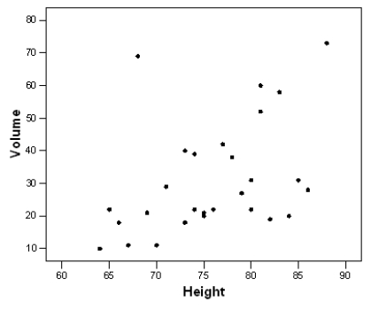 Select all descriptions that apply to the scatterplot.
A)There is a positive association between height and volume.
B)There is a negative association between height and volume.
C)There is an outlier in the plot.
D)The plot is skewed to the left.
E)Both A and C
Select all descriptions that apply to the scatterplot.A)There is a positive association between height and volume.
B)There is a negative association between height and volume.
C)There is an outlier in the plot.
D)The plot is skewed to the left.
E)Both A and C
Question
Question
Question
Question
Question
The graph below is a plot of the fuel efficiency (in miles per gallon,or mpg)of various cars versus the weight of these cars (in thousands of pounds). 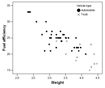 The points denoted by the plotting symbol × correspond to pick-up trucks and SUVs.The points denoted by the plotting symbol correspond to automobiles (sedans and station wagons).What can we conclude from this plot?
A)There is little difference between trucks and automobiles.
B)Trucks tend to be higher in weight than automobiles.
C)Trucks tend to get poorer gas mileage than automobiles.
D)The plot is invalid.A scatterplot is used to represent quantitative variables,and the vehicle type is a qualitative variable.
E)Both B and C
The points denoted by the plotting symbol × correspond to pick-up trucks and SUVs.The points denoted by the plotting symbol correspond to automobiles (sedans and station wagons).What can we conclude from this plot?A)There is little difference between trucks and automobiles.
B)Trucks tend to be higher in weight than automobiles.
C)Trucks tend to get poorer gas mileage than automobiles.
D)The plot is invalid.A scatterplot is used to represent quantitative variables,and the vehicle type is a qualitative variable.
E)Both B and C
Question
A researcher measured the height (in feet)and volume of usable lumber (in cubic feet)of 32 cherry trees.The goal is to determine if the volume of usable lumber can be estimated from the height of a tree.The results are plotted below:  Fill in the blank.The variable _______________ is the response variable in this study.
Fill in the blank.The variable _______________ is the response variable in this study. Question
The scatterplot below displays data collected from 20 adults on their age and overall GPA at graduation. 
The scatterplot shows a strong relationship.
The scatterplot shows a strong relationship.
Question
Question
The scatterplot below displays data collected from 20 adults on their age and overall GPA at graduation. 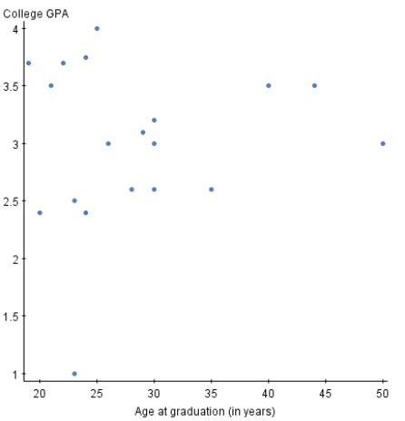
If you switched the variables on the x and y axis,the relationship between the two variables would appear much stronger.
If you switched the variables on the x and y axis,the relationship between the two variables would appear much stronger.
Question
The scatterplot below displays data collected from 20 adults on their age and overall GPA at graduation. 
There appear to be outliers in the data set.
There appear to be outliers in the data set.
Question
Volunteers for a research study were divided into three groups.Group 1 listened to Western religious music,Group 2 listened to Western rock music,and Group 3 listened to Chinese religious music.The blood pressure of each volunteer was measured before and after listening to the music,and the change in blood pressure (blood pressure before listening minus blood pressure after listening)was recorded. A scatterplot of change in blood pressure (mmHg)versus the type of music listened to is given below: 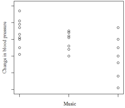 What do we know about the correlation between change in blood pressure and type of music?
A)It is negative.
B)It is positive.
C)It is first negative then positive.
D)None of the above
What do we know about the correlation between change in blood pressure and type of music?A)It is negative.
B)It is positive.
C)It is first negative then positive.
D)None of the above
Question
Question
Question
Question
Question
Question
Question
Question
Question
Question
Question
Question
Question
Question
Question
Question
Question
Question
Question
Question
Question
Question
Question
Question
Question
Question
Question
Question
Question
Malaria is a leading cause of infectious disease and death worldwide.It is also a popular example of a vector-borne disease that could be greatly affected by the influence of climate change.The table below is a summary from a linear regression that uses dewpoint (°C)to predict malaria prevalence in West Africa.  Fill in the blank.The correlation coefficient,r,is ___.
Fill in the blank.The correlation coefficient,r,is ___. Question
Malaria is a leading cause of infectious disease and death worldwide.It is also a popular example of a vector-borne disease that could be greatly affected by the influence of climate change.The table below is a summary from a linear regression that uses dewpoint (°C)to predict malaria prevalence in West Africa. 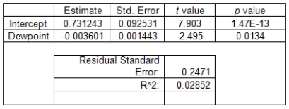 Fill in the blank.The equation of the least-square regression line is __________.
Fill in the blank.The equation of the least-square regression line is __________. Question
Malaria is a leading cause of infectious disease and death worldwide.It is also a popular example of a vector-borne disease that could be greatly affected by the influence of climate change.The table below is a summary from a linear regression that uses dewpoint (°C)to predict malaria prevalence in West Africa. 
There is a strong correlation between dewpoint and malaria prevalence in West Africa.
There is a strong correlation between dewpoint and malaria prevalence in West Africa.
Question
Malaria is a leading cause of infectious disease and death worldwide.It is also a popular example of a vector-borne disease that could be greatly affected by the influence of climate change.The table below is a summary from a linear regression that uses dewpoint (°C)to predict malaria prevalence in West Africa. 
There is a negative association between dewpoint and malaria prevalence in West Africa.
There is a negative association between dewpoint and malaria prevalence in West Africa.
Question
Question
Malaria is a leading cause of infectious disease and death worldwide.It is also a popular example of a vector-borne disease that could be greatly affected by the influence of climate change.The scatterplot shows total precipitation (in mm)in select cities in West Africa on the x axis and the percent of people who tested positive for malaria in the select cities on the y axis in 2000. 
There are influential points in the scatterplot.
There are influential points in the scatterplot.
Question
Malaria is a leading cause of infectious disease and death worldwide.It is also a popular example of a vector-borne disease that could be greatly affected by the influence of climate change.The scatterplot shows total precipitation (in mm)in select cities in West Africa on the x axis and the percent of people who tested positive for malaria in the select cities on the y axis in 2000. 
There is a strong linear relationship between percentage of people who tested positive for malaria and precipitation.
There is a strong linear relationship between percentage of people who tested positive for malaria and precipitation.
Question
Malaria is a leading cause of infectious disease and death worldwide.It is also a popular example of a vector-borne disease that could be greatly affected by the influence of climate change.The scatterplot shows total precipitation (in mm)in select cities in West Africa on the x axis and the percent of people who tested positive for malaria in the select cities on the y axis in 2000. 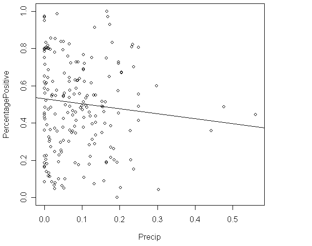 The correlation between precipitation and percent who tested positive for malaria is probably close to _____.
A)1
B)0
C)Can't tell.
The correlation between precipitation and percent who tested positive for malaria is probably close to _____.A)1
B)0
C)Can't tell.

Unlock Deck
Sign up to unlock the cards in this deck!
Unlock Deck
Unlock Deck
1/48
Play
Full screen (f)
Deck 2: Looking at Datarelationships
1
A researcher measured the height (in feet)and volume of usable lumber (in cubic feet)of 32 cherry trees.The goal is to determine if the volume of usable lumber can be estimated from the height of a tree.The results are plotted below: Select all descriptions that apply to the scatterplot.
A)There is a positive association between height and volume.
B)There is a negative association between height and volume.
C)There is an outlier in the plot.
D)The plot is skewed to the left.
E)Both A and C
Select all descriptions that apply to the scatterplot.A)There is a positive association between height and volume.
B)There is a negative association between height and volume.
C)There is an outlier in the plot.
D)The plot is skewed to the left.
E)Both A and C
Both A and C
2
We are interested in determining if students who graduate from larger universities receive greater starting salaries than students who graduate from smaller universities.We collected data from 50 small universities and 50 large universities to examine this relationship.This is an example of ________
A)exploratory data analysis.
B)benchmarking.
C)data mining.
A)exploratory data analysis.
B)benchmarking.
C)data mining.
benchmarking.
3
Fill in the blank.A researcher is interested in determining if one could predict the score on a statistics exam from the amount of time spent studying for the exam.The variable _______________ is the explanatory variable in this study.
amount of time spent studying for the exam
4
Variables measured on the same cases are _______ if knowing the values of one of the variables gives you information about the values of another variable that was not known beforehand.
A)transformed
B)categorical
C)associated
D)quantitative
A)transformed
B)categorical
C)associated
D)quantitative
Unlock Deck
Unlock for access to all 48 flashcards in this deck.
Unlock Deck
k this deck
5
Fill in the blank.A study is conducted to determine if one can predict the yield of a crop based on the amount of yearly rainfall.The variable _______________ is the response variable in this study.
Unlock Deck
Unlock for access to all 48 flashcards in this deck.
Unlock Deck
k this deck
6
The graph below is a plot of the fuel efficiency (in miles per gallon,or mpg)of various cars versus the weight of these cars (in thousands of pounds). The points denoted by the plotting symbol × correspond to pick-up trucks and SUVs.The points denoted by the plotting symbol correspond to automobiles (sedans and station wagons).What can we conclude from this plot?
A)There is little difference between trucks and automobiles.
B)Trucks tend to be higher in weight than automobiles.
C)Trucks tend to get poorer gas mileage than automobiles.
D)The plot is invalid.A scatterplot is used to represent quantitative variables,and the vehicle type is a qualitative variable.
E)Both B and C
The points denoted by the plotting symbol × correspond to pick-up trucks and SUVs.The points denoted by the plotting symbol correspond to automobiles (sedans and station wagons).What can we conclude from this plot?A)There is little difference between trucks and automobiles.
B)Trucks tend to be higher in weight than automobiles.
C)Trucks tend to get poorer gas mileage than automobiles.
D)The plot is invalid.A scatterplot is used to represent quantitative variables,and the vehicle type is a qualitative variable.
E)Both B and C
Unlock Deck
Unlock for access to all 48 flashcards in this deck.
Unlock Deck
k this deck
7
A researcher measured the height (in feet)and volume of usable lumber (in cubic feet)of 32 cherry trees.The goal is to determine if the volume of usable lumber can be estimated from the height of a tree.The results are plotted below: Fill in the blank.The variable _______________ is the response variable in this study.
Fill in the blank.The variable _______________ is the response variable in this study. Unlock Deck
Unlock for access to all 48 flashcards in this deck.
Unlock Deck
k this deck
8
The scatterplot below displays data collected from 20 adults on their age and overall GPA at graduation.
The scatterplot shows a strong relationship.
The scatterplot shows a strong relationship.
Unlock Deck
Unlock for access to all 48 flashcards in this deck.
Unlock Deck
k this deck
9
A variable that explains or causes change to another variable is called a(n)_______ variable.
A)independent
B)dependent
C)response
A)independent
B)dependent
C)response
Unlock Deck
Unlock for access to all 48 flashcards in this deck.
Unlock Deck
k this deck
10
The scatterplot below displays data collected from 20 adults on their age and overall GPA at graduation.
If you switched the variables on the x and y axis,the relationship between the two variables would appear much stronger.
If you switched the variables on the x and y axis,the relationship between the two variables would appear much stronger.
Unlock Deck
Unlock for access to all 48 flashcards in this deck.
Unlock Deck
k this deck
11
The scatterplot below displays data collected from 20 adults on their age and overall GPA at graduation.
There appear to be outliers in the data set.
There appear to be outliers in the data set.
Unlock Deck
Unlock for access to all 48 flashcards in this deck.
Unlock Deck
k this deck
12
Volunteers for a research study were divided into three groups.Group 1 listened to Western religious music,Group 2 listened to Western rock music,and Group 3 listened to Chinese religious music.The blood pressure of each volunteer was measured before and after listening to the music,and the change in blood pressure (blood pressure before listening minus blood pressure after listening)was recorded. A scatterplot of change in blood pressure (mmHg)versus the type of music listened to is given below: What do we know about the correlation between change in blood pressure and type of music?
A)It is negative.
B)It is positive.
C)It is first negative then positive.
D)None of the above
What do we know about the correlation between change in blood pressure and type of music?A)It is negative.
B)It is positive.
C)It is first negative then positive.
D)None of the above
Unlock Deck
Unlock for access to all 48 flashcards in this deck.
Unlock Deck
k this deck
13
Two variables are ______ if knowing the values of one of the variables gives one information about the other variable.
A)associated
B)lurking
C)confounded
A)associated
B)lurking
C)confounded
Unlock Deck
Unlock for access to all 48 flashcards in this deck.
Unlock Deck
k this deck
14
Fill in the blank.When creating a scatterplot,one should use the _______________ axis for the explanatory variable if a regression line is to be fit to the data.
Unlock Deck
Unlock for access to all 48 flashcards in this deck.
Unlock Deck
k this deck
15
Fill in the blank.The owner of a winery collects data on competing wineries every year.He would like to predict the gross sales (in number of cases)from the size of the wineries (in acres).The variable _______________ is the explanatory variable in this study.
Unlock Deck
Unlock for access to all 48 flashcards in this deck.
Unlock Deck
k this deck
16
Fill in the blank.The Environmental Protection Agency records data on the fuel economy of many different makes of cars.They are interested in determining if one could predict the mileage of the car (in miles per gallon)from the weight of the car (in lbs. ).The variable _______________ is the response variable in this study.
Unlock Deck
Unlock for access to all 48 flashcards in this deck.
Unlock Deck
k this deck
17
A categorical variable can be added to a scatterplot.
Unlock Deck
Unlock for access to all 48 flashcards in this deck.
Unlock Deck
k this deck
18
Fill in the blank.A scatterplot is a graphical tool for displaying the relationship between two __________ variables measured on the same individuals.
Unlock Deck
Unlock for access to all 48 flashcards in this deck.
Unlock Deck
k this deck
19
To examine the relationship between two variables,the variables must be measured from the same _______.
A)cases
B)labels
C)units
D)values
A)cases
B)labels
C)units
D)values
Unlock Deck
Unlock for access to all 48 flashcards in this deck.
Unlock Deck
k this deck
20
Volunteers for a research study were divided into three groups.Group 1 listened to Western religious music,Group 2 listened to Western rock music,and Group 3 listened to Chinese religious music.The blood pressure of each volunteer was measured before and after listening to the music,and the change in blood pressure (blood pressure before listening minus blood pressure after listening)was recorded. What could we do to explore the relationship between type of music and change in blood pressure?
A)See if blood pressure decreases as type of music increases by examining a scatterplot.
B)Make a histogram of the change in blood pressure for all of the volunteers.
C)Make side-by-side boxplots of the change in blood pressure,with a separate boxplot for each group.
D)All of the above
A)See if blood pressure decreases as type of music increases by examining a scatterplot.
B)Make a histogram of the change in blood pressure for all of the volunteers.
C)Make side-by-side boxplots of the change in blood pressure,with a separate boxplot for each group.
D)All of the above
Unlock Deck
Unlock for access to all 48 flashcards in this deck.
Unlock Deck
k this deck
21
When looking for relationships between two quantitative variables,you are looking for ___________.
A)linear relationships
B)nonlinear relationships
C)All of the above
D)None of the above
A)linear relationships
B)nonlinear relationships
C)All of the above
D)None of the above
Unlock Deck
Unlock for access to all 48 flashcards in this deck.
Unlock Deck
k this deck
22
When examining a scatterplot for form,you are looking to see if _____.
A)the points in the scatterplot show a straight line pattern
B)the points in the scatterplot show a curved relationship
C)there are clusters in the scatterplot
D)None of the above
E)A,B,C
A)the points in the scatterplot show a straight line pattern
B)the points in the scatterplot show a curved relationship
C)there are clusters in the scatterplot
D)None of the above
E)A,B,C
Unlock Deck
Unlock for access to all 48 flashcards in this deck.
Unlock Deck
k this deck
23
Which of the following statements is/are FALSE?
A)A scatterplot is a useful graphical tool for displaying the strength of the relationship between two quantitative variables.
B)The only relationship that a scatterplot can usefully display is linear with no outliers.
C)If above-average values of two quantitative variables and below-average values of the same two quantitative variables tend to occur together,the two variables are positively associated.
D)An individual value that deviates from the overall pattern displayed on a scatterplot is called an outlier.
E)A categorical variable can be added to a scatterplot by using a different color or symbol for each category.
Unlock Deck
Unlock for access to all 48 flashcards in this deck.
Unlock Deck
k this deck
24
Which type of transformation may help change a curved relationship into a more linear relationship?
A)Log
B)Arcsin
C)Reciprocal
D)Cubed-root
A)Log
B)Arcsin
C)Reciprocal
D)Cubed-root
Unlock Deck
Unlock for access to all 48 flashcards in this deck.
Unlock Deck
k this deck
25
Scatterplots can be used to explain the relationship between one categorical variable and one quantitative variable.
Unlock Deck
Unlock for access to all 48 flashcards in this deck.
Unlock Deck
k this deck
26
Time plots are special scatterplots where the explanatory variable,x,is a measure of time.
Unlock Deck
Unlock for access to all 48 flashcards in this deck.
Unlock Deck
k this deck
27
When trying to explain the relationship between two quantitative variables,it would be best to use a _______.
A)density curve
B)scatterplot
C)boxplot
D)histogram
A)density curve
B)scatterplot
C)boxplot
D)histogram
Unlock Deck
Unlock for access to all 48 flashcards in this deck.
Unlock Deck
k this deck
28
Scatterplot "smoothing" is used to determine the ______ of the data.
A)direction
B)form
C)variation
D)None of the above
A)direction
B)form
C)variation
D)None of the above
Unlock Deck
Unlock for access to all 48 flashcards in this deck.
Unlock Deck
k this deck
29
If you have two quantitative variables,one way to study them is to use a ______.
A)scatterplot
B)two-way table
C)None of the above
A)scatterplot
B)two-way table
C)None of the above
Unlock Deck
Unlock for access to all 48 flashcards in this deck.
Unlock Deck
k this deck
30
When examining a scatterplot for strength,you are looking to see _______.
A)how close the points in the scatterplot follow a line
B)how close the points in the scatterplot follow a curve
C)All of the above
D)None of the above
A)how close the points in the scatterplot follow a line
B)how close the points in the scatterplot follow a curve
C)All of the above
D)None of the above
Unlock Deck
Unlock for access to all 48 flashcards in this deck.
Unlock Deck
k this deck
31
Transformations are used to ______.
A)make curved relationships more linear
B)make data more normal
C)change the scale of measurements
D)All of the above
A)make curved relationships more linear
B)make data more normal
C)change the scale of measurements
D)All of the above
Unlock Deck
Unlock for access to all 48 flashcards in this deck.
Unlock Deck
k this deck
32
Explanatory variables are also called ___________ variables.
Unlock Deck
Unlock for access to all 48 flashcards in this deck.
Unlock Deck
k this deck
33
Which of the following statements about a scatterplot is/are TRUE?
A)It is always necessary to identify one of the two variables as the explanatory variable and the other as the response variable.
B)On a scatterplot we look for overall patterns showing the form,direction,and the shape of the relationship.
C)Because a scatterplot requires the values of two quantitative variables,it is never possible to add one or more categorical variables to the graph.
D)Both A and B are true statements.
E)None of the above statements are true.
Unlock Deck
Unlock for access to all 48 flashcards in this deck.
Unlock Deck
k this deck
34
Response variables are also called ____________ variables.
Unlock Deck
Unlock for access to all 48 flashcards in this deck.
Unlock Deck
k this deck
35
To use a log transformation,all values must be positive.
Unlock Deck
Unlock for access to all 48 flashcards in this deck.
Unlock Deck
k this deck
36
Scatterplots can be used to determine ______ relationships between variables.
A)linear
B)quadratic
C)cubic
D)All of the above
E)None of the above
A)linear
B)quadratic
C)cubic
D)All of the above
E)None of the above
Unlock Deck
Unlock for access to all 48 flashcards in this deck.
Unlock Deck
k this deck
37
The "direction" in scatterplots refers to the _________ direction.
A)horizontal and vertical
B)positive and negative
C)left and right
D)None of the above
A)horizontal and vertical
B)positive and negative
C)left and right
D)None of the above
Unlock Deck
Unlock for access to all 48 flashcards in this deck.
Unlock Deck
k this deck
38
An outlier is ______.
A)a point in a scatterplot that follows the same pattern as the other points
B)a point in a scatterplot that does not follow the same pattern as the other points
C)All of the above
D)None of the above
A)a point in a scatterplot that follows the same pattern as the other points
B)a point in a scatterplot that does not follow the same pattern as the other points
C)All of the above
D)None of the above
Unlock Deck
Unlock for access to all 48 flashcards in this deck.
Unlock Deck
k this deck
39
Two variables are positively associated when _______.
A)above-average values of one tend to accompany above-average values of the other and vice versa
B)above-average values of one tend to accompany below-average values of the other,and vice versa
C)both variables have an outlier
D)None of the above
A)above-average values of one tend to accompany above-average values of the other and vice versa
B)above-average values of one tend to accompany below-average values of the other,and vice versa
C)both variables have an outlier
D)None of the above
Unlock Deck
Unlock for access to all 48 flashcards in this deck.
Unlock Deck
k this deck
40
You can describe the overall pattern of a scatterplot by the _____.
A)form,direction,and strength
B)Normal distribution
C)number of points in the plot
D)None of the above
A)form,direction,and strength
B)Normal distribution
C)number of points in the plot
D)None of the above
Unlock Deck
Unlock for access to all 48 flashcards in this deck.
Unlock Deck
k this deck
41
Malaria is a leading cause of infectious disease and death worldwide.It is also a popular example of a vector-borne disease that could be greatly affected by the influence of climate change.The table below is a summary from a linear regression that uses dewpoint (°C)to predict malaria prevalence in West Africa. Fill in the blank.The correlation coefficient,r,is ___.
Fill in the blank.The correlation coefficient,r,is ___. Unlock Deck
Unlock for access to all 48 flashcards in this deck.
Unlock Deck
k this deck
42
Malaria is a leading cause of infectious disease and death worldwide.It is also a popular example of a vector-borne disease that could be greatly affected by the influence of climate change.The table below is a summary from a linear regression that uses dewpoint (°C)to predict malaria prevalence in West Africa. Fill in the blank.The equation of the least-square regression line is __________.
Fill in the blank.The equation of the least-square regression line is __________. Unlock Deck
Unlock for access to all 48 flashcards in this deck.
Unlock Deck
k this deck
43
Malaria is a leading cause of infectious disease and death worldwide.It is also a popular example of a vector-borne disease that could be greatly affected by the influence of climate change.The table below is a summary from a linear regression that uses dewpoint (°C)to predict malaria prevalence in West Africa.
There is a strong correlation between dewpoint and malaria prevalence in West Africa.
There is a strong correlation between dewpoint and malaria prevalence in West Africa.
Unlock Deck
Unlock for access to all 48 flashcards in this deck.
Unlock Deck
k this deck
44
Malaria is a leading cause of infectious disease and death worldwide.It is also a popular example of a vector-borne disease that could be greatly affected by the influence of climate change.The table below is a summary from a linear regression that uses dewpoint (°C)to predict malaria prevalence in West Africa.
There is a negative association between dewpoint and malaria prevalence in West Africa.
There is a negative association between dewpoint and malaria prevalence in West Africa.
Unlock Deck
Unlock for access to all 48 flashcards in this deck.
Unlock Deck
k this deck
45
When the explanatory variable is categorical and the response variable is quantitative,what type of plot would be appropriate?
A)Boxplot
B)Time plot
C)Scatterplot
A)Boxplot
B)Time plot
C)Scatterplot
Unlock Deck
Unlock for access to all 48 flashcards in this deck.
Unlock Deck
k this deck
46
Malaria is a leading cause of infectious disease and death worldwide.It is also a popular example of a vector-borne disease that could be greatly affected by the influence of climate change.The scatterplot shows total precipitation (in mm)in select cities in West Africa on the x axis and the percent of people who tested positive for malaria in the select cities on the y axis in 2000.
There are influential points in the scatterplot.
There are influential points in the scatterplot.
Unlock Deck
Unlock for access to all 48 flashcards in this deck.
Unlock Deck
k this deck
47
Malaria is a leading cause of infectious disease and death worldwide.It is also a popular example of a vector-borne disease that could be greatly affected by the influence of climate change.The scatterplot shows total precipitation (in mm)in select cities in West Africa on the x axis and the percent of people who tested positive for malaria in the select cities on the y axis in 2000.
There is a strong linear relationship between percentage of people who tested positive for malaria and precipitation.
There is a strong linear relationship between percentage of people who tested positive for malaria and precipitation.
Unlock Deck
Unlock for access to all 48 flashcards in this deck.
Unlock Deck
k this deck
48
Malaria is a leading cause of infectious disease and death worldwide.It is also a popular example of a vector-borne disease that could be greatly affected by the influence of climate change.The scatterplot shows total precipitation (in mm)in select cities in West Africa on the x axis and the percent of people who tested positive for malaria in the select cities on the y axis in 2000. The correlation between precipitation and percent who tested positive for malaria is probably close to _____.
A)1
B)0
C)Can't tell.
The correlation between precipitation and percent who tested positive for malaria is probably close to _____.A)1
B)0
C)Can't tell.
Unlock Deck
Unlock for access to all 48 flashcards in this deck.
Unlock Deck
k this deck
Unlock Deck
Unlock for access to all 48 flashcards in this deck.


