Multiple Choice
The following diagram shows marginal value and expenditure curves for a monopsony. In moving from the competitive price and quantity to the monopsony price and quantity, the deadweight loss from monopsony power is the area: 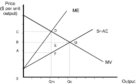
A) ACDF
B) CDE
C) EDG
D) FDG
E) BCDG
Correct Answer:

Verified
Correct Answer:
Verified
Q33: The marginal cost of a monopolist is
Q34: The marginal cost of a monopolist is
Q35: Which of the following statements about natural
Q36: Suppose that a firm can produce its
Q37: Suppose the marginal value curve for a
Q39: Unlike a competitive buyer,<br>A) a monopsonist faces
Q40: For a monopsony buyer, the marginal expenditure
Q41: <img src="https://d2lvgg3v3hfg70.cloudfront.net/TB3095/.jpg" alt=" Figure 10.1.2 -Refer
Q42: Determine the "rule-of-thumb" price when the monopolist
Q43: Scenario 10.2:<br>A monopolist faces the following demand