Essay
Refer to the graphs below representing three computer simulations of Earth's climate between 1850 and 2000.Blue lines represent results of the model;red lines are actual climate data.The graph A model includes only natural factors,such as solar input and volcanic activity.The graph B model includes only human-caused (anthropogenic)factors,such as fossil fuel burning and deforestation.The graph C model includes both natural and anthropogenic factors.Curves are expressed as deviations around 0,which represents the average temperature for the late 1800s.Which graph best fits the actual data? What does a comparison of the three graphs indicate about the causes of global temperature increase? 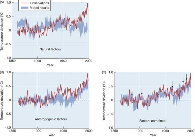
Correct Answer:

Verified
The best fit occurs in graph C,which com...View Answer
Unlock this answer now
Get Access to more Verified Answers free of charge
Correct Answer:
Verified
View Answer
Unlock this answer now
Get Access to more Verified Answers free of charge
Q85: In 1957,Dave Keeling used new sensitive instruments
Q86: Refer to the graphs below.Briefly explain the
Q87: Refer to the diagram below.Explain briefly how
Q88: Leaves of most deciduous trees in Mediterranean
Q89: Satellite maps show that NPP,measured as distribution
Q91: Winter moths in the Netherlands are part
Q92: Nitrogen enters a grassland ecosystem and cycles
Q93: In general,how have patterns of precipitation around
Q94: A bird species responds to earlier spring
Q95: An insect pollinator emerges on May 1,but