Multiple Choice
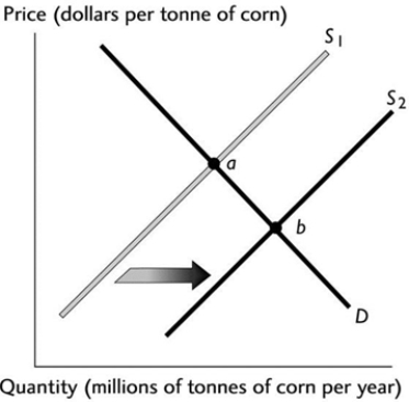 The above figure illustrates the market for corn. If point 'a' represents the original equilibrium and point 'b' the new equilibrium, which of the following could have caused the change?
A) An increase in the number of corn growers.
B) An increase in the cost of the fertiliser used to grow the corn.
C) An increase in the price of wheat, a substitute in production for corn.
D) An increase in income if corn is a normal good.
E) A belief among corn farmers that the price of a tonne of corn will be higher next month.
Correct Answer:

Verified
Correct Answer:
Verified
Q116: Car insurance and cars are complements. If
Q117: If a higher price for wheat decreases
Q118: Which of the following increases the demand
Q119: <img src="https://d2lvgg3v3hfg70.cloudfront.net/TB7671/.jpg" alt=" The graph illustrates
Q120: Suppose that the price of flour used
Q122: Which of the following results in a
Q123: The phrase 'a change in demand' most
Q124: A supply curve<br>A) slopes upward.<br>B) is a
Q125: A competitive market is in equilibrium. Then
Q126: Market equilibrium occurs when<br>A) demand and supply