Multiple Choice
The following graphic of cigarettes smoked (sold) per capita (CIG) and deaths per 100K population from lung cancer (LUNG) indicates _________ 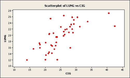
A) a weak negative relationship between the two variables
B) a somewhat positive relationship between the two variables
C) when the number of cigarettes smoked (sold) per capita (CIG) increases the deaths per 100K population from lung cancer (LUNG) decreases
D) a negative relationship between the two variables
E) no relationship between the two variables
Correct Answer:

Verified
Correct Answer:
Verified
Q85: To show hourly sales throughout a day,
Q86: A scatter plot indicates that two variables
Q87: Consider the following frequency distribution:
Q88: A summary of data in which raw
Q89: An instructor made a frequency table
Q91: Pinky Bauer, Chief Financial Officer of
Q92: Consider the following frequency distribution:
Q93: A frequency distribution was developed.The lower endpoint
Q94: Pinky Bauer, Chief Financial Officer of
Q95: Dot Plots are mainly used to display