Multiple Choice
The following graph shows average fixed costs, average variable costs, average total costs, and marginal costs of production. 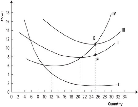 Why does the distance between curves II and III get smaller as quantity increases?
A) Marginal cost is increasing.
B) Average variable cost is increasing.
C) Average fixed cost is declining.
D) Average fixed cost is increasing.
Correct Answer:

Verified
Correct Answer:
Verified
Q119: Rachel left her job as a graphic
Q120: Refer to the table shown. If
Q121: Refer to the graph shown. This set
Q122: In the short run, average variable cost
Q123: In the short run:<br>A) some inputs are
Q125: Fixed costs exist only in the:<br>A) long
Q126: A factory producing calculators employs four workers.
Q127: The vertical distance between the average total
Q128: If marginal cost is less than average
Q129: Whenever the marginal cost curve lies below