Multiple Choice
The graph below shows the change in allele frequency for a beneficial allele over time (the x axis shows generations) . Based on the shape of the curve, this allele is most likely 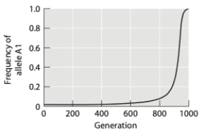
A) homozygous.
B) dominant.
C) recessive.
D) heterozygous.
E) additive.
Correct Answer:

Verified
Correct Answer:
Verified
Q44: In which of the scenarios below is
Q45: Many plant species are hermaphroditic and run
Q46: Inbreeding<br>A) changes allele frequencies in a population.<br>B)
Q47: Tasmanian devils once inhabited most of present-day
Q48: The frequency of a slightly deleterious allele
Q50: Alleles are<br>A) found at genetic loci.<br>B) always
Q51: In a population of butterflies that has
Q52: Bighorn sheep occupy a range that extends
Q53: How does "random mating" affect population genetics
Q54: Assuming that a deleterious allele is maintained