Not Answered
The graph below shows results of two simulations, both depicting the rise in frequency of a beneficial allele in a population of infinite size. The selection coefficient and the starting frequency are the same, but in one simulation the beneficial allele is dominant and in the other it is recessive. Neither allele is fixed by 500 generations. 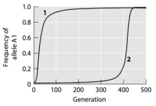 (a) Which simulation shows results for a dominant and which shows results for a recessive allele? How can you tell?
(b) Neither of the alleles reaches fixation by 500 generations. If given enough time, will both of these alleles reach fixation in the population? Why or why not?
Correct Answer:

Verified
Correct Answer:
Verified
Q61: Contrast evolution by natural selection with evolution
Q62: Why was Charles II of Spain, of
Q63: How do gene frequencies behave in Hardy-Weinberg
Q64: In the Hardy-Weinberg equation, q is<br>A) an
Q65: Why might an endangered species, whose population
Q66: Earth's biotic and abiotic environments are changing
Q67: When F<sub>ST</sub> ≈ 0, a population<br>A) has
Q68: Which of the following statements is/are supported
Q70: Lively and Dybdahl studied parasite infection rates
Q71: Some Drosophila melanogaster larvae use a "sitting"