Multiple Choice

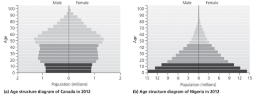
Use the accompanying figure to answer the following question.
-A graph of world population growth over the past 500 years most closely resembled the letter _________________
A) S
B) U
C) J
D) M
E) K
Correct Answer:

Verified
Correct Answer:
Verified
Q10: The richest one- fifth of the world's
Q12: Demographically speaking, the effects of AIDS are
Q13: Which of the following best describes the
Q14: According to the IPAT model, which of
Q16: Briefly explain why Helmut Haberl's research group
Q17: Region hit hardest by the HIV/AIDS epidemic<br>A)China<br>B)Burkina-
Q18: Replacement fertility_<br>A)restores population size after a catastrophic
Q19: The Cornucopian view held by many economists
Q22: Explain human population growth in terms of
Q54: What three-factor model is used for representing