Multiple Choice
The following graph shows pepper prices throughout a 12-month period. 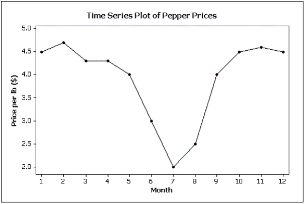 Suppose you made a new graph of the same data, where the maximum value on the Y-axis was changed from 5.0 to 10.0.(Assume everything else stays the same.) Your new graph would appear to have ____ variability in pepper prices compared to the original graph shown above.
A) more
B) less
C) the same
D) unknown
Correct Answer:

Verified
Correct Answer:
Verified
Q15: Which of the following describes a positive
Q30: If two variables have a strong linear
Q31: Graphical excellence is a term usually applied
Q69: Compare the two histograms below.Which statement is
Q73: According to the stem-and-leaf plot below, this
Q88: Briefly discuss the difference between cross-sectional data
Q119: Pie charts only show _,not _.This means
Q134: A(n)_ is a table that sorts data
Q139: The intervals (classes)in a histogram do not
Q148: A bar chart can be made to