Multiple Choice
Use the following to answer questions
This table and figure depict the average SAT scores for entering freshmen in the year 1995 at 36 North Carolina colleges.
Figure: Histogram of SAT 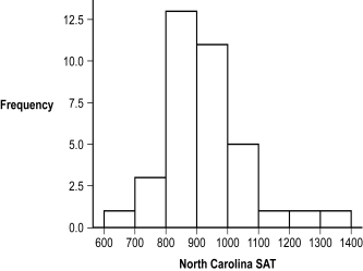
-(Figure: Histogram of SAT) Based on the frequency distribution, what was the interval with the most common score?
A) 700-799
B) 800-899
C) 900-999
D) 1000-1099
Correct Answer:

Verified
Correct Answer:
Verified
Q46: A _ is a data point that
Q47: Raw scores are data that have not
Q48: A histogram is typically used to depict
Q49: When constructing a frequency table, the final
Q50: Use the following to answer questions
Q52: A grouped frequency table is most useful
Q53: Dr.Choi is examining the weights of 750
Q54: A _ is a line graph with
Q55: A _ is a data point that
Q56: In a _, the tail of the