Multiple Choice
Use the figures to answer the following question.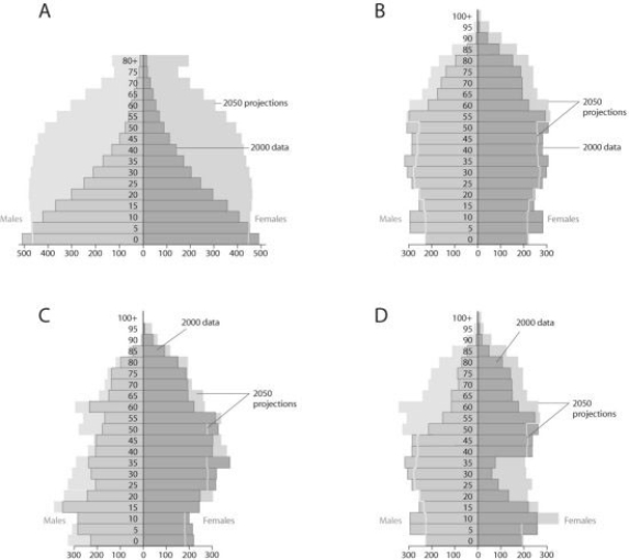
Based on the diagrams in the figure and on the large population of baby boomers in the United States, which graph best reflects U.S. population in 20 years?
A) A
B) B
C) C
D) D
Correct Answer:

Verified
Correct Answer:
Verified
Related Questions
Q14: A population of white-footed mice becomes severely
Q46: Use the figure to answer the following
Q48: Use the figure to answer the following
Q49: Use the survivorship curves in the figure
Q50: A recent study of ecological footprints concluded
Q52: Use the figure to answer the following
Q53: Based on current growth rates, Earth's human
Q54: According to the logistic growth equation, <img
Q55: In 2008, the population of New Zealand
Q56: Which of the following examples would most