Short Answer
NARRBEGIN: Home Care
Home Care
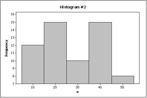
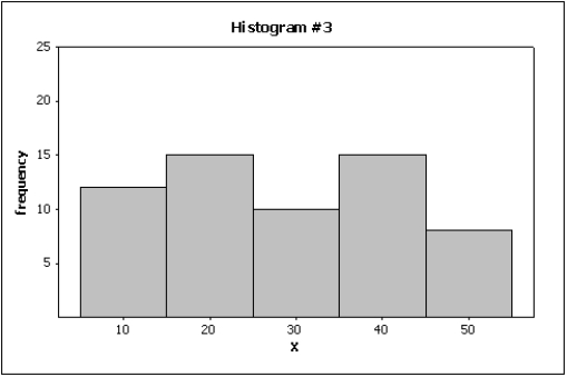
Data are collected on the number of house calls (x) made in a given week by each of 60 nurses in a certain hospital. The same data set is displayed in each of the three histograms below. 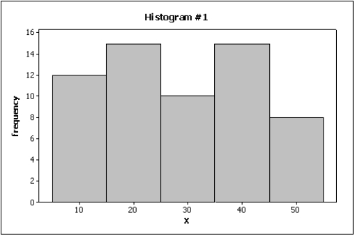
 NARREND
-The line chart below shows potato prices per pound for each month from January (month 1) to December last year. By looking at this chart you can see the lowest potato prices occurred in ____________________. 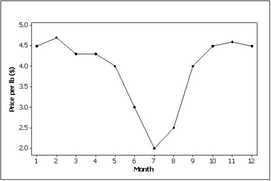
Correct Answer:

Verified
Correct Answer:
Verified
Q1: Correlation implies causation.
Q16: The number of observations within each class
Q45: Time series data are often graphically depicted
Q107: Time series data are often graphically depicted
Q110: Briefly explain the difference between correlation and
Q117: The sum of the relative frequencies for
Q130: A graph of the frequency distribution for
Q133: It is speculated that the number of
Q139: The intervals (classes)in a histogram do not
Q144: In applications involving two variables,X and Y,where